 kage
kage
cloudflare.com

Design analysis
The page opens with a full-bleed, heavily rounded brand-orange hero panel — event pill, oversized two-line headline, one white pill CTA and a glowing horizon — then settles onto a white canvas where airy centred display statements alternate with dense proof modules: a halftone-dot globe card, a tabbed logo wall with testimonial, a bordered four-column pricing grid, and fake product-UI mockups (a deployment version table, an agent terminal). After the hero, orange is rationed to micro-accents — active tabs, "Deployed" badges, line icons — so the closing orange CTA band lands with the same visual weight as the opening. Thin 1px borders, flat shadows, a single geometric sans and a dense multi-column footer keep the enterprise scale readable.
Prompt preview
## Reference images

Study these alongside the description below: hierarchy, rhythm, spacing, colour. Build for the product you are asked about, using this design language.

- Full page: https://kage-design-assets.t3.tigrisfiles.io/screenshots/cloudflare-com/1ca6ff30-a094-43e2-8124-fd26c9356e55-1789213761908-full.webp
- Above the fold: https://kage-design-assets.t3.tigrisfiles.io/screenshots/cloudflare-com/1ca6ff30-a094-43e2-8124-fd26c9356e55-1789213756578.webp
- Design on Kage: https://kage.design/designs/cloudflare-landing-page

# Brand-colour enterprise landing page (Cloudflare-style)

## Before you start
Ask the user and wait for answers before writing code:
- What product are they building and what is the one platform-level promise it makes?
- Who is the audience — developers, IT/security teams, enterprises, or consumers?
- What brand assets exist: name, logo, primary brand colour (hex), secondary tint, and typeface preference?
- Do they have a headline stat (e.g. "powers 45% of the Fortune 500"), real customer logos, or testimonials to show?
Apply everything below to *their* product and brand, not to the reference site.

## Page structure
1. **Top nav (white, full-width)** — logo left; centre nav items with dropdown chevrons (Products / Solutions / Resources) plus Pricing; right side: a status-style text link with small icon, "Login", a dark solid pill "Contact sales" button, and a search icon. Thin bottom border or none; page background shows below.
2. **Hero (inset rounded brand-colour panel)** — the panel sits inside a small page margin with a large border-radius (~28px) and a subtle grid/scanline texture. Inside, top-centred: a slim pill banner for an event/announcement with a register link. Then a two-line display headline (very large, white, tight tracking), a two-line subheadline, and a single white pill CTA. The bottom edge glows like a sunrise horizon (radial gradient, lighter warm tone).
3. **Platform scope section** — centred display heading with a witty one-liner sub ("Region: Earth" style), followed by a large illustration card in cream with a halftone/dot-matrix globe in brand colour. Below it, a 3-column icon row: thin line icon, bold short title, 1–2 sentence grey body (e.g. everywhere / anywhere / massive scale).
4. **Social proof** — huge centred stat headline ("powers 45% of the Fortune 500"), short sub-line, then a horizontally scrolling/tabbed strip of 8 customer logo tabs. Selecting one swaps a testimonial card: large quote mark, quote text, small portrait + company logo, name and title in small type. Under it, "And thousands more…" and one static row of 6 well-known logos in their own brand colours.
5. **Problem/solution split** — two asymmetric cards: left, a white card titled with the pain ("Fighting infra with 'cloud'") containing a glitchy log/terminal collage with red error text and latency numbers; right, an orange card titled with the relief ("Shipping with Cloudflare") containing a single success toast ("Pushed 117 new updates today").
6. **Pricing** — centred display heading plus a parenthetical joke subline ("Pay only when your code runs (Not to keep servers warm.)"). A pill tab switcher selects three product groups (active pill in brand colour). Below: a split explainer — left text block ("Pay for clean traffic…"), right a diagram card showing traffic icons (CDN, DDoS, SSL, WAF, Bot) flowing to "Your site". Then a bordered 4-column plan grid: plan name, audience tagline, large price ($0 / $20 / $200 / Custom) with billing note, small feature list, and a text link "See X plan".
7. **Team-fit bento** — centred heading ("Tailored to your team"). A large composite: left a fake deployment table (version numbers as rows, "Updated" timestamps, orange "Deployed ✓" states) with a small floating card; right an orange explainer card ("One network for users, apps, and data") with 3–4 lines of copy. Caption block below-left: "Fits into your existing workflows" + one sentence. Then a two-up row: "Secure by default" feature text, and "Fast path to AI adoption" with a terminal-style mockup card (agent names, statuses, token counts, blinking cursor, Enter button).
8. **Final CTA band (full-width brand colour)** — centred display heading ("Build without boundaries"), two lines of copy, white primary pill button + ghost secondary ("View docs"). Floating thin-line icons (gear, database, shield, coins) scattered around the edges. Along the bottom edge, a ticker/marquee strip of 4–5 short value claims with icons, separated by dividers.
9. **Footer (white, dense)** — wordmark top-left, then 4 link columns in row one (Getting started / Public interest / Resources / Solutions) and 3 smaller columns in row two (Company / Compliance / Developers). Bottom legal bar: © year, Privacy policy, Report security issues, Terms of use, Trademark, privacy-choices link.

## Design language
- **Rhythm:** alternate temperature down the page — hot (orange hero) → cool and airy (white statement sections with ~120px vertical padding) → dense and tight (pricing grid, mockups, ~24–32px internal padding) → hot again (orange CTA) → cool dense (footer). Each "statement" section is one centred headline + one short subline; each "proof" section is a bordered grid or mockup that gets denser.
- **Hierarchy:** display headlines at 56–96px with tight letter-spacing (-0.02em) and sentence case; sublines 16–18px in 60%-grey; feature titles 18–20px bold; labels/features 13–14px. Never more than one display headline per section.
- **Colour:** white base `#FFFFFF`, near-black text `#101216`, grey secondary `#6B7280`, hairline borders `#E5E7EB`. Brand colour (use the user's primary, e.g. `#F6821F`) fills exactly two big moments — hero and final CTA — plus micro-accents elsewhere: active tab pill, status badges, selected icons, links. Warm cream `#FFF6E8` as illustration-card fill; a glow gradient from brand colour toward pale yellow for hero horizons. Red `#E5484D` appears *only* inside error/log mockups. White text always on brand colour; inverted buttons (white pill on orange, dark pill on white).
- **Type:** one geometric sans family for everything (e.g. Inter/Manrope/Space Grotesk class), weights 400–700; no serifs. Prices and stats are the boldest, largest numerals on the page. Monospace only inside terminal/log mockups.
- **Shape & depth:** page-level panels are inset with ~24–32px radius; cards 12–16px radius; buttons, tabs and badges fully rounded pills. Borders are 1px light grey; shadows are nearly absent — depth comes from colour blocks and borders, not elevation.
- **Icons & illustration:** thin 1.5px monochrome line icons, either bare or in small bordered squares; one hero-scale illustration per page built from dots/halftone patterns in brand colour on cream. No stock photography.
- **Mockups:** rebuild product UI as real HTML — version tables with status chips, terminal cards with monospace lines, toasts, traffic diagrams — with monospace details and brand-coloured success states. Never screenshots of the real product.
- **Interaction:** subtle and flat — logo tabs swap testimonial content, pill tabs switch pricing groups, buttons darken slightly on hover, marquee ticker drifts slowly. No parallax, no heavy scroll animation.

## Never
- Never use Cloudflare's name, logo, cloud mark, wordmark, copy, conference banner, customer logos, or their exact orange as-is unless the user's brand is Cloudflare.
- Never copy headlines, stats, testimonials or feature claims from the reference; invent equivalent content for the user's product.
- Never reuse the halftone globe, agent terminal, or specific mockup content verbatim — rebuild the *pattern* with the user's own product scenarios.
- Never present the result as Cloudflare or imply affiliation.
Components from this page
All components
 Global navigation
cloudflare.com · Navigation
Global navigation
cloudflare.com · Navigation
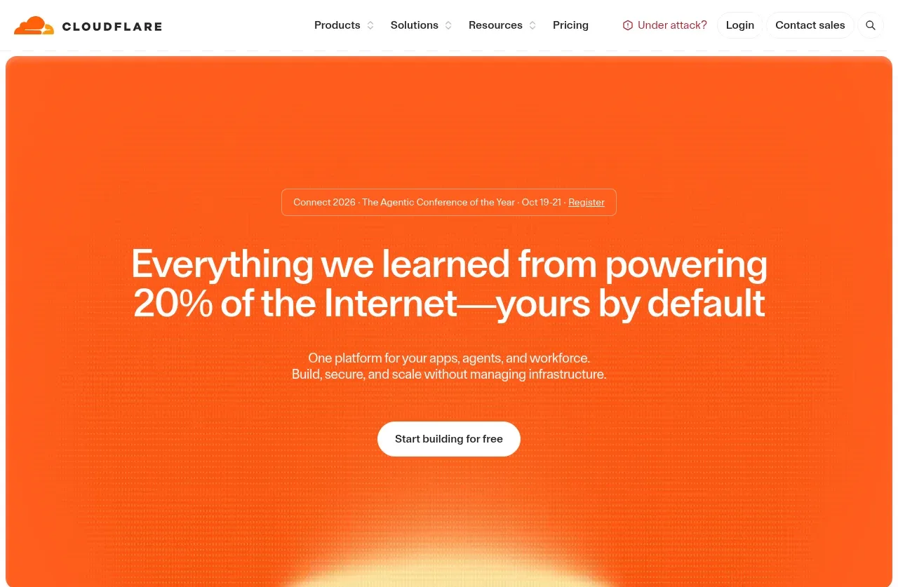 Orange network hero
cloudflare.com · Hero
Orange network hero
cloudflare.com · Hero
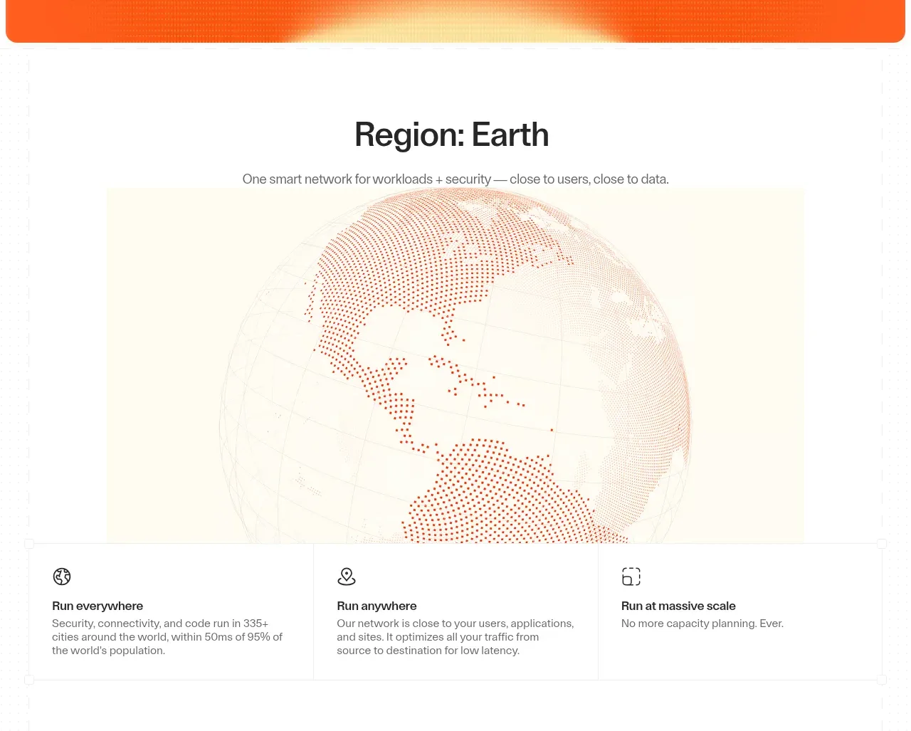 Global network overview
cloudflare.com · Feature grid
Global network overview
cloudflare.com · Feature grid
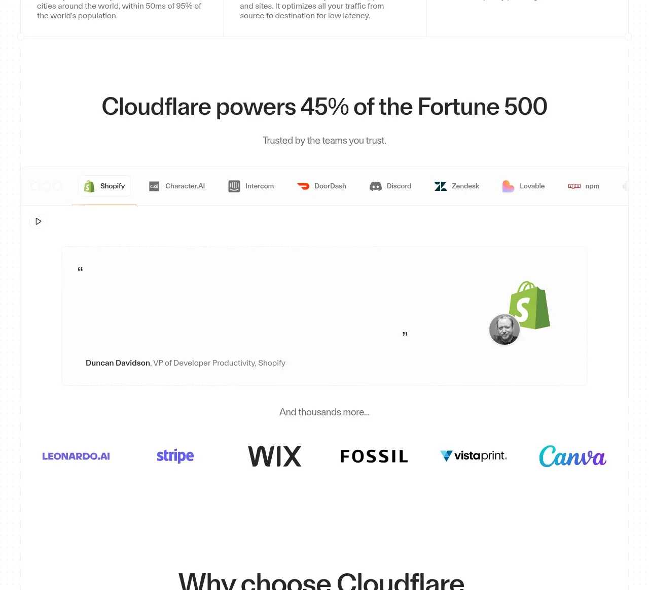 Customer proof and logos
cloudflare.com · Testimonials
Customer proof and logos
cloudflare.com · Testimonials
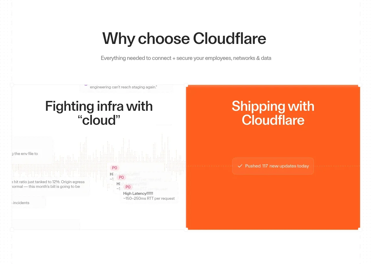 Why choose the product
cloudflare.com · Feature grid
Why choose the product
cloudflare.com · Feature grid
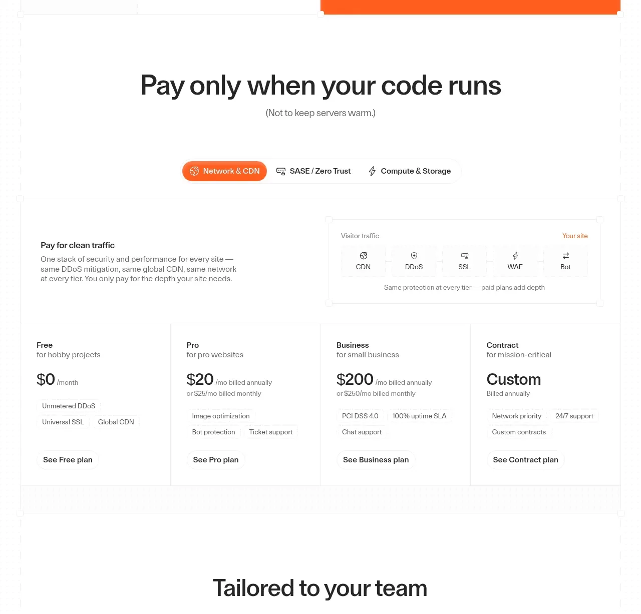 Usage-based pricing plans
cloudflare.com · Pricing table
Usage-based pricing plans
cloudflare.com · Pricing table
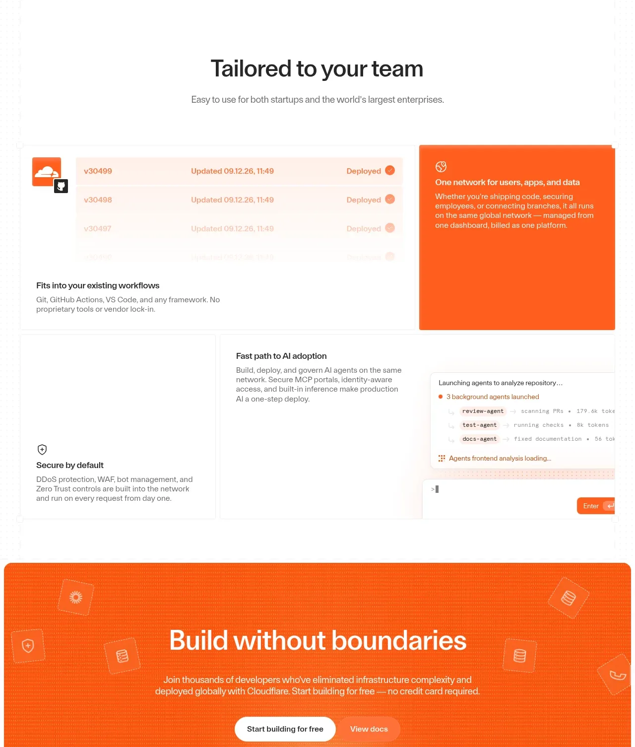 Team workflows and platform capabilities
cloudflare.com · Feature grid
Team workflows and platform capabilities
cloudflare.com · Feature grid
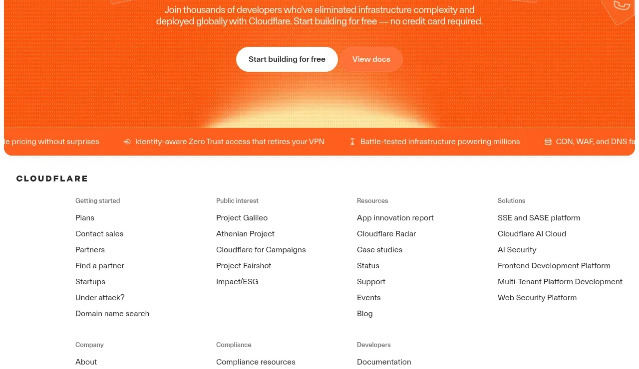 Conversion banner
cloudflare.com · Call to action
Conversion banner
cloudflare.com · Call to action
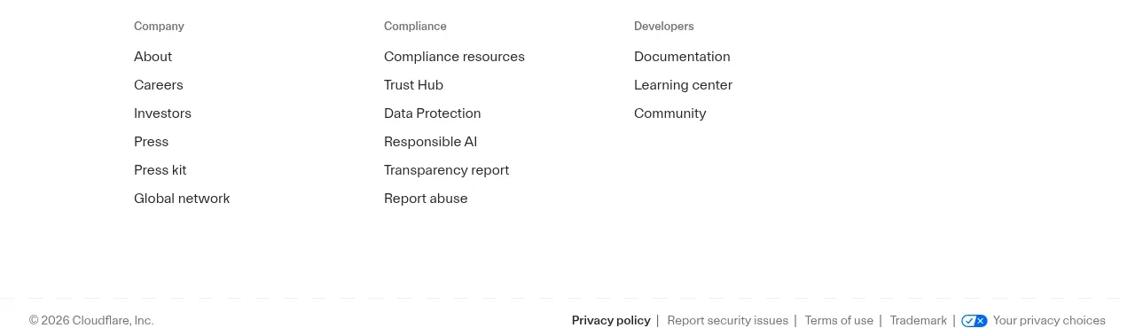 Multi-column site footer
cloudflare.com · Footer
Multi-column site footer
cloudflare.com · Footer
Related designs


 termsquad.com
Landing page · Cloud & infrastructure
termsquad.com
Landing page · Cloud & infrastructure


 upstash.com
Landing page · Cloud & infrastructure
upstash.com
Landing page · Cloud & infrastructure


 render.com
Landing page · Cloud & infrastructure
render.com
Landing page · Cloud & infrastructure


 planetscale.com
Landing page · Cloud & infrastructure
planetscale.com
Landing page · Cloud & infrastructure


 supabase.com
Landing page · Cloud & infrastructure
supabase.com
Landing page · Cloud & infrastructure


 fly.io
Landing page · Cloud & infrastructure
fly.io
Landing page · Cloud & infrastructure