 kage
kage
cloudflare.com
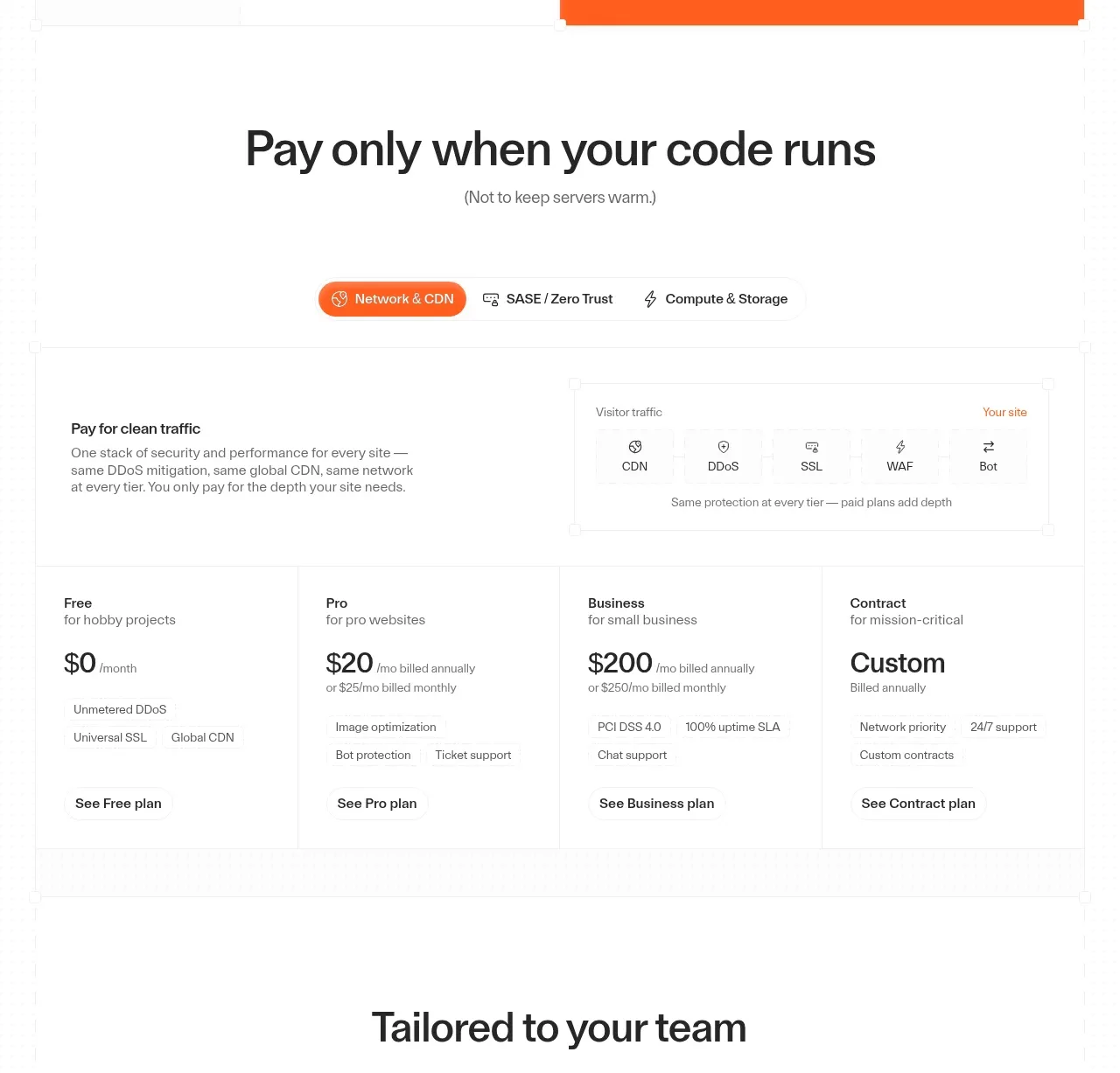
Design analysis
A pricing section uses category tabs, a compact explanatory product diagram, and four clearly differentiated plan columns with prices and CTAs.
Prompt preview
## Reference images

Study these alongside the description below: hierarchy, rhythm, spacing, colour. Build for the product you are asked about, using this design language.

- Component: https://kage-design-assets.t3.tigrisfiles.io/components/cloudflare-com/1ca6ff30-a094-43e2-8124-fd26c9356e55-1789213791-5.webp
- Full page it was cut from: https://kage-design-assets.t3.tigrisfiles.io/screenshots/cloudflare-com/1ca6ff30-a094-43e2-8124-fd26c9356e55-1789213761908-full.webp
- Component on Kage: https://kage.design/component/cloudflare-pricing-table

## Before you start
Ask what the user's pricing model, billing units, target segments, and conversion goal are. Apply the following hierarchy to those actual plans.

Create a pricing section with a centered heading and a short clarification of the pricing philosophy. Add a pill-style category tab bar with one active brand-colored tab (`#f26a21`) and clear keyboard interaction. Beneath it, show a concise explanatory band or diagram that explains what is included before presenting a four-column plan grid. Each plan card should have a plan name, audience descriptor, prominent price, billing note, 3–5 scannable benefits, and a text or button CTA. Use white cards, 1px `#e5e5e5` borders, consistent column widths, 16px internal padding, and a subtle active/recommended treatment. On mobile, stack cards or use an accessible horizontal scroller; never hide price context.

### Never
- Never use logos, product names, copy, illustrations, or imagery from the reference.
- Never copy the reference prices or plan names.
- Never use deceptive crossed-out prices, hidden fees, or inaccessible tabs.
More components
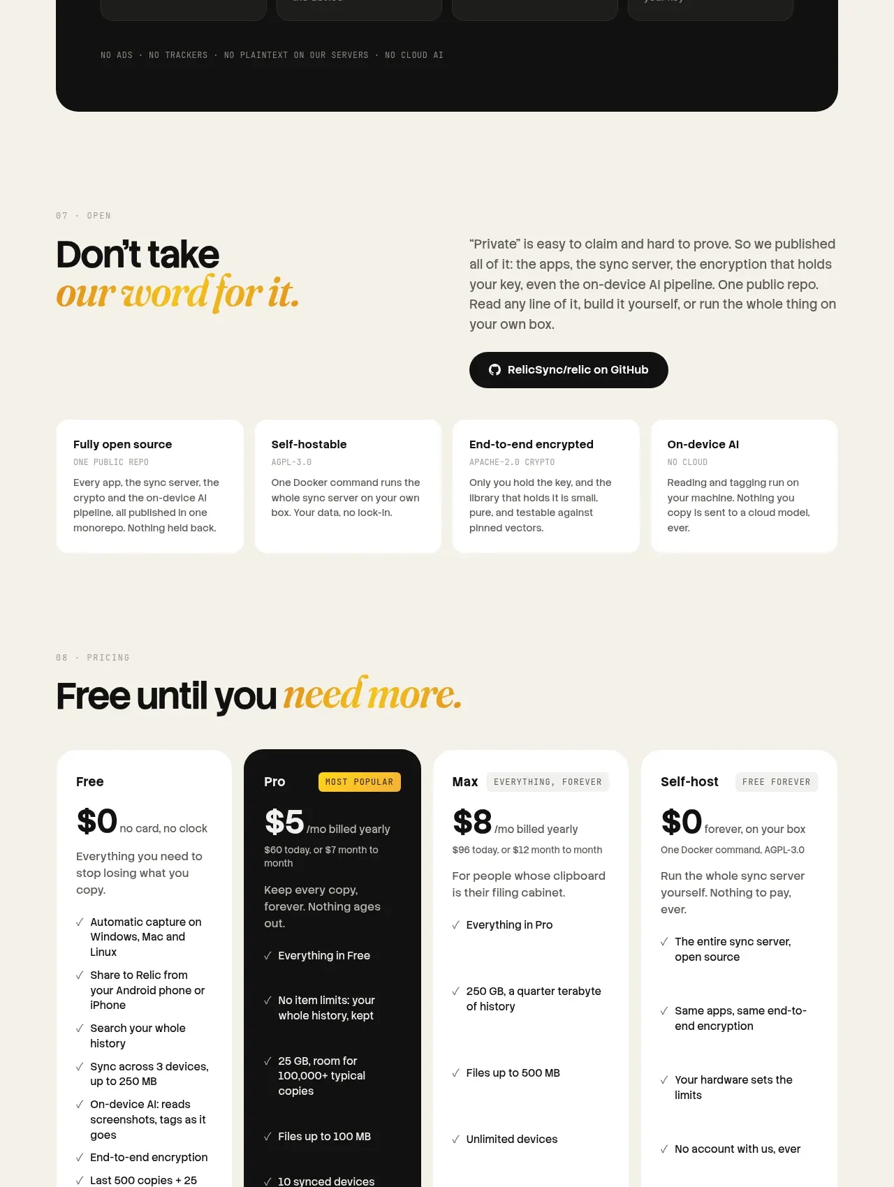
 Tiered pricing
Relic · Pricing table
Tiered pricing
Relic · Pricing table

 Platform download cards
Moji · Pricing table
Platform download cards
Moji · Pricing table

 Four-tier monthly pricing
termsquad.com · Pricing table
Four-tier monthly pricing
termsquad.com · Pricing table

 Two-tier pricing table
tryobra.com · Pricing table
Two-tier pricing table
tryobra.com · Pricing table

 Trial and subscription pricing
copilot.money · Pricing table
Trial and subscription pricing
copilot.money · Pricing table

 Premium comparison
rocketmoney.com · Pricing table
Premium comparison
rocketmoney.com · Pricing table