 kage
cloudknife.com

Design analysis
A compact centered CTA closes the first dark narrative with an icon, direct question, paired buttons, and a low-risk trial reassurance.
Prompt preview
## Reference images

Study these alongside the description below: hierarchy, rhythm, spacing, colour. Build for the product you are asked about, using this design language.

- Component: https://kage-design-assets.t3.tigrisfiles.io/components/cloudknife/9dafaa08-16c6-4721-8c78-296bafbb7abc-1793081090-4.webp
- Full page it was cut from: https://kage-design-assets.t3.tigrisfiles.io/screenshots/cloudknife/9dafaa08-16c6-4721-8c78-296bafbb7abc-1793080968695-full.webp
- Component on Kage: https://kage.design/component/cloudknife-cta

## Before you start
Ask what the user's product is, who it serves, and what their brand personality and visual identity are. Apply the following principles to that product rather than copying the reference.

Create a centered CTA band on the same dark navy background. Add a small rounded product/category icon above a two-line question, then place a primary and secondary pill button side by side with a short reassurance line below. Keep the hierarchy compact and confident: 30–40px headline, 14px supporting line, 12px reassurance. Use a subtle vertical rule or glow above the icon to connect it to the preceding story. Buttons should use a lavender primary and dark outlined secondary with 999px radius. Preserve generous top and bottom padding and stack controls on mobile.

Never: use logos, product names, copy, illustrations, or imagery from the reference.
More components
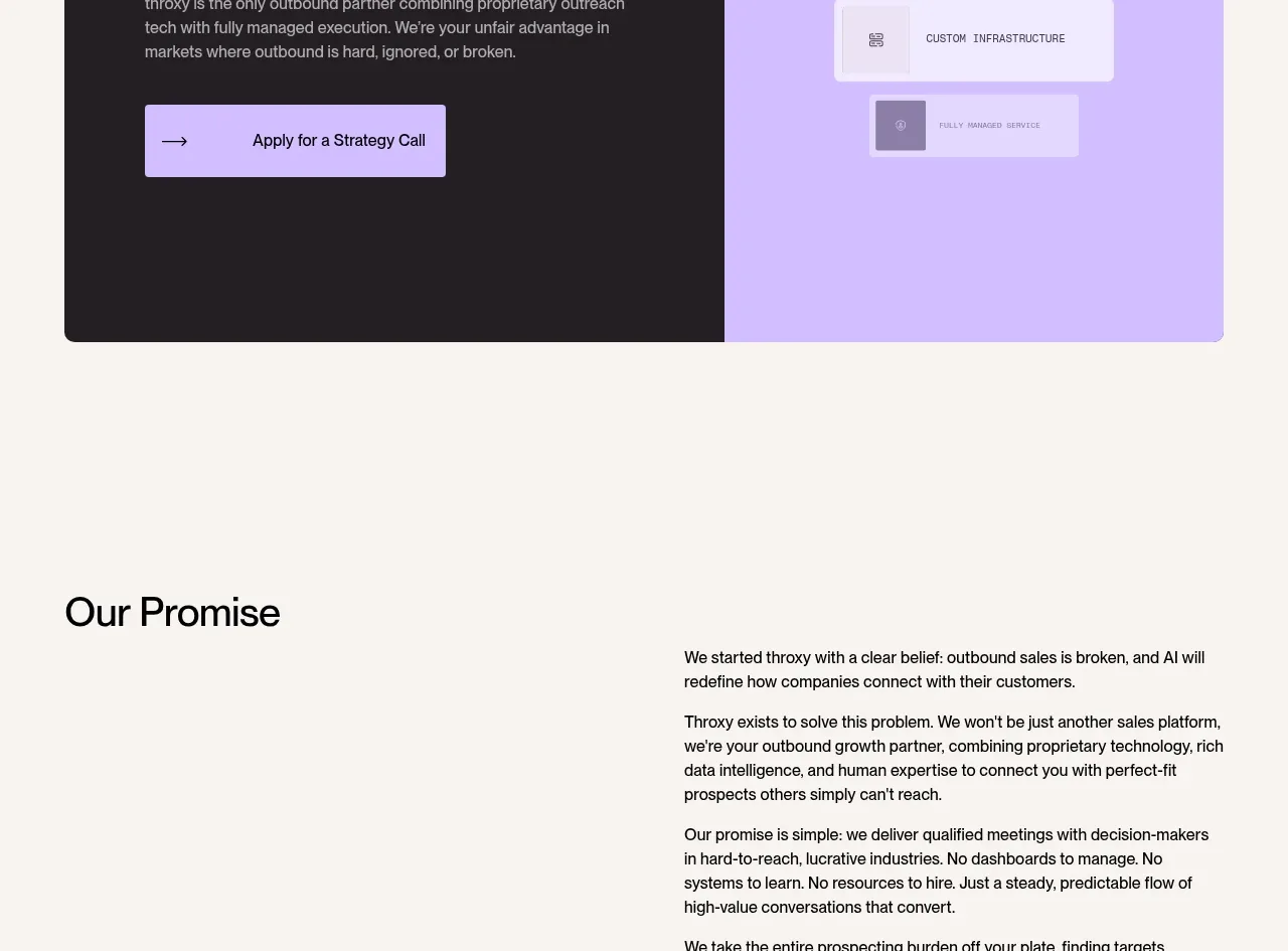
 Split final conversion panel
throxy · Call to action
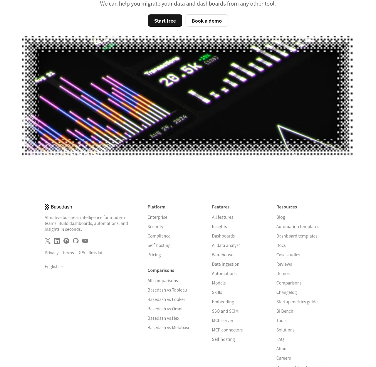
 Fast-start conversion CTA
Basedash View-only members · Call to action
 Closing conversion CTA
Open For sales · Call to action
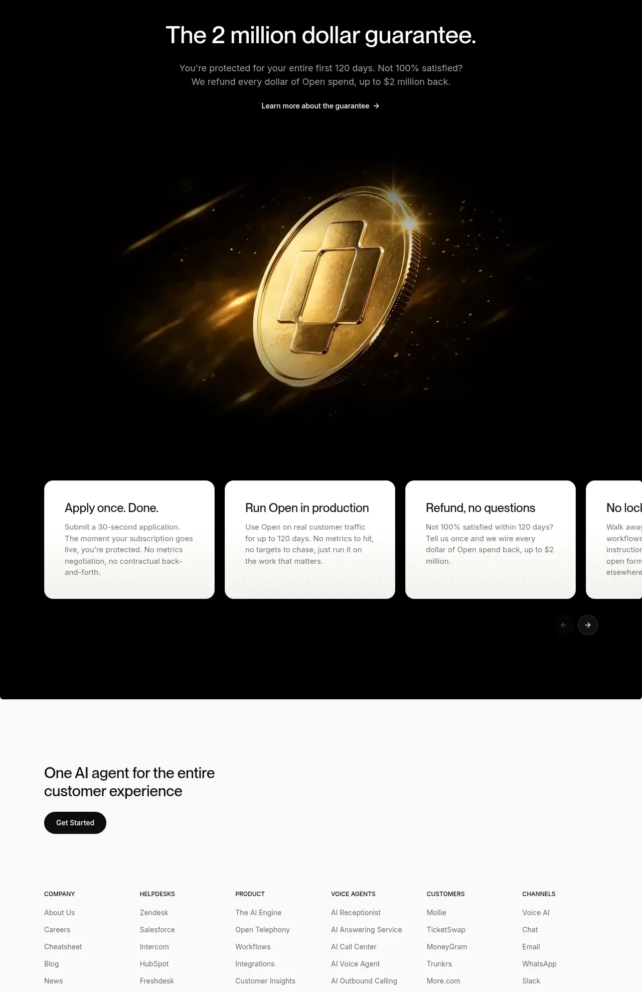 Guarantee and proof CTA
Open For sales · Call to action
 Final purchase call to action
bytemail · Call to action
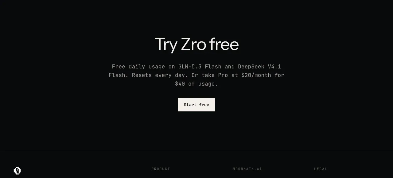
 Final free-trial CTA
Zro: Uncensored Security Models · Call to action