kage
kage
coldiq.com
Design analysis
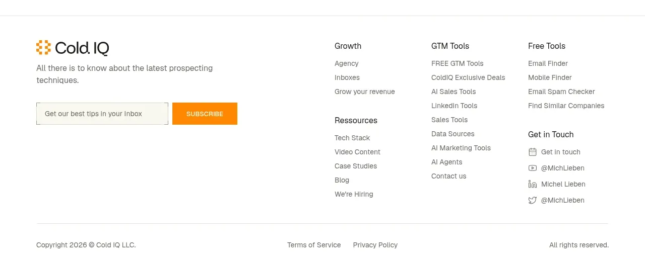
The footer combines a brand/newsletter block with several organized link columns and a restrained legal row at the bottom.
Prompt preview
## Reference images

Study these alongside the description below: hierarchy, rhythm, spacing, colour. Build for the product you are asked about, using this design language.

- Component: https://kage-design-assets.t3.tigrisfiles.io/components/coldiq-x-slack/e029c4ff-104d-4249-8c7e-44961fb1d1f9-1790748089-10.webp
- Full page it was cut from: https://kage-design-assets.t3.tigrisfiles.io/screenshots/coldiq-x-slack/e029c4ff-104d-4249-8c7e-44961fb1d1f9-1790748039437-full.webp
- Component on Kage: https://kage.design/component/coldiq-x-slack-footer

## Before you start
Ask what brand details, newsletter goal, navigation groups, social destinations, and legal links the user's product needs. Apply the same structure to that content.

Build a light footer with a centered max-width container and a top divider. Use a two-part upper layout: a left brand and newsletter signup block, and several right-side link columns with clear group headings. The signup should include a single-line email field, a compact high-contrast submit button, and a short privacy reassurance. Finish with a thin divider and a legal row containing copyright, terms, privacy, and an optional right-aligned status.

Use #f7f6f1, #20211e, #6f706a, #deddd5, and #ff8a00. Use 14–16px brand text, 12–13px link text, 11px legal text, 24–32px column gaps, and 48px top/bottom padding. Inputs and buttons should be 40–44px tall with square or 2px corners. Keep link hover states orange and maintain strong contrast and keyboard focus. Collapse columns into accordions or stacked groups on mobile.

Never: use logos, product names, copy, illustrations, or imagery from the reference.