kage
kage
coldiq.com

Design analysis
A long-form GTM landing page begins with a near-black, editorial hero: oversized serif headlines, orange emphasis, compact navigation, and a framed terminal demo. The dark section develops through alternating workflow explainers, provider cards, developer diagrams, proof-of-execution case studies, and pricing, then sharply switches to a white catalog section for skills and integrations before closing with a split CTA and dense multi-column footer.
Prompt preview
## Reference images

Study these alongside the description below: hierarchy, rhythm, spacing, colour. Build for the product you are asked about, using this design language.

- Full page: https://kage-design-assets.t3.tigrisfiles.io/screenshots/coldiq-x-slack/e029c4ff-104d-4249-8c7e-44961fb1d1f9-1790748039437-full.webp
- Above the fold: https://kage-design-assets.t3.tigrisfiles.io/screenshots/coldiq-x-slack/e029c4ff-104d-4249-8c7e-44961fb1d1f9-1790748033572.webp
- Design on Kage: https://kage.design/designs/coldiq-x-slack-landing-page

## Before you start
Ask the user what they are building, who it is for, and what brand assets they already have, including the product name, colours, typography, logo, and any existing UI patterns. Wait for their answers before designing. Apply the system below to their product, not to the reference product.

## Page structure
1. **Announcement strip and navigation** — Start with a very thin announcement bar, then a compact dark navigation row with a small brand mark at left, centered utility links, and outlined/filled CTAs at right.
2. **Hero** — Use a centered, spacious hero with a small amber eyebrow, a two-line serif headline with one orange line, concise supporting copy, and a large framed terminal/product demonstration below.
3. **Hero trust row** — Place a small “works with” ecosystem row and a low-contrast free-usage reassurance beneath the demo.
4. **Workflow difference section** — Introduce the operating model with a centered eyebrow and headline, then use a two-column layout: three numbered steps with orange rules on the left and a product/terminal image on the right.
5. **Why-this-product section** — Add a centered editorial headline, then a three-column bordered feature grid. Each card combines a visual proof panel, a bold benefit statement, short explanatory text, and a small text link where relevant.
6. **Developer section** — Use a centered eyebrow, headline, and subheading, followed by a large low-contrast architecture/code diagram showing input, shared interface, output, feedback loop, and provider layer. Finish with a centered outlined CTA.
7. **Proof-of-execution section** — Introduce the results section with an editorial heading and supporting line. Present a dense three-column case-study matrix mixing metric cards, company labels, and embedded video thumbnail cards; close it with trust statistics and a bright CTA.
8. **Pricing section** — Add a centered pricing eyebrow, two-line heading, explanation, billing cadence control, and four equal pricing cards. Highlight the recommended plan with an amber border and badge, use white/orange action buttons, then add an enterprise support strip beneath the cards.
9. **Theme transition** — Switch from the near-black background to a warm white/off-white background to signal a new resource/catalog area.
10. **Skills and playbooks section** — Center a two-line heading with orange emphasis and supporting copy. Below, place two large side-by-side feature panels with contrasting light and dark treatments, workflow diagrams, and full-width CTA buttons.
11. **Integrations directory** — Use a centered heading and a spacious multi-column directory. Put category filters in a left rail and grouped integration lists in several columns, with small icons, thin separators, and a centered directory CTA at the bottom.
12. **Final CTA banner** — Add a wide split panel: warm off-white copy and CTA controls on the left, abstract orange/cream motion imagery on the right.
13. **Footer** — Finish with a white footer containing brand/about and newsletter signup on the left, several link columns on the right, then a thin legal baseline with copyright, terms, privacy, and status text.

## Design language
- Build hierarchy through contrast in type scale rather than heavy decoration: use large high-contrast serif headlines for editorial statements, compact neutral sans-serif text for navigation and body copy, and tiny uppercase/monospace labels for section eyebrows.
- Keep the first half dark and restrained: use near-black `#171817` or `#191a18`, charcoal panels around `#20211f`, muted gray text near `#8f8c84`, and warm white headings near `#f3f0e8`.
- Use one decisive accent throughout the dark experience: amber-orange around `#ff8a00` or `#f28a16`. Reserve it for emphasized headline words, rules, active borders, badges, key metrics, and primary CTAs rather than filling every component.
- Pair a refined display serif with a practical sans-serif. Scale the main hero to roughly 64–76px desktop, section headings to 34–48px, card headings to 16–20px, and supporting copy to 12–15px with generous line height.
- Make sections breathe. Use large vertical gaps around centered headings, then increase density inside proof grids, pricing cards, and the integration directory. Change rhythm deliberately rather than applying one uniform spacing scale.
- Treat borders as structural: use 1px charcoal lines, faint panel dividers, and occasional amber outlines for highlighted states. Keep radii small, generally 0–4px; avoid soft rounded SaaS cards, floating shadows, and excessive glass effects.
- Let product evidence carry the visual interest: terminal windows, code blocks, provider diagrams, metric tables, and workflow diagrams should look like crisp inset artifacts with restrained contrast and subtle glow only around active orange elements.
- Use dark cards with thin grids for the case-study and pricing areas, then make the white resource section feel like a deliberate reset using `#f7f7f2`, black text, pale gray borders, and the same orange accent.
- Keep buttons rectangular and compact. Primary buttons are orange with dark text; secondary buttons are white or transparent with a thin border. Use short arrow affordances and clear hover changes in border, background, or text colour.
- For motion, keep transitions fast and functional: subtle border/colour changes, restrained terminal activity, and gentle media hover treatment. Do not introduce large scroll effects that compete with the diagrams or typography.
- Preserve a strong desktop editorial grid, but collapse feature and pricing columns into readable single-column or two-column mobile stacks while keeping the dark-to-light theme transition and CTA hierarchy intact.

## Never
- Do not copy the reference company’s logos, wordmarks, product names, wording, screenshots, illustrations, photography, integration logos, or icon sets.
- Do not reproduce the reference brand or present the result as ColdIQ, Slack, Claude Code, or any other referenced product.
- Create original product-specific copy, diagrams, data, imagery, and brand assets based on the user’s answers.
Components from this page
All components
 Utility banner and primary navigation
ColdIQ x Slack · Navigation
Utility banner and primary navigation
ColdIQ x Slack · Navigation
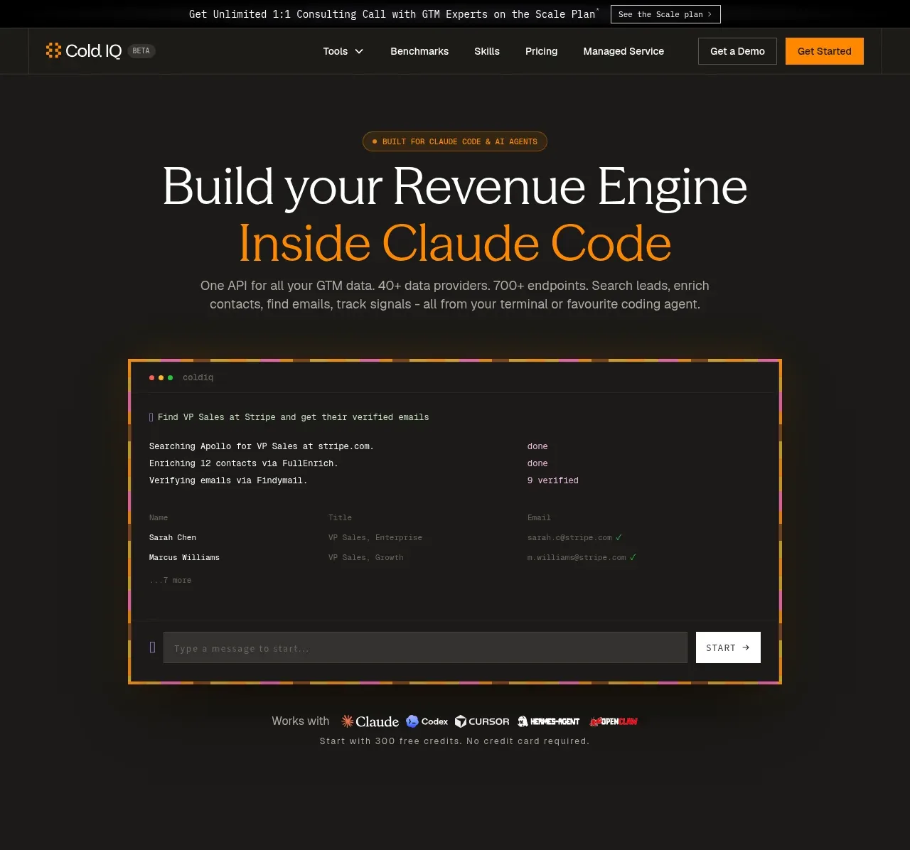 Terminal-led revenue engine hero
ColdIQ x Slack · Hero
Terminal-led revenue engine hero
ColdIQ x Slack · Hero
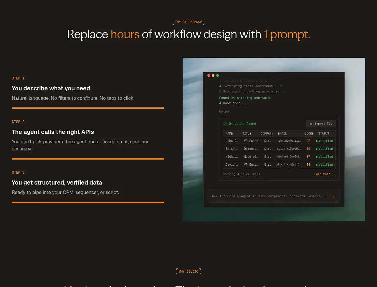 Three-step prompt workflow
ColdIQ x Slack · Feature grid
Three-step prompt workflow
ColdIQ x Slack · Feature grid
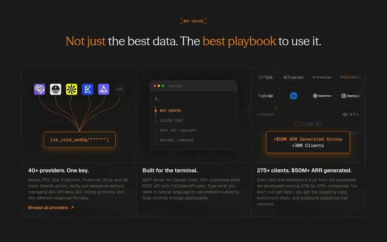 Capability overview cards
ColdIQ x Slack · Feature grid
Capability overview cards
ColdIQ x Slack · Feature grid
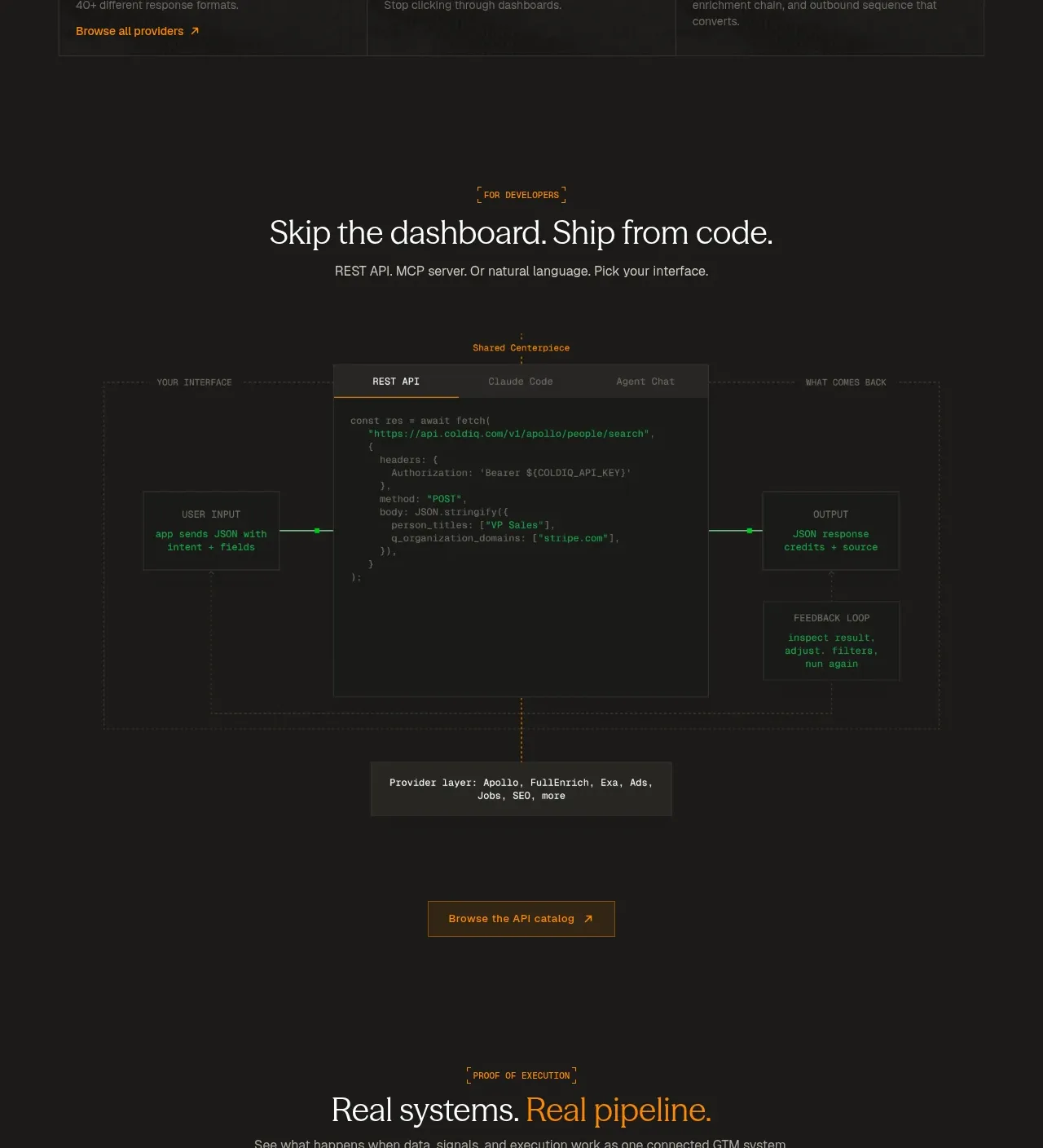 Code-first integration explainer
ColdIQ x Slack · Code block
Code-first integration explainer
ColdIQ x Slack · Code block
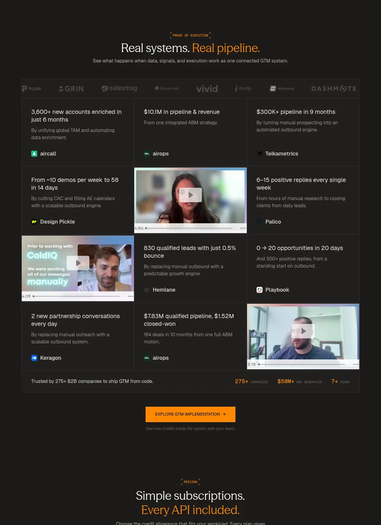 Customer proof and outcome grid
ColdIQ x Slack · Stats
Customer proof and outcome grid
ColdIQ x Slack · Stats
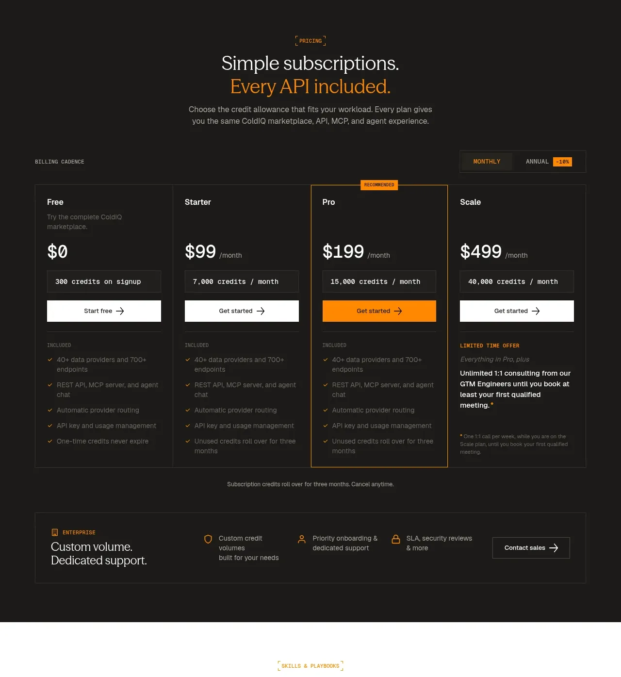 Four-tier subscription pricing
ColdIQ x Slack · Pricing table
Four-tier subscription pricing
ColdIQ x Slack · Pricing table
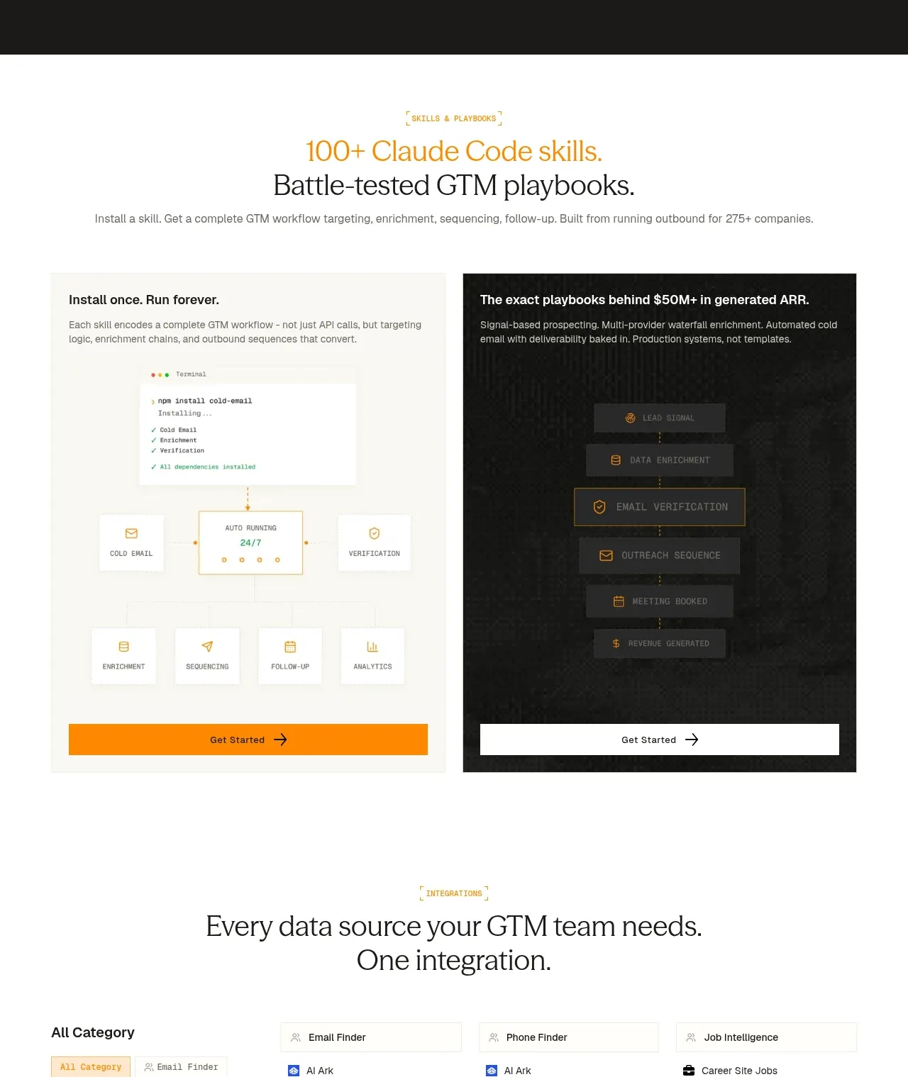 Skills and playbooks showcase
ColdIQ x Slack · Feature grid
Skills and playbooks showcase
ColdIQ x Slack · Feature grid
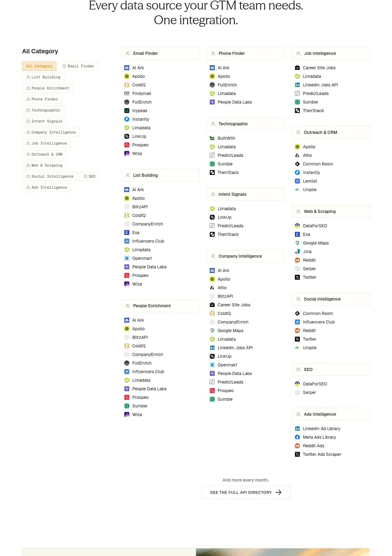 Integration directory
ColdIQ x Slack · Tabs & steps
Integration directory
ColdIQ x Slack · Tabs & steps
 Final marketplace call to action
ColdIQ x Slack · Call to action
Final marketplace call to action
ColdIQ x Slack · Call to action
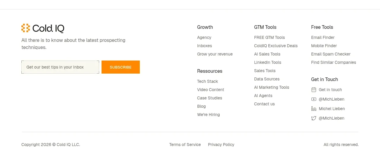 Multi-column site footer
ColdIQ x Slack · Footer
Multi-column site footer
ColdIQ x Slack · Footer