 kage
kage
coldiq.com

Design analysis
A proof section combines a customer/logo strip, a dense grid of quantified outcomes, embedded video-style testimonial tiles, and a compact trust summary.
Prompt preview
## Reference images

Study these alongside the description below: hierarchy, rhythm, spacing, colour. Build for the product you are asked about, using this design language.

- Component: https://kage-design-assets.t3.tigrisfiles.io/components/coldiq-x-slack/e029c4ff-104d-4249-8c7e-44961fb1d1f9-1790748087-5.webp
- Full page it was cut from: https://kage-design-assets.t3.tigrisfiles.io/screenshots/coldiq-x-slack/e029c4ff-104d-4249-8c7e-44961fb1d1f9-1790748039437-full.webp
- Component on Kage: https://kage.design/component/coldiq-x-slack-stats

## Before you start
Ask what measurable outcomes customers achieve, which customer stories are credible, and whether video, quotes, or logos are available. Apply the same proof hierarchy to the user's product.

Create a proof-of-execution section with a centered headline and supporting line. Start with a subdued customer-name or category strip, then lay out a three-column grid of outcome cards. Mix text-first metric cards with a few video thumbnail cards, but keep equal borders and consistent cell dimensions. Each text card should have a quantified result, a short explanation, and a customer attribution. Close with a full-width trust row containing a sentence, several compact aggregate stats, and a strong implementation CTA below.

Use the dark palette #171816, #20221f, #f2eee8, #a3a29a, and #ff8a00. Keep borders 1px #373833, use square corners, and reserve 28–32px cell padding. Metrics should be 18–24px, explanations 12–14px, and attribution 12px. Video cards need a poster treatment, play control, and optional thin progress bar, but no autoplay. Ensure keyboard-accessible cards and keep the numerical hierarchy obvious.

Never: use logos, product names, copy, illustrations, or imagery from the reference.
More components
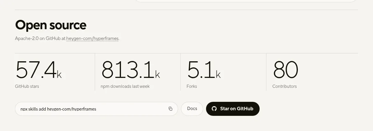
 Open-source proof and repository stats
HyperFrames Studio (Desktop) · Stats
Open-source proof and repository stats
HyperFrames Studio (Desktop) · Stats
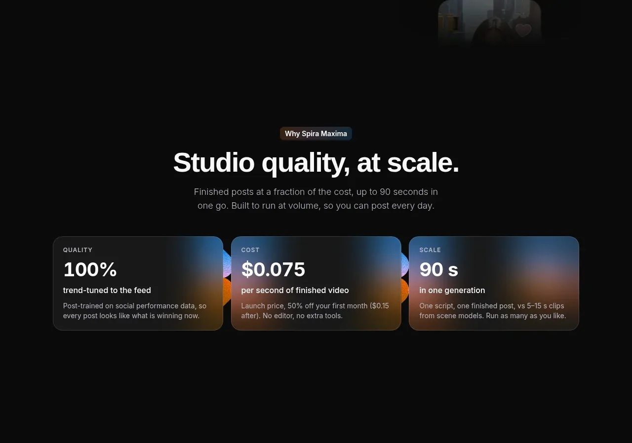
 Quality, cost, and scale metrics
Spira Maxima · Stats
Quality, cost, and scale metrics
Spira Maxima · Stats
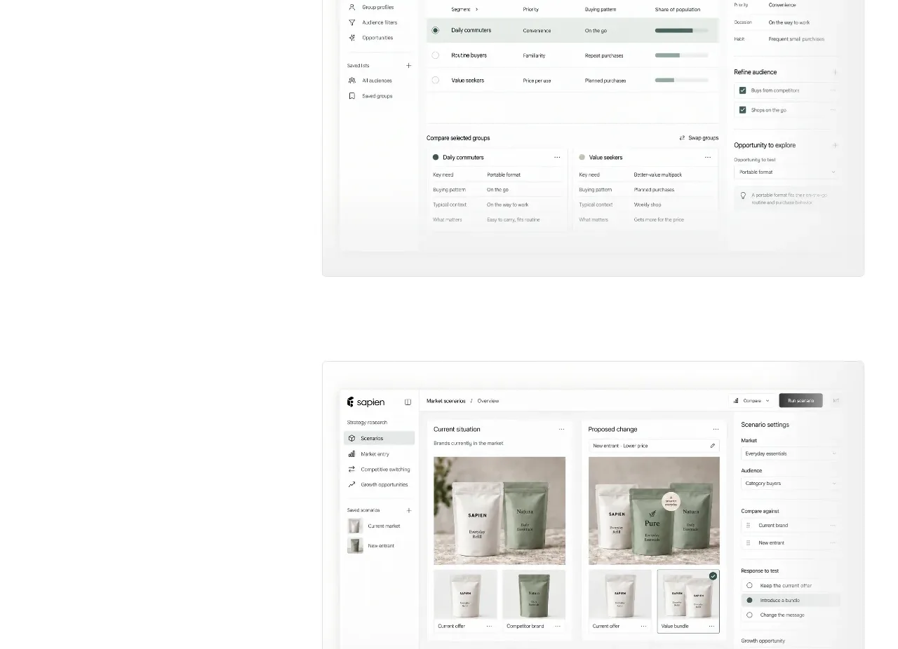
 Prediction benchmark statistic
Sapien · Stats
Prediction benchmark statistic
Sapien · Stats
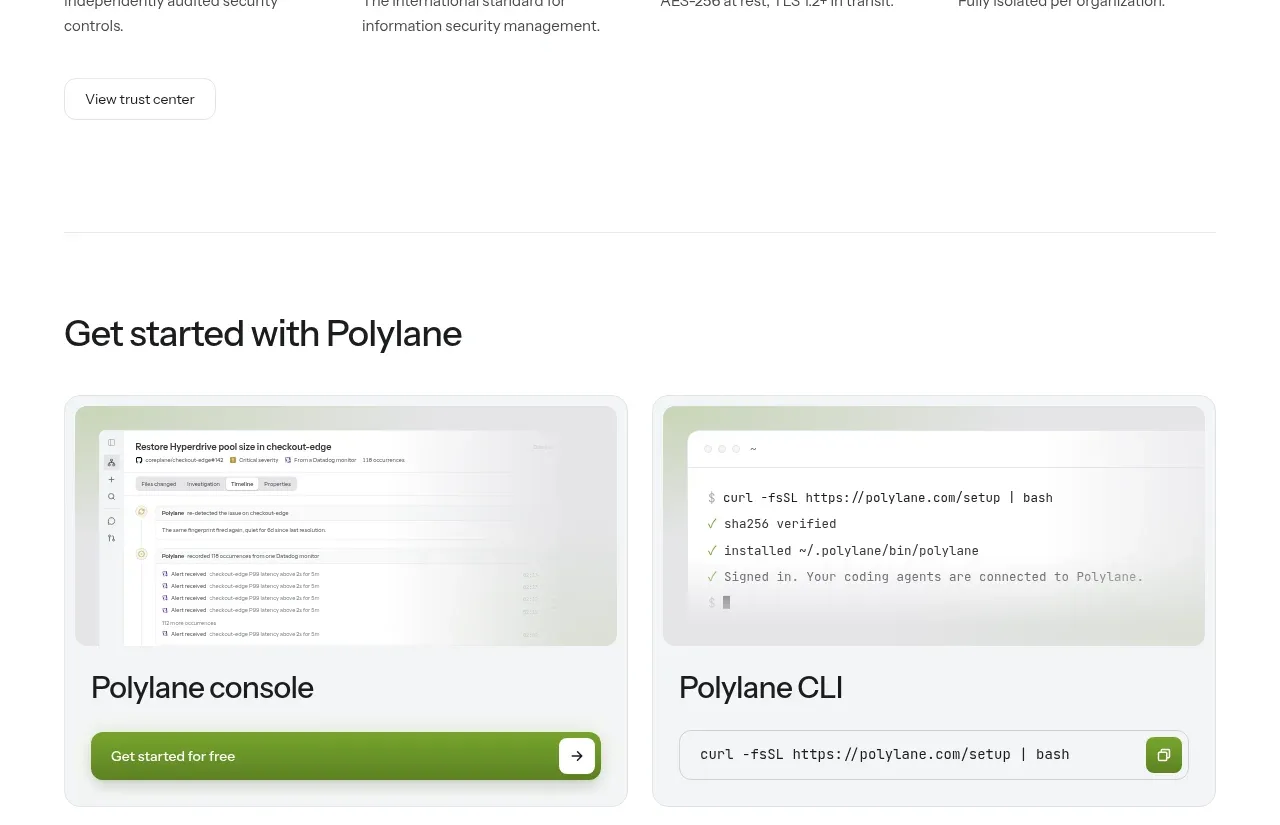
P
Security and trust assurances
Polylane · Stats

 Safety and control principles
Omnia Agent · Stats
Safety and control principles
Omnia Agent · Stats

 Real-world proof section
Humalike x GTA RP · Stats
Real-world proof section
Humalike x GTA RP · Stats