kage
kage
salience.com
Design analysis
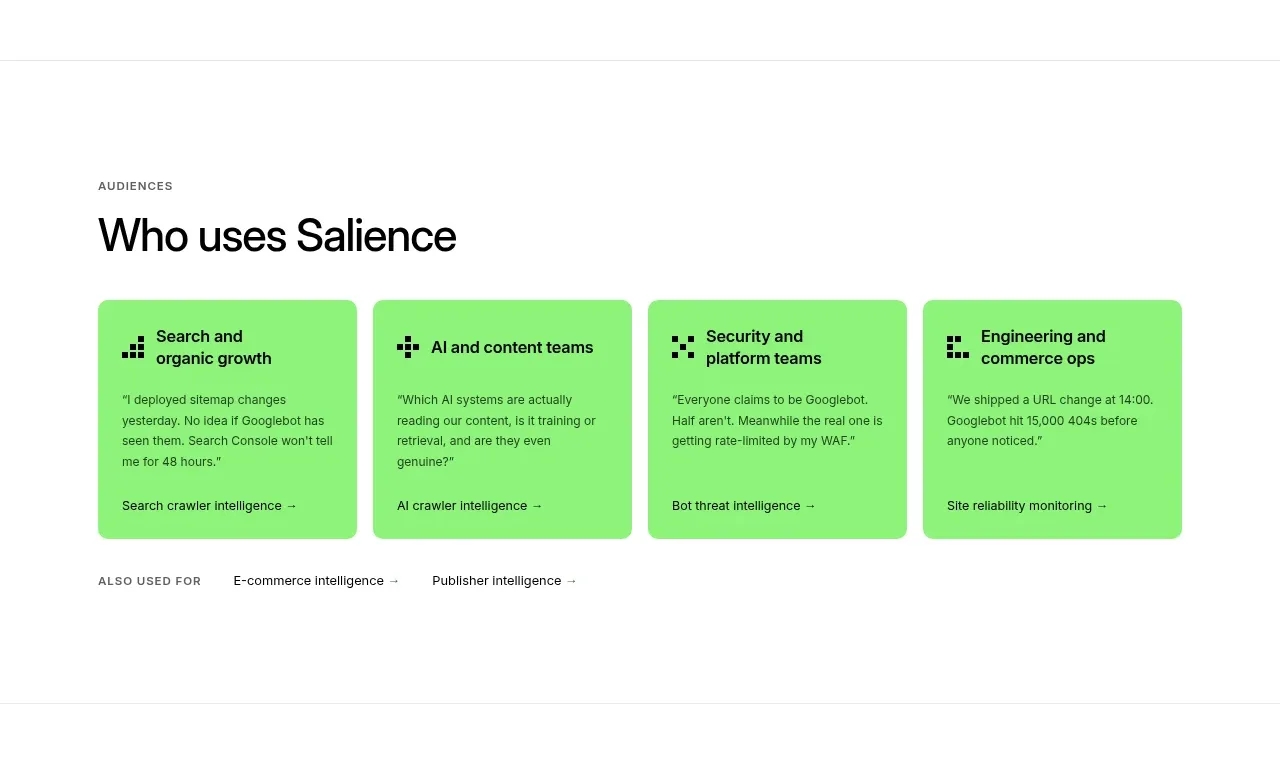
A labelled audience section uses four bright green cards to let different user groups self-select while keeping each card actionable and compact.
Prompt preview
## Reference images

Study these alongside the description below: hierarchy, rhythm, spacing, colour. Build for the product you are asked about, using this design language.

- Component: https://kage-design-assets.t3.tigrisfiles.io/components/salience/db9244f7-ec48-4516-9a93-11a957a9eab9-1792303419-3.webp
- Full page it was cut from: https://kage-design-assets.t3.tigrisfiles.io/screenshots/salience/db9244f7-ec48-4516-9a93-11a957a9eab9-1792303314589-full.webp
- Component on Kage: https://kage.design/component/salience-card

## Before you start
Ask who the user's primary audiences are and what job each audience needs done. Build a tailored use-case section rather than copying any wording or categories.

Create a section with a small uppercase eyebrow and a large left-aligned heading. Below, lay out four equal cards in a responsive grid. Give each card a saturated but soft green background (#8bea72), 12px radius, 20–24px padding, a small geometric or text icon, a bold 14–16px audience title, a short quoted or outcome-oriented statement, and a bottom-aligned text link with an arrow. Keep cards equal height and use flex layout so the link sits at the bottom. Use black text, 13px body copy, 1.35 line-height, and 24px gaps. Add a quiet row of secondary audience links below the cards. On hover, slightly lift the card and deepen the green; preserve keyboard focus rings.

Never use logos, product names, copy, illustrations, or imagery from the reference.