 kage
koiscribe.com

Design analysis
The visible pricing section presents a simple choice between recurring and one-time purchase paths, with the one-time option receiving the strongest visual emphasis.
Prompt preview
## Reference images

Study these alongside the description below: hierarchy, rhythm, spacing, colour. Build for the product you are asked about, using this design language.

- Component: https://kage-design-assets.t3.tigrisfiles.io/components/koi/1f2fb87d-9243-4e92-a42a-66c20077da12-1792649023-11.webp
- Full page it was cut from: https://kage-design-assets.t3.tigrisfiles.io/screenshots/koi/1f2fb87d-9243-4e92-a42a-66c20077da12-1792648920300-full.webp
- Component on Kage: https://kage.design/component/koi-pricing-table

## Before you start
Ask what the user's pricing model is, which plan should be recommended, and what billing or trial constraints apply. Then design an original pricing section using these principles.

Build a compact pricing area on a black background with a centered section title and supporting sentence, followed by two side-by-side plan cards. Make the recurring plan neutral charcoal and the preferred or lifetime plan more prominent with a soft brand-colour gradient or glow. Each card needs a plan name, price hierarchy, billing cadence, short feature checklist, and a full-width CTA. Use 16–22px corner radii, subtle borders, 24px padding, clear checkmarks, and a small badge for the recommended choice. Make the billing switch or cadence selector pill-shaped if relevant. Ensure both cards remain equal in height and stack cleanly on mobile.

Never: copy logos, product names, copy, illustrations, or imagery from the reference.
More components
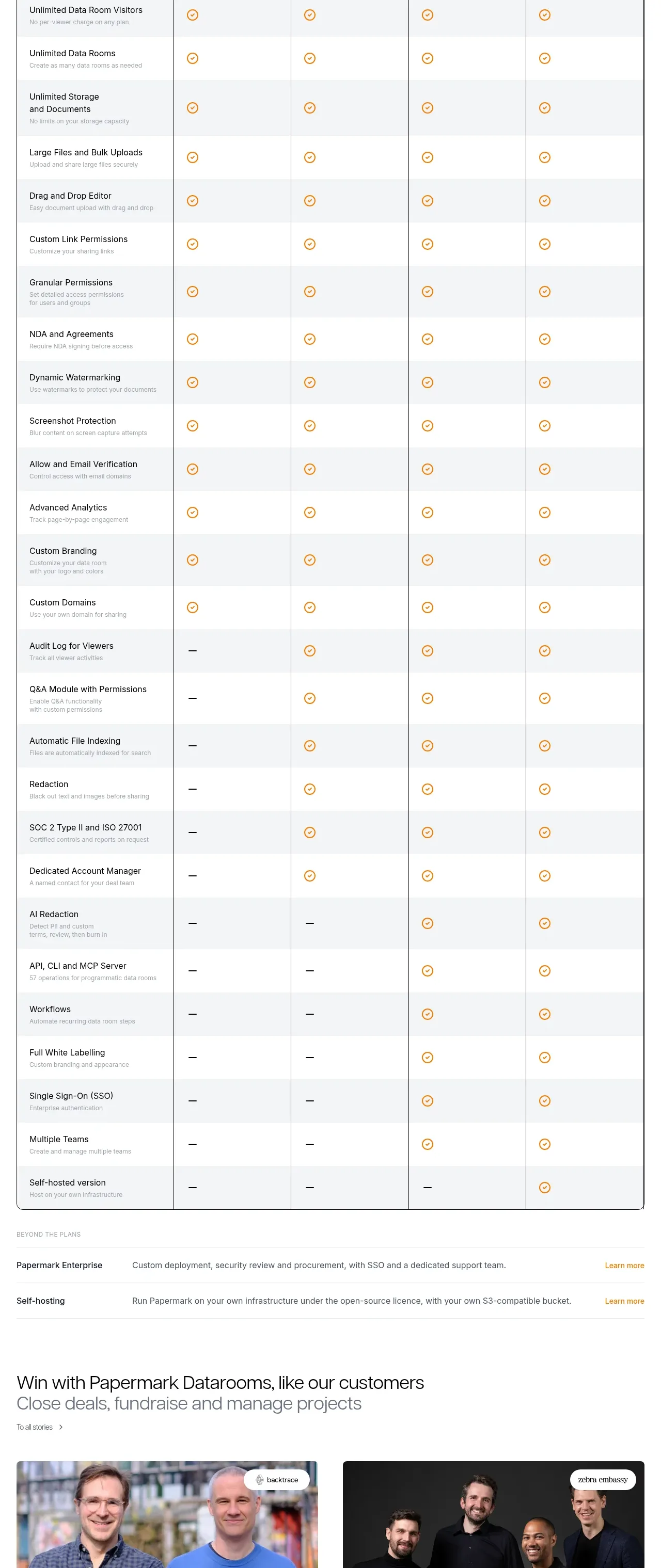
 Plan comparison table
Papermark Data Rooms · Pricing table
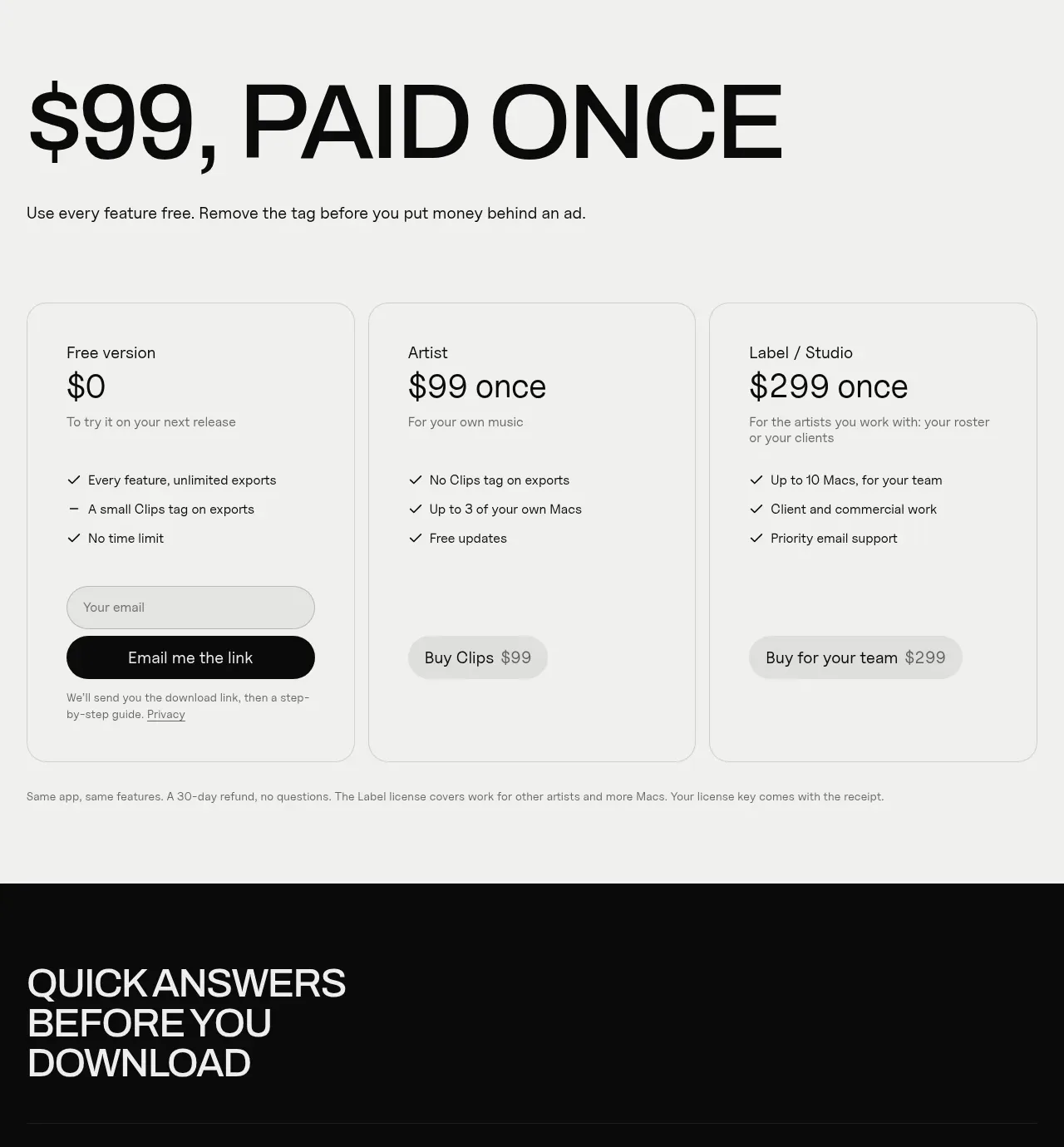
 One-time purchase pricing
Clips by Plastic · Pricing table
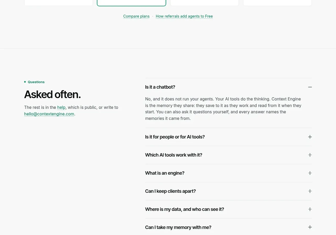
 Per-unit pricing table
Context Engine · Pricing table
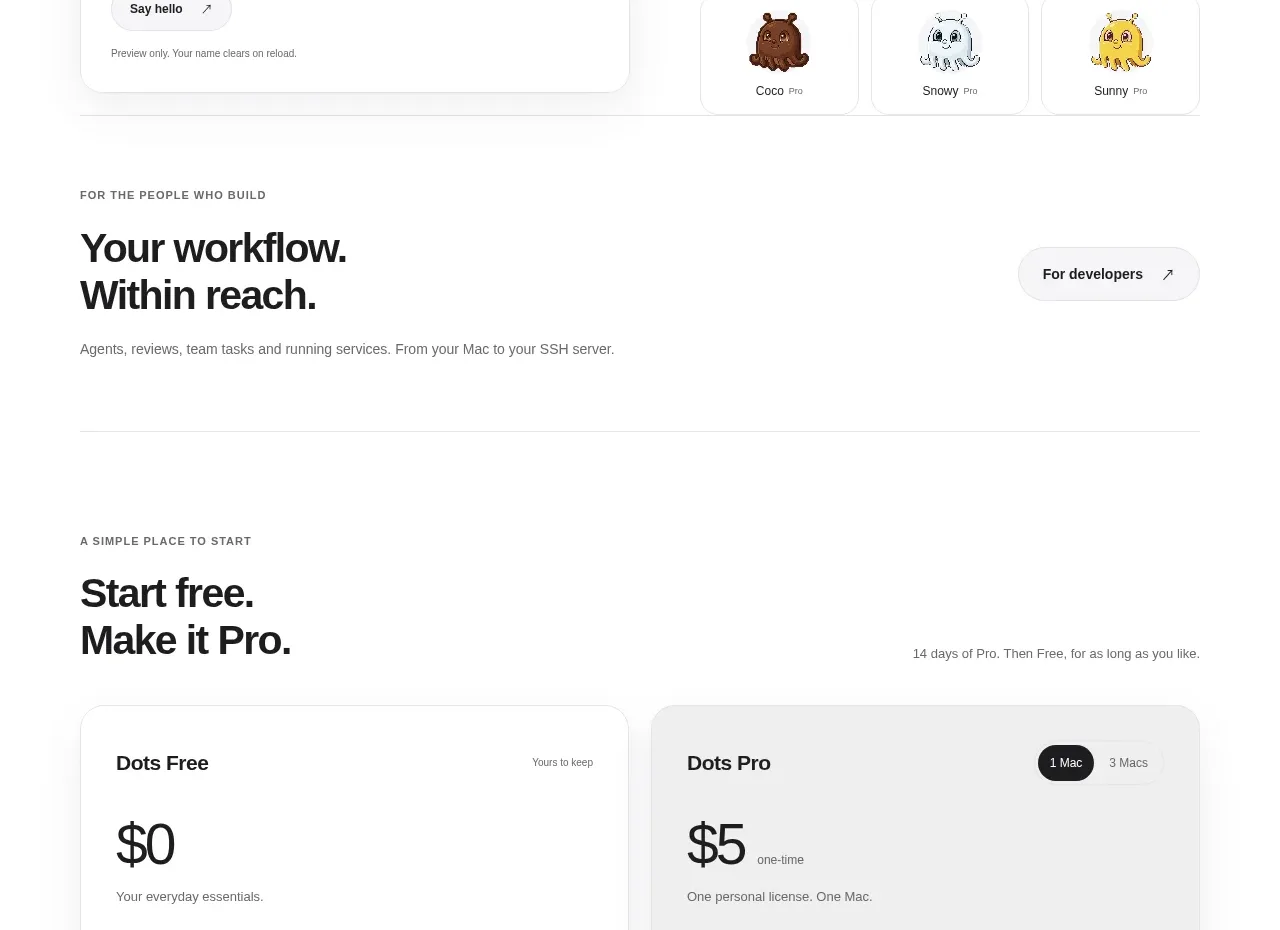
 Free and pro pricing cards
Dots · Pricing table
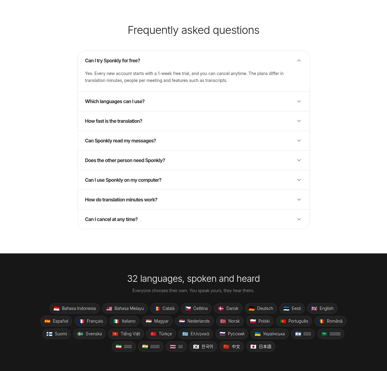
 Transparent multi-tier pricing
Sponkly · Pricing table
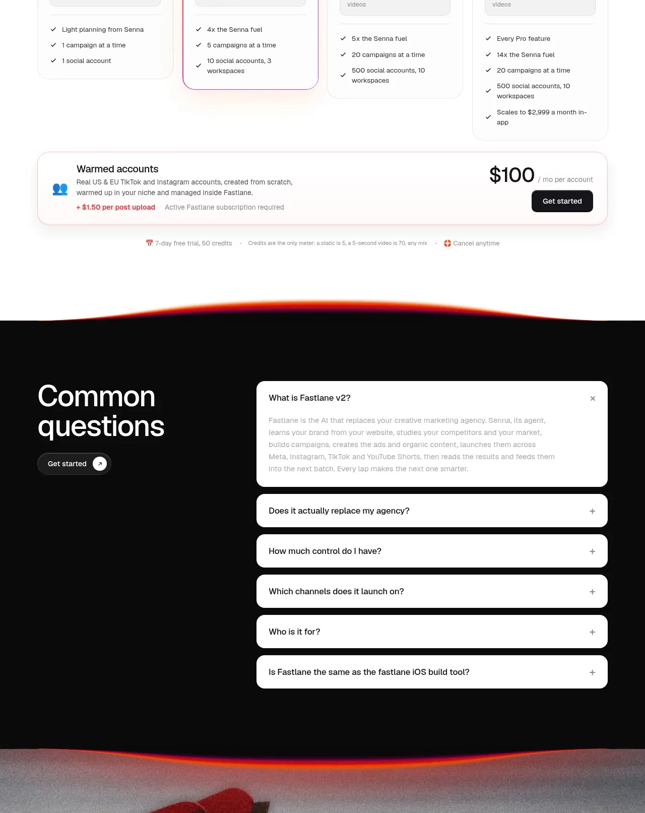
 Four-tier pricing table
Fastlane 2.0 · Pricing table