kage
kage
cortexdocs.dev
Design analysis
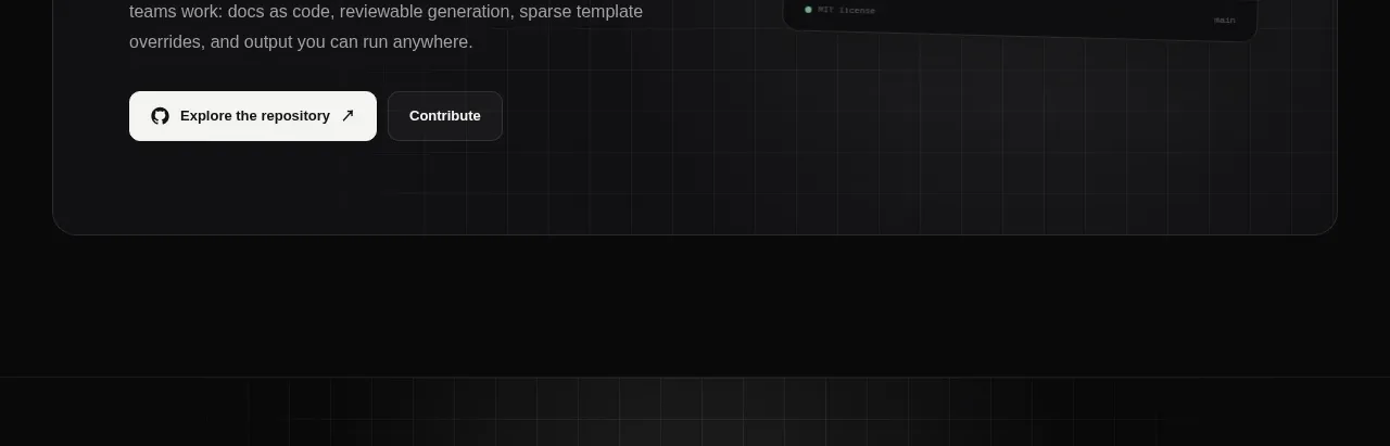
The footer uses a restrained top rule, brand summary, grouped navigation links, and a small legal/copyright row.
Prompt preview
## Reference images

Study these alongside the description below: hierarchy, rhythm, spacing, colour. Build for the product you are asked about, using this design language.

- Component: https://kage-design-assets.t3.tigrisfiles.io/components/cortex/48e48c32-4544-4e71-94d3-849a84be1bb9-1789279411-10.webp
- Full page it was cut from: https://kage-design-assets.t3.tigrisfiles.io/screenshots/cortex/48e48c32-4544-4e71-94d3-849a84be1bb9-1789279340596-full.webp
- Component on Kage: https://kage.design/component/cortex-footer

## Before you start
Ask what brand identity, navigation groups, legal links, and community channels the user's product needs. Use those answers to create an original footer.

Build a dark footer with a thin top border and generous top padding. Use a four-column desktop layout: a brand block with a small mark, product name, and one-line description, followed by three groups of small navigation links. Use uppercase 9–10px group labels, 11–12px muted links, and generous vertical spacing. Add a bottom rule and a compact copyright/license row at the bottom.

Keep the background #090a0a, borders #202223, primary text #e8e8e5, and secondary text #77797b. Links should brighten on hover and show visible keyboard focus. Collapse into a two-column or stacked layout on mobile while keeping the brand block prominent.

Never: use the reference's logos, product names, copy, illustrations, imagery, or exact link labels.