 kage
kage
cortexdocs.dev

Design analysis
A near-black developer-tool landing page that lets dense, dimmed product mockups carry the proof while typography stays minimal: a grotesque display headline with a deliberately dimmed second line, monospace uppercase eyebrows marked with dots and dashes, and hairline-bordered panels throughout. A single green accent is rationed to live dots, status chips, and checklist ticks, while HTTP method colors (green GET, blue POST, orange PUT, red DELETE) appear only inside the docs mockup. Rhythm alternates between centered hero-style sections and left-aligned feature blocks, compressed by full-width numbered table strips (spec surfaces, eleven languages) and a numbered bento grid of five proof cards.
Prompt preview
## Reference images

Study these alongside the description below: hierarchy, rhythm, spacing, colour. Build for the product you are asked about, using this design language.

- Full page: https://kage-design-assets.t3.tigrisfiles.io/screenshots/cortex/48e48c32-4544-4e71-94d3-849a84be1bb9-1789279340596-full.webp
- Above the fold: https://kage-design-assets.t3.tigrisfiles.io/screenshots/cortex/48e48c32-4544-4e71-94d3-849a84be1bb9-1789279338139.webp
- Design on Kage: https://kage.design/designs/cortex-landing-page

## Before you start
Ask the user what they are building, who it is for, and what brand assets they already have (product name, logo, brand colours, typefaces). Wait for their answers before writing any code — everything below is a design language to apply to *their* product, not a page to recreate.

## Page structure
1. **Top nav** — slim bar: wordmark + small monospace "open source" badge left; four text links centered; a white pill CTA with an arrow glyph right.
2. **Hero** — centered stack: a monospace uppercase eyebrow led by a small green status dot, a two-line display headline where line 1 is white and line 2 is dimmed to ~40% white, a two-sentence gray sub-paragraph, then a white pill primary button and a dark bordered secondary button side by side.
3. **Product demo frame** — a large hairline-bordered panel styled as a browser window: chrome bar with a green "Live demo" dot and a URL; inside, a full docs-app mockup (top tab row Home/Docs/API Reference/SDKs/MCP, ⌘K search field, left sidebar grouped by resource with color-coded GET/POST/PUT/DELETE badges, article body with inline code chips, right-hand SDK snippet panel). The mockup is dimmed so the page still reads as one dark surface.
4. **Spec-surface strip** — full-width table row: a mono uppercase label on the left cell, then five numbered cells (01–05) each naming a spec type, separated by hairline dividers.
5. **Workflow section** — centered eyebrow (dash + mono label), large two-line headline, one-sentence sub. Below, a three-part row: a YAML config editor card on the left, a circular "generate" node in the middle, and three stacked numbered output cards (01/02/03, each with icon, title, audience note, arrow) on the right.
6. **Agent section** — lighter inset panel, two columns: left column with eyebrow, big four-line headline, paragraph, a green-check bullet list of three items, and a text link with arrow; right column a framed agent-chat mockup with a "CONNECTED" badge, a user message, a tool-call row marked completed, an assistant reply, and an input field.
7. **Bento grid** — section header with left-aligned headline and a right-aligned explanatory paragraph, then five hairline-bordered cards in a 3-over-2 grid. Each card carries a mono number (01–05) and a mono caption in its top corners, a small abstract mock or diagram (node graph, wireframe, tool list, language chips, license card), then a bold title and one-sentence body.
8. **Languages section** — centered eyebrow/headline/sub, then a full-bleed numbered table strip listing languages 01–11 in hairline-divided cells, followed by a tabbed code-sample card (TypeScript/Python/Go tabs) with muted syntax highlighting and small status chips (green "type-safe" dot plus two more) along its bottom edge.
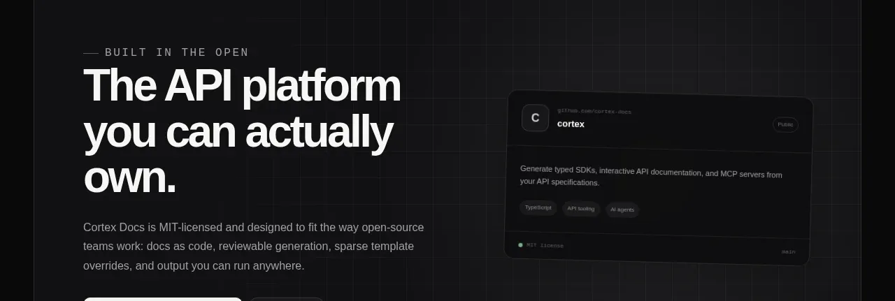
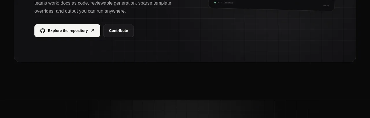
9. **Open-source panel** — large rounded dark panel: left side eyebrow, big headline, paragraph, and two CTAs (white pill + dark button); right side a repo-card mockup with description, topic tags, a license chip, and a star count.
10. **Final CTA** — centered mono eyebrow, an oversized single-line headline, one-sentence sub, white pill + dark secondary button; a faint grid texture fades in at the page edges.
11. **Footer** — brand column with wordmark and one-line mission, three link columns (Product, Community, Legal), and a bottom legal row with copyright left and license note right in tiny mono caps.

## Design language
- **Surface palette:** page background near-black `#0a0a0b`; panels `#121315`–`#16181a`; hairline borders `rgba(255,255,255,0.08)`; never use heavy shadows — separation comes from borders and one-step-lighter panels.
- **Type system:** a tight-tracked grotesque sans for headlines (hero ~clamp(56px, 9vw, 96px), section heads 40–56px) in near-white `#f5f5f5`, with the second line of hero-style headlines dimmed to ~40% white for two-tone contrast. Pair it with a monospace face used ONLY for micro-labels: 11–12px uppercase, letter-spacing 0.15–0.2em, gray `#8b8f94`, always introduced by a short dash or a green dot. Body copy 14–15px at 60–70% white, line-height 1.6, max-width ~60ch.
- **Accent discipline:** one accent green `#4ade80`, reserved for status semantics only — live dots, "connected"/"ready" chips, checkmarks. Never use it for decoration or headlines.
- **In-mockup colour coding:** HTTP method badges GET green, POST blue `#60a5fa`, PUT orange `#fb923c`, DELETE red `#f87171` — colour lives inside product mockups, keeping the page chrome monochrome.
- **Editorial numbering:** cards, table cells, and output rows carry mono numbers (01, 02, 03…) in gray — it sequences the narrative and adds technical texture without icons.
- **Buttons:** primary is a white pill (`#fff` bg, black text, small arrow); secondary is a dark pill with a hairline border and gray text; radius 999px for buttons, 10–14px for panels and cards.
- **Proof via mockups:** every claim sits next to a framed, dimmed UI mockup (docs app, agent chat, code editor, repo card). Build these as simplified HTML/CSS mockups with the same palette — not screenshots.
- **Rhythm down the page:** open with two centered, symmetrical sections; switch to left-aligned two-column feature blocks; compress into full-width table strips between big sections as palate cleansers; end centered again. Vertical padding 120–160px between major sections, ~32px between cards.
- **Interaction:** links and mockup rows brighten from ~50% to full white on hover; card borders lighten from 8% to ~16% white; keep motion to 150–200ms ease transitions, no large animations.

## Never
- Do not use the Cortex name, wordmark, logo, taglines, or any copy from the reference (including "Every developer. Every agent.", "Build once. Meet every user.", "Petstore").
- Do not reuse its demo API, code samples, repo-card text, or section headlines verbatim — write copy for the user's own product.
- Do not copy its specific diagrams, icon set, or illustration style; rebuild equivalent proof elements from the user's content.
- Never present the result as Cortex or imply it is that product.
Components from this page
All components
 Minimal dark navigation bar
Cortex · Navigation
Minimal dark navigation bar
Cortex · Navigation
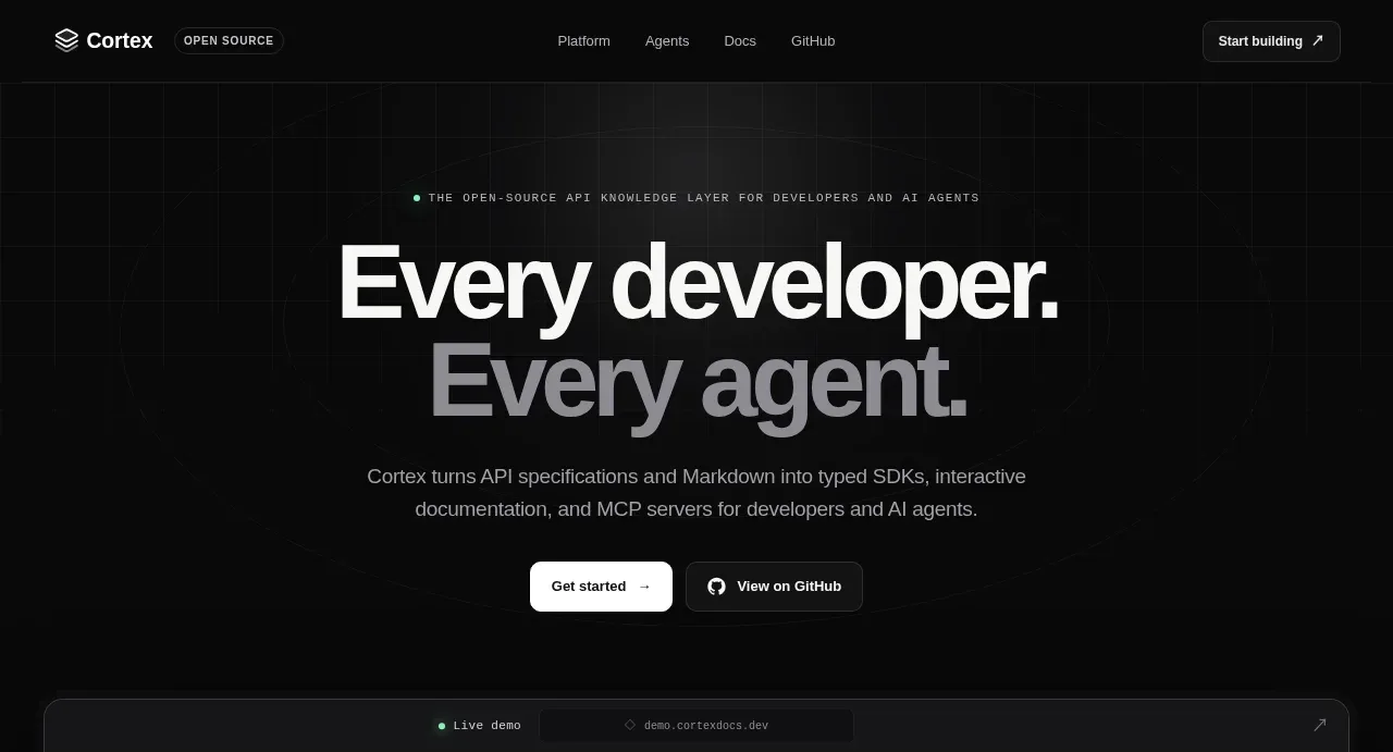 Developer and agent knowledge-layer hero
Cortex · Hero
Developer and agent knowledge-layer hero
Cortex · Hero
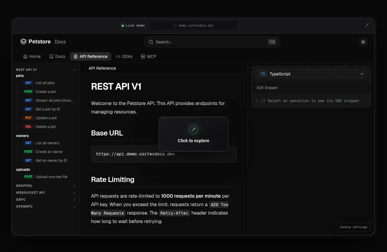 Interactive product preview
Cortex · Gallery
Interactive product preview
Cortex · Gallery
 Supported API surface strip
Cortex · Logo cloud
Supported API surface strip
Cortex · Logo cloud
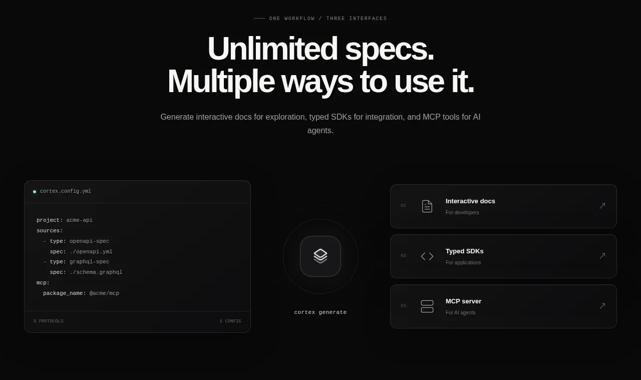 Three interfaces workflow section
Cortex · Feature grid
Three interfaces workflow section
Cortex · Feature grid
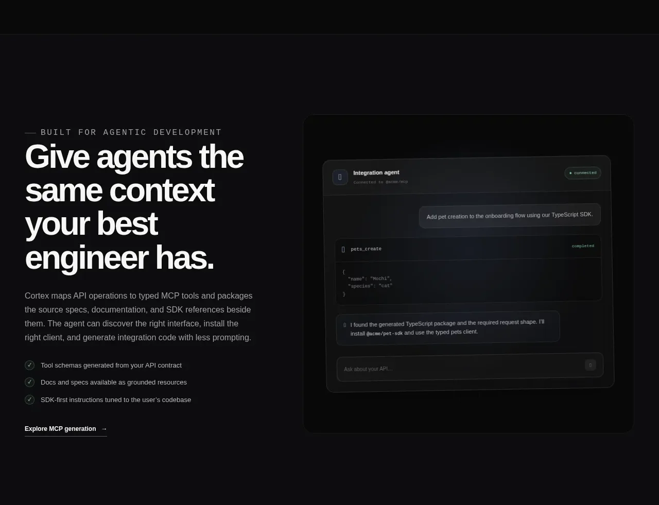 Agent context split feature
Cortex · Feature grid
Agent context split feature
Cortex · Feature grid
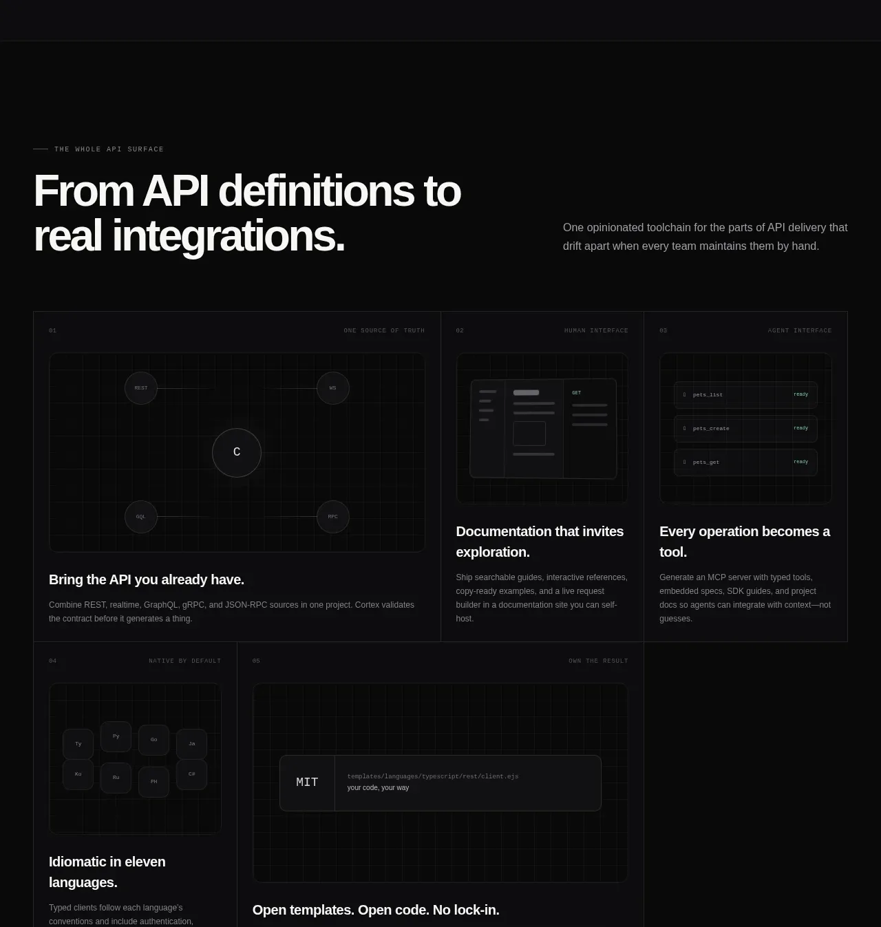 API surface capability cards
Cortex · Feature grid
API surface capability cards
Cortex · Feature grid
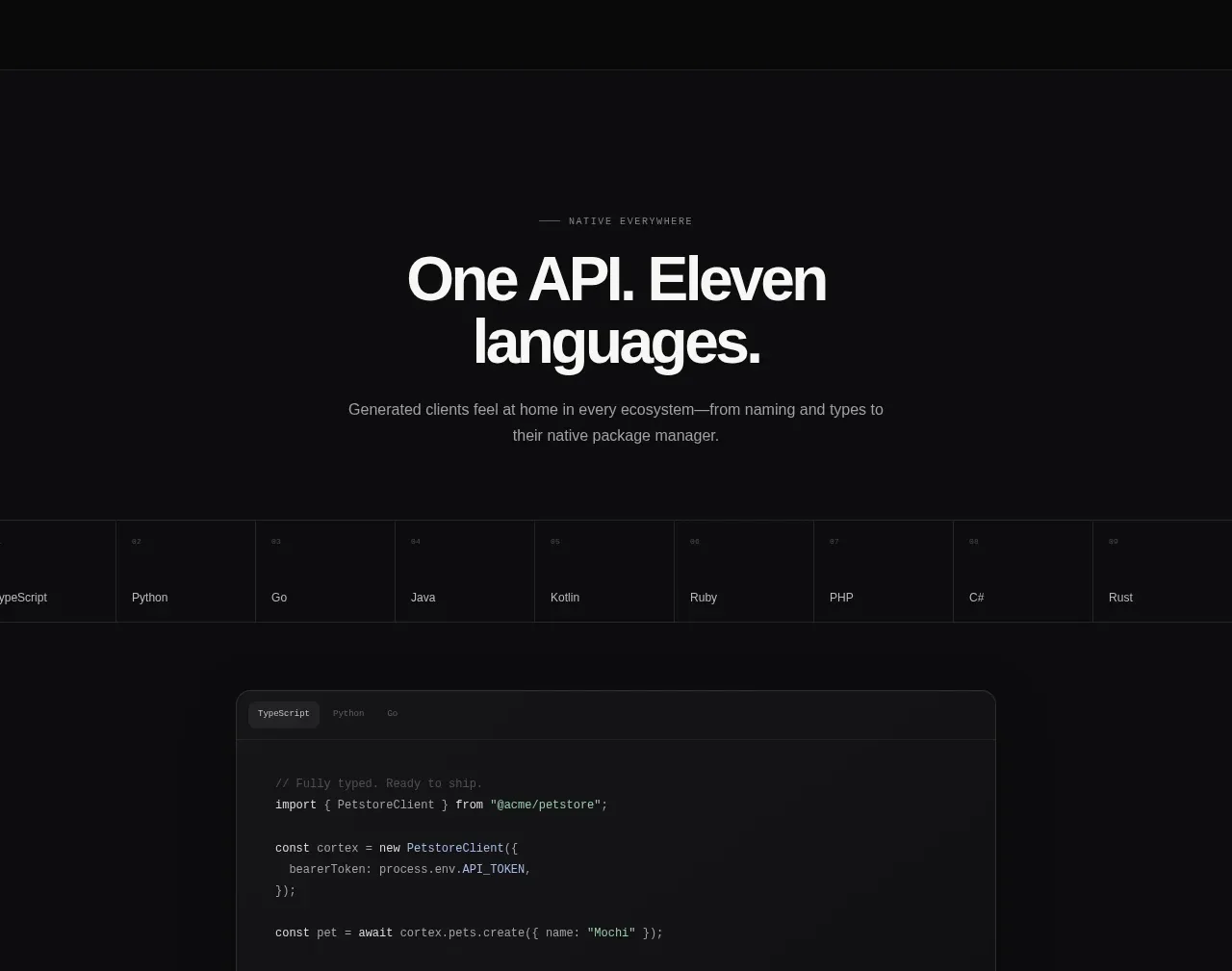 Multi-language developer section
Cortex · Hero
Multi-language developer section
Cortex · Hero
 Open-source platform callout
Cortex · Call to action
Open-source platform callout
Cortex · Call to action
 Final conversion banner
Cortex · Call to action
Final conversion banner
Cortex · Call to action
 Dark multi-column footer
Cortex · Footer
Dark multi-column footer
Cortex · Footer


