 kage
kage
lleverage.ai

Design analysis
A light proof section alternates warehouse imagery and written quotes in a ruled three-column mosaic, creating a more personal form of evidence.
Prompt preview
## Reference images

Study these alongside the description below: hierarchy, rhythm, spacing, colour. Build for the product you are asked about, using this design language.

- Component: https://kage-design-assets.t3.tigrisfiles.io/components/lleverage/862048bd-3dd3-4c2e-9d3c-aadeb65c3eec-1792130580-8.webp
- Full page it was cut from: https://kage-design-assets.t3.tigrisfiles.io/screenshots/lleverage/862048bd-3dd3-4c2e-9d3c-aadeb65c3eec-1792130486253-full.webp
- Component on Kage: https://kage.design/component/lleverage-testimonials-2

## Before you start
Ask what customer evidence is available, which stories can be published, and what visual material represents the user's market. Then use an original mix of proof types.

Build a customer-proof section on #FAFAF7 with a small uppercase eyebrow and a large serif heading. Use a three-column, two-row mosaic with thin #E2E3DF borders. Alternate image panels and quote panels so the grid has visual rhythm; quote cells include a 2–4 sentence testimonial and compact attribution with a small avatar or customer mark. Keep image crops intentional, use consistent cell heights, and align content to a comfortable inset. Typography should be 14–16px sans-serif for quotes, 11px for attribution, and 40–52px serif for the heading. Add a subdued hover treatment to image cells and preserve the grid as a single-column sequence on mobile.

Never: use the reference's logos, product names, copy, illustrations, imagery, or exact customer quotes.
More components

 Social proof and comparison links
CrewTower Mod for Claude Code · Testimonials
Social proof and comparison links
CrewTower Mod for Claude Code · Testimonials
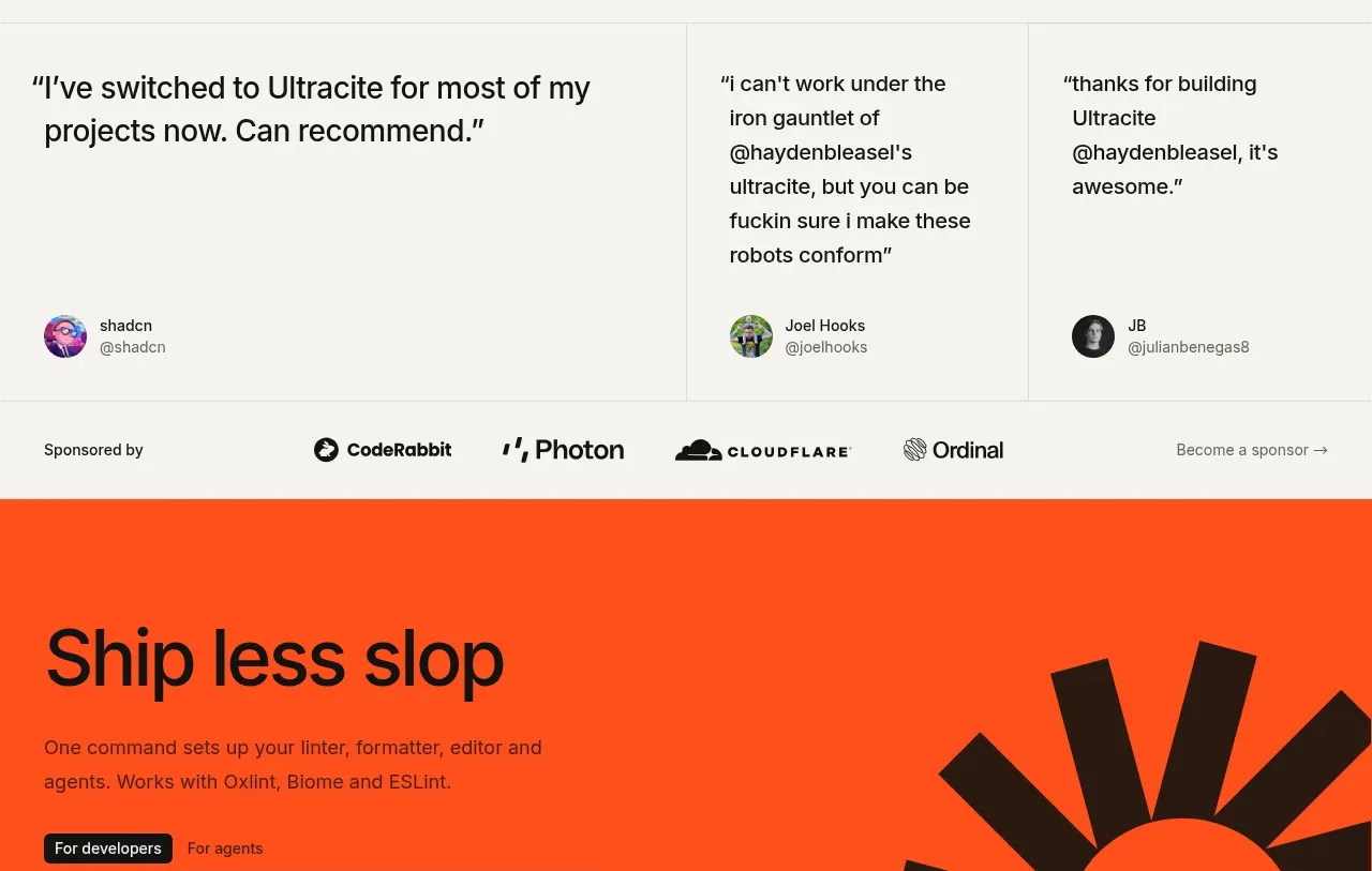
 Developer testimonials and sponsor strip
Ultracite v8 · Testimonials
Developer testimonials and sponsor strip
Ultracite v8 · Testimonials
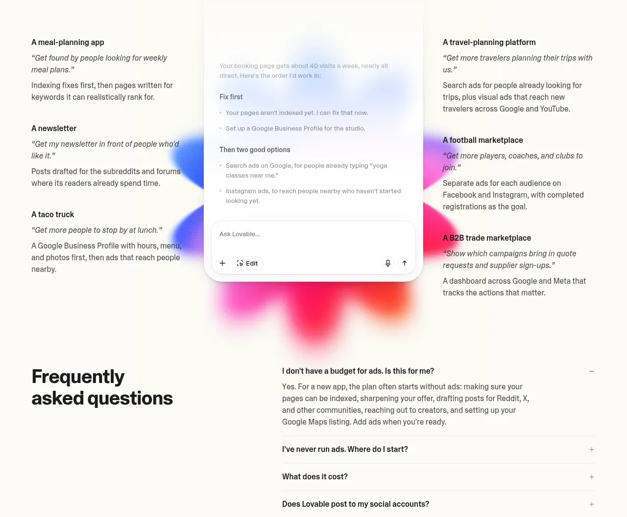
 Customer growth examples
Lovable Growth Tools · Testimonials
Customer growth examples
Lovable Growth Tools · Testimonials
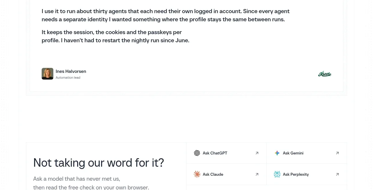
 Customer proof quote
Scalebrowser · Testimonials
Customer proof quote
Scalebrowser · Testimonials
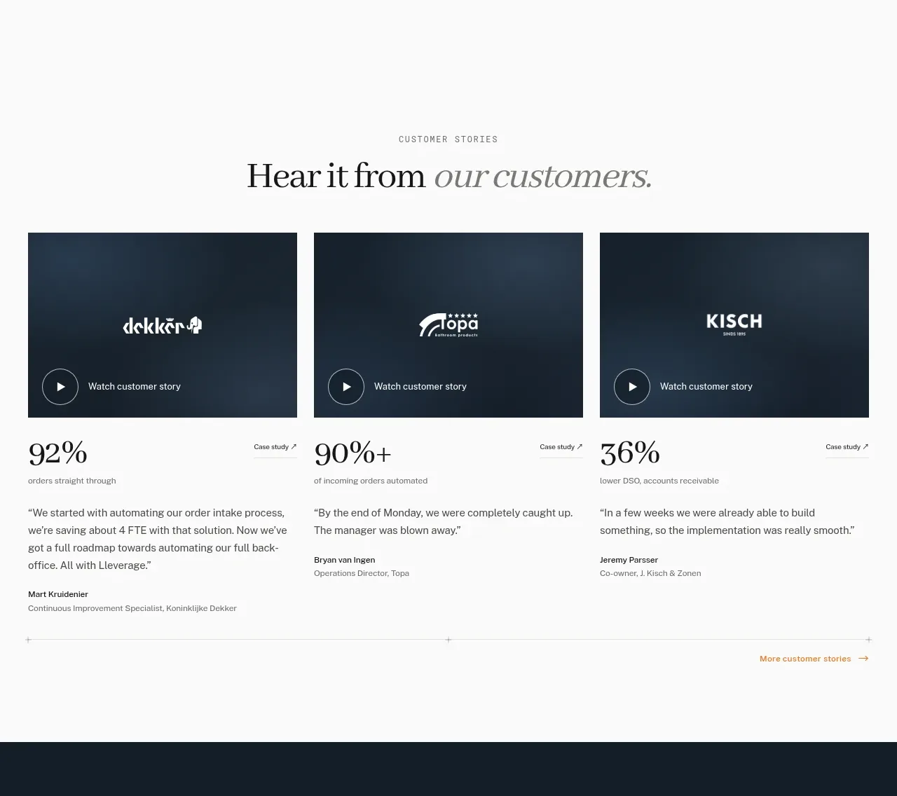
 Customer story cards
Lleverage · Testimonials
Customer story cards
Lleverage · Testimonials
 Developer testimonials
Polylane Impact Analysis · Testimonials
Developer testimonials
Polylane Impact Analysis · Testimonials