 kage
kage
lovable.dev
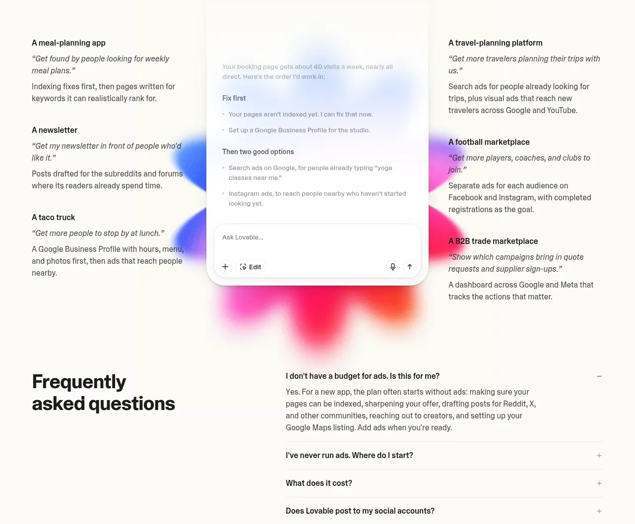
Design analysis
A centered heading introduces a three-part social-proof composition with example business types around a softly glowing central assistant panel. It demonstrates outcomes without relying on a dense quote carousel.
Prompt preview
## Reference images

Study these alongside the description below: hierarchy, rhythm, spacing, colour. Build for the product you are asked about, using this design language.

- Component: https://kage-design-assets.t3.tigrisfiles.io/components/lovable-growth-tools/9452fb95-0338-4269-a5da-8889e8804cc9-1792216986-10.webp
- Full page it was cut from: https://kage-design-assets.t3.tigrisfiles.io/screenshots/lovable-growth-tools/9452fb95-0338-4269-a5da-8889e8804cc9-1792216920277-full.webp
- Component on Kage: https://kage.design/component/lovable-growth-tools-testimonials

## Before you start
Ask what the user's product and brand are, then apply these principles to that product rather than reproducing the reference.

Build a social-proof section with a centered heading and a three-column layout. Put short outcome examples in the left and right columns, and a central product/assistant card with a very soft radial color glow behind it. Use warm white, gentle blue/pink/orange atmospheric accents at low opacity, 14–16px example headings, italicized or quoted outcome lines only when genuine, and a rounded central panel with a small input footer. Keep the section credible: use anonymized or user-provided evidence, and make the central visual secondary to the heading.

Never: use logos, product names, copy, illustrations, or imagery from the reference.
More components
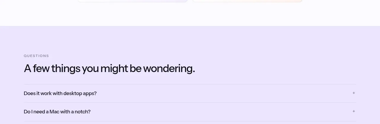
 Social proof and comparison links
CrewTower Mod for Claude Code · Testimonials
Social proof and comparison links
CrewTower Mod for Claude Code · Testimonials
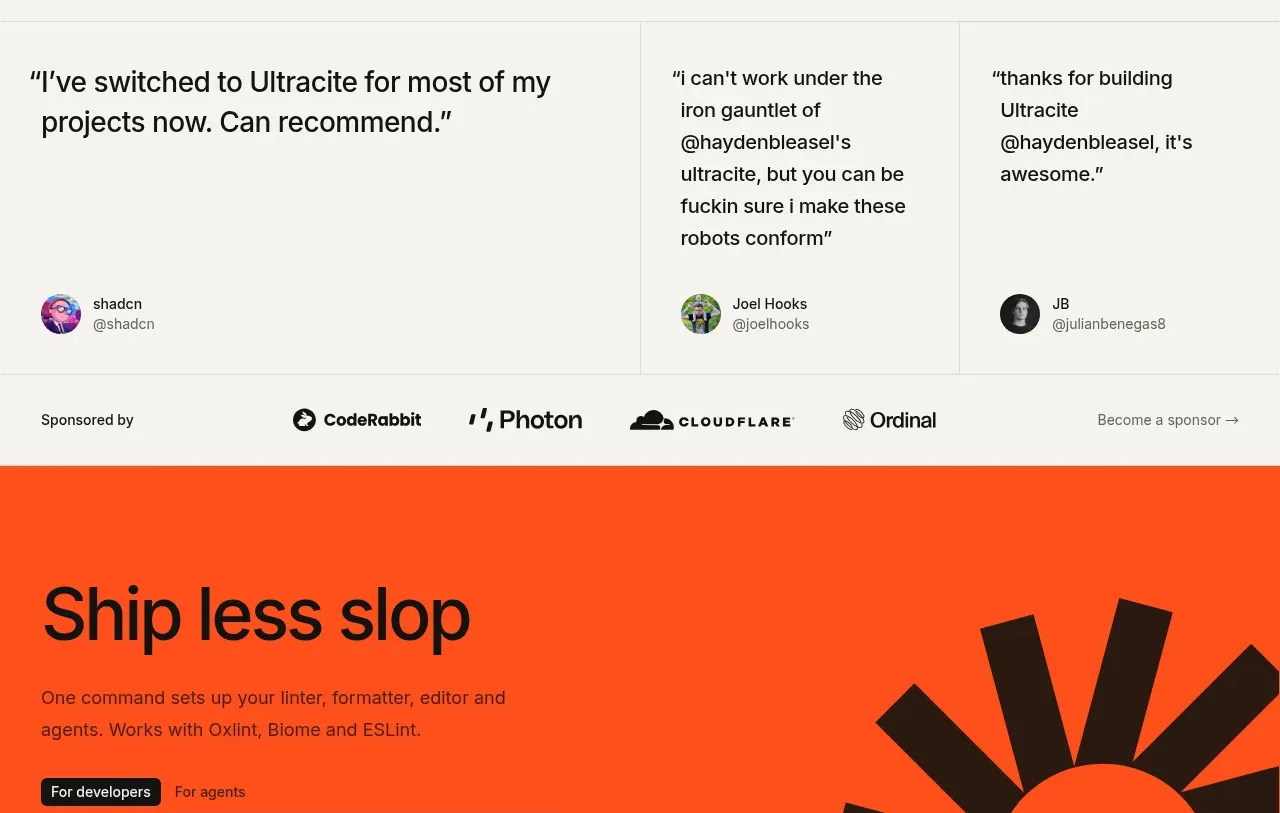
 Developer testimonials and sponsor strip
Ultracite v8 · Testimonials
Developer testimonials and sponsor strip
Ultracite v8 · Testimonials
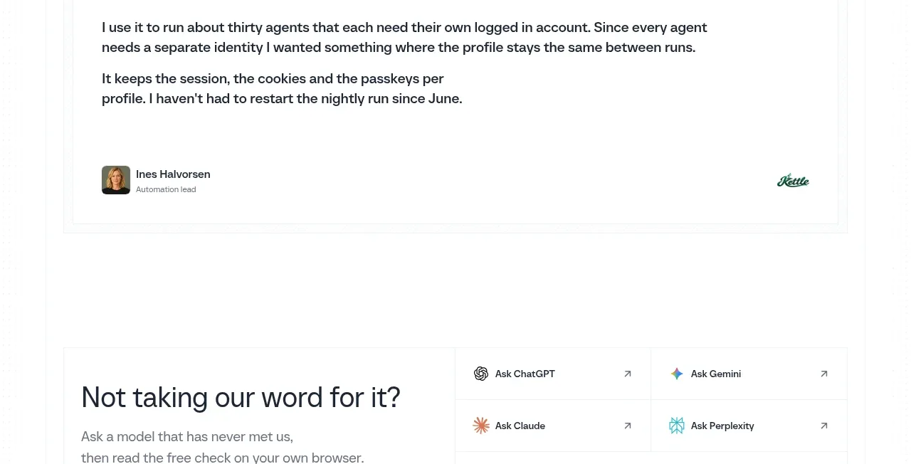
 Customer proof quote
Scalebrowser · Testimonials
Customer proof quote
Scalebrowser · Testimonials
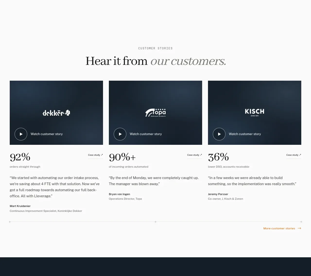
 Customer story cards
Lleverage · Testimonials
Customer story cards
Lleverage · Testimonials
 Customer proof mosaic
Lleverage · Testimonials
Customer proof mosaic
Lleverage · Testimonials
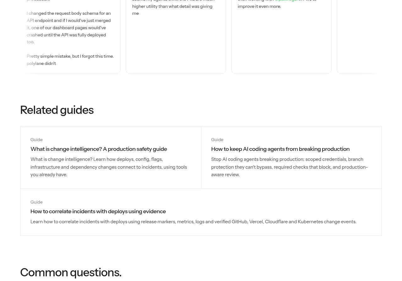
 Developer testimonials
Polylane Impact Analysis · Testimonials
Developer testimonials
Polylane Impact Analysis · Testimonials