 kage
kage
polylane.com
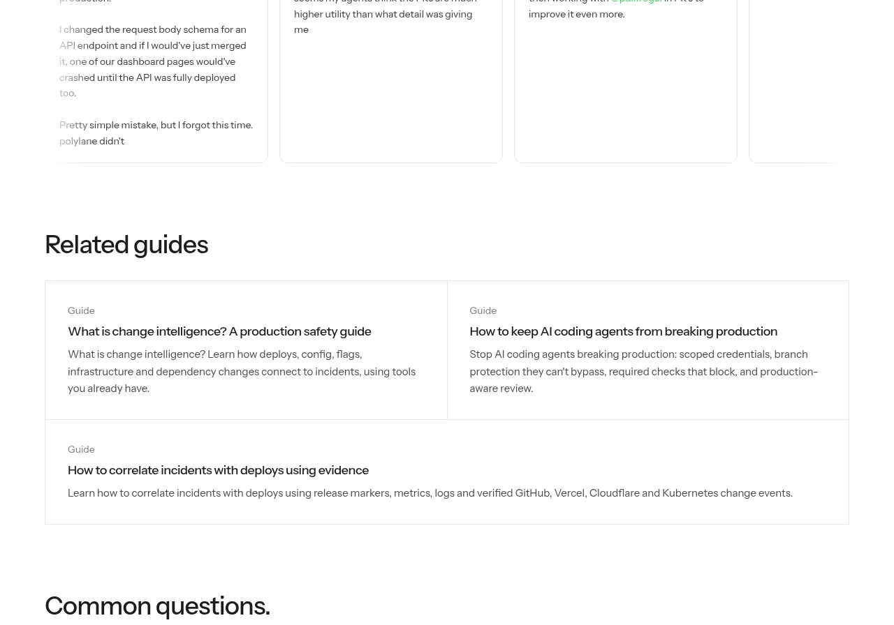
Design analysis
A horizontal row of testimonial cards gives the page human proof, with compact identities and long-form quotes in lightly bordered panels.
Prompt preview
## Reference images

Study these alongside the description below: hierarchy, rhythm, spacing, colour. Build for the product you are asked about, using this design language.

- Component: https://kage-design-assets.t3.tigrisfiles.io/components/polylane-impact-analysis/878f0a8a-6be5-46ae-8786-d3cb31a469c0-1792130548-9.webp
- Full page it was cut from: https://kage-design-assets.t3.tigrisfiles.io/screenshots/polylane-impact-analysis/878f0a8a-6be5-46ae-8786-d3cb31a469c0-1792130477581-full.webp
- Component on Kage: https://kage.design/component/polylane-impact-analysis-testimonials

## Before you start
Ask who the user's real customers are and request approved testimonial content and avatars. Then apply this layout without borrowing reference content.

Build a testimonial section with a clear left-aligned heading and a horizontal row of four lightly bordered cards. Each card should include a small avatar or initials, name, handle or role, and a readable quote. Use white cards, 1px #e4e6e2 borders, 10–12px radius, 24–28px padding, 14–15px body text, and equal card heights with overflow handled cleanly. On smaller screens, use a swipeable carousel with visible pagination and keyboard controls. Keep the section airy and avoid excessive quotation marks or decorative graphics.

Never: use logos, product names, copy, illustrations, or imagery from the reference.
More components
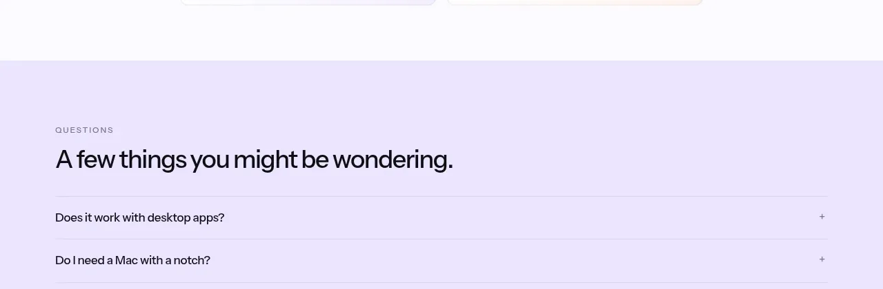
 Social proof and comparison links
CrewTower Mod for Claude Code · Testimonials
Social proof and comparison links
CrewTower Mod for Claude Code · Testimonials
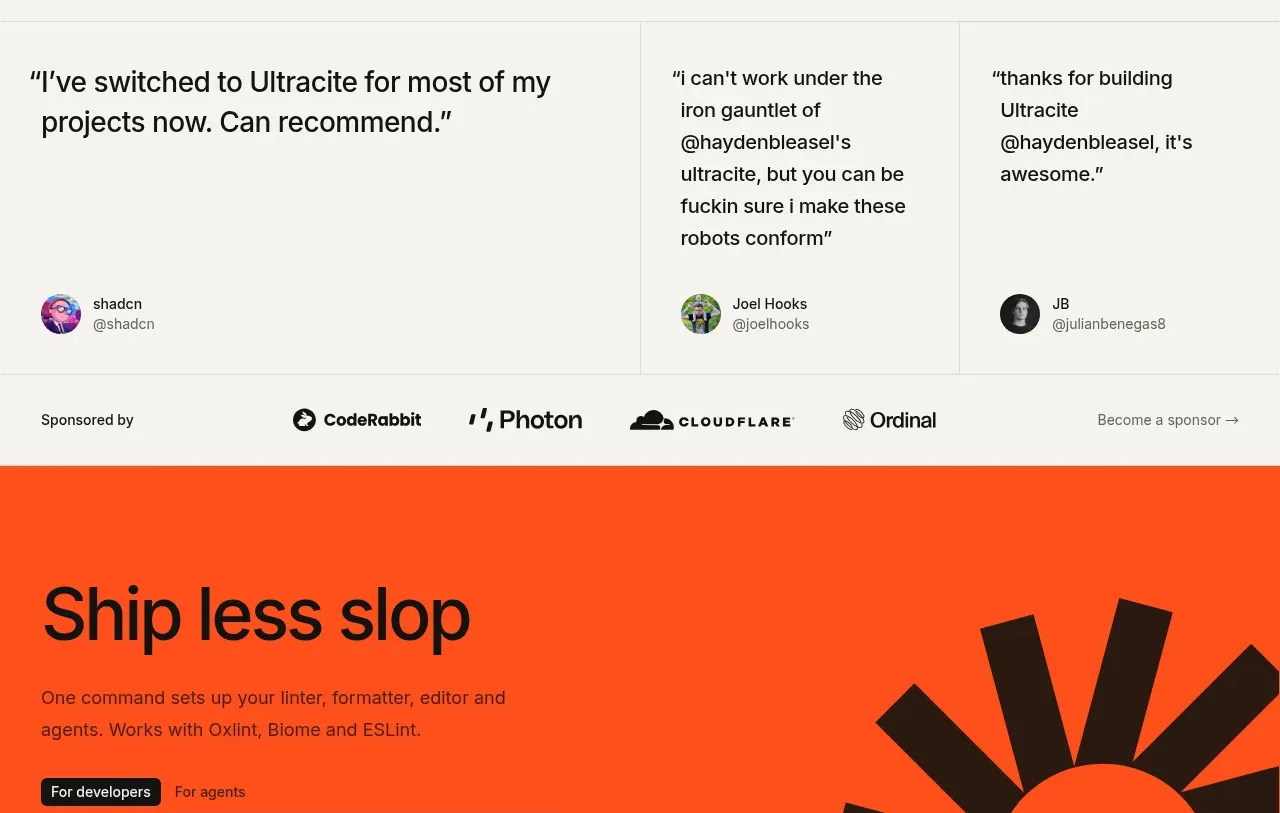
 Developer testimonials and sponsor strip
Ultracite v8 · Testimonials
Developer testimonials and sponsor strip
Ultracite v8 · Testimonials
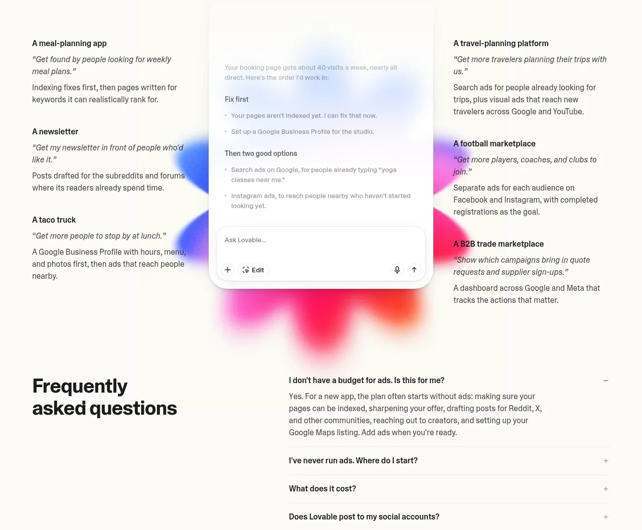
 Customer growth examples
Lovable Growth Tools · Testimonials
Customer growth examples
Lovable Growth Tools · Testimonials
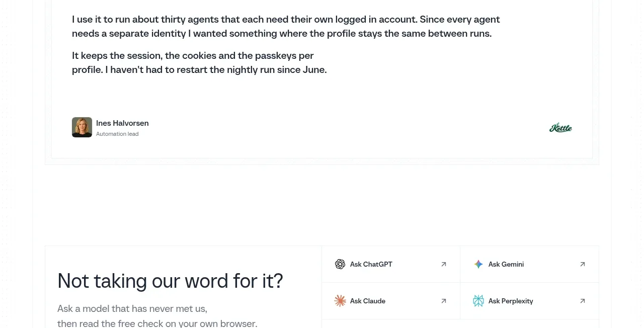
 Customer proof quote
Scalebrowser · Testimonials
Customer proof quote
Scalebrowser · Testimonials

 Customer proof mosaic
Lleverage · Testimonials
Customer proof mosaic
Lleverage · Testimonials
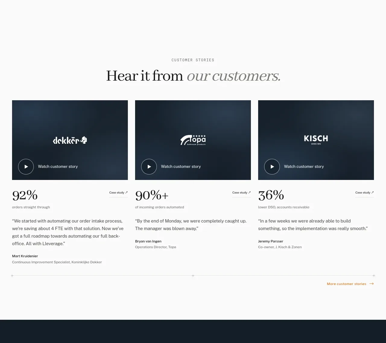 Customer story cards
Lleverage · Testimonials
Customer story cards
Lleverage · Testimonials