kage
kage
alkera.ai
Design analysis
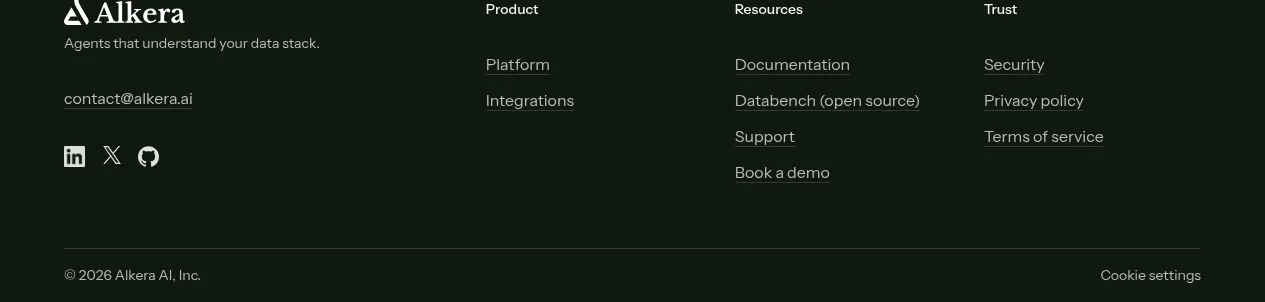
The dark footer continues the CTA color, with a brand summary on the left, grouped navigation links across the row, social links, and a separated legal line at the bottom.
Prompt preview
## Reference images

Study these alongside the description below: hierarchy, rhythm, spacing, colour. Build for the product you are asked about, using this design language.

- Component: https://kage-design-assets.t3.tigrisfiles.io/components/databench-by-alkera/229e473d-7918-4538-a962-0aa359369c12-1791439390-8.webp
- Full page it was cut from: https://kage-design-assets.t3.tigrisfiles.io/screenshots/databench-by-alkera/229e473d-7918-4538-a962-0aa359369c12-1791439317723-full.webp
- Component on Kage: https://kage.design/component/databench-by-alkera-footer

## Before you start
Ask the user for their brand name, short description, support/contact destinations, legal links, and social channels. Use their information rather than copying the reference.

Build a dark multi-column SaaS footer using the same forest background as the CTA. Use a max-width content container and a top area with a brand summary at left plus three or four link groups such as Product, Resources, Company, and Trust. Typography should be compact: 13–14px group labels, 13–14px links, and 11–12px muted metadata. Use warm white text such as #f4f5f1 and muted green-gray #9aa69e. Add social icons below the brand summary. Separate the lower legal row with a 1px rgba(255,255,255,.12) rule; include copyright and privacy/cookie controls. Keep link hover states visible and stack columns on mobile.

Never: use logos, product names, copy, illustrations, or imagery from the reference.