kage
kage
alkera.ai

Design analysis
A spacious, editorial landing page pairs oversized black sans-serif headlines with mint-green highlight blocks, fine gray body copy, and restrained black-green actions. The hero moves from a compact two-column message and illustrated robot to a large product screenshot, then the page develops through an integrations grid, a pale blue-gray feature panel with stacked workflow screenshots, alternating notebook/GPU sections, and a collaboration demo before resolving into a dark green CTA and footer. Rounded containers, thin borders, pale blue structural rails, and real interface imagery create continuity while the rhythm shifts from airy marketing sections to denser product proof.
Prompt preview
## Reference images

Study these alongside the description below: hierarchy, rhythm, spacing, colour. Build for the product you are asked about, using this design language.

- Full page: https://kage-design-assets.t3.tigrisfiles.io/screenshots/databench-by-alkera/229e473d-7918-4538-a962-0aa359369c12-1791439317723-full.webp
- Above the fold: https://kage-design-assets.t3.tigrisfiles.io/screenshots/databench-by-alkera/229e473d-7918-4538-a962-0aa359369c12-1791439313520.webp
- Design on Kage: https://kage.design/designs/databench-by-alkera-landing-page

## Before you start
Ask the user what they are building, who it is for, and what brand assets they already have, including the product name, colours, typography, logo, and any existing UI screenshots. Wait for their answers before designing. Apply the system below to their product, not to the reference product, and use their own content and assets.

## Page structure
1. **Global navigation** — Create a slim white header with the brand at left, compact navigation links with dropdown indicators through the center/right, a text login link, and a dark primary CTA at the far right.
2. **Hero introduction** — Use a generous two-column layout: a large left-aligned headline with one line emphasized by a soft green rectangular highlight, a concise supporting paragraph, and paired primary/secondary buttons; place a friendly custom product illustration on the right.
3. **Hero product proof** — Immediately follow with a large, softly rounded product screenshot spanning most of the content width. Show a realistic collaborative workspace with a sidebar, tabs, connected workflow nodes, agent cards, and small status labels. Let a pale blue vertical rail visually connect this proof to later sections.
4. **Integration strip** — Add a centered sentence followed by a compact two-row grid of integrations. Each cell contains a small tool mark, product name, and muted category label; use subtle dividers and plenty of white space rather than heavy cards.
5. **Context and knowledge feature panel** — Introduce a very large pale blue-gray rounded section with an oversized heading at the top. Use a left column of stacked feature tabs or statements and a right column of three vertically arranged interface screenshots, each with a short caption and dark “learn more” action. Keep the screenshots layered into the panel and connect the composition with thick pale-blue rounded rails.
6. **Notebook and dashboard feature** — Within a cool light-blue rounded section, place a two-column heading and explanatory copy, then a wide combined product visual showing a notebook on the left and a dashboard on the right, separated by a lively angled transition. Add a dark action button beneath or beside the visual.
7. **Dedicated GPU feature** — Continue in the same light-blue feature area with another two-column heading/copy row and a wide screenshot showing code beside a training-loss chart. Include a small hardware/status badge in the screenshot and preserve the rounded white product frame.
8. **Live collaboration feature** — Return to a white background with a two-column heading and description, followed by a wide collaborative interface screenshot. Show chat/activity on one side and an updating chart or artifact on the other, with participant labels and agent activity visible.
9. **Final CTA** — Switch to a deep near-black green rounded section. Center a large light headline, place light and outlined buttons below it, and add a small documentation link with an arrow.
10. **Footer** — Keep the dark background and separate the footer with a thin horizontal rule. Use a left brand block with a short descriptor, contact link, and social icons, then three compact link columns for product, resources, and trust. Finish with a lower legal row and cookie-settings link.

## Design language
- Build hierarchy with oversized geometric sans-serif headlines, short paragraphs, and clear section-level contrast; use roughly 56–72px hero/section headlines, 18–20px supporting text, and 13–15px utility labels, scaling responsively.
- Keep the page predominantly white and airy at the top, then change rhythm through large pale blue-gray feature containers and dense product-proof imagery. Alternate expansive whitespace with tightly framed interface screenshots so the page feels like a guided product tour rather than a feature list.
- Use near-black ink such as `#101712` for type and primary buttons, white `#FFFFFF` for the base, a mint highlight around `#7ED58F`, pale blue-gray panels around `#EAF1F3`, structural blue-gray rails around `#A8C2CC`, and a deep forest CTA/footer around `#08170D`.
- Pair a clean modern sans-serif for all UI and body copy with strong weight contrast rather than a decorative display face. Use regular gray copy, bold black headings, and occasional green or colored status chips.
- Treat screenshots as primary visual content: frame them in white or nearly white rounded rectangles with light borders, soft diffuse shadows, and realistic internal UI density. Use 12–18px radii for screenshots and 28–40px radii for major section panels.
- Keep borders thin and low-contrast, typically `#DDE4E2`; avoid excessive card chrome. Use subtle shadows only to lift product screenshots from pale panels.
- Repeat rounded vertical rails and oversized corner treatments as a visual thread between sections, but keep them secondary to the content. Use integration logos and status marks sparingly and at small scale.
- Make buttons compact, high-contrast, and pill-to-soft-rectangle rather than fully rounded: dark filled primary actions, white or transparent outlined secondary actions, and arrow affordances for deeper links.
- Where motion is added, use restrained scroll reveals for screenshots, gentle rail/line movement, and small hover transitions on buttons and integration cells. Never animate the dense interface imagery so aggressively that it harms legibility.

## Never
- Do not copy the reference product’s logo, wordmark, product name, tagline, exact copy, robot illustration, screenshots, integration marks, or icon set.
- Do not present the result as Alkera or Databench, and do not imply affiliation with the reference.
- Do not fill the page with generic abstract illustrations or stock photography; create product-specific visuals from the user’s own workflow and brand.
- Do not reproduce the exact interface text or data shown in the reference screenshots.
Components from this page
All components
 Primary navigation
Databench by Alkera · Navigation
Primary navigation
Databench by Alkera · Navigation
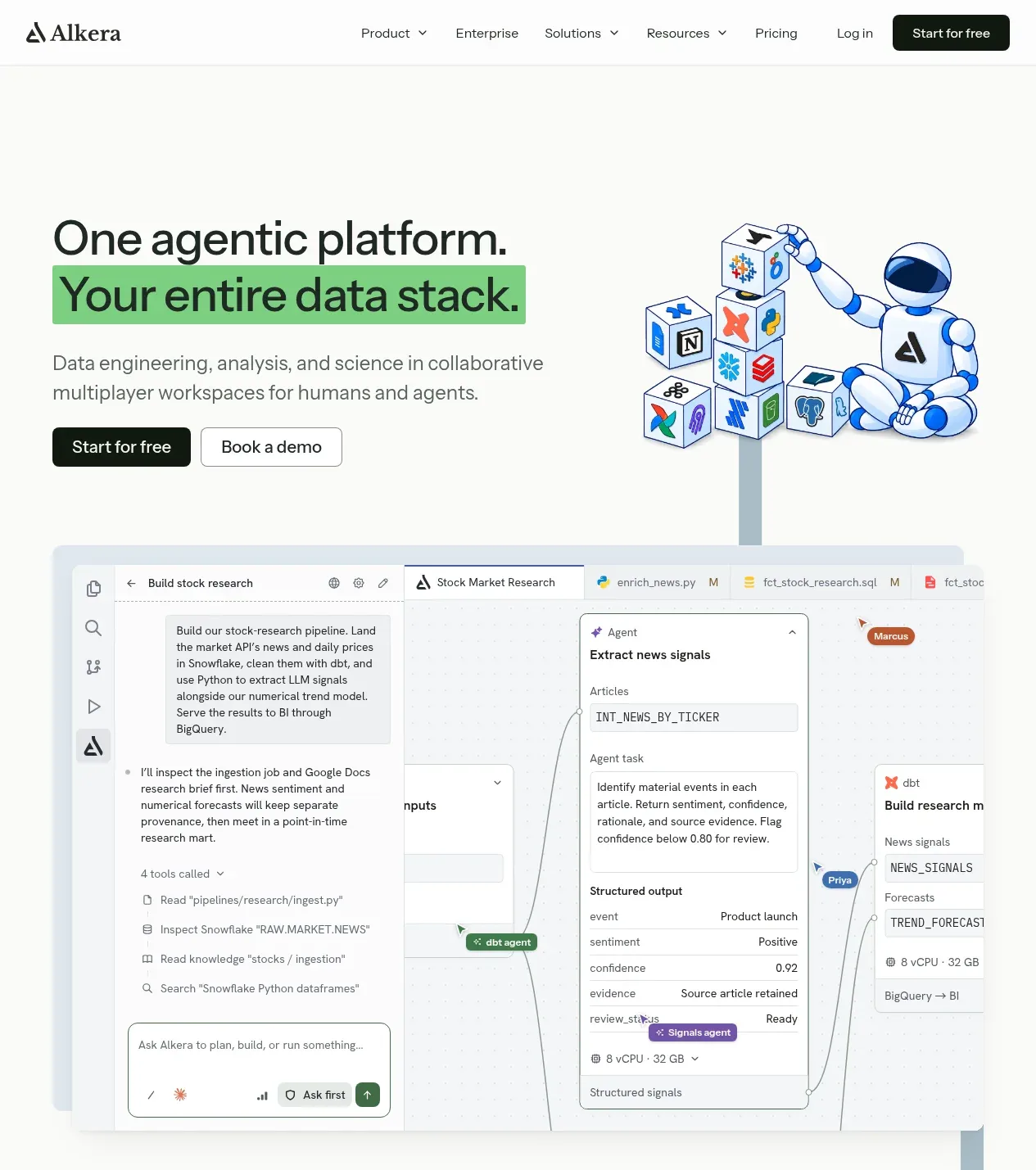 Agentic data platform hero
Databench by Alkera · Hero
Agentic data platform hero
Databench by Alkera · Hero
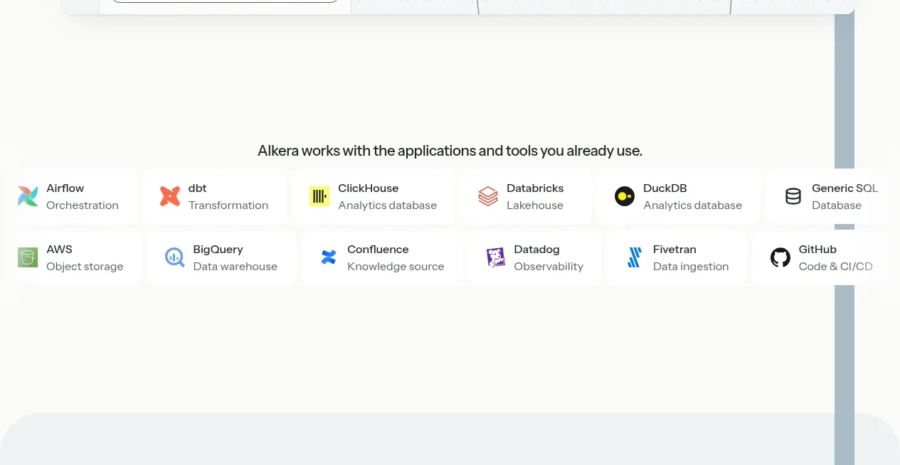 Technology integrations
Databench by Alkera · Logo cloud
Technology integrations
Databench by Alkera · Logo cloud
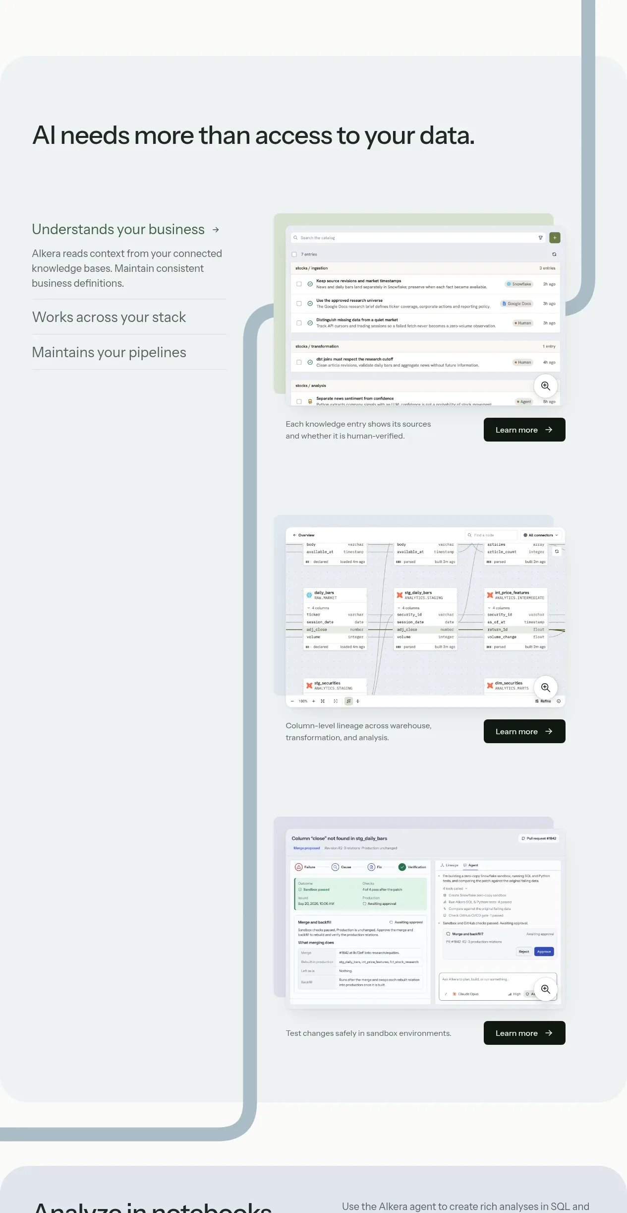 Contextual data workflow features
Databench by Alkera · Feature grid
Contextual data workflow features
Databench by Alkera · Feature grid
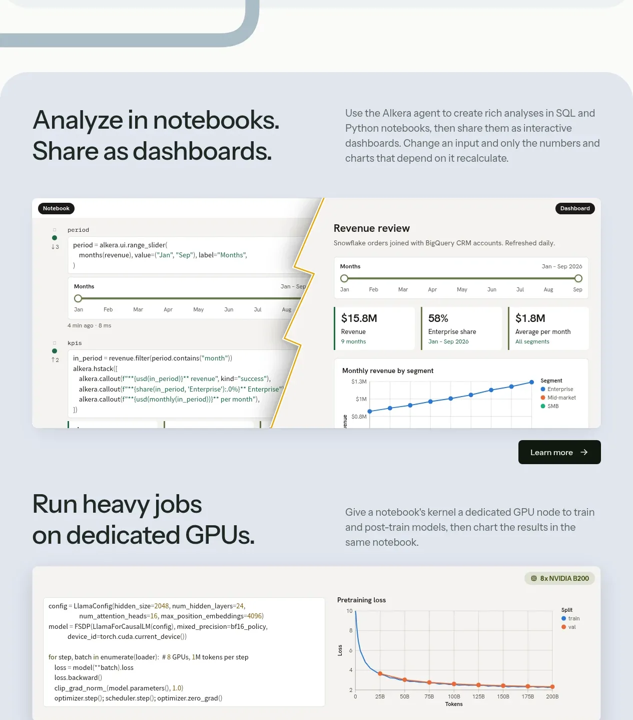 Notebook analytics feature
Databench by Alkera · Feature grid
Notebook analytics feature
Databench by Alkera · Feature grid
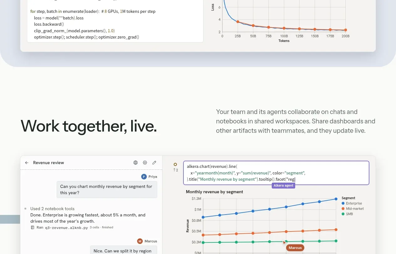 Dedicated compute feature
Databench by Alkera · Feature grid
Dedicated compute feature
Databench by Alkera · Feature grid
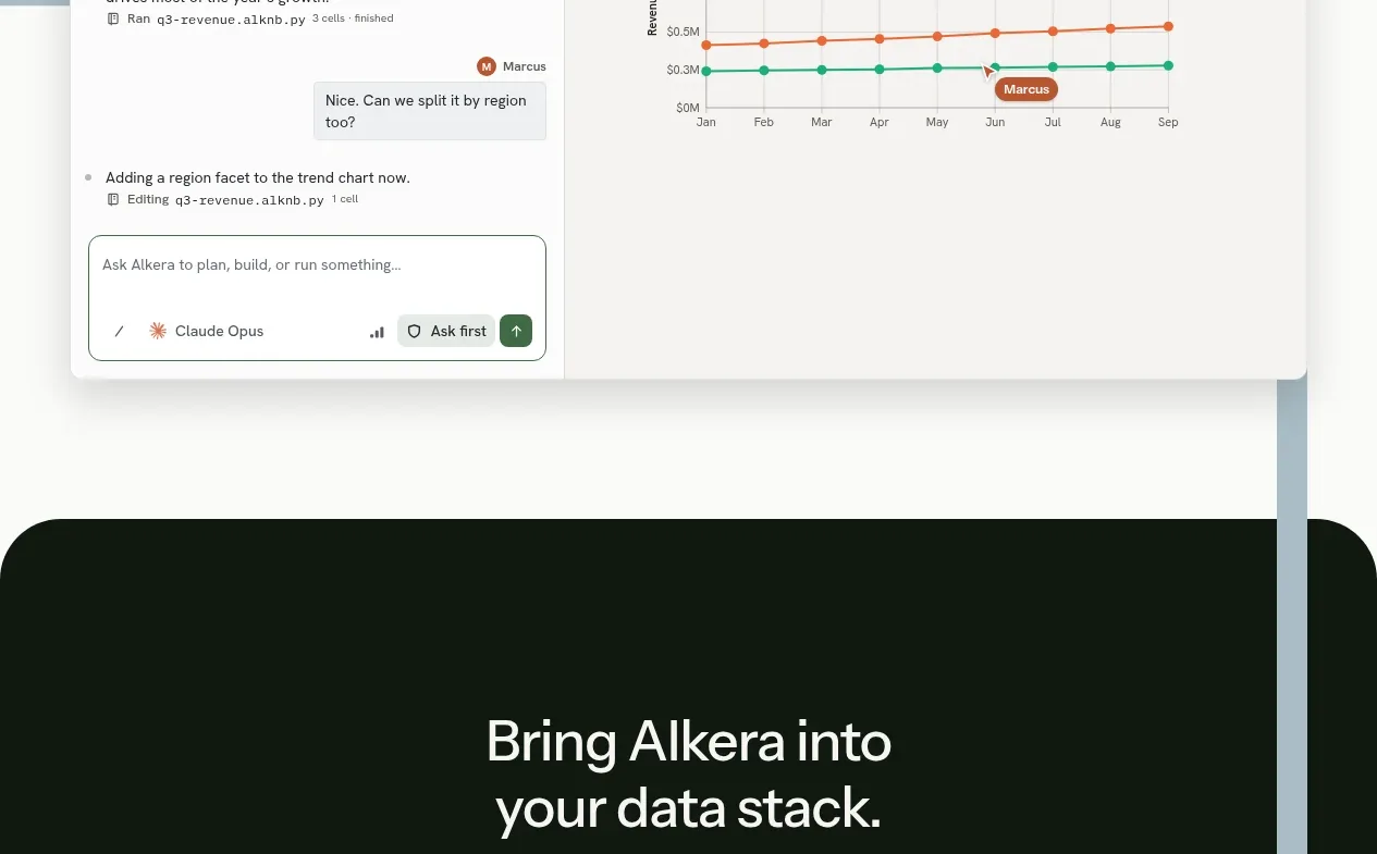 Live collaboration feature
Databench by Alkera · Feature grid
Live collaboration feature
Databench by Alkera · Feature grid
 Bottom conversion call to action
Databench by Alkera · Call to action
Bottom conversion call to action
Databench by Alkera · Call to action
 Site footer
Databench by Alkera · Footer
Site footer
Databench by Alkera · Footer