 kage
kage
datafa.st

Design analysis
A focused pricing-table treatment that uses generous whitespace, softly elevated cards, restrained borders, and a warm coral CTA to make plan comparison feel approachable. A compact social-proof row beneath the cards adds reassurance without competing with the primary conversion action.
Prompt preview
## Reference images

Study these alongside the description below: hierarchy, rhythm, spacing, colour. Build for the product you are asked about, using this design language.

- Component: https://kage-design-assets.t3.tigrisfiles.io/components/datafa-st/3396b937-0925-4898-ae76-13fd2ccd1a9f-1789067843-9.webp
- Full page it was cut from: https://kage-design-assets.t3.tigrisfiles.io/screenshots/datafa-st/3396b937-0925-4898-ae76-13fd2ccd1a9f-1789067801-full.webp
- Component on Kage: https://kage.design/component/datafa-pricing-table

## Before you start
Ask me what my product does, who it is for, and what its brand personality, colour palette, and pricing model are. Then apply the principles below to create an original pricing section for my product—not a copy of the reference.

## Build a warm, minimal pricing section
Create a responsive pricing-table section for a modern software product. The section should make comparing plans easy and move users toward a clear trial or purchase action while keeping the page calm and spacious.

### Layout and alignment
- Place the pricing section in a centred content container, approximately 960–1120px wide on desktop.
- Use two or three adjacent plan cards on desktop, with equal widths and consistent internal padding. Stack the cards vertically on narrow screens.
- Align plan names, prices, feature lists, buttons, and supporting text to a predictable grid. Keep the CTA area aligned across cards by allowing feature content to occupy a consistent vertical region.
- Give the cards generous space around them. Use approximately 24–32px gaps between cards and 80–120px vertical section padding.
- Optionally place a compact trust row beneath the cards: a small overlapping avatar group followed by a short statement of adoption or customer satisfaction. Keep it centred and visually subordinate to the pricing cards.

### Typography hierarchy
- Use a clean contemporary sans-serif with a slightly friendly feel. Use a dark charcoal for primary text, approximately `#292929`.
- Make the section heading or plan titles clear and medium-to-bold, around 18–24px depending on hierarchy.
- Make prices the strongest element inside each card, around 32–48px, with a smaller, muted billing interval beside or below them.
- Set feature text around 14–16px with comfortable line height around 1.5.
- Use muted gray text, approximately `#77736F`, for secondary descriptions, exclusions, billing notes, and supporting copy.
- Keep CTA labels concise and sentence case rather than using all caps.

### Colour and emphasis
- Use a warm off-white page background, approximately `#FAF9F7` or `#FBFAF8`.
- Use white or near-white card surfaces, approximately `#FFFFFF`.
- Reserve one warm coral-orange accent for the primary CTA, approximately `#E96845` or `#E96B48`, with white text.
- If one plan is recommended, distinguish it with a subtle accent border, small badge, or slightly stronger elevation—not a loud gradient or saturated fill across the whole card.
- Use dark gray checks for included features and a soft neutral gray for unavailable features. Ensure the difference is communicated by more than colour alone, such as check/cross symbols and text treatment.

### Borders, radius, and depth
- Use thin, low-contrast borders around cards, approximately `#E5E3DF`.
- Give cards a soft rounded radius around 18–24px.
- Use a restrained shadow such as `0 8px 24px rgba(35, 31, 28, 0.08)`; the component should feel lightly lifted, not glossy.
- Use a smaller radius around 8–10px for buttons. Make the primary button full-width within each card and provide enough height for a comfortable touch target, approximately 46–50px.
- Separate feature groups with whitespace rather than many divider lines. If dashed separators are used, keep them subtle and functional.

### Pricing-card content and interaction
- Give each plan a clear name, short positioning statement, price, billing cadence, and concise feature list.
- Make the primary action visually obvious and consistent across plans. Include a small reassurance line beneath it, such as trial or payment information, using muted text.
- Make the recommended plan easy to identify without preventing comparison with other plans.
- On hover, slightly raise the card or strengthen its shadow and darken the CTA by approximately 5–8%. Keep transitions smooth, around 150–200ms.
- Ensure buttons have visible keyboard focus states and meet accessible contrast requirements.
- On mobile, preserve the full-width CTA and readable feature spacing; do not shrink the cards so far that the pricing hierarchy becomes cramped.
- If a billing toggle is relevant to the product, place it above the cards, centred, with a clear selected state and an optional savings note. Do not add one if the product does not have multiple billing cadences.

### Social proof row
- If customer proof is available, place a compact row below the pricing cards with 6–10 small circular avatars or neutral placeholders, slightly overlapping with thin borders.
- Pair it with a short, credible adoption statement. Keep the row visually quiet and avoid letting it compete with the CTA.
- If real customer imagery is unavailable, use initials, abstract colour circles, or omit the row rather than inventing misleading proof.

### Responsive and accessible behaviour
- Use CSS grid or flexbox with a clear desktop-to-mobile breakpoint around 700–800px.
- Keep all plan details readable at 320px viewport width.
- Use semantic headings, lists for features, buttons or links for actions, and descriptive accessible labels.
- Never rely on colour alone to indicate the recommended plan or included features.

## Never
- Never use logos, product names, or brand copy from the reference.
- Never reproduce the reference’s exact plan names, prices, feature wording, user count, or CTA wording.
- Never copy the reference’s exact layout proportions, spacing values, typography, or visual assets; interpret the principles for my product.
- Never include the reference’s illustrations, photographs, avatars, or other imagery. Use my supplied assets, neutral placeholders, or no imagery.
- Never invent customer, compliance, performance, or social-proof claims without my approval.
- Never make every card visually identical if one plan is intentionally recommended, but also never hide important pricing or feature differences.
More components
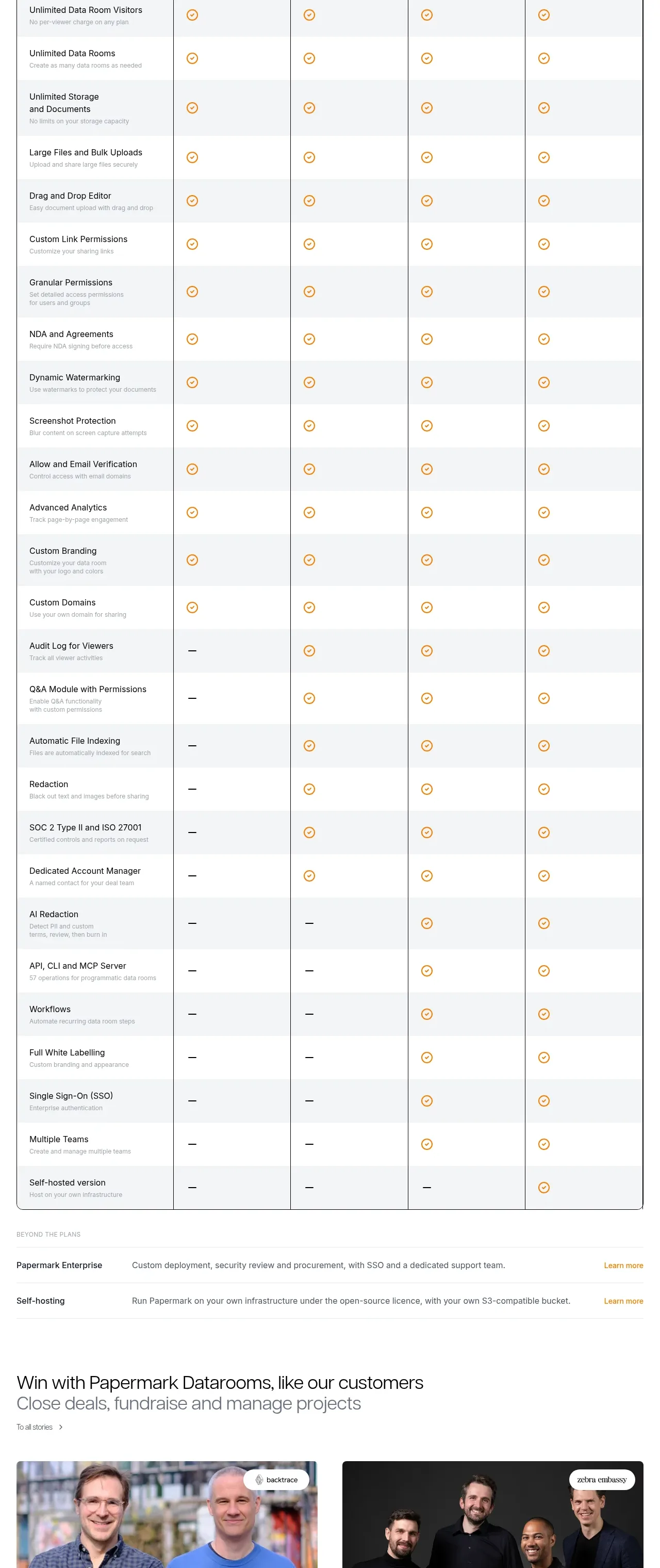
 Plan comparison table
Papermark Data Rooms · Pricing table
Plan comparison table
Papermark Data Rooms · Pricing table
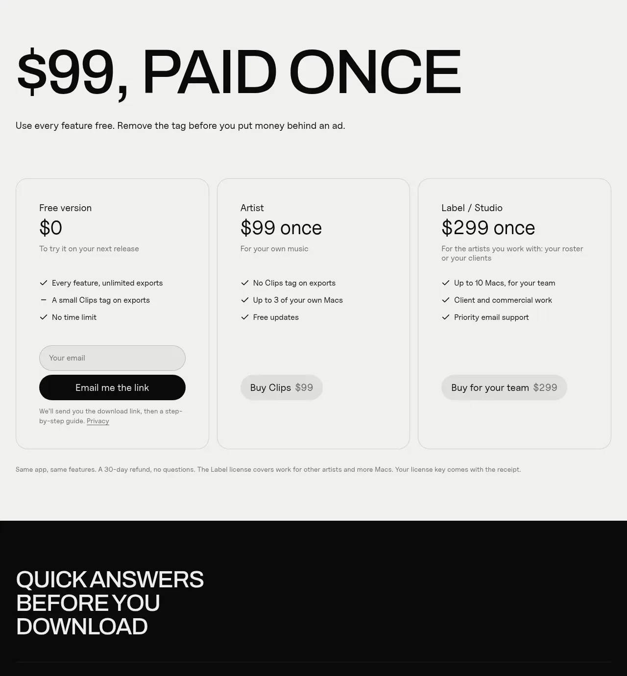
 One-time purchase pricing
Clips by Plastic · Pricing table
One-time purchase pricing
Clips by Plastic · Pricing table
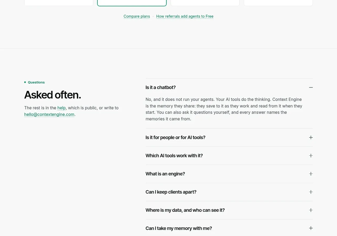
 Per-unit pricing table
Context Engine · Pricing table
Per-unit pricing table
Context Engine · Pricing table
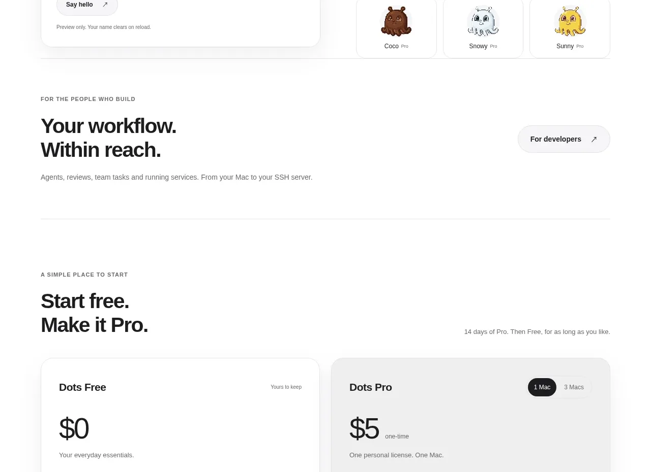
 Free and pro pricing cards
Dots · Pricing table
Free and pro pricing cards
Dots · Pricing table
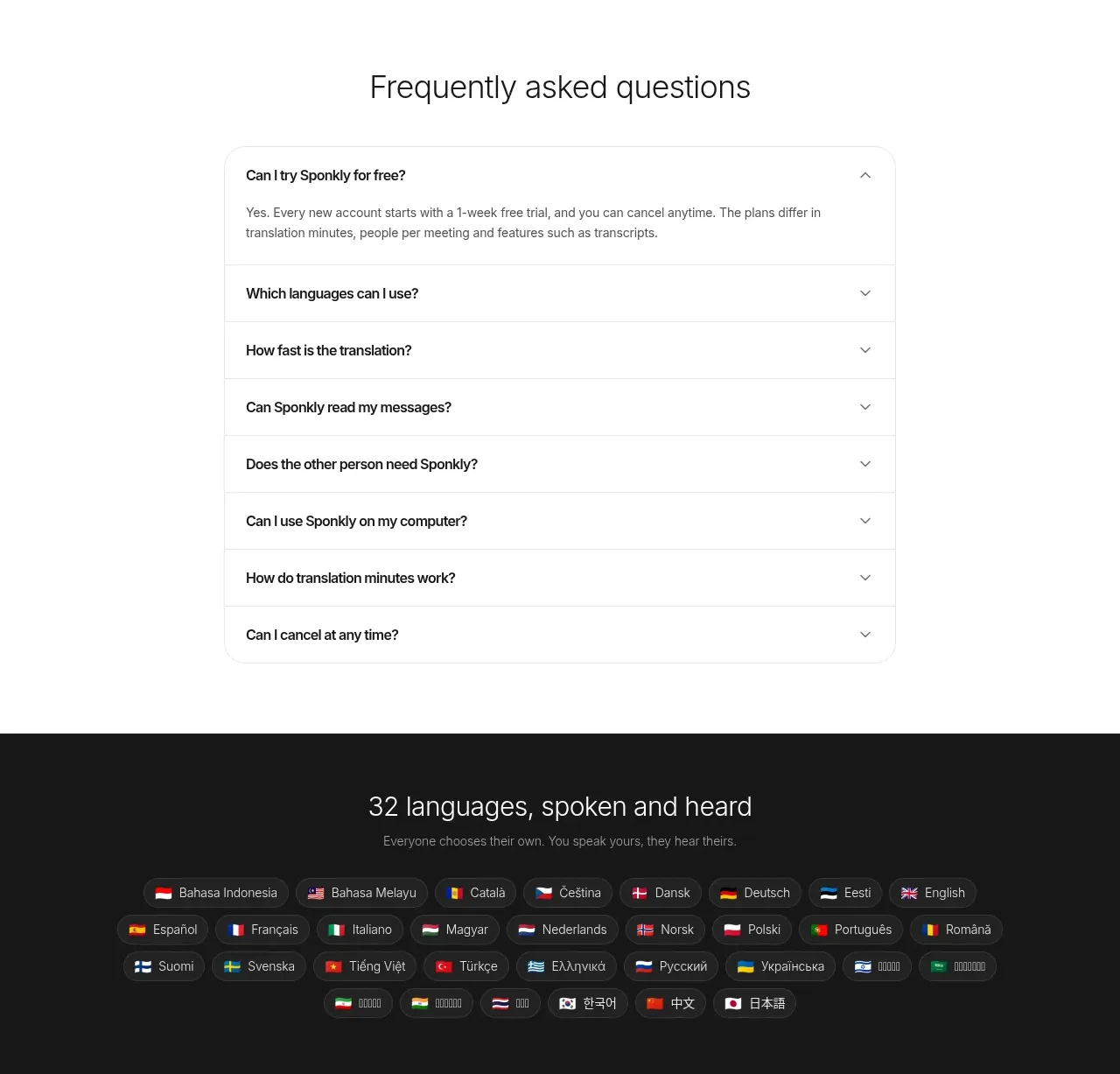
 Transparent multi-tier pricing
Sponkly · Pricing table
Transparent multi-tier pricing
Sponkly · Pricing table
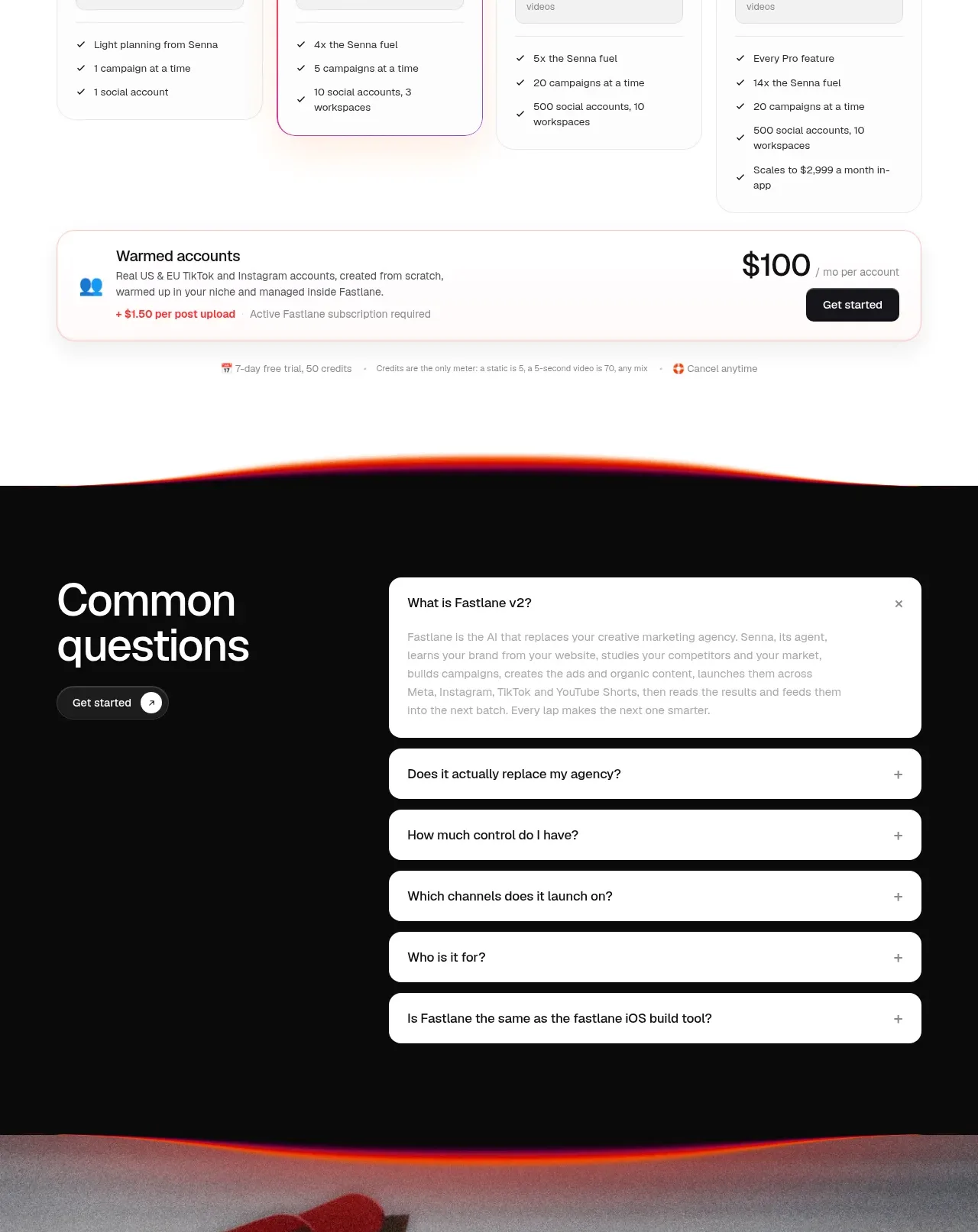
 Four-tier pricing table
Fastlane 2.0 · Pricing table
Four-tier pricing table
Fastlane 2.0 · Pricing table