 kage
kage
datafa.st

Design analysis
A long, conversion-focused analytics landing page uses a warm off-white canvas, near-black typography, and a restrained coral-orange accent for every primary action. The hero is sparse and centered, then the page becomes progressively denser through dashboard imagery, testimonial feeds, three-step cards, feature tiles, integrations, pricing, FAQ, and a final CTA/footer; repeated framed screenshots and soft shadows create continuity across the changing rhythms.
Prompt preview
## Reference images

Study these alongside the description below: hierarchy, rhythm, spacing, colour. Build for the product you are asked about, using this design language.

- Full page: https://kage-design-assets.t3.tigrisfiles.io/screenshots/datafa-st/3396b937-0925-4898-ae76-13fd2ccd1a9f-1789067801-full.webp
- Above the fold: https://kage-design-assets.t3.tigrisfiles.io/screenshots/datafa-st/3396b937-0925-4898-ae76-13fd2ccd1a9f-1789060057668.webp
- Design on Kage: https://kage.design/designs/datafa-landing-page

## Before you start
Ask the user what they are building, who it is for, and what brand assets they already have (name, colours, and type). Wait for their answers before designing. Apply the reference’s principles to their product, not to the reference product, and use their own content and brand assets.

## Page structure
1. **Top navigation:** Place a small product mark at left, three compact text links centered or near-center, and a subtle login action at right on a mostly empty header.
2. **Hero:** Center a large, heavy headline, a two-line supporting paragraph, a compact website/input-and-CTA form, a trial reassurance line, and a small overlapping avatar row with usage proof.
3. **Interactive product demo:** Show a large browser-framed analytics dashboard with KPI counters, a chart, tables, and small annotation callouts. Let this be the first wide visual anchor.
4. **Early social proof:** Follow with a wide, multi-column collage of social-post or customer-proof cards, using varied screenshots and short quotes rather than a single testimonial.
5. **How-it-works section:** Introduce a small eyebrow and a centered three-step heading, then arrange three equal cards horizontally: installation, connecting data, and acting on insights. Each card has an image or UI preview, numbered title, and concise explanation.
6. **Repeated signup CTA:** Reuse the compact input/CTA form and avatar proof with generous vertical whitespace.
7. **Testimonials:** Present three short, widely spaced quote blocks with star ratings, highlighted phrases, and small attribution details.
8. **Features heading:** Add an eyebrow and a large centered statement focused on outcomes rather than technical specifications.
9. **Feature grid:** Use a two-column grid of four large rounded cards. Each card combines a short title, explanatory copy, an underlined demo link, and a wide product screenshot or animated-preview area.
10. **AI/agent release callout:** Add a small release/date eyebrow, a centered heading and description, then a prominent dark terminal-style interface preview below a CTA for connecting an agent or using a CLI. Keep this section visually distinct but within the same light page.
11. **Integrations:** Center a large heading, divide integrations into two labeled groups such as code and no-code, and show compact logo/tool tiles inside two bordered rounded panels. Follow with another signup CTA.
12. **Founder/product story:** Create a narrow editorial-style text block with a small founder/media panel beside it, several numbered reasons, and a short personal closing.
13. **Embedded product video/demo:** Show a large framed dashboard/video preview with a play affordance and optional presenter thumbnail.
14. **Mid-page testimonial:** Center one concise testimonial beneath the demo, with highlighted result text, star rating, and attribution.
15. **Pricing:** Use a strong centered heading about traffic-based plans, a billing toggle and usage-range control, then two side-by-side pricing cards. Include feature checklists, orange trial buttons, and the recurring avatar proof below.
16. **FAQ:** Keep a narrow column with a left-aligned heading and a long stack of thin bordered accordion rows, each ending in a plus icon.
17. **Comparison/social-proof section:** Use an italic or expressive heading with one accent-colored word, a short supporting line, and another multi-column review-card collage with a centered “see all” control.
18. **Final CTA:** Place a large, softly bordered rounded panel with centered outcome-focused heading, supporting text, orange CTA, and avatar proof.
19. **Footer:** Finish with a multi-column footer: product description and app badges at left, then links grouped under product, legal, API/apps, and more. Keep the footer small, airy, and low contrast.

## Design language
- Build hierarchy with a very large, heavy sans-serif headline, compact medium-weight section headings, and small gray explanatory text. Use approximate sizes of 56–72px for the hero, 34–44px for major section headings, 16px for body copy, and 11–13px for labels and metadata.
- Use a warm off-white background around `#faf9f7` or `#fcfbf9`, near-black text around `#202020`, muted gray copy around `#6f6d69`, and a coral-orange action colour around `#e9684c` or `#ed704f`. Reserve pale blue and soft chart colours for product screenshots rather than the surrounding marketing UI.
- Keep the hero and most headings centered, but switch to left-aligned copy inside cards, pricing panels, FAQ rows, footer columns, and the founder story. This alternation prevents a long page from feeling monotonous.
- Change rhythm deliberately: use large blank vertical gaps around the hero, CTAs, testimonials, and release callout; use denser grids for dashboards, social proof, integrations, feature cards, pricing, and FAQ content.
- Treat screenshots as primary visual content. Place them in browser frames or white cards with thin `#e7e5e1` borders, 12–18px corner radii, and very soft shadows such as `0 3px 14px rgba(30,30,30,.10)`. Keep controls and marketing cards tactile but not glossy.
- Use a consistent card system: white surfaces on the warm background, thin neutral borders, modest radius, minimal shadow, and no heavy gradients. Let charts, maps, avatars, and embedded media provide visual variation.
- Make the orange accent highly functional: use it for primary buttons, small underlines, highlighted testimonial phrases, and occasional eyebrow details. Buttons should be compact, rounded about 5–7px, with clear trial-oriented labels and a subtle hover lift or darkening.
- Pair a geometric or modern sans-serif for all UI and headings with the same family’s regular weight for body copy; create contrast through weight, size, italics, and spacing rather than decorative fonts.
- Use small uppercase or tiny eyebrow labels above major headings, generous section spacing, and restrained line lengths. Keep supporting paragraphs to roughly 45–65 characters per line.
- For interaction, use familiar accordion plus controls, billing toggles, input states, playable demo overlays, and hoverable cards. Keep motion quiet: fade/slide content into view, gently animate charts or screenshots, and avoid distracting page-wide effects.
- Make the layout responsive: collapse two- and three-column grids to one column on narrow screens, keep the hero form full width, allow pricing cards to stack, and preserve readable whitespace rather than shrinking text excessively.

## Never
- Do not copy the reference product’s logos, wordmarks, product name, exact copy, testimonials, screenshots, dashboard data, integration marks, illustrations, photography, or icon sets.
- Do not present the result as the reference product or imply an affiliation with it.
- Do not reproduce the exact brand identity; translate the structure, spacing, density changes, card treatment, and conversion patterns into the user’s own product and brand.
Components from this page
All components
 Minimal product navigation bar
datafa.st · Navigation
Minimal product navigation bar
datafa.st · Navigation
 Revenue-first analytics hero
datafa.st · Hero
Revenue-first analytics hero
datafa.st · Hero
 Social proof masonry wall
datafa.st · Testimonials
Social proof masonry wall
datafa.st · Testimonials
 Three-step feature pathway
datafa.st · Feature grid
Three-step feature pathway
datafa.st · Feature grid
 Three-column testimonial strip
datafa.st · Testimonials
Three-column testimonial strip
datafa.st · Testimonials
 Video-led feature grid
datafa.st · Feature grid
Video-led feature grid
datafa.st · Feature grid
 AI agent integration CTA
datafa.st · Call to action
AI agent integration CTA
datafa.st · Call to action
 Framed integration logo cloud
datafa.st · Logo cloud
Framed integration logo cloud
datafa.st · Logo cloud
 Analytics dashboard product card
datafa.st · Card
Analytics dashboard product card
datafa.st · Card
 Warm minimal pricing cards
datafa.st · Pricing table
Warm minimal pricing cards
datafa.st · Pricing table
 Minimal stacked FAQ accordion
datafa.st · FAQ
Minimal stacked FAQ accordion
datafa.st · FAQ
 Centered social-proof testimonial panel
datafa.st · Testimonials
Centered social-proof testimonial panel
datafa.st · Testimonials
Related designs
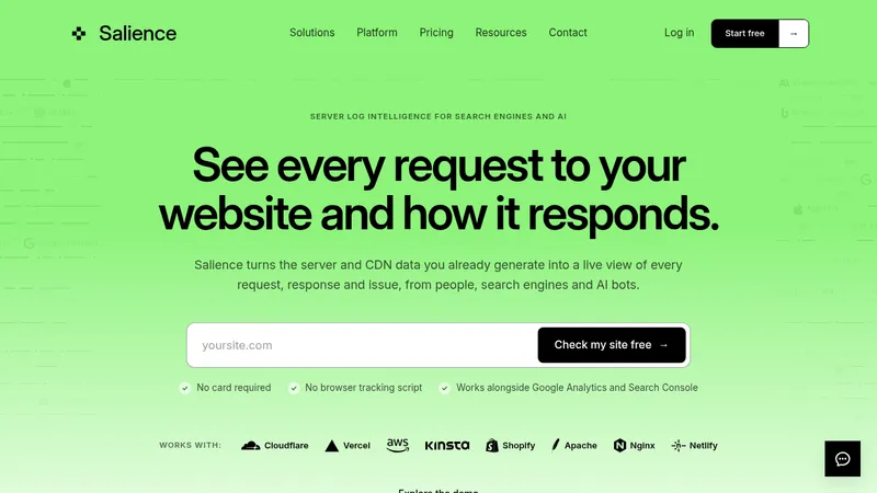

 Salience
Landing page · Analytics & data
Salience
Landing page · Analytics & data
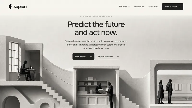

 Sapien
Landing page · Analytics & data
Sapien
Landing page · Analytics & data
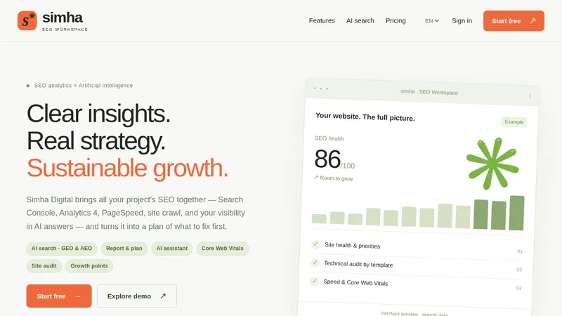

 Simha Digital
Landing page · Analytics & data
Simha Digital
Landing page · Analytics & data
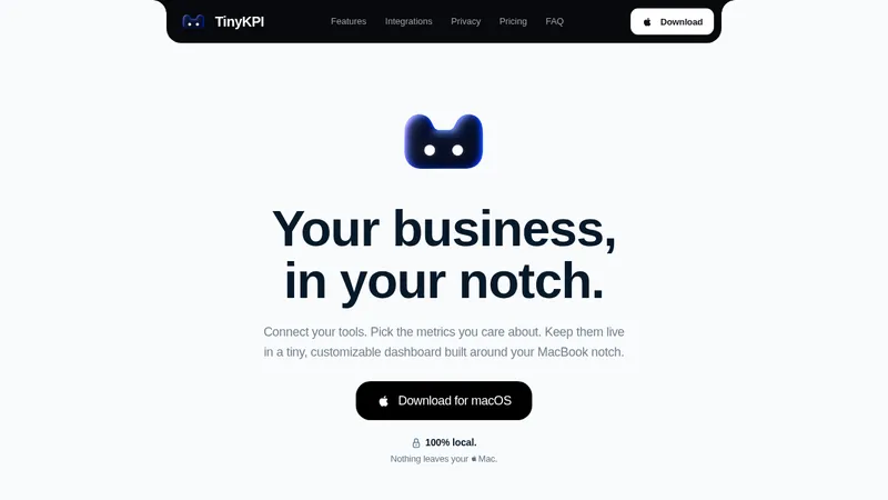

 TinyKPI
Landing page · Analytics & data
TinyKPI
Landing page · Analytics & data


 Basedash in Español Français & Português
Landing page · Analytics & data
Basedash in Español Français & Português
Landing page · Analytics & data


 AI Observability by OpenObserve
Landing page · Analytics & data
AI Observability by OpenObserve
Landing page · Analytics & data