kage
kage
deno.com

Design analysis
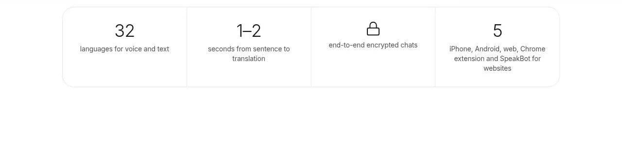
A compact pair of metric cards turns trust signals into an immediate visual proof point. Strong numerals, quiet labels, mint icon badges, and restrained borders keep the component credible, scannable, and easy to adapt to another product.
Prompt preview
## Reference images

Study these alongside the description below: hierarchy, rhythm, spacing, colour. Build for the product you are asked about, using this design language.

- Component: https://kage-design-assets.t3.tigrisfiles.io/components/deno-com/32c2f827-c733-4746-82ec-fc83a363518f-1789073869-11.webp
- Full page it was cut from: https://kage-design-assets.t3.tigrisfiles.io/screenshots/deno-com/32c2f827-c733-4746-82ec-fc83a363518f-1789073825-full.webp
- Component on Kage: https://kage.design/component/deno-stats-2

## Before you start
Ask the user what their product is, who it is for, and what visual brand it uses. Then apply the principles below to that product rather than reproducing the reference literally.

## Build this component
Create a compact social-proof statistics section with two horizontally arranged metric cards. Each card should communicate one high-value product milestone, such as adoption, usage, reliability, or community traction. Keep the section self-contained and suitable for placing near a hero, signup prompt, or trust statement.

## Design language

- **Layout and alignment:** Center the stats group within the page, using a two-column row on desktop. Give both cards equal width and align their contents horizontally: a circular icon badge on the left, followed by the metric and its label. Keep the group narrow enough to feel like a focused proof point rather than a full dashboard. On small screens, stack the cards vertically or allow a clean two-column layout only when each card remains comfortably readable.
- **Card sizing:** Use a flexible width around 300–340px per card, with a minimum height of roughly 80px. Maintain consistent card dimensions and equal internal padding of approximately 20–24px.
- **Typography hierarchy:** Make the metric the dominant element with a bold, near-black sans-serif at approximately 28–32px and tight line height. Place the supporting label directly below it in a regular 14–16px size with muted gray colour. Keep the metric and label left-aligned within the text area.
- **Icon treatment:** Use a simple, universally understandable line or solid icon inside a 44–48px circular badge. Use a bright mint or green fill, approximately `#5FF2A8` to `#6CF5B0`, with a dark icon around `#111111`. Choose icons that match the metric’s meaning, but keep them visually secondary to the number.
- **Colour:** Use a white or near-white page background such as `#FFFFFF` or `#FAFAFA`. Use `#111111` for primary text and `#626262` for labels. The accent should be fresh mint green, used only for the icon badge or a small brand cue.
- **Borders and radius:** Give each card a subtle 1px border around `#E5E5E5`, a soft shadow such as `0 2px 5px rgba(0,0,0,0.08)`, and a medium rounded corner radius around 14–16px. Avoid heavy elevation or glossy effects.
- **Spacing:** Keep 12–16px between the icon and text. Use 16–20px between cards. Leave generous whitespace around the component so the numbers feel intentional and premium.
- **Interaction:** These cards are primarily informational and do not need to behave like buttons. If a metric links to a public report or community page, make the entire card keyboard-focusable with a subtle border or shadow change on hover and focus; otherwise keep the hover state static.
- **Accessibility and responsiveness:** Use semantic text for every number and label, provide meaningful accessible names for icons, preserve strong contrast, and ensure the layout works from narrow mobile widths through large desktop screens.

## Never
- Never copy the reference’s logos, product names, statistics, labels, or exact copy.
- Never use the reference’s mascot, illustration, photography, or any other imagery.
- Never recreate the component as a pixel-for-pixel clone; adapt the content, iconography, accent colour, and dimensions to the user’s product and brand.
- Never use decorative elements that compete with the metrics or make the cards resemble a dense analytics dashboard.