kage
mylens.ai
Design analysis
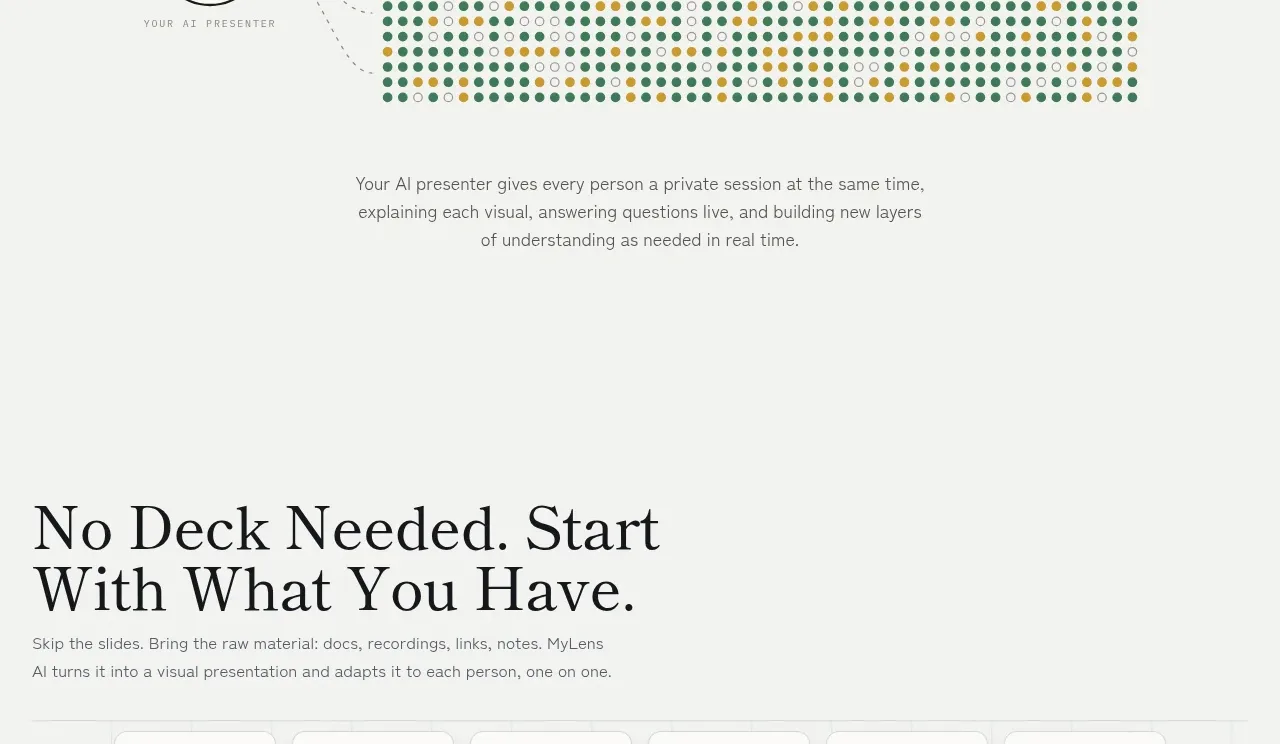
A centered numeric lockup makes the product's multiplication effect unmistakable. A single-person symbol, directional arrow, and large audience figure are supported by one clarifying sentence.
Prompt preview
## Reference images

Study these alongside the description below: hierarchy, rhythm, spacing, colour. Build for the product you are asked about, using this design language.

- Component: https://kage-design-assets.t3.tigrisfiles.io/components/mylens/1ccd9fd0-0589-4047-afdb-6c3bf2f362f8-1792389755-9.webp
- Full page it was cut from: https://kage-design-assets.t3.tigrisfiles.io/screenshots/mylens/1ccd9fd0-0589-4047-afdb-6c3bf2f362f8-1792389647544-full.webp
- Component on Kage: https://kage.design/component/mylens-stats-3

## Before you start
Ask what transformation your product creates and what scale claim can be stated accurately. Express it as a simple, memorable numeric lockup.

Create a centered statistics band with a small source symbol and number, a bold directional arrow, and a larger destination symbol and number. Put a concise explanatory sentence below. Keep the composition typographic and spacious, with no extra chart furniture.

Design rules:
- Use an off-white background and large dark serif numerals around 76–100px; use a blue arrow around `#4389e8`.
- Put symbols in pale rounded-square containers with thin gray borders and 10–14px radius.
- Use one short centered sans-serif explanation at 13–15px with muted gray colour.
- Align the numeric baseline precisely and preserve generous vertical padding.
- On mobile, reduce the numeral size while retaining a horizontal relationship if it fits; otherwise stack clearly.

Never:
- Never use logos, product names, copy, illustrations, or imagery from the reference.
- Never reuse the exact numeric claim or iconography.
- Never present an unqualified vanity metric as proof of value.