 kage
kage
diewithme.co

Design analysis
The closing CTA uses a tinted band, paired product visuals, a reassuring headline, and repeated primary/secondary actions to make the next step unmistakable.
Prompt preview
## Reference images

Study these alongside the description below: hierarchy, rhythm, spacing, colour. Build for the product you are asked about, using this design language.

- Component: https://kage-design-assets.t3.tigrisfiles.io/components/die-with-me/0682dea9-a1fa-4b17-a0ad-c426bf87c57f-1789711345-9.webp
- Full page it was cut from: https://kage-design-assets.t3.tigrisfiles.io/screenshots/die-with-me/0682dea9-a1fa-4b17-a0ad-c426bf87c57f-1789711263535-full.webp
- Component on Kage: https://kage.design/component/die-with-cta

## Before you start
Ask what single action the user's product most wants visitors to take and what reassurance would remove friction. Build a fresh closing CTA around that answer.

Create a full-width closing call-to-action band with a pale sage background around `#eef0df`. Center a small paired visual or abstract symbol above a concise, bold headline, followed by one reassuring sentence and two horizontally aligned buttons. Use a dark charcoal primary button (`#202421`) and a light outlined secondary button, both around 10px radius and 44px high. Keep the band visually distinct from the rest of the page while preserving the site's warm, understated tone. Include clear hover, focus, disabled, and mobile stacked states. The CTA should feel like a friendly conclusion, not a sales-heavy banner.

Never: use logos, product names, copy, illustrations, or imagery from the reference.
More components
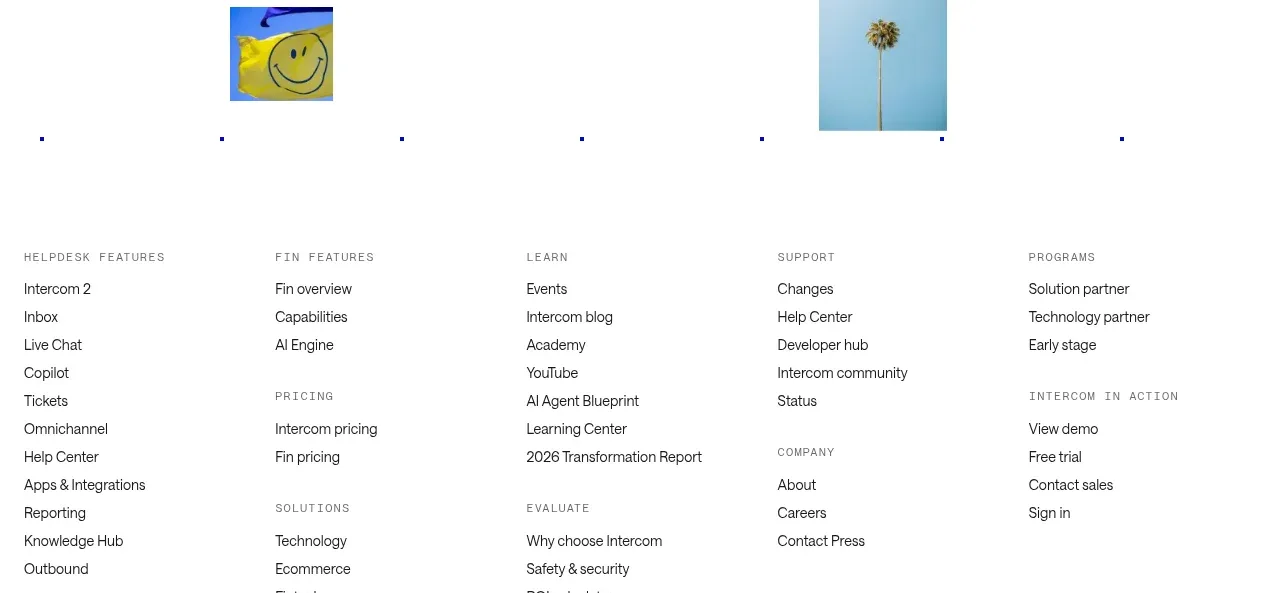
 Final customer experience call to action
intercom.com · Call to action
Final customer experience call to action
intercom.com · Call to action
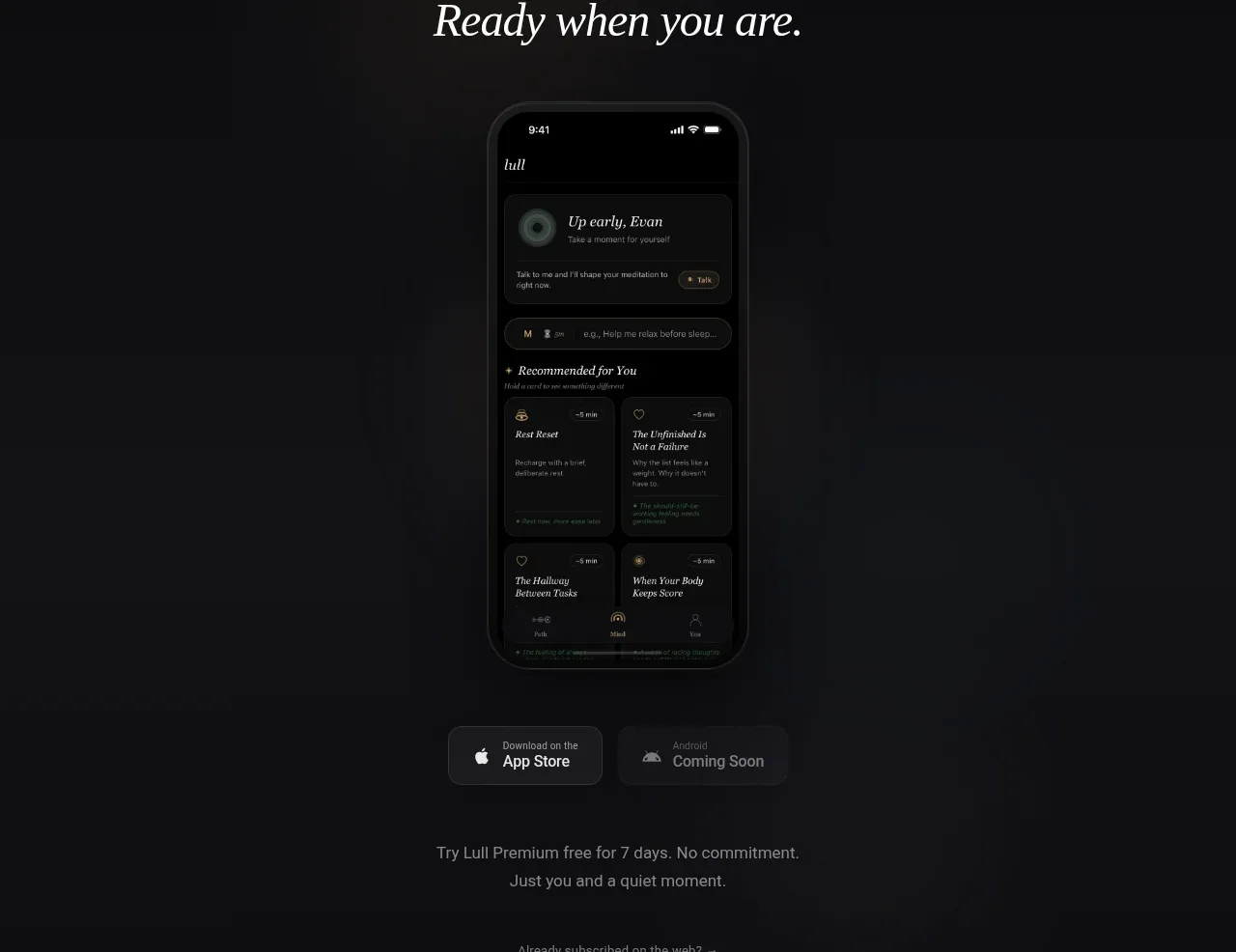
 App download conversion
Lull · Call to action
App download conversion
Lull · Call to action

 Centered final call to action
ApplySeed · Call to action
Centered final call to action
ApplySeed · Call to action
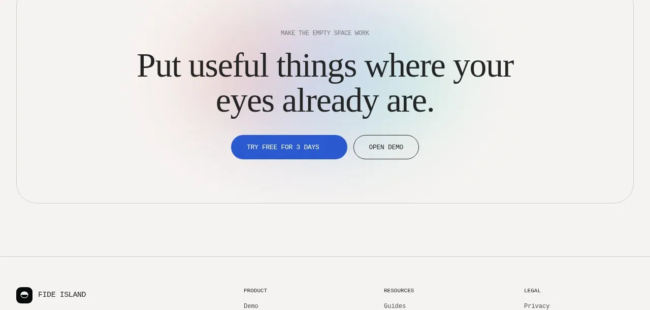
F
Final conversion call to action
Fide Island · Call to action

 Inline conversion banner
QAgent · Call to action
Inline conversion banner
QAgent · Call to action
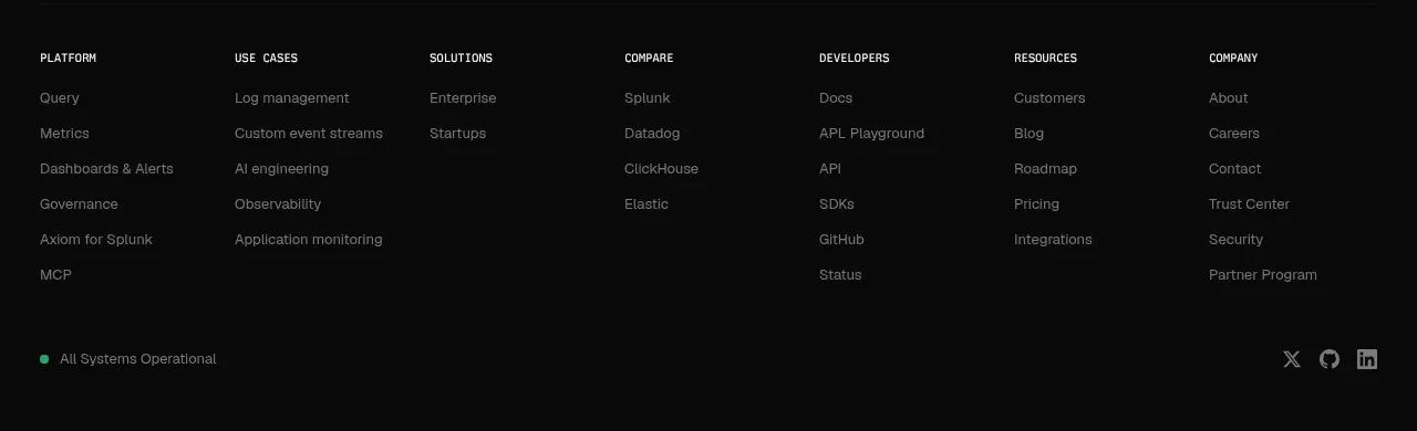
A
Final signup call to action
Axiom · Call to action