kage
kage
diewithme.co
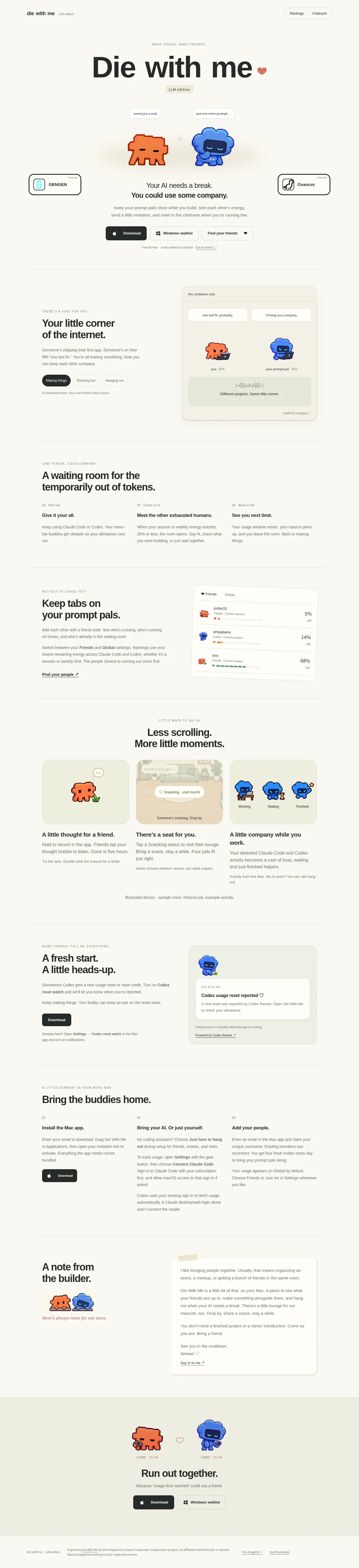
Design analysis
A long-form, warm off-white landing page pairs oversized black typography with tiny uppercase eyebrow labels, restrained borders, and pixel-art Claude/Codex mascots. The hero is centered and airy, then the page settles into alternating two-column feature sections, three-column explanatory grids, and framed product demos; generous separators keep the narrative legible while pale green panels and orange/blue character accents add warmth. Near the bottom, the builder note becomes more personal and card-like before a full-width tinted closing CTA returns to the mascots and download actions.
Prompt preview
## Reference images

Study these alongside the description below: hierarchy, rhythm, spacing, colour. Build for the product you are asked about, using this design language.

- Full page: https://kage-design-assets.t3.tigrisfiles.io/screenshots/die-with-me/0682dea9-a1fa-4b17-a0ad-c426bf87c57f-1789711263535-full.webp
- Above the fold: https://kage-design-assets.t3.tigrisfiles.io/screenshots/die-with-me/0682dea9-a1fa-4b17-a0ad-c426bf87c57f-1789711261134.webp
- Design on Kage: https://kage.design/designs/die-with-landing-page

## Before you start
Ask the user what they are building, who it is for, and what brand assets they already have (name, colours, type, imagery, and any existing UI patterns). Wait for their answers before designing. Apply the system below to their product, not to the reference product.

## Page structure
1. **Slim header** — Place a small text brand at the upper left, with a tiny edition/status note beside it; put two compact outlined navigation buttons at the upper right.
2. **Centered hero** — Use a small spaced eyebrow, an oversized one-line headline, a compact edition pill, and a centered pixel-art or product illustration pair. Add small floating speech/status chips around the visual.
3. **Hero value statement and actions** — Follow the artwork with a short two-line statement, a muted explanatory paragraph, a dark primary download button, light secondary buttons, and a small availability/invite note.
4. **Feature section: shared corner** — After a thin horizontal rule, use a two-column layout with the text and segmented tabs on the left and a large rounded pale demo panel on the right. Show multiple characters or states inside the panel to make the social/product concept tangible.
5. **Three-step usage section** — Introduce a new theme with an eyebrow and large heading, then use three equal columns labelled 01–03. Each column has a bold mini-heading and a concise explanatory paragraph.
6. **Feature section: friends and rankings** — Alternate the composition: text and an underlined link on the left, a slightly tilted framed list/status UI on the right. Use rows, avatars, percentages, and small state indicators to demonstrate the product.
7. **Three-card moments section** — Center the eyebrow and heading, then arrange three equal illustrated cards in one row. Place the descriptive heading and paragraph below each image, followed by a small footnote line below the group.
8. **Feature section: reset notification** — Return to a two-column layout with explanatory copy and a download button on the left, and a pale green notification/demo card on the right. Include a small mascot, notification hierarchy, and supporting link text.
9. **Three-step setup section** — Use an eyebrow and heading followed by three equal columns explaining installation, connecting the AI/tools, and adding people. Include a dark download button in the first column and keep the body copy compact.
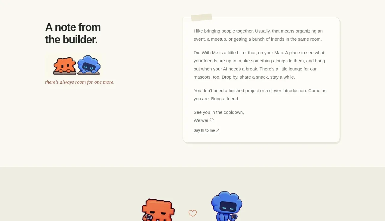
10. **Builder note section** — Split the section between a large heading and small character illustration on the left and a taped-note style letter card on the right. Make this section warmer and more personal than the product feature sections.
11. **Closing CTA band** — Switch to a full-width very pale green/beige background. Center the two mascots, tiny usage labels, a short closing headline, supporting line, and paired download/waitlist buttons.
12. **Footer** — End with a quiet multi-part footer: small brand/legal text at left, attribution/disclaimer copy in the middle, and small utility links at right.

## Design language
- Build hierarchy through contrast in scale rather than decoration: use tiny uppercase, widely tracked eyebrows; bold near-black section headings; and short, readable body paragraphs in a smaller gray size.
- Keep the overall canvas warm and nearly paper-like, around `#F8F7F1` or `#FAF9F4`, with text around `#202321` and secondary copy around `#777871`.
- Use pale sage and cream product surfaces around `#EEF0E2` and `#F3F1E5`; reserve saturated colour for small character illustrations, especially coral-orange near `#F4774F` and electric blue near `#3C7DF5`.
- Let the page rhythm change deliberately: a spacious centered hero, alternating image/text feature bands, denser three-column explanation bands, then a personal note and a simplified full-width CTA.
- Use a restrained max-width container with generous vertical padding and thin horizontal rules in a low-contrast gray-beige. Align most sections to a consistent left edge even when the hero is centered.
- Treat demos as artifacts: use rounded rectangular frames, faint borders, soft inset or low shadows, and occasional slight rotation. Keep corners moderately rounded, roughly 10–16px; avoid glossy glass effects.
- Pair a clean modern sans-serif for all UI and body copy with optional small editorial/italic accents only in personal notes or captions. Scale hero text dramatically, section headings large and tight, and body copy to comfortable short measure.
- Make buttons compact and tactile: near-black filled primary actions with white text, light outlined secondary actions, small radius, and clear platform icons only when they are meaningful to the user’s product.
- Use pixel-art, mascot, or similarly compact illustrative elements as punctuation rather than as full backgrounds. Give illustrations room to breathe and place them inside quiet panels.
- Keep interaction understated: buttons may lift or darken slightly on hover, cards can shift a few pixels or sharpen their shadow, and tabs/status chips can change contrast. Avoid continuous animation; if mascots move, use subtle idle motion.
- Use small labels, percentages, avatars, status bars, and notification cards to make abstract product behaviour concrete without increasing visual density everywhere.

## Never
- Do not copy the reference’s logos, wordmarks, product name, tagline, copy, mascots, pixel characters, illustrations, photography, or icon set.
- Do not present the result as Die With Me or imply affiliation with it.
- Do not reproduce the reference’s exact text, artwork, screenshots, sponsor marks, or brand-specific UI. Create original content, assets, and product examples for the user’s product.
Components from this page
All components
 Minimal utility navigation
Die With Me · Navigation
Minimal utility navigation
Die With Me · Navigation
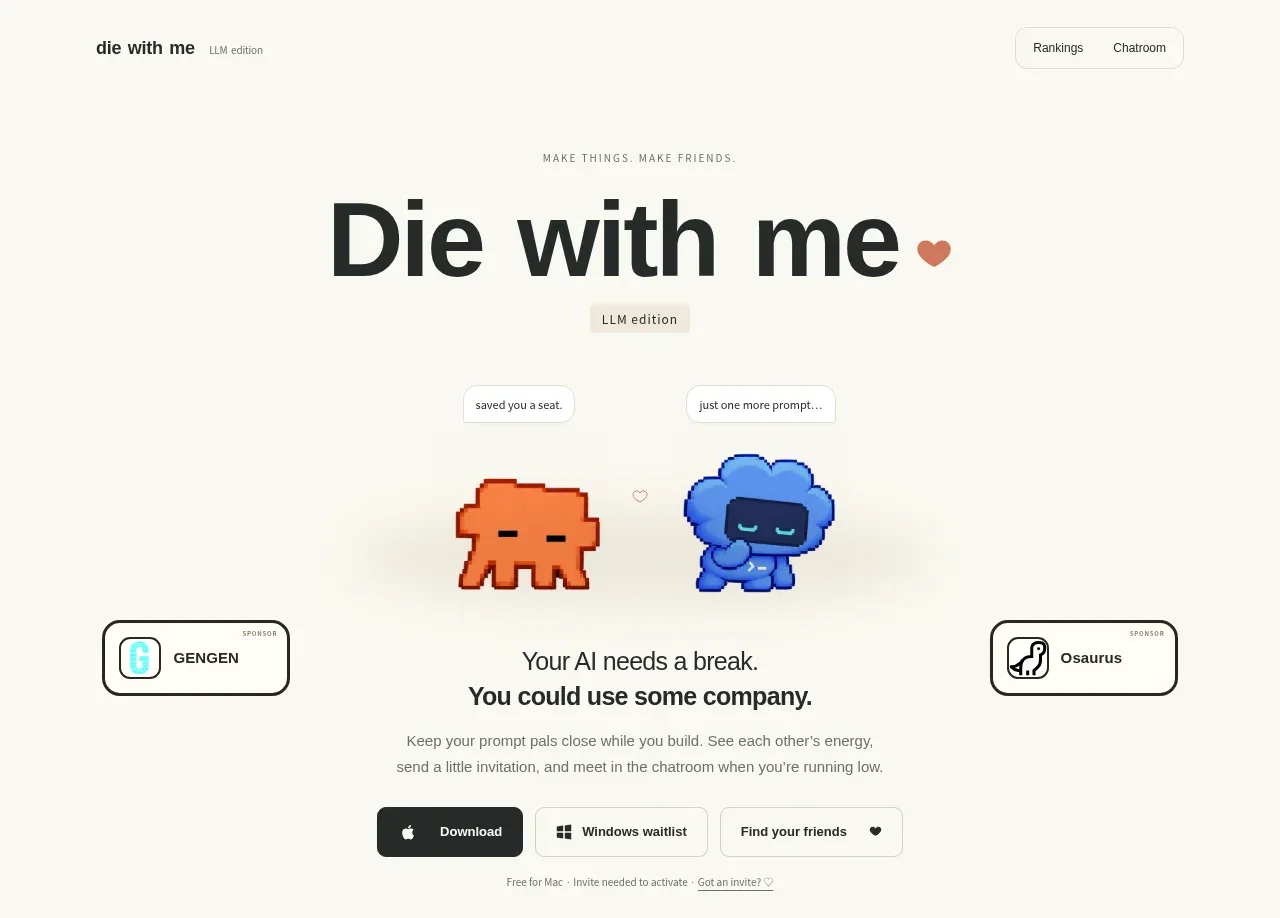 Playful product hero
Die With Me · Hero
Playful product hero
Die With Me · Hero
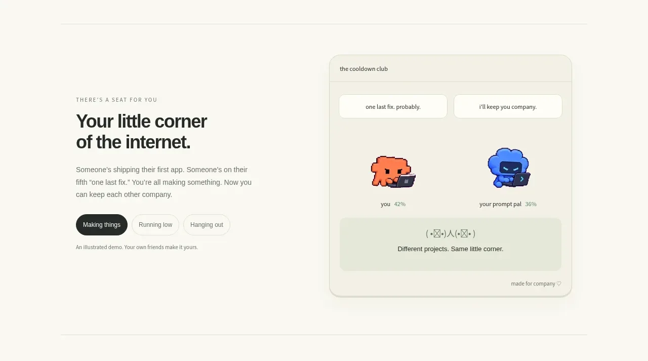 Product world introduction
Die With Me · Feature grid
Product world introduction
Die With Me · Feature grid
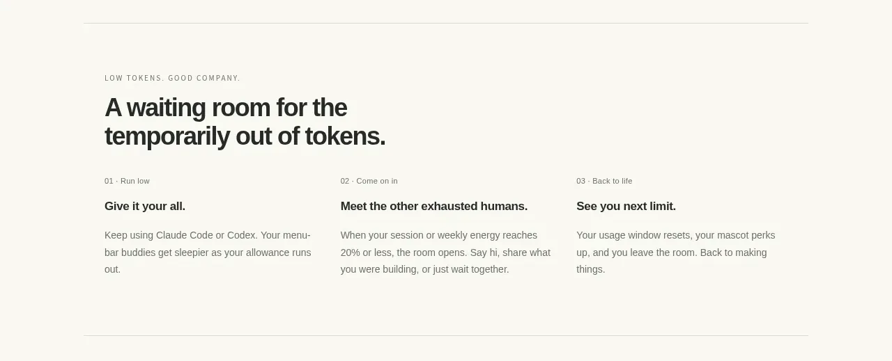 Three-step usage journey
Die With Me · Feature grid
Three-step usage journey
Die With Me · Feature grid
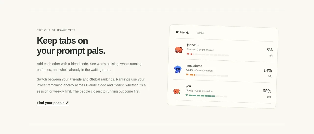 Social ranking and connections
Die With Me · Feature grid
Social ranking and connections
Die With Me · Feature grid
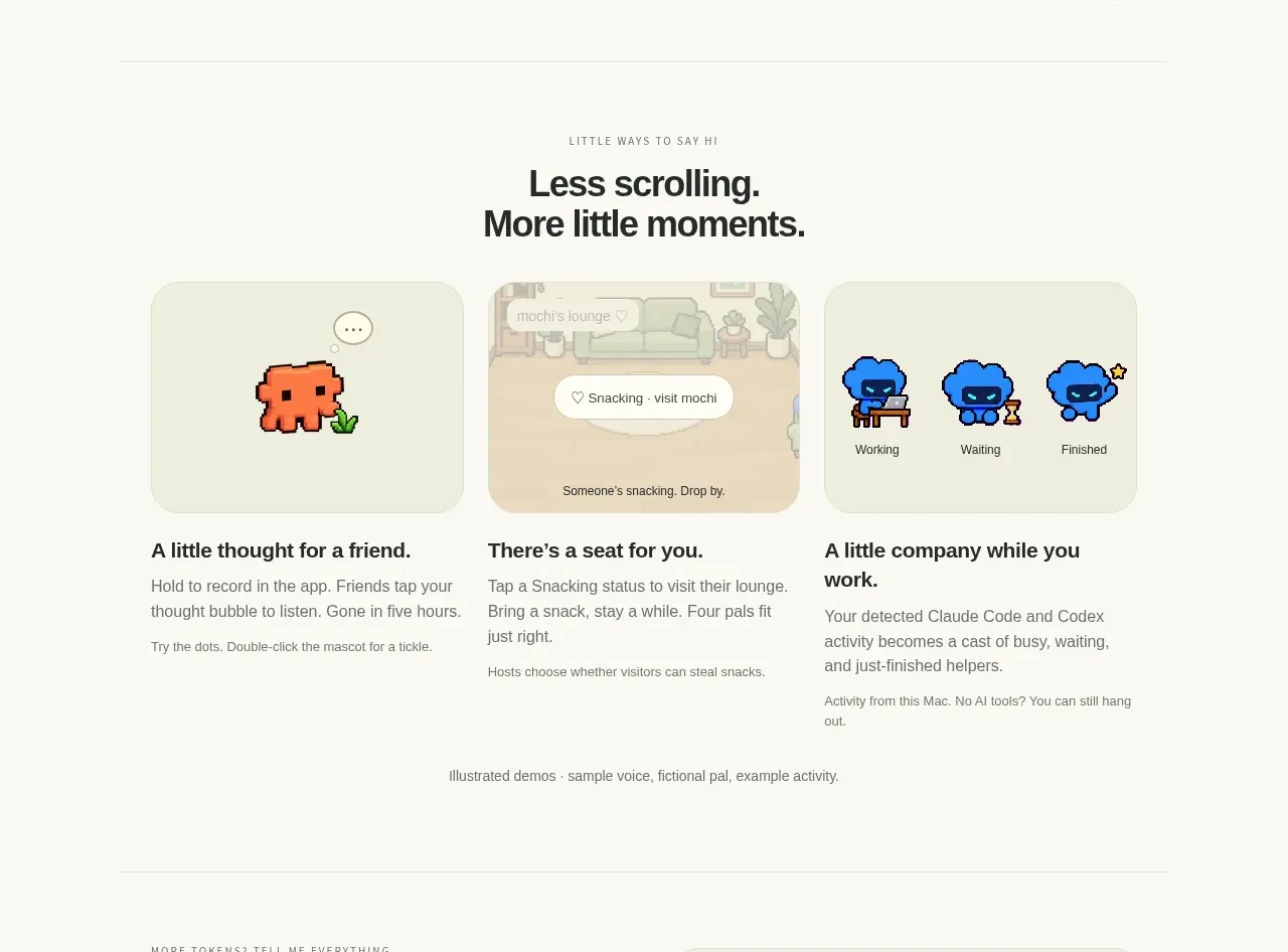 Small moments feature gallery
Die With Me · Feature grid
Small moments feature gallery
Die With Me · Feature grid
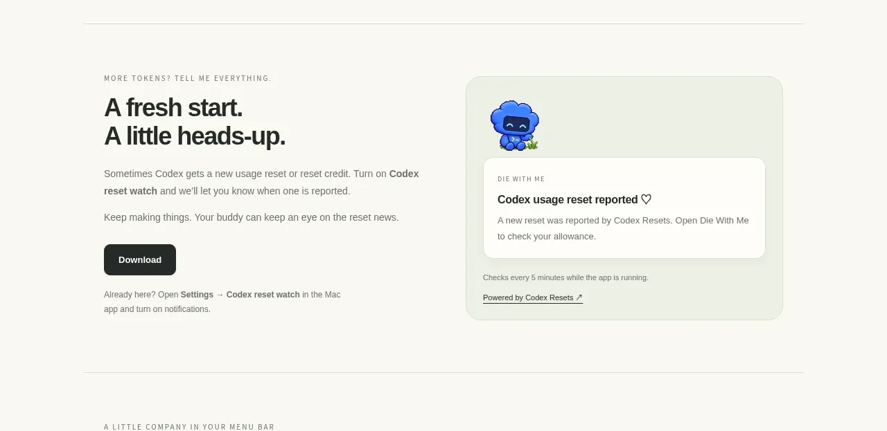 Usage reset notification
Die With Me · Feature grid
Usage reset notification
Die With Me · Feature grid
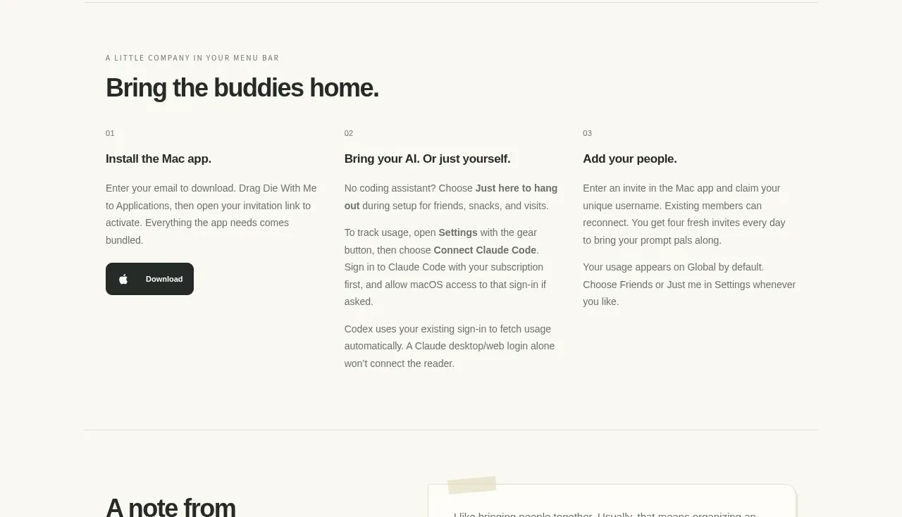 Getting started steps
Die With Me · Feature grid
Getting started steps
Die With Me · Feature grid
 Builder note
Die With Me · Testimonials
Builder note
Die With Me · Testimonials
 Final run-together call to action
Die With Me · Call to action
Final run-together call to action
Die With Me · Call to action
 Quiet informational footer
Die With Me · Footer
Quiet informational footer
Die With Me · Footer