kage
kage
diewithme.co

Design analysis
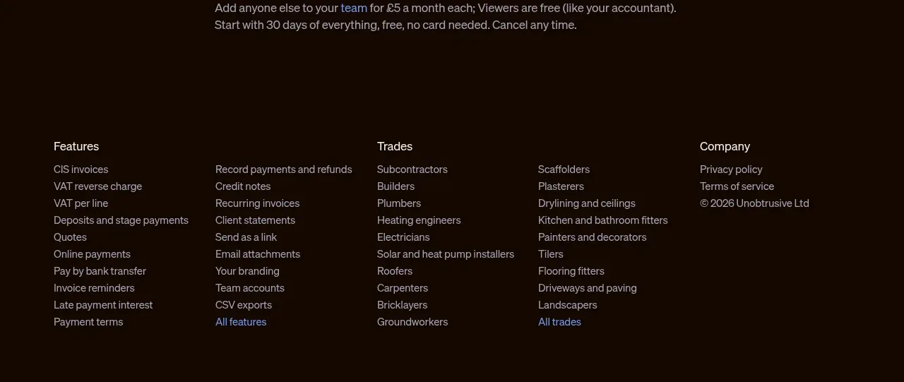
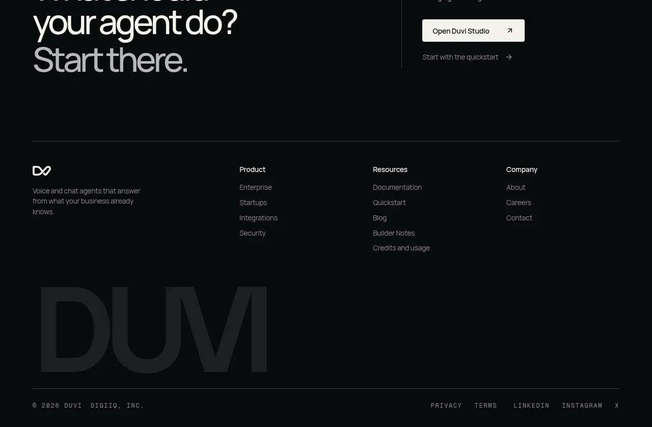
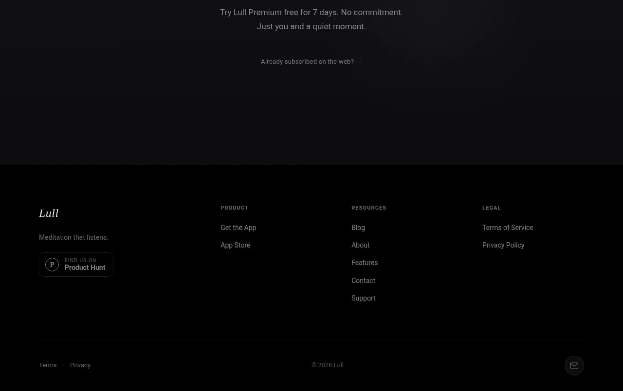
A low-contrast footer closes the page with a small project statement and a few understated utility links, preserving the site's editorial calm.
Prompt preview
## Reference images

Study these alongside the description below: hierarchy, rhythm, spacing, colour. Build for the product you are asked about, using this design language.

- Component: https://kage-design-assets.t3.tigrisfiles.io/components/die-with-me/0682dea9-a1fa-4b17-a0ad-c426bf87c57f-1789711345-10.webp
- Full page it was cut from: https://kage-design-assets.t3.tigrisfiles.io/screenshots/die-with-me/0682dea9-a1fa-4b17-a0ad-c426bf87c57f-1789711263535-full.webp
- Component on Kage: https://kage.design/component/die-with-footer

## Before you start
Ask what legal, attribution, support, and social links the user's product needs. Apply the visual rules below with original content.

Build a compact footer on a warm off-white surface, separated from the CTA by whitespace or a very subtle top border. Use a centered max-width row with small muted text, a short product/organization statement on the left, and a few utility links on the right. Use font size 11–12px, generous line-height, gray text around `#777970`, and underlined or clearly differentiated links. Keep the footer responsive: wrap into a clean vertical or two-row layout on mobile. Preserve accessible contrast and visible keyboard focus states.

Never: use logos, product names, copy, illustrations, or imagery from the reference.