kage
kage
dockfix.app
Design analysis
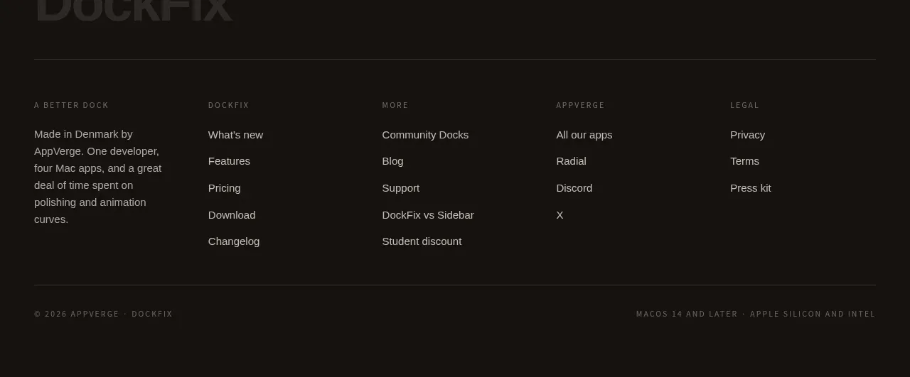
The footer uses a dark field, an oversized subdued wordmark area, several compact navigation columns, and a final legal row to close the page quietly.
Prompt preview
## Reference images

Study these alongside the description below: hierarchy, rhythm, spacing, colour. Build for the product you are asked about, using this design language.

- Component: https://kage-design-assets.t3.tigrisfiles.io/components/dockfix-5-0/2c092be4-cae6-431a-8bc7-3fef5352fd95-1789279443-6.webp
- Full page it was cut from: https://kage-design-assets.t3.tigrisfiles.io/screenshots/dockfix-5-0/2c092be4-cae6-431a-8bc7-3fef5352fd95-1789279362906-full.webp
- Component on Kage: https://kage.design/component/dockfix-5-0-footer

## Before you start
Ask what the user's product is, who it is for, and what their brand personality and visual identity are. Apply the principles below to that product rather than reproducing this reference.

Create a dark footer matching the closing CTA (#151311), with a muted oversized brand lockup or text treatment near the top left, followed by four or five compact link columns such as product, resources, support, social, and legal. Use a constrained 1120px container, small 11–13px link text in warm gray (#aaa39a), 24–32px column gaps, and a thin divider before the bottom legal row. Keep headings uppercase and letter-spaced, links comfortably spaced for touch, and include a tiny copyright/version line plus secondary legal metadata. Collapse columns into a readable two-column or accordion layout on mobile.

Never: use logos, product names, copy, illustrations or imagery from the reference.