 kage
kage

Design analysis
The page opens on a full-bleed, desaturated moorland photograph with the product name set as an oversized black grotesque wordmark, then alternates cream editorial sections, black inverted bands and further photo bands as chapter breaks down the page. Hierarchy is built almost entirely from extreme type-scale jumps, huge whitespace tracts and 1px hairline rules — the feature list is a two-column label/description table with no cards — while a single coral-red accent is reserved for buttons, the price and one eyebrow label. A black four-column stats strip, a photo band carrying a three-line manifesto statement, and a giant low-contrast footer watermark give the page its rhythm; the long cream tracts are scroll-animation stages for product demos.
Prompt preview
## Reference images

Study these alongside the description below: hierarchy, rhythm, spacing, colour. Build for the product you are asked about, using this design language.

- Full page: https://kage-design-assets.t3.tigrisfiles.io/screenshots/dockfix-5-0/2c092be4-cae6-431a-8bc7-3fef5352fd95-1789279362906-full.webp
- Above the fold: https://kage-design-assets.t3.tigrisfiles.io/screenshots/dockfix-5-0/2c092be4-cae6-431a-8bc7-3fef5352fd95-1789279359014.webp
- Design on Kage: https://kage.design/designs/dockfix-5-0-landing-page

## Before you start
Ask the user what they are building, who it is for, and what brand assets they already have (product name, colours, typeface, any photography). Wait for the answers before writing any code. Everything below is applied to their product, not to the reference site.

## Page structure
- **Announcement bar**: a slim full-width black strip with one centred 10px uppercase, letter-spaced message and a dismiss × at the right edge.
- **Header**: a floating, slightly translucent bar over the hero — logo left, five centred text links, and on the right a small price tag plus one filled red pill CTA. No border, no background block beyond a subtle blur.
- **Hero**: a full-viewport, desaturated warm landscape photograph (misty hills, muted browns and greys). A tiny uppercase eyebrow with a dot marker sits above the product name, which is set as gigantic display type (10–14vw, tight tracking, near-black) overlapping the photo. A small uppercase "SCROLL" hint sits at the bottom.
- **Scroll story**: a long cream-coloured section of sticky, scroll-triggered product scenes. The large empty vertical space is intentional — demos animate in as the user scrolls, so budget generous viewport heights for each scene.
- **Stats band**: a full-width black strip with four equal columns, each a big number (48–64px) over a tiny uppercase label — rating, review count, price, performance metric.
- **Announcement split**: left column has a small red uppercase eyebrow and a huge two-word headline; right column holds one paragraph with a 2px red left rule. Roughly 60/40 split.
- **Feature list**: a heading, then six rows separated by 1px hairlines. Each row is a two-column table — bold 16–18px label left, muted 14px description right — no cards, no icons, no shadows.
- **Statement band**: a second full-bleed landscape photograph with a centred, three-line bold statement set large in ink colour.
- **Second scroll story**: another cream zone of scroll-animated product scenes, mirroring the first.
- **Closing CTA**: a black full-width section — tiny uppercase eyebrow, huge centred three-line headline, one short paragraph, then two buttons (filled red pill + ghost pill with the price) and a tiny uppercase meta line about system requirements.
- **Footer**: a giant low-contrast watermark of the product name (8–10vw, near-black on black), then five link columns with 10px uppercase column headers, and a bottom legal row with copyright and platform requirements.

## Design language
- **Palette**: warm cream background ≈ #EFECE5; ink/near-black ≈ #141414 for headings; muted warm grey ≈ #8A857D for body text; hairlines ≈ #DCD7CE; one coral-red accent ≈ #E8492F; pure white text on black bands. Nothing else — resist adding a second accent.
- **Type**: a single neo-grotesque family throughout (Helvetica-like). Display sizes are enormous with tight tracking (−0.02em) and line-height ~1.0; section headlines 48–72px; list labels 16–18px semibold; body 14–16px at 1.6; all eyebrows and meta lines 10–11px uppercase with +0.12–0.2em tracking. Hierarchy comes from scale jumps, not weight changes alone.
- **Structure without boxes**: use 1px hairline rules and whitespace instead of cards, borders and shadows. Almost no rounded containers outside buttons. Sections are separated by background changes (cream → black → photo → cream) rather than dividers.
- **Rhythm down the page**: alternate ultra-low density (huge whitespace, one giant headline per viewport) with medium-density editorial blocks (stats, feature table). Full-bleed photograph bands act as chapter breaks and each carries at most one statement.
- **Photography**: desaturated, warm-toned landscape imagery used full-bleed; text overlaps it in ink or white with enough contrast, never in boxes.
- **Accent discipline**: red appears only on actionable or announcing elements — CTA pill, price tag, one eyebrow label, one left rule on a pull paragraph. Everything else stays monochrome.
- **Buttons**: fully-rounded pills, filled red with white text for the primary action; ghost variant with a 1px light border for the secondary; generous horizontal padding.
- **Motion**: scroll-driven reveals and sticky scenes in the long cream sections; a tiny uppercase scroll hint in the hero; keep transitions to opacity/transform, slow and calm.
- **Inverted sections**: reuse the exact same type scale and spacing on black bands, swapping ink for white — the stats strip and closing CTA must feel like the same system, just inverted.

## Never
- Never reuse the DockFix name, wordmark, logo, nav labels, taglines, stats copy, feature descriptions or footer text from the reference.
- Never reuse its landscape photography or icon set; choose imagery that fits the user's own brand.
- Never present the result as DockFix or mention the reference product anywhere in the output.
Components from this page
All components
 Announcement bar and primary navigation
DockFix 5.0 · Navigation
Announcement bar and primary navigation
DockFix 5.0 · Navigation
 Editorial product hero
DockFix 5.0 · Hero
Editorial product hero
DockFix 5.0 · Hero
 Proof and purchase stats strip
DockFix 5.0 · Stats
Proof and purchase stats strip
DockFix 5.0 · Stats
 Announcement and what’s-new feature list
DockFix 5.0 · Feature grid
Announcement and what’s-new feature list
DockFix 5.0 · Feature grid
 Statement image banner
DockFix 5.0 · Banner
Statement image banner
DockFix 5.0 · Banner
 Dark conversion call to action
DockFix 5.0 · Call to action
Dark conversion call to action
DockFix 5.0 · Call to action
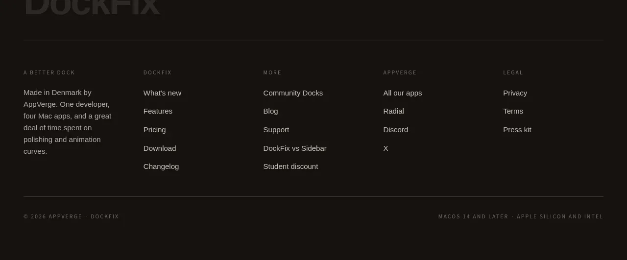 Multi-column product footer
DockFix 5.0 · Footer
Multi-column product footer
DockFix 5.0 · Footer


