 kage
kage
dreamscalelabs.com

Design analysis
A terse closing message sits opposite a final blue button, creating a low-friction conversion moment before the footer. The large whitespace and divider make it feel like a deliberate ending rather than another feature block.
Prompt preview
## Reference images

Study these alongside the description below: hierarchy, rhythm, spacing, colour. Build for the product you are asked about, using this design language.

- Component: https://kage-design-assets.t3.tigrisfiles.io/components/dreamscale-labs/1997d92a-7a08-4743-8853-9f94160e0cd8-1792130788-7.webp
- Full page it was cut from: https://kage-design-assets.t3.tigrisfiles.io/screenshots/dreamscale-labs/1997d92a-7a08-4743-8853-9f94160e0cd8-1792130510959-full.webp
- Component on Kage: https://kage.design/component/dreamscale-labs-cta

## Before you start
Ask the user what final action matters most—trial, demo, contact, signup, or documentation—and what concise promise should accompany it. Apply that to this layout.

Build a slim closing CTA band with a short 26–30px heading on the left and one prominent deep-blue button on the right. Keep the container wide, vertically centered, and separated from adjacent content by thin #e2e5e6 rules. Use a white background, near-black #151719 heading, and #0757ad button with white text, 4px radius, and a clear hover state. Avoid adding a paragraph unless it materially improves conversion. On mobile, stack the button under the heading and align it to the left or full width.

Never: use logos, product names, copy, illustrations, or imagery from the reference.
More components

 Final conversion banner
CrewTower Mod for Claude Code · Call to action
Final conversion banner
CrewTower Mod for Claude Code · Call to action
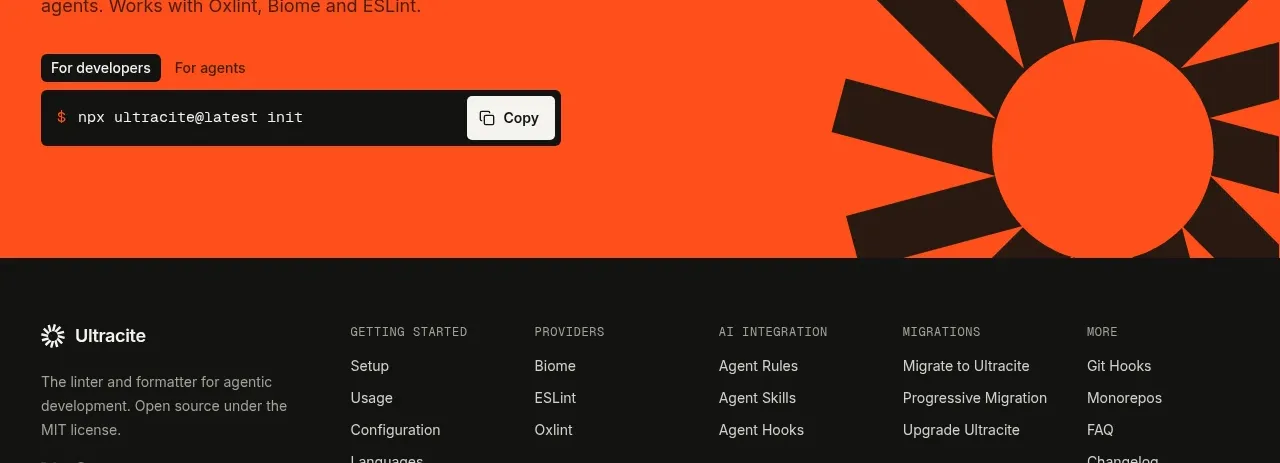
 Bright installation call to action
Ultracite v8 · Call to action
Bright installation call to action
Ultracite v8 · Call to action
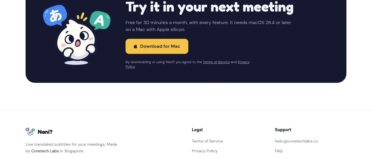
 Download call to action
NANI??? · Call to action
Download call to action
NANI??? · Call to action
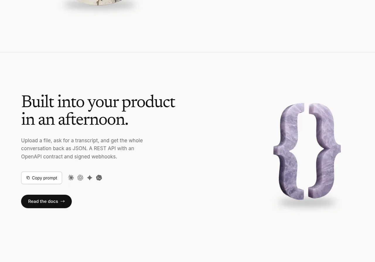
 Developer integration CTA
Maybloc · Call to action
Developer integration CTA
Maybloc · Call to action
 Marble-backed final CTA
Maybloc · Call to action
Marble-backed final CTA
Maybloc · Call to action
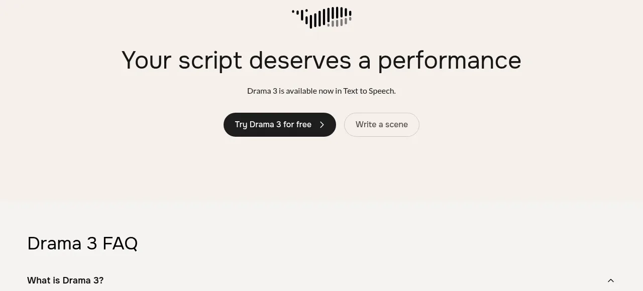
 Centered conversion call to action
Fish Audio Drama 3 · Call to action
Centered conversion call to action
Fish Audio Drama 3 · Call to action