kage
kage
dreamscalelabs.com
Design analysis
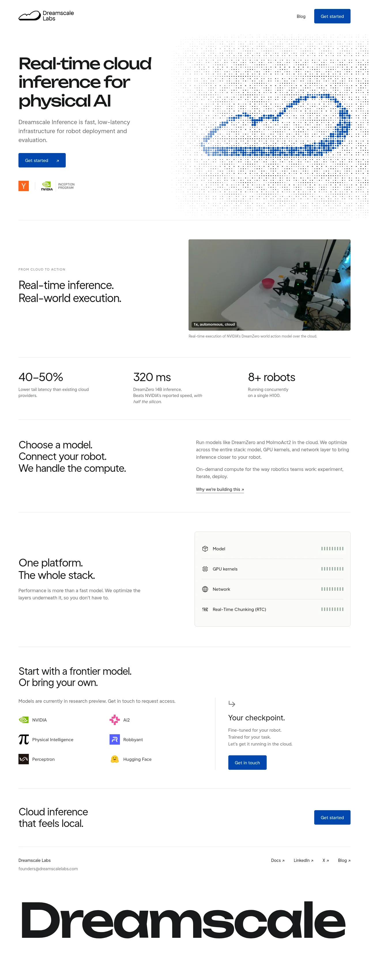
A near-monochrome white page for a robot-inference cloud, structured almost entirely by 1px hairline rules rather than coloured blocks, with a single royal-blue accent reserved for CTAs and the halftone dithered cloud artwork in the hero. Rhythm changes deliberately down the page: image-led demo section, then a large-numeral stats band, then alternating text splits, a gray stack-list card, a partner logo grid, and a bare CTA band, all closed by an oversized bottom-cropped 'Dreamscale' wordmark. Type is one bold geometric sans stepped through three sizes (hero, section, stat numerals) against small gray body copy, with uppercase tracked eyebrows for labelling.
Prompt preview
## Reference images

Study these alongside the description below: hierarchy, rhythm, spacing, colour. Build for the product you are asked about, using this design language.

- Full page: https://kage-design-assets.t3.tigrisfiles.io/screenshots/dreamscale-labs/1997d92a-7a08-4743-8853-9f94160e0cd8-1792130510959-full.webp
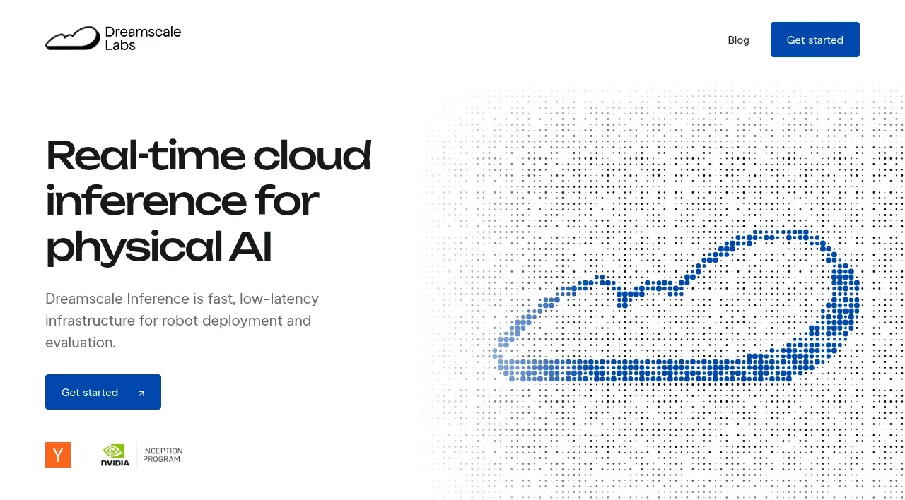
- Above the fold: https://kage-design-assets.t3.tigrisfiles.io/screenshots/dreamscale-labs/1997d92a-7a08-4743-8853-9f94160e0cd8-1792130509343.webp
- Design on Kage: https://kage.design/designs/dreamscale-labs-landing-page

## Before you start
Ask the user what they are building, who it is for, and what brand assets they already have (name, colours, type). Wait for the answers before writing any code. Everything below is a design language to apply to *their* product, not a template of the reference.

## Page structure
Build a single marketing page on a white background, sectioned by hairline rules:

1. **Top nav** — very slim, no border. Logo/wordmark left; one text link and one solid accent-colour CTA button right.
2. **Hero** — two columns. Left: a 3-line bold headline, one short gray paragraph, a solid accent CTA button with a ↗ arrow glyph, and a row of 2–3 small partner/credential badges. Right: a full-height decorative graphic rendered as a halftone/dithered dot field (dark noise dots with the product's key shape traced in accent-coloured dots). White space is generous around it.
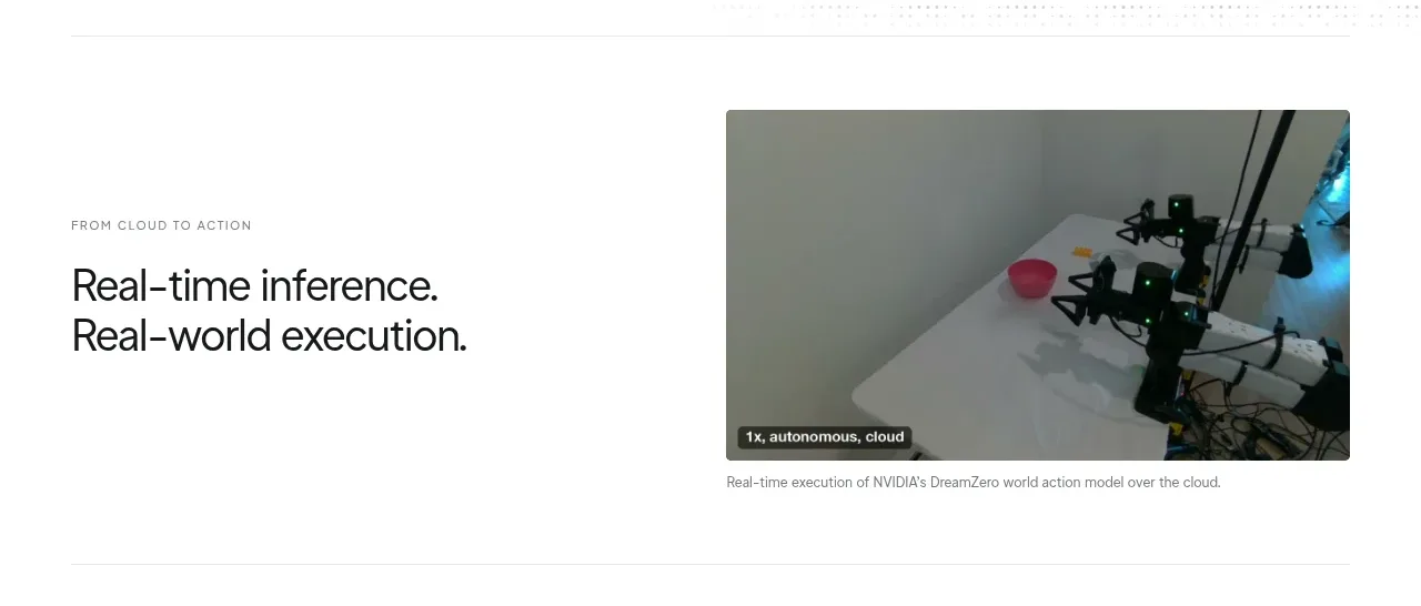
3. **Proof/demo section** — left: an uppercase letter-spaced eyebrow label, then a two-line section headline. Right: a real product artefact (photo or looping video) with a tiny dark status chip overlaid in its corner and a one-line gray caption beneath it.
4. **Stats band** — three equal columns between two hairline rules: a large numeral or metric each (e.g. percentages, milliseconds, counts) with a 1–2 line small gray caption below.
5. **Pitch split** — left: a big three-sentence statement, one sentence per line. Right: two short body paragraphs plus an underlined text link with ↗.
6. **Capability/stack section** — left: a two-line headline plus a one-sentence gray paragraph. Right: a light-gray rounded card containing 4 stacked rows separated by hairlines, each row: small line icon, label, and a small segmented meter/dot-bar aligned right.
7. **Partners/compatibility section** — headline plus a small italic-gray eligibility note. Left: a 2-column list of six partner entries (small colourful icon + name). Right, after a vertical hairline: a mini-panel with a small arrow icon, a headline, three short lines of copy, and a solid accent button.
8. **Closing CTA band** — one two-line headline left, one solid accent button right, framed by hairlines above and below.
9. **Footer** — company name and contact email left, four ↗ links right, all small. Below, a giant display wordmark spanning the full page width, cropped at the bottom edge.

## Design language
- **One accent on a monochrome page.** Background `#ffffff`, text `#111112`, secondary text `#6b6f76`, hairlines `#e6e6e4`, card fill `#f5f5f3`. Accent is a single royal blue, roughly `#1d4ed8`–`#2456e0`, used *only* for CTA buttons, the halftone hero artwork, and nothing else. Partner icons may keep their own colours inside small rounded squares/tiles.
- **Hairlines do the structural work.** No coloured section backgrounds, no shadows. Sections are separated by 1px full-width rules; inside cards, hairlines separate rows. Whitespace (80–140px vertical padding per section) provides the rest of the separation.
- **Rhythm alternates by content type, not decoration.** Going down the page: graphic hero → image evidence → big numbers → big statement → itemised list → logo grid → bare CTA. Each section changes the texture so the page never repeats itself.
- **Type: one geometric sans, three sizes.** Display headlines bold, tight leading, minimal letter-spacing: hero ~56–64px, section headlines ~36–40px, stat numerals ~40px. Body and captions 14–15px in the gray tone. Eyebrow labels 11px uppercase with +0.08em tracking. Never mix a second display typeface.
- **Line-splitting headlines.** Compose big headlines as short stacked lines (two or three), often with sentence-per-line phrasing. Keep them left-aligned; let the right column of each split hold the quiet explanatory text.
- **Buttons.** Solid accent fill, white 14px text, ~6px radius, no shadow, slightly darker shade on hover; a ↗ glyph inside CTAs and after outbound links. Secondary actions are underlined gray text links, not outlined buttons.
- **Status/overlay details.** Over media, use a tiny dark pill with 12px white lowercase text (e.g. a live status). Use small 16–18px 1.5px-stroke line icons next to list labels.
- **Metrics as typography.** Present numbers as large plain numerals with small gray captions — no chart junk, no icon boxes, no progress bars in the stats band.
- **Decorative art with restraint.** Any hero graphic should be generative/dot-based (halftone, dither, ASCII) in the two core colours only, sitting inside the whitespace rather than breaking the grid.
- **Motion.** Near-none: hover darkening on buttons, underline on links, optionally a slow looping demo video in the proof section. No parallax, no scroll-triggered animation.
- **Editorial footer flourish.** End the page with the brand name set enormous in the display face across the full width, bottom-cropped — the only oversized gesture on an otherwise disciplined page.

## Never
- Do not use the Dreamscale Labs name, wordmark, cloud logo, or the giant footer wordmark text from the reference.
- Do not reproduce the halftone cloud artwork itself; create an original dot-based graphic of the user's own subject matter.
- Do not copy any copy text, headlines, stats, partner names, or the YC/NVIDIA/Inception badges; only use badges the user actually has.
- Do not present the result as Dreamscale Labs or imply affiliation.
Components from this page
All components
 Minimal cloud-lab navigation
Dreamscale Labs · Navigation
Minimal cloud-lab navigation
Dreamscale Labs · Navigation
 Real-time cloud inference hero
Dreamscale Labs · Hero
Real-time cloud inference hero
Dreamscale Labs · Hero
 Cloud-to-action feature introduction
Dreamscale Labs · Feature grid
Cloud-to-action feature introduction
Dreamscale Labs · Feature grid
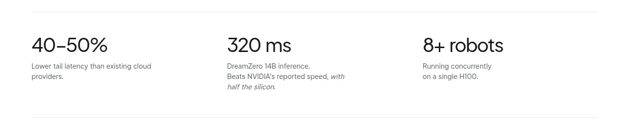 Inference performance metrics
Dreamscale Labs · Stats
Inference performance metrics
Dreamscale Labs · Stats
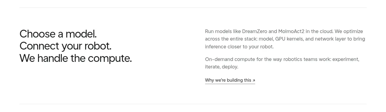 Product positioning statement
Dreamscale Labs · Feature grid
Product positioning statement
Dreamscale Labs · Feature grid
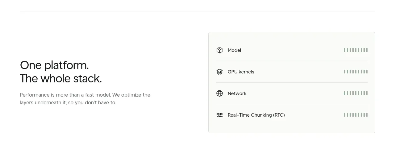 Unified platform stack card
Dreamscale Labs · Card
Unified platform stack card
Dreamscale Labs · Card
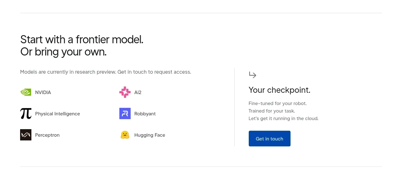 Model ecosystem and access section
Dreamscale Labs · Feature grid
Model ecosystem and access section
Dreamscale Labs · Feature grid
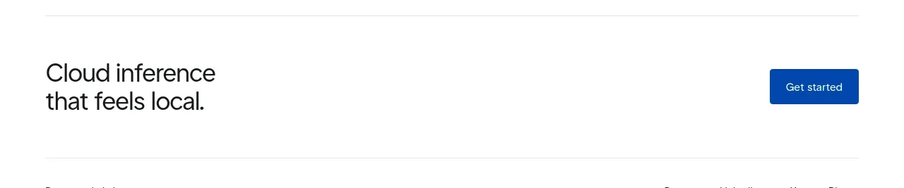 Closing product call to action
Dreamscale Labs · Call to action
Closing product call to action
Dreamscale Labs · Call to action
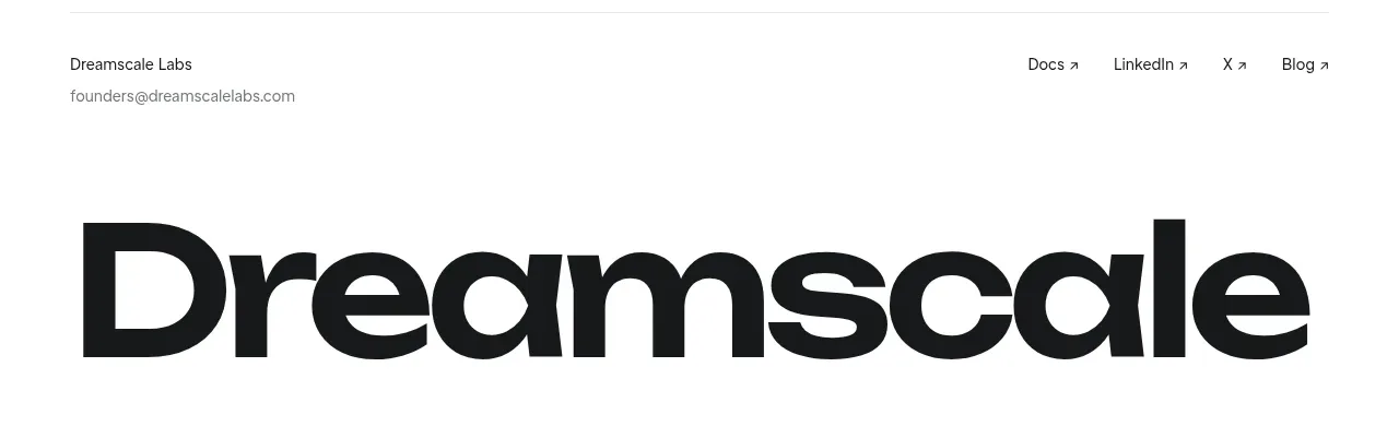 Minimal oversized brand footer
Dreamscale Labs · Footer
Minimal oversized brand footer
Dreamscale Labs · Footer