kage
kage
dreamscalelabs.com

Design analysis
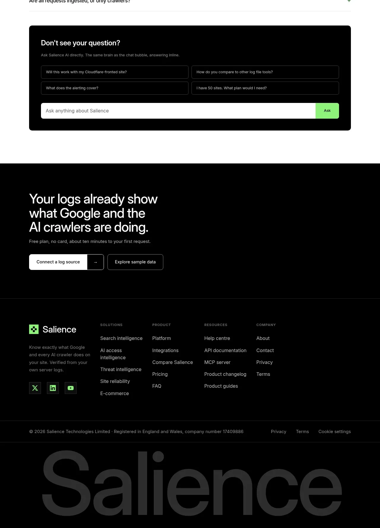
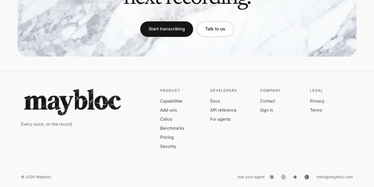
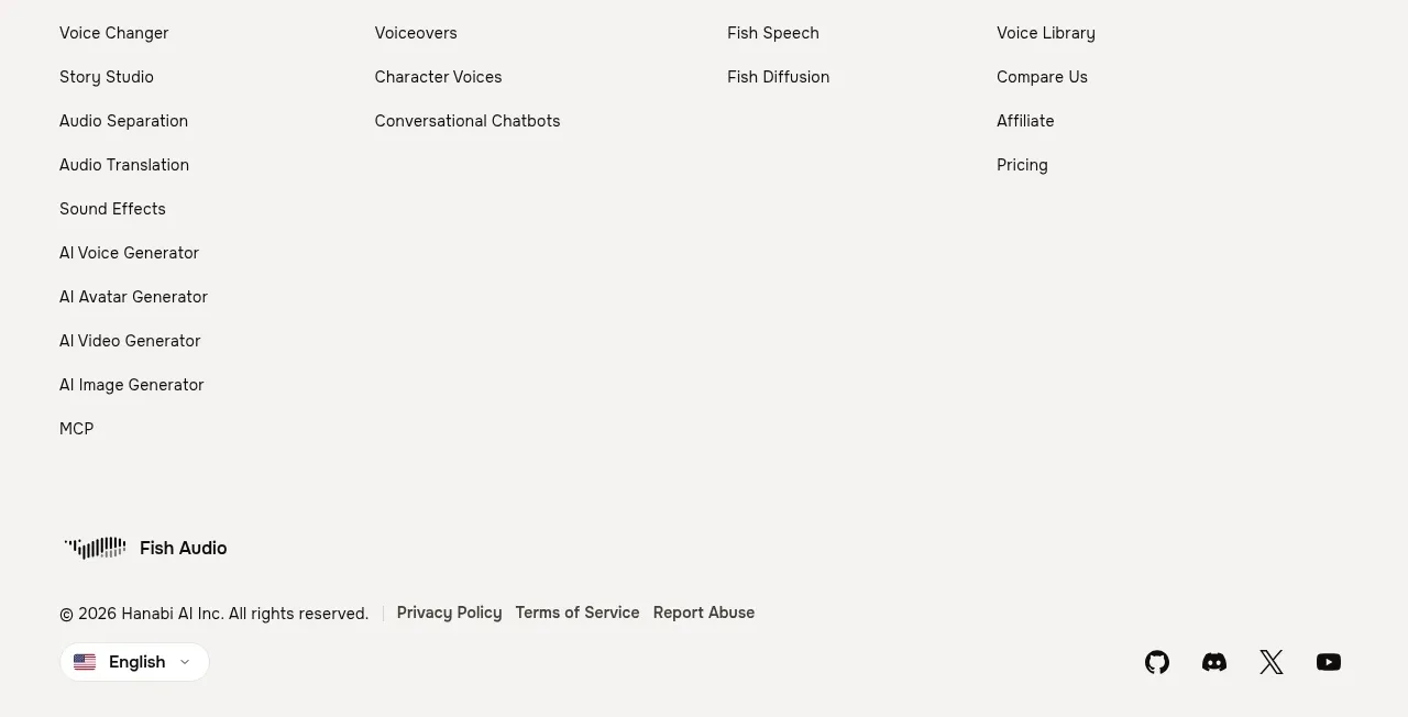
The footer begins with a small contact identity and a compact link row, then ends with oversized typographic brand treatment. It feels editorial and memorable while keeping utility links easy to find.
Prompt preview
## Reference images

Study these alongside the description below: hierarchy, rhythm, spacing, colour. Build for the product you are asked about, using this design language.

- Component: https://kage-design-assets.t3.tigrisfiles.io/components/dreamscale-labs/1997d92a-7a08-4743-8853-9f94160e0cd8-1792130788-8.webp
- Full page it was cut from: https://kage-design-assets.t3.tigrisfiles.io/screenshots/dreamscale-labs/1997d92a-7a08-4743-8853-9f94160e0cd8-1792130510959-full.webp
- Component on Kage: https://kage.design/component/dreamscale-labs-footer

## Before you start
Ask the user what legal, contact, social, and documentation links their product needs, plus whether a large typographic brand signature suits their identity. Then build an original footer.

Create a clean footer with a top utility row: a small organization/contact block on the left and a compact set of documentation, social, or company links on the right. Use 11–13px text, gray secondary information, generous horizontal alignment, and a thin #e3e5e5 top divider. Below, reserve the lower area for an oversized typographic brand signature or abstract wordmark treatment using the user’s own brand name only; use a bold sans-serif, very large scale, tight tracking, near-black #111315, and clip responsively if needed. Keep the background white and provide visible keyboard focus states. On mobile, stack utility links and scale the signature down.

Never: use logos, product names, copy, illustrations, or imagery from the reference.