 kage
kage
dreamscalelabs.com
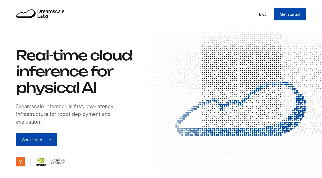
Design analysis
The hero uses a two-column split: a large black statement and supporting copy on the left, with a blue dotted cloud visualization on the right. A blue CTA and small partner marks create credibility beneath the message without competing with it.
Prompt preview
## Reference images

Study these alongside the description below: hierarchy, rhythm, spacing, colour. Build for the product you are asked about, using this design language.

- Component: https://kage-design-assets.t3.tigrisfiles.io/components/dreamscale-labs/1997d92a-7a08-4743-8853-9f94160e0cd8-1792130787-1.webp
- Full page it was cut from: https://kage-design-assets.t3.tigrisfiles.io/screenshots/dreamscale-labs/1997d92a-7a08-4743-8853-9f94160e0cd8-1792130510959-full.webp
- Component on Kage: https://kage.design/component/dreamscale-labs-hero

## Before you start
Ask the user what their product is, what outcome it promises, and what visual brand language they want. Then adapt this composition to their product.

Create a spacious two-column hero directly below the navigation. Keep the left column around 42% wide with a very large, tightly set headline of 42–48px, 0.96–1.02 line-height, and near-black #111315 text. Place readable supporting copy below it in 16px gray #697078 with a restrained max width, followed by a filled deep-blue CTA around #0757ad with white text and a small directional affordance. Use the right column for an abstract product-relevant technical visual—such as a generative dot field, diagram, or data texture—rather than a stock image. Let it softly fade into the white background and use blue accents from #0b57ad through #8aaed8. Add a small row of partner, ecosystem, or trust indicators below the CTA with subdued scale. Keep generous whitespace, a thin bottom divider, and responsive stacking on small screens.

Never: use logos, product names, copy, illustrations, or imagery from the reference.
More components
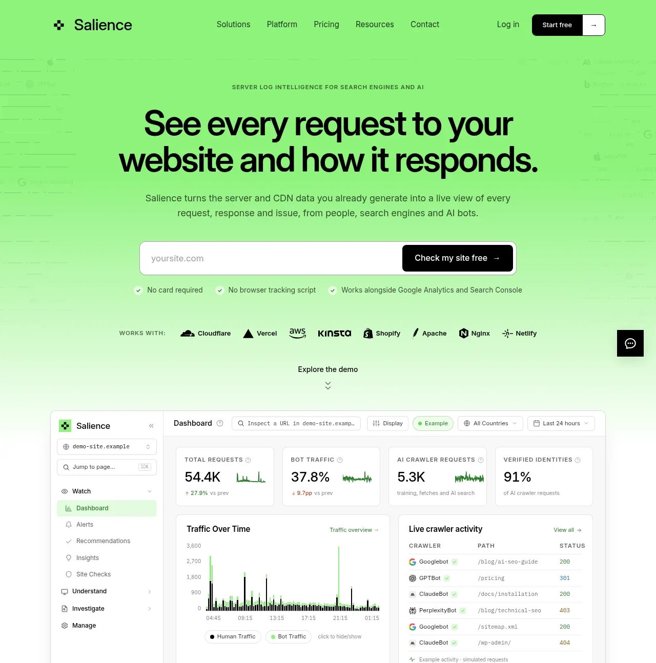
 Product promise and site checker hero
Salience · Hero
Product promise and site checker hero
Salience · Hero
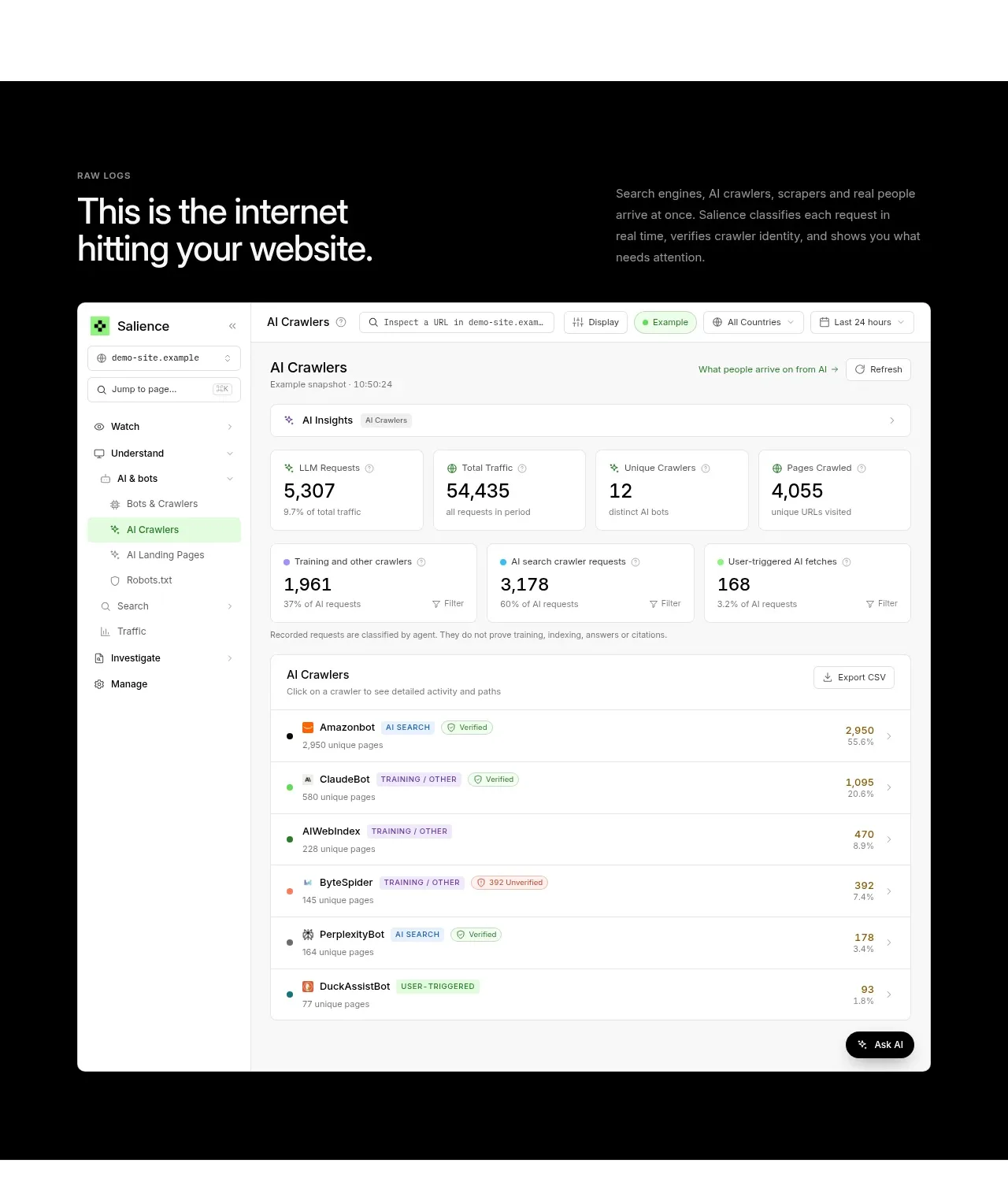 Raw activity dashboard showcase
Salience · Hero
Raw activity dashboard showcase
Salience · Hero
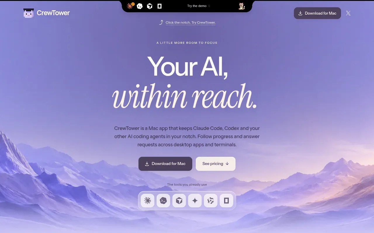
 Focus-oriented hero
CrewTower Mod for Claude Code · Hero
Focus-oriented hero
CrewTower Mod for Claude Code · Hero
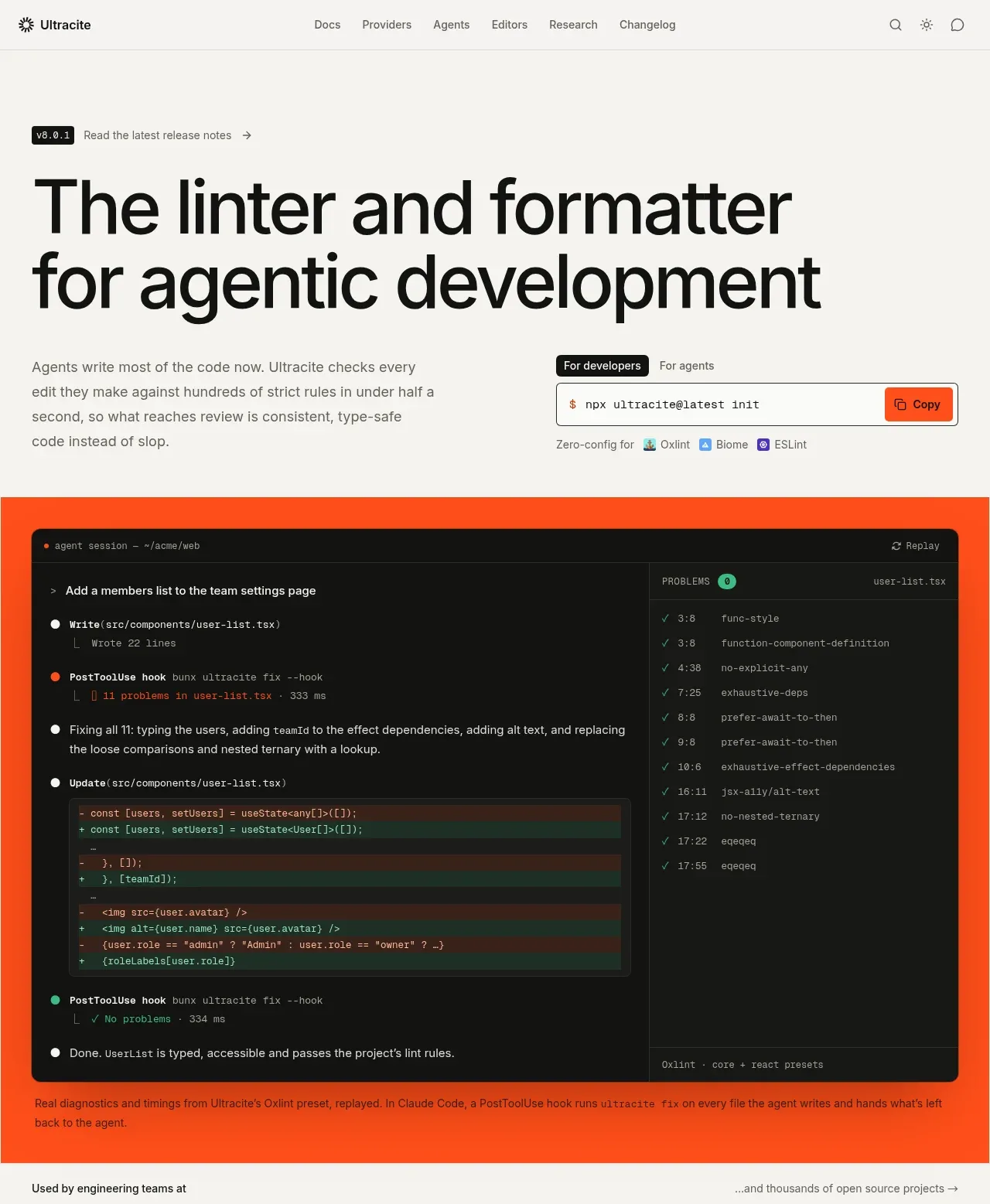
 Agentic development hero with live terminal preview
Ultracite v8 · Hero
Agentic development hero with live terminal preview
Ultracite v8 · Hero
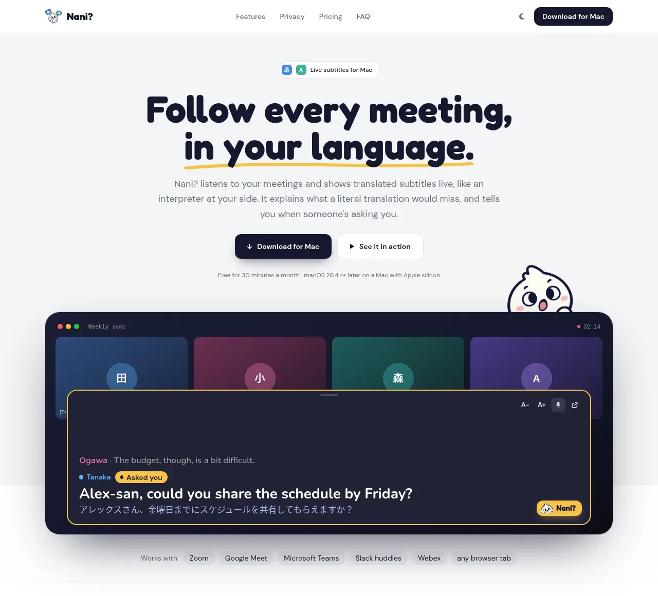
 Translation meeting hero
NANI??? · Hero
Translation meeting hero
NANI??? · Hero
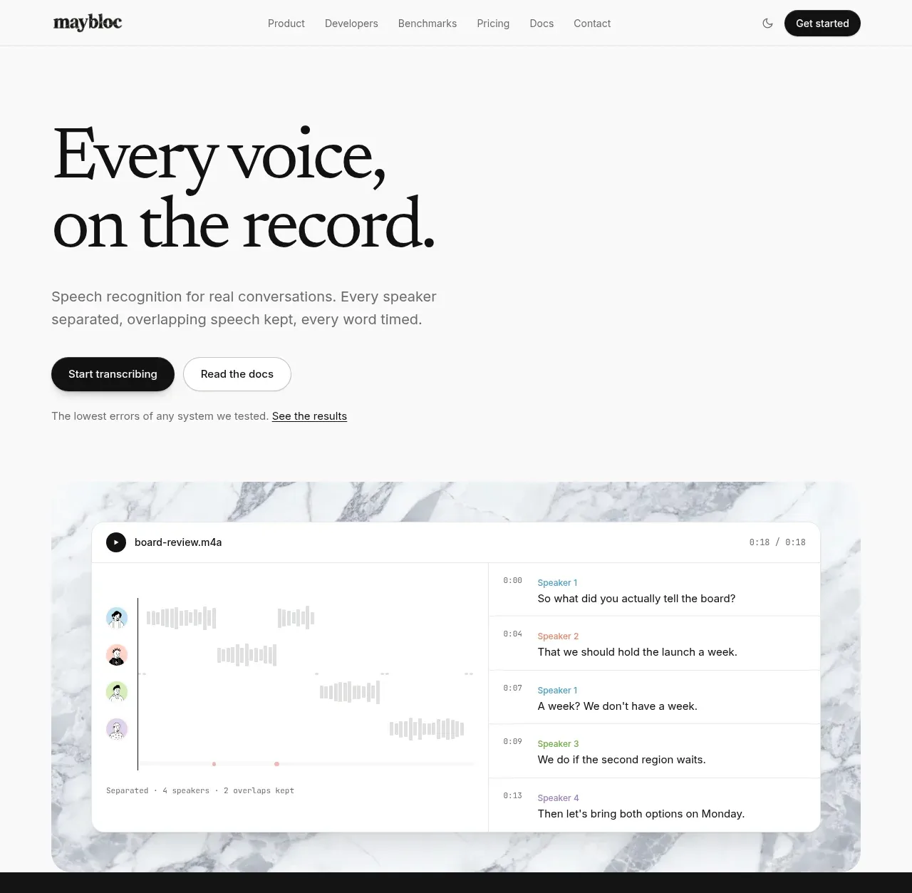
 Editorial speech transcription hero
Maybloc · Hero
Editorial speech transcription hero
Maybloc · Hero