kage
kage
duvi.ai
Design analysis
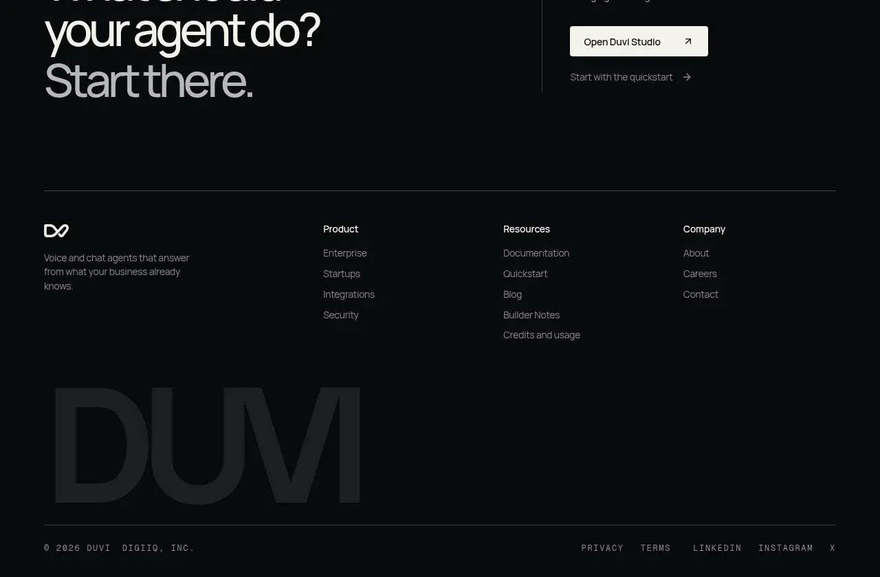
The closing area first presents a large invitation to begin, then resolves into a sparse multi-column footer with a watermark-like wordmark and legal/social links. It ends the page with strong typography and ample dark space.
Prompt preview
## Reference images

Study these alongside the description below: hierarchy, rhythm, spacing, colour. Build for the product you are asked about, using this design language.

- Component: https://kage-design-assets.t3.tigrisfiles.io/components/duvi/fdecc34f-2fb4-47cd-8615-09e917d211ca-1789884154-11.webp
- Full page it was cut from: https://kage-design-assets.t3.tigrisfiles.io/screenshots/duvi/fdecc34f-2fb4-47cd-8615-09e917d211ca-1789884106277-full.webp
- Component on Kage: https://kage.design/component/duvi-footer

## Before you start
Ask what the user's product, audience, and brand are, then apply these principles to that product rather than reproducing the reference.

Build a dark closing section combining a CTA and footer. At the top, use a two-column CTA: an oversized multiline invitation on the left with the final line in muted gray, and concise supporting copy plus a high-contrast primary button on the right. Add a thin divider before the footer navigation. The footer should contain a small brand mark and short descriptor at left, three or four link columns with small headings, and a very large low-opacity typographic watermark behind or below the links. Finish with a bottom divider and a tiny legal/social row. Use #080a0b, #f1f2ed, #858b8d, #2b3031, and a pale button #f1f1eb; keep radii around 6–10px and use 12–14px link text. Preserve generous vertical rhythm and make columns stack cleanly on mobile.

Never use logos, product names, copy, illustrations, or imagery from the reference.