kage
kage
duvi.ai

Design analysis
A long-form dark landing page uses oversized, tightly set sans-serif headlines and sparse monospace-style eyebrow labels to create an editorial product narrative. The hero combines a line-drawn car scene, a builder conversation card, and a floating call-to-action; below it, the rhythm shifts through logo proof, large product screenshots, three operational use cases, integrations, testimonials, a pale article strip, and a restrained footer. White and cool gray type dominate, with electric blue reserved for emphasis, active states, and one testimonial card; hairline borders, near-black panels, and very limited corner radius keep the interface technical and controlled.
Prompt preview
## Reference images

Study these alongside the description below: hierarchy, rhythm, spacing, colour. Build for the product you are asked about, using this design language.

- Full page: https://kage-design-assets.t3.tigrisfiles.io/screenshots/duvi/fdecc34f-2fb4-47cd-8615-09e917d211ca-1789884106277-full.webp
- Above the fold: https://kage-design-assets.t3.tigrisfiles.io/screenshots/duvi/fdecc34f-2fb4-47cd-8615-09e917d211ca-1789884095997.webp
- Design on Kage: https://kage.design/designs/duvi-landing-page

## Before you start
Ask the user what they are building, who it is for, and which brand assets they already have (name, colours, typefaces, logo, imagery, and existing UI patterns). Wait for their answers before designing. Apply the system below to their product, not to the reference product, and replace all example copy and imagery with product-specific content.

## Page structure
1. **Global navigation** — Use a slim dark header with a small brand mark at left, centered or compact navigation links, and a light primary action button at right.
2. **Hero statement** — Start with a small uppercase eyebrow, then a very large two-line headline and a short supporting sentence aligned to the left. Keep substantial negative space around the copy.
3. **Hero product scene** — Place a wide, restrained visual beneath the hero copy: use a thin line-art or product-relevant diagram rather than a busy illustration. Anchor a dark conversation/builder card in the lower-left and a small pill-shaped “talk” or interaction control toward the right.
4. **Customer logo proof** — Add a centered uppercase label followed by a loose horizontal arrangement of muted customer or partner marks, with generous vertical spacing and no heavy container.
5. **Start-to-finish product overview** — Introduce the workflow with a large stacked statement where the first line is white and subsequent lines use gray and blue emphasis. Follow with a wide, dark product UI screenshot or simulated interface spanning most of the content width.
6. **Omnichannel capability section** — Use a thin divider, then a two-column heading block: a large left statement and a concise explanatory paragraph on the right. Below, show a browser-like product frame with a light conversation widget over a dark page to demonstrate the product in context.
7. **Operational workflow introduction** — Add another oversized two-line statement with a short explanatory paragraph, maintaining the white/gray hierarchy.
8. **Use case 01: live knowledge** — Label the use case with a small numbered eyebrow. Pair a left-aligned heading and description with a product or commerce panel and an adjacent dark assistant conversation showing real-time lookup or availability.
9. **Use case 02: website actions** — Continue the sequence in a different composition: show checkout/order UI and assistant messages on the left or center, with the numbered label, heading, and explanation offset to the right. Make the visual demonstrate a completed action, not just a chat transcript.
10. **Use case 03: team workspace** — Repeat the numbered pattern with copy on the left and an orders/dashboard panel plus connected assistant conversation on the right. Use the final example to show internal team access and retrieved business context.
11. **Integrations** — After a divider, create a two-column section with an editorial heading and small outlined button on the left, and a compact grid of dark rounded integration tiles on the right. Keep the tiles uniform and low-contrast.
12. **Testimonials** — Introduce the proof section with a large two-line heading and a short qualification paragraph. Place two wide quote cards side by side: one warm off-white and one saturated blue, with subtle organic line textures and small attribution text.
13. **Article/resource strip** — Change the background to a pale warm gray/off-white band. Lay out three compact article summaries in columns with dates, titles, descriptions, and a small archive button.
14. **Studio call to action** — Return to the dark background. Use a large left-aligned invitation headline and a right-side explanatory paragraph separated by a vertical rule, followed by a light primary button and a smaller secondary text link.
15. **Footer** — Add a horizontal divider, then a multi-column footer with a small brand mark and description on the left plus Product, Resources, and Company link groups. Finish with an oversized low-contrast typographic brand treatment and a bottom row for copyright, privacy, terms, and social links.

## Design language
- Build hierarchy through scale and line breaks rather than many colours: use very large display headlines, compact body copy, and widely tracked uppercase eyebrows.
- Keep the page predominantly near-black, approximately `#08090A` to `#101112`, with white text around `#F2F2EE` and secondary gray around `#8B8D91`.
- Use electric blue sparingly, approximately `#2E8BFF` to `#1674E8`, for emphasized words, active UI states, progress accents, links, and one high-impact testimonial surface.
- Introduce a warm pale neutral around `#E8E8E1` for the resource strip and `#F4F4EE` for light interface surfaces, creating a deliberate rhythm break late in the page.
- Pair a clean modern sans-serif for all interface and display text with a restrained monospace or technical uppercase treatment for labels, dates, and metadata. Scale display headings aggressively and keep body text narrow and readable.
- Use a spacious editorial grid with large horizontal margins, wide visual modules, and alternating two-column compositions. Let sections become denser in the use-case and integrations areas, then open up again for testimonials and the CTA.
- Treat borders as hairlines in muted gray, approximately `#292C2F`, especially around screenshots, cards, dividers, browser frames, and input fields. Use little or no shadow on dark surfaces.
- Keep radii modest: mostly square or lightly rounded panels around 4–10px; reserve pill shapes for compact actions and status controls. Avoid glossy glass effects and excessive floating cards.
- Make screenshots feel like real products: use dark dashboards with tabular rows, chat bubbles, controls, browser chrome, and focused blue highlights. Mix them with occasional light conversation widgets for contrast.
- Use motion sparingly: reveal oversized text and product panels with subtle upward fades, allow long visual sections to scroll smoothly, and use gentle hover brightness or border changes on buttons and integration tiles. Do not add distracting parallax or looping effects.
- Preserve the narrative progression: abstract hero scene first, credibility next, then concrete product UI, sequential operational examples, ecosystem proof, customer proof, editorial resources, and finally the conversion CTA and footer.

## Never
- Do not copy the reference product’s logos, wordmarks, product name, tagline, exact copy, customer marks, screenshots, illustrations, car scene, chat content, or icon set.
- Do not present the result as Duvi or imply affiliation with it.
- Create original brand assets, product-specific interface examples, and copy for the user’s product while retaining only the reusable layout, hierarchy, contrast, spacing, and interaction principles.
Components from this page
All components
 Global navigation
Duvi · Navigation
Global navigation
Duvi · Navigation
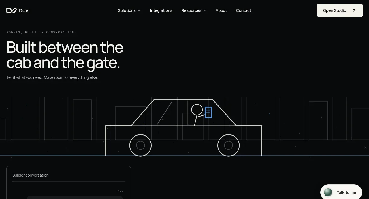 Conversation-led hero
Duvi · Hero
Conversation-led hero
Duvi · Hero
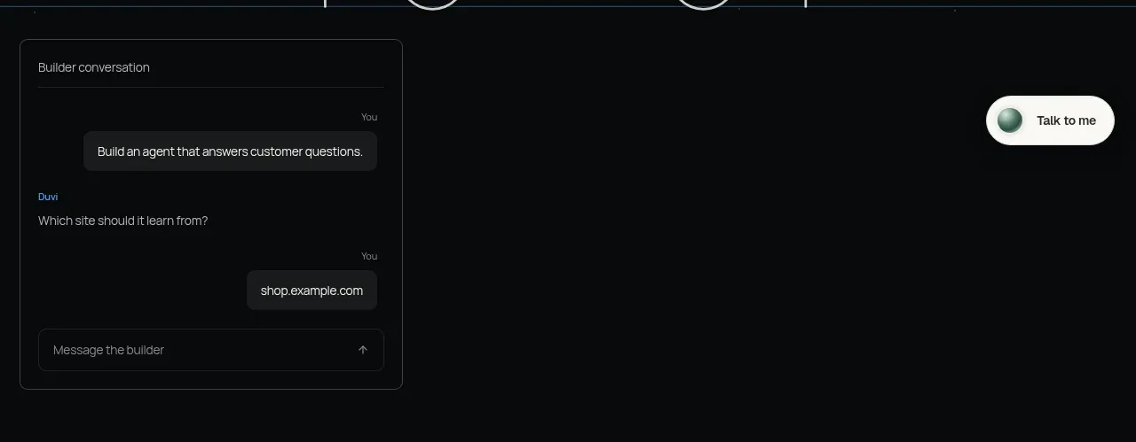 Builder conversation demo
Duvi · Card
Builder conversation demo
Duvi · Card
 Customer logo cloud
Duvi · Logo cloud
Customer logo cloud
Duvi · Logo cloud
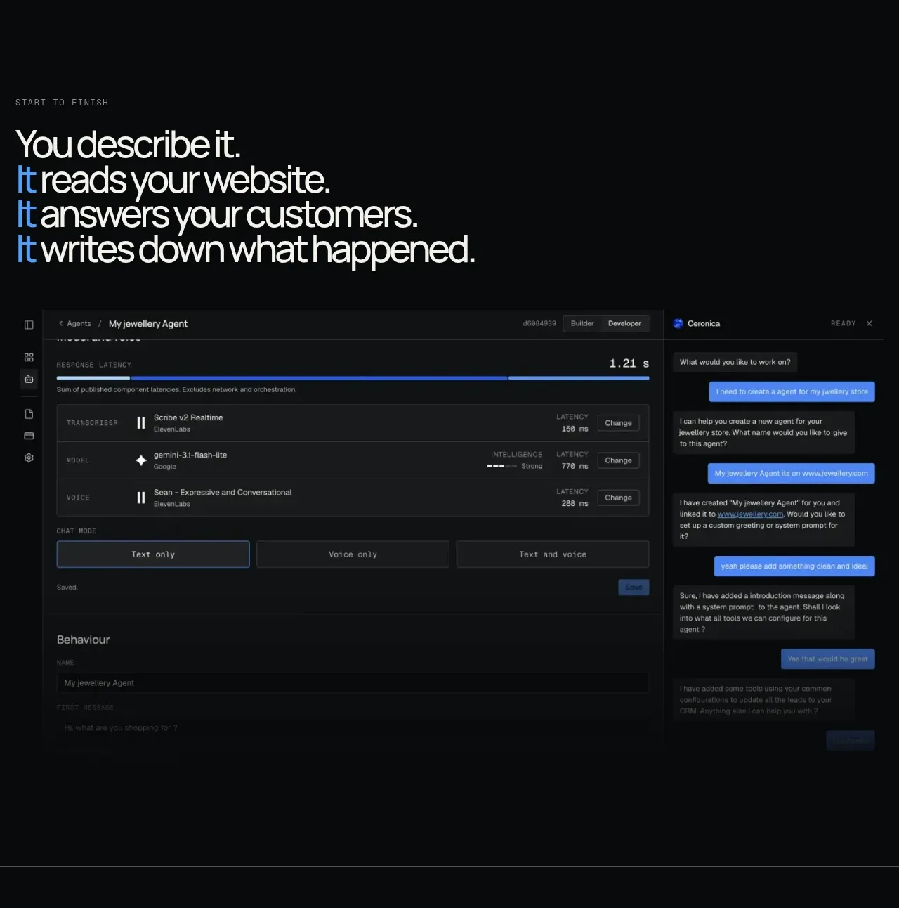 End-to-end product workflow
Duvi · Feature grid
End-to-end product workflow
Duvi · Feature grid
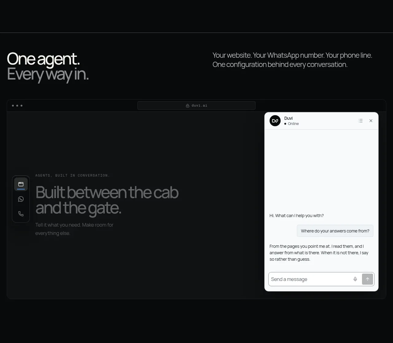 One agent, many channels
Duvi · Feature grid
One agent, many channels
Duvi · Feature grid
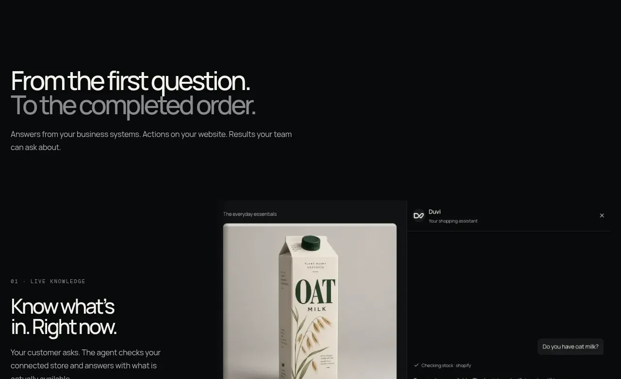 From question to completed task
Duvi · Feature grid
From question to completed task
Duvi · Feature grid
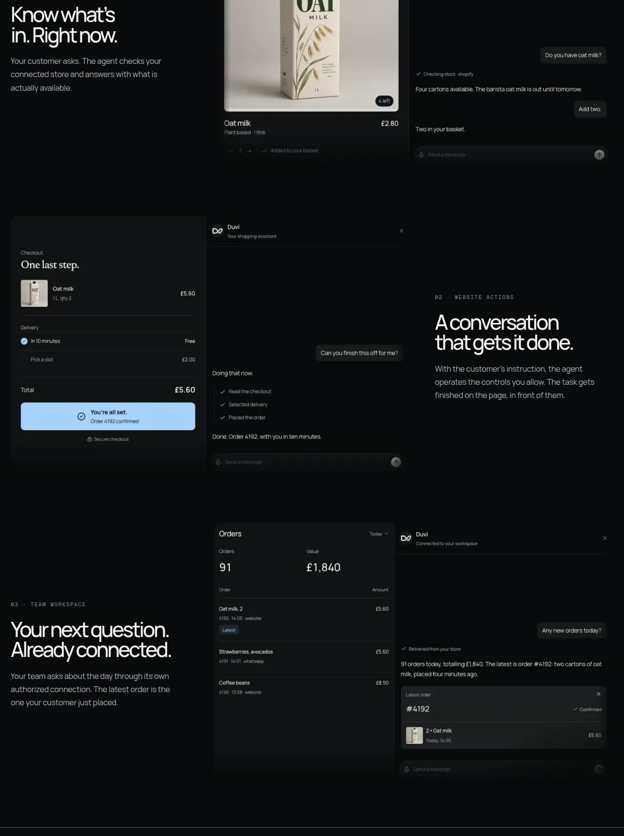 Website actions and team workspace
Duvi · Feature grid
Website actions and team workspace
Duvi · Feature grid
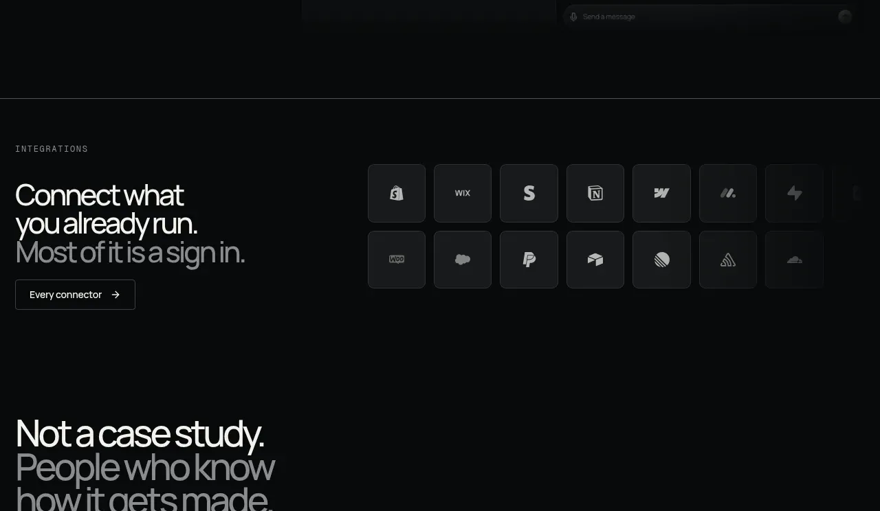 Integrations grid
Duvi · Logo cloud
Integrations grid
Duvi · Logo cloud
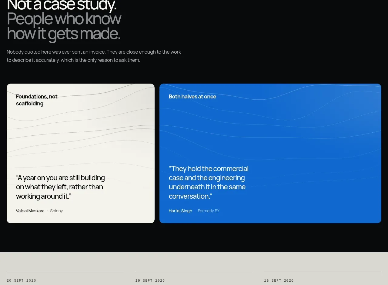 Customer proof cards
Duvi · Testimonials
Customer proof cards
Duvi · Testimonials
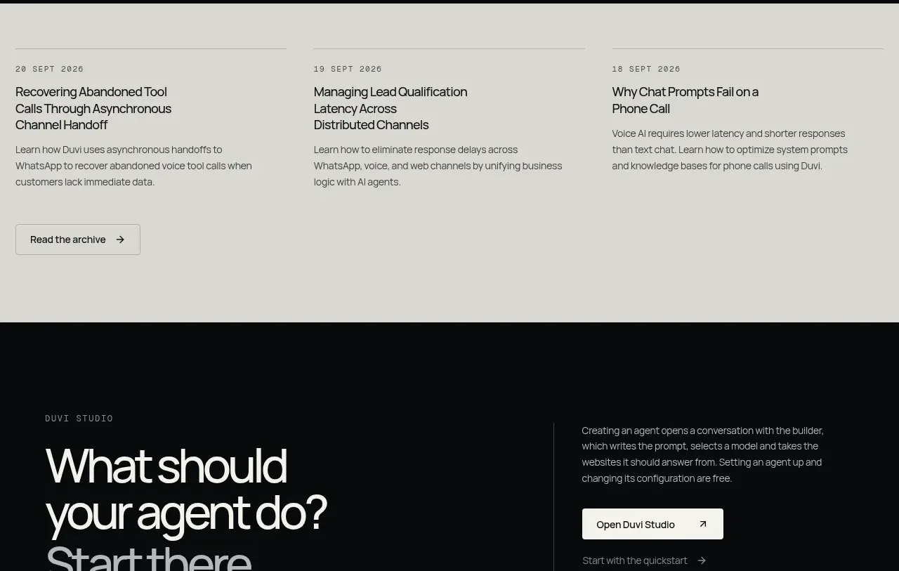 Insights archive preview
Duvi · Card
Insights archive preview
Duvi · Card
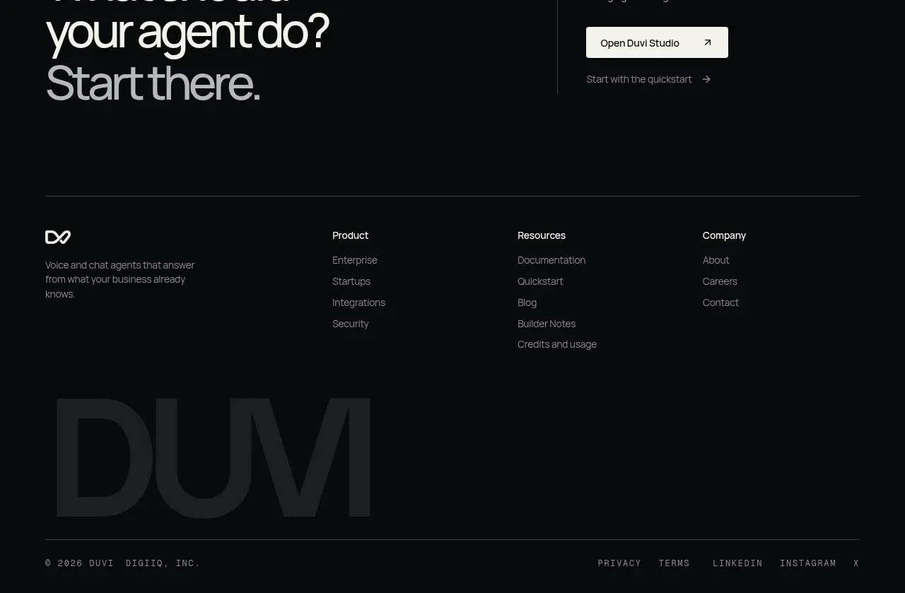 Studio CTA and footer
Duvi · Footer
Studio CTA and footer
Duvi · Footer