 kage
kage
getelva.ai
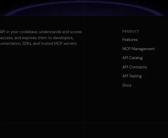
Design analysis
The closing CTA distills the value proposition into one centered statement, a compact command-like action field, and two buttons. A restrained glow gives the ending a sense of momentum without adding visual noise.
Prompt preview
## Reference images

Study these alongside the description below: hierarchy, rhythm, spacing, colour. Build for the product you are asked about, using this design language.

- Component: https://kage-design-assets.t3.tigrisfiles.io/components/elva/1eb2f570-9576-4b74-bb9a-568459f8b568-1789452095-11.webp
- Full page it was cut from: https://kage-design-assets.t3.tigrisfiles.io/screenshots/elva/1eb2f570-9576-4b74-bb9a-568459f8b568-1789452038199-full.webp
- Component on Kage: https://kage.design/component/elva-cta

## Before you start
Ask what final action the user should take, what low-friction alternative should sit beside it, and what visual treatment matches the brand. Then build this closing moment for that product.

Create a centered conversion CTA on a black background with generous top and bottom padding. Place a small abstract product glyph or status badge above a 42–52px heading, followed by a short muted sentence. Add a compact command-like input/action row with a dark #111116 fill, #27272e border, 10px radius, and a small copy/action button. Under it, place a bright primary pill and a dark outlined secondary pill. Use off-white #f1f1f3, muted #9999a2, and a restrained violet glow behind the glyph or lower edge. Keep the CTA width around 420–520px and make the actions stack neatly on mobile. The command field should be decorative or functional according to the product, with accessible labels.

Never use logos, product names, copy, illustrations, or imagery from the reference.
More components
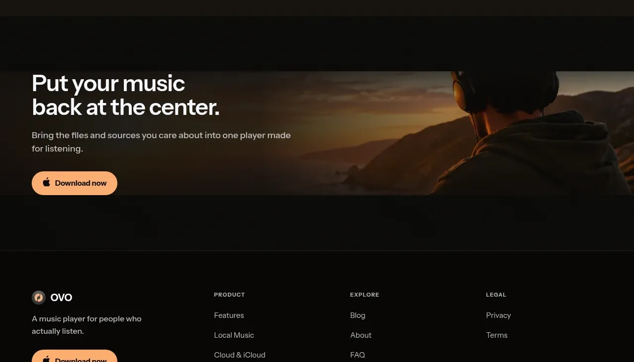
 Closing download call to action
OVO · Call to action
Closing download call to action
OVO · Call to action
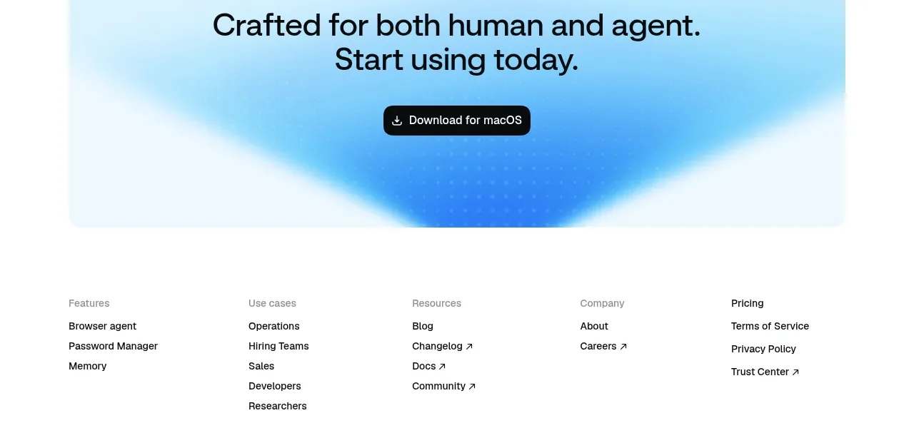
 Final download call to action
Aside · Call to action
Final download call to action
Aside · Call to action

 Download call to action
Oats · Call to action
Download call to action
Oats · Call to action

 Website migration CTA
Neopress · Call to action
Website migration CTA
Neopress · Call to action
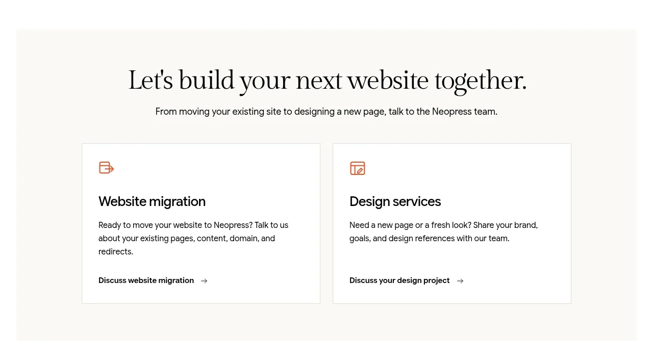 Build or migrate services CTA
Neopress · Call to action
Build or migrate services CTA
Neopress · Call to action
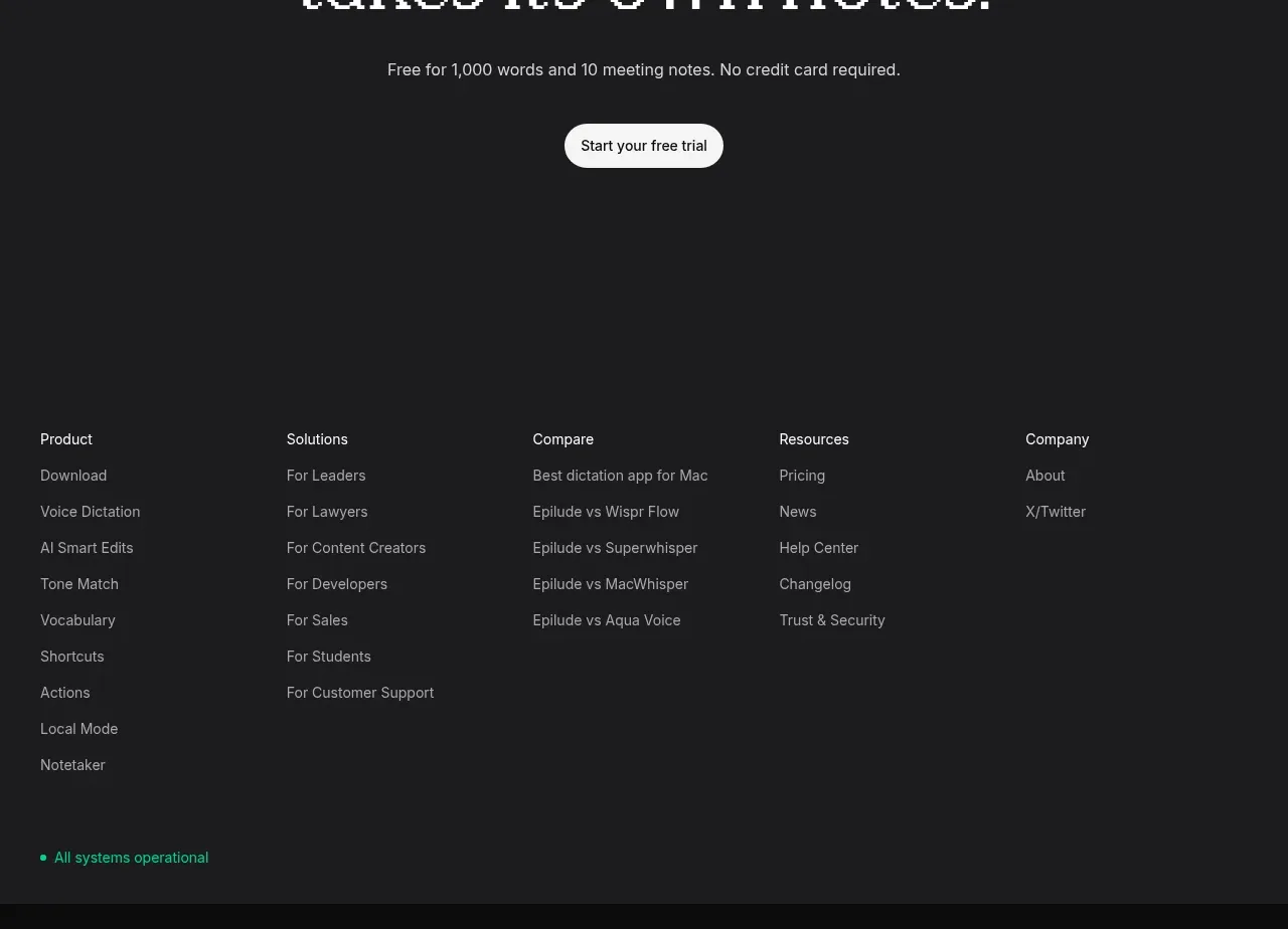
 Final trial call to action
Epilude Notetaker · Call to action
Final trial call to action
Epilude Notetaker · Call to action