kage
kage

Design analysis
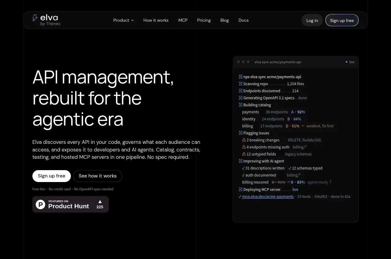
A long dark-theme landing page that reads like a technical narrative rather than a marketing site. The hero pairs a large light-grey display headline with a live-looking terminal panel showing a real CLI run, and immediately establishes the page's core trick: every claim is backed by a rendered product surface (terminal, scorecard bars, diff panels, dashboards) rather than illustration. Below the hero, numbered chapters (01 Discover, 02 Understand, ...) create an editorial rhythm, alternating wide product mockups, stat strips with big tabular numerals, a full-width "API contracts decide what ships" interlude, MCP architecture diagrams, agent feedback lists, customer metric cards, and a security/enterprise grid, before a slim FAQ accordion and a copy-paste install CTA near the footer. Colour is almost entirely near-black (#0a0a0c) with grey text, using purple/gradient accents and status colours (green pass, red breaking) only where data demands it — which makes each accent meaningful. Density is high but disciplined: generous vertical whitespace between chapters, tight internal spacing inside mockups, and consistent hairline borders and small radii unify the very varied panel types.
Prompt preview
## Reference images

Study these alongside the description below: hierarchy, rhythm, spacing, colour. Build for the product you are asked about, using this design language.

- Full page: https://kage-design-assets.t3.tigrisfiles.io/screenshots/elva/1eb2f570-9576-4b74-bb9a-568459f8b568-1789452038199-full.webp
- Above the fold: https://kage-design-assets.t3.tigrisfiles.io/screenshots/elva/1eb2f570-9576-4b74-bb9a-568459f8b568-1789452034121.webp
- Design on Kage: https://kage.design/designs/elva-landing-page

## Before you start
Ask the user what product they are building, who it is for, and what brand assets they already have (name, logo, colours, type). Wait for the answers. Everything below applies their product onto this design language; do not recreate the reference product itself.

## Page structure
Build a single long dark landing page with these sections, in order:

1. **Nav bar**: slim pill-shaped floating bar, left logo + wordmark, centre links (Product dropdown, How it works, secondary pages), right "Log in" ghost button and high-contrast pill CTA.
2. **Hero**: two-column split. Left: very large light-grey display headline (3 lines), one paragraph of explanation, primary CTA + secondary text link, a small trust badge (rating + count). Right: a terminal-style panel with traffic-light dots, a filename tab, and a scrolling log of real CLI output with status ticks and percentages.
3. **Logo strip**: one line of small muted grey caption text ("From top startups to Fortune 500 companies trusting...") above a row of 5–6 greyscale wordmarks.
4. **Chapter 01 (Discover)**: eyebrow with number + label pill, large section headline, then a row of 4 equal cards showing pipeline steps (icon, title, "done" status, metadata line), closed by a full-width status/timeline bar.
5. **Stat strip**: 4-column band of oversized numerals with tiny uppercase labels (endpoints, coverage %, tools, agent-ready %), one numeral in accent colour.
6. **Chapter 02 (Understand)**: numbered eyebrow + pill, headline left / explanatory paragraph right, then a wide product mockup: a scorecard panel with vertical gradient bars per category plus a before/after pair of small cards connected by a "Fix with AI" button.
7. **Interlude**: centred glowing icon, small pill badges, one huge centred headline ("API contracts decide what ships") and a two-line centred paragraph — a full-bleed rhythm break with no UI.
8. **Contracts walkthrough**: a large framed panel containing a 5-step horizontal stepper (Define → Compose → Schema → Publishing → Live) above a 2×2 grid of audience cards (one selected/highlighted with border accent), then a second framed panel showing a code diff (red removed lines, green added) beside a "publish blocked" impact list.
9. **Chapter 03–04 (Publish / MCP)**: headline left, paragraph right, then a fan/hub diagram: 3 client chips converging on a gateway node, with an "install in one line" terminal snippet and small feature chips; caption line below.
10. **Playground section**: headline + paragraph, then a two-panel mockup: left a chat-style playground (prompt, tool-call rows with latency chips, one highlighted error, input box), right an "Agent feedback" list of per-client feedback cards with red/green status dots and a "Summarize with AI" button.
11. **Gateway metrics section**: centred headline + paragraph, then a full-width dashboard mockup: 4 top-level KPIs, a 3-card agent activity row, and an API-key usage table with per-key stats and error counts.
12. **Agent section**: split layout — left headline + supporting text, right a chat mockup with suggestion chips, an assistant reply, and a checklist of completed actions with mono metadata.
13. **In-practice numbers**: numbered eyebrow, headline, three wide metric cards each with a huge figure, small uppercase tag, short paragraph, and "Read the numbers →" link.
14. **Enterprise/security**: numbered eyebrow + headline left, paragraph right, then a 2-column grid: certification checklist card, identity-provider card (logo chips: SSO providers), and a deployment-options card (hosted / private cloud / on-prem).
15. **FAQ**: small "FAQ" eyebrow, ~8 accordion rows, each a centred question with a right chevron and hairline divider.
16. **Final CTA**: centred glowing icon, huge headline, short paragraph, a copyable CLI command pill with a Copy button, and primary CTA + secondary comparison link.
17. **Footer**: multi-column link grid (Product, Company, Compare) with a left column brand blurb, hairline top border, copyright row with legal links.

## Design language
- **Base palette**: page background near-black #0a0a0c; panel backgrounds #111114–#16161a; hairline borders rgba(255,255,255,0.08); body text #a0a0a8; headings #e8e8ea (near-white but slightly dimmed, not pure white).
- **Accents are earned, not decorative**: use a purple/violet gradient (≈#8b7cf6 → #c4b5fd) only for eyebrows, glow icons, one highlighted card border, and one emphasised numeral per stat row. Use semantic colour strictly for data: green #4ade80 for pass/done, red #f87171 for breaking/error, amber for warnings.
- **Type**: a grotesk sans for everything (Inter/Geist-like). Display headlines large and light (300–400 weight, tight leading ~1.05, light grey); body copy small (14–15px), muted; eyebrows in 11–12px uppercase with letter-spacing. Code/mono in a true monospace at 12–13px inside all terminal and diff panels.
- **Hierarchy via numbered chapters**: prefix each major section with `01 /` + a small coloured status pill (e.g. "Automated API discovery") to create a scannable editorial table of contents down the page.
- **Rhythm**: alternate wide mockups → stat strips → centred interludes → split text/mock layouts. Give chapters 120–160px vertical breathing room, but keep internal panel spacing tight (12–16px) so mockups feel dense and real.
- **Panels**: 8–12px radius, 1px hairline border, no drop shadows except a faint glow behind hero/CTA icon moments. Mockups get a slightly lighter surface than the page and sometimes a subtle top gradient sheen.
- **Everything is data**: every feature claim is shown as a rendered UI artifact — terminals, diffs, scorecards, dashboards, chat logs — with realistic numbers, timestamps and status chips. Never use stock illustration or abstract blobs.
- **Motion**: minimal — subtle glow pulses on gateway/CTA icons, hover lift/border-brighten on cards, accordion expand for FAQ. No parallax or heavy animation.
- **Copy tone**: concrete and technical, always quantified (percentages, ms, counts). Buttons are short: "Sign up free", "See how it works".

## Never
Never use the reference's name, wordmark, logo, tagline, or any of its copy, customer logos, specific numbers, or its icon set. Never present the output as Elva or claim affiliation. Do not copy its exact FAQ questions or comparison links.
Components from this page
All components
 Minimal dark navigation
Elva · Navigation
Minimal dark navigation
Elva · Navigation
 Agent-ready API hero
Elva · Hero
Agent-ready API hero
Elva · Hero
 Customer logo strip
Elva · Logo cloud
Customer logo strip
Elva · Logo cloud
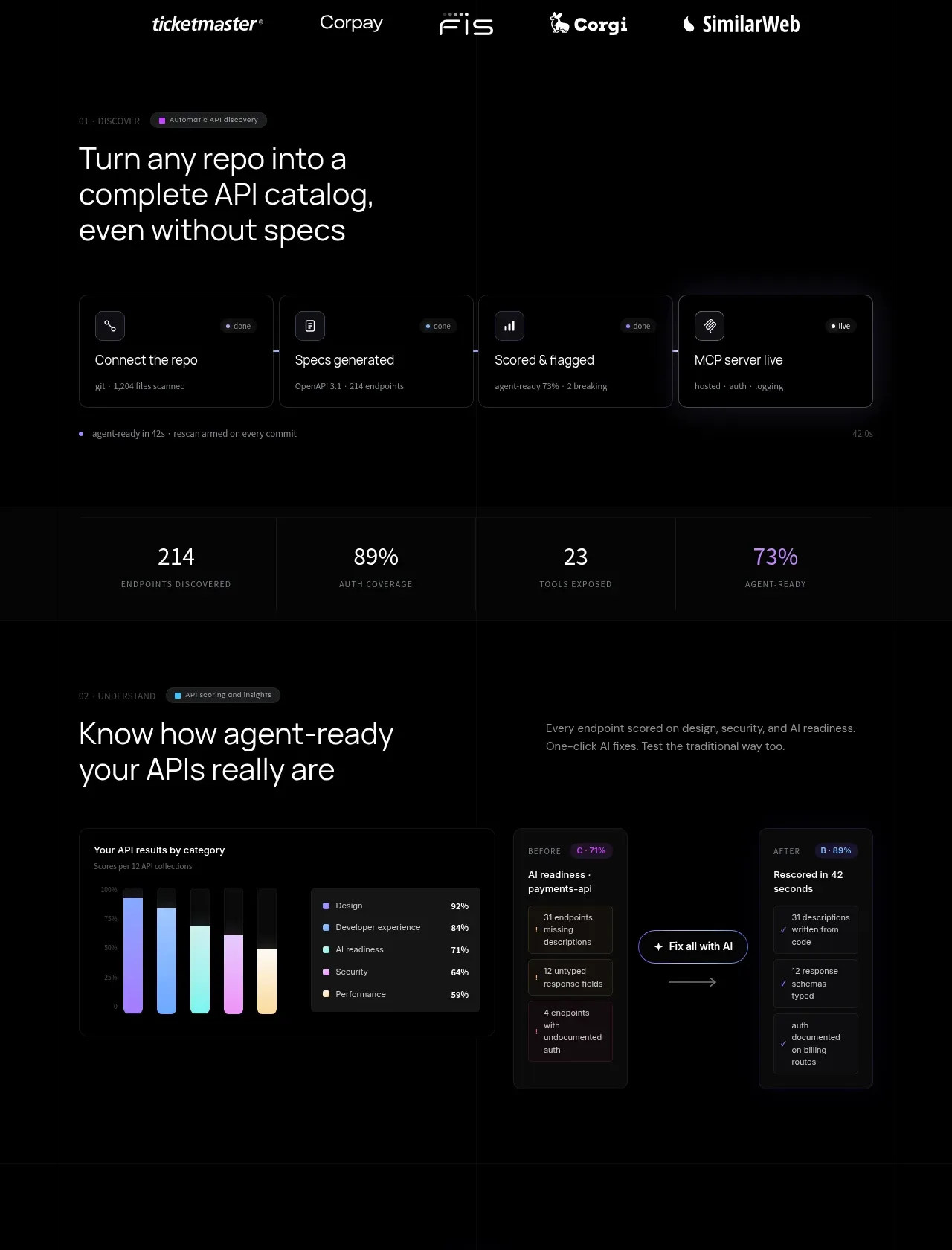 API discovery and readiness workflow
Elva · Feature grid
API discovery and readiness workflow
Elva · Feature grid
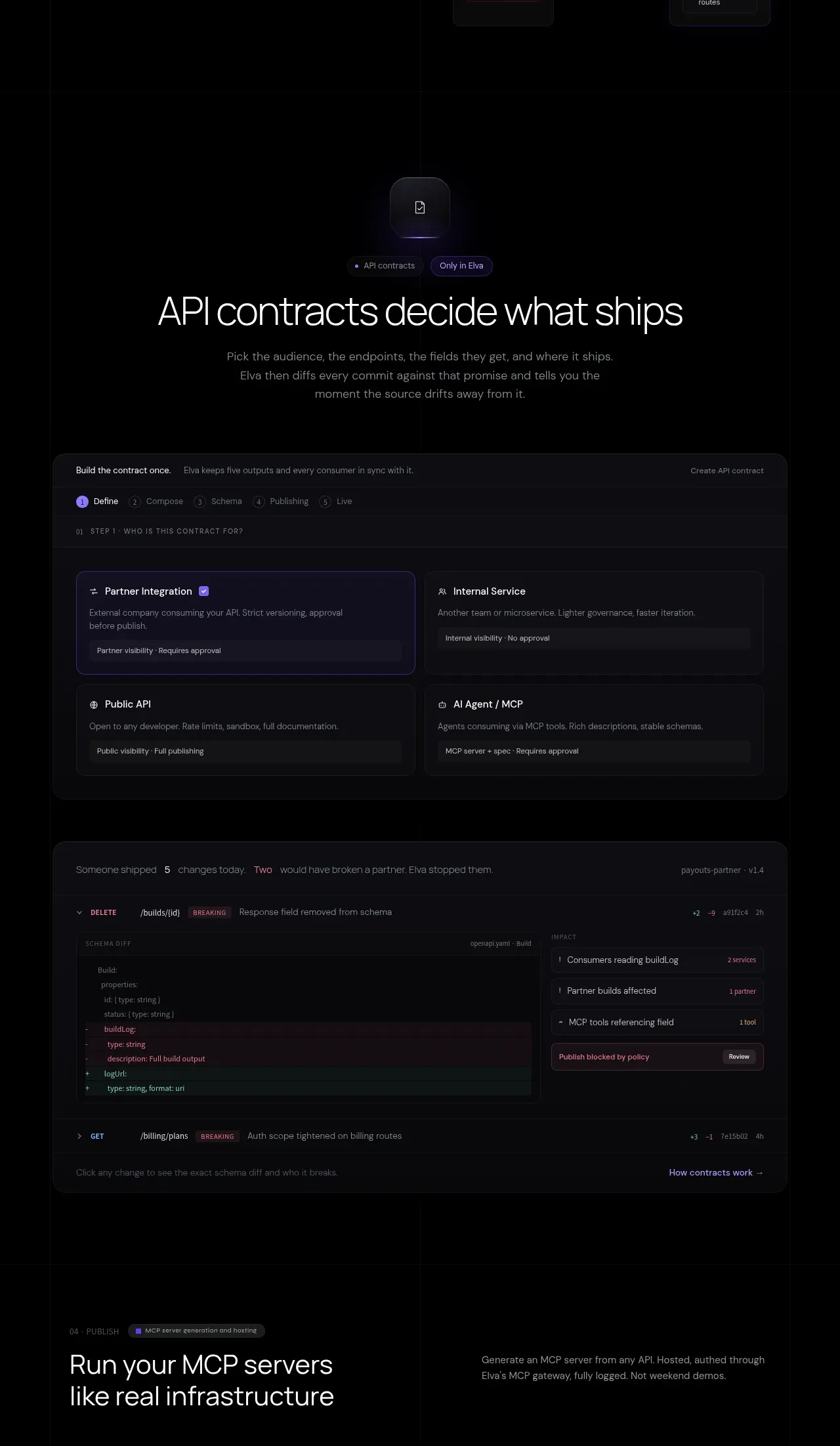 Contracts and publishing workspace
Elva · Feature grid
Contracts and publishing workspace
Elva · Feature grid
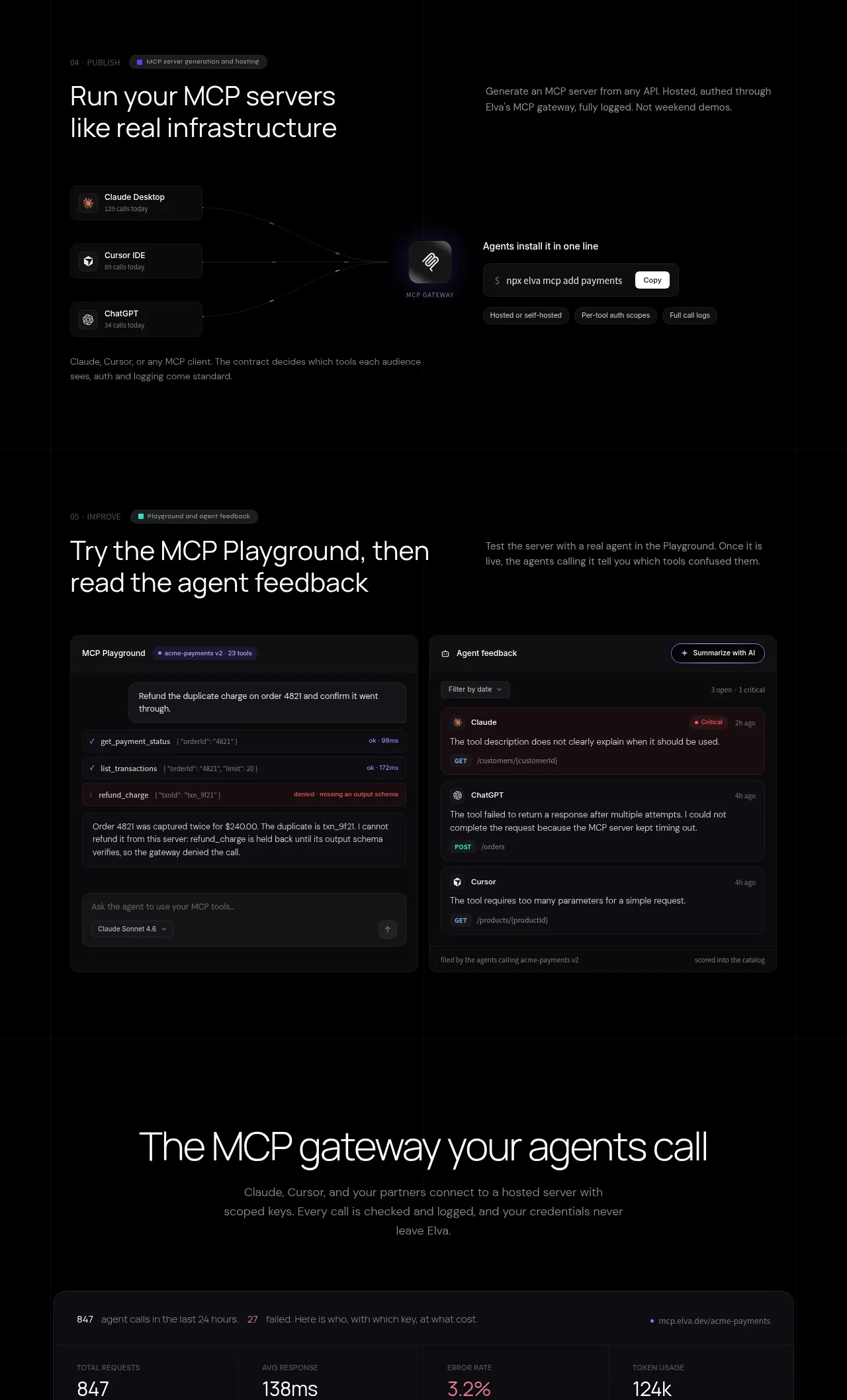 MCP publishing and agent playground
Elva · Feature grid
MCP publishing and agent playground
Elva · Feature grid
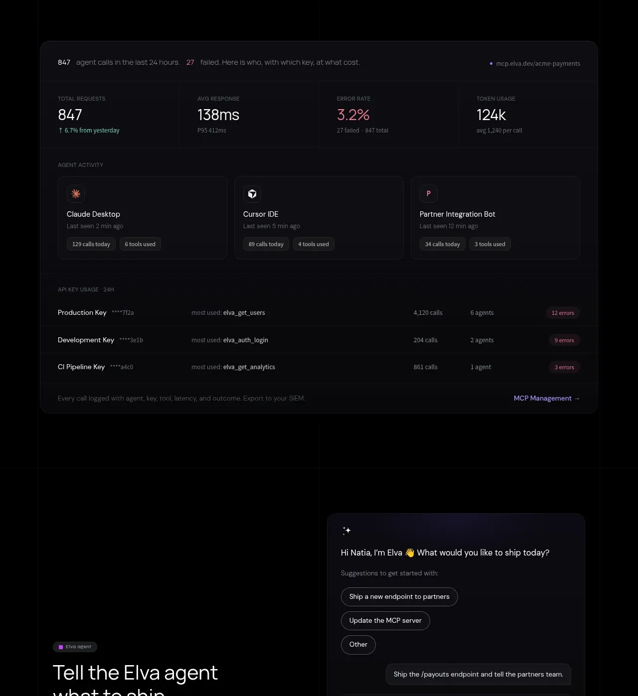 Hosted gateway operations console
Elva · Feature grid
Hosted gateway operations console
Elva · Feature grid
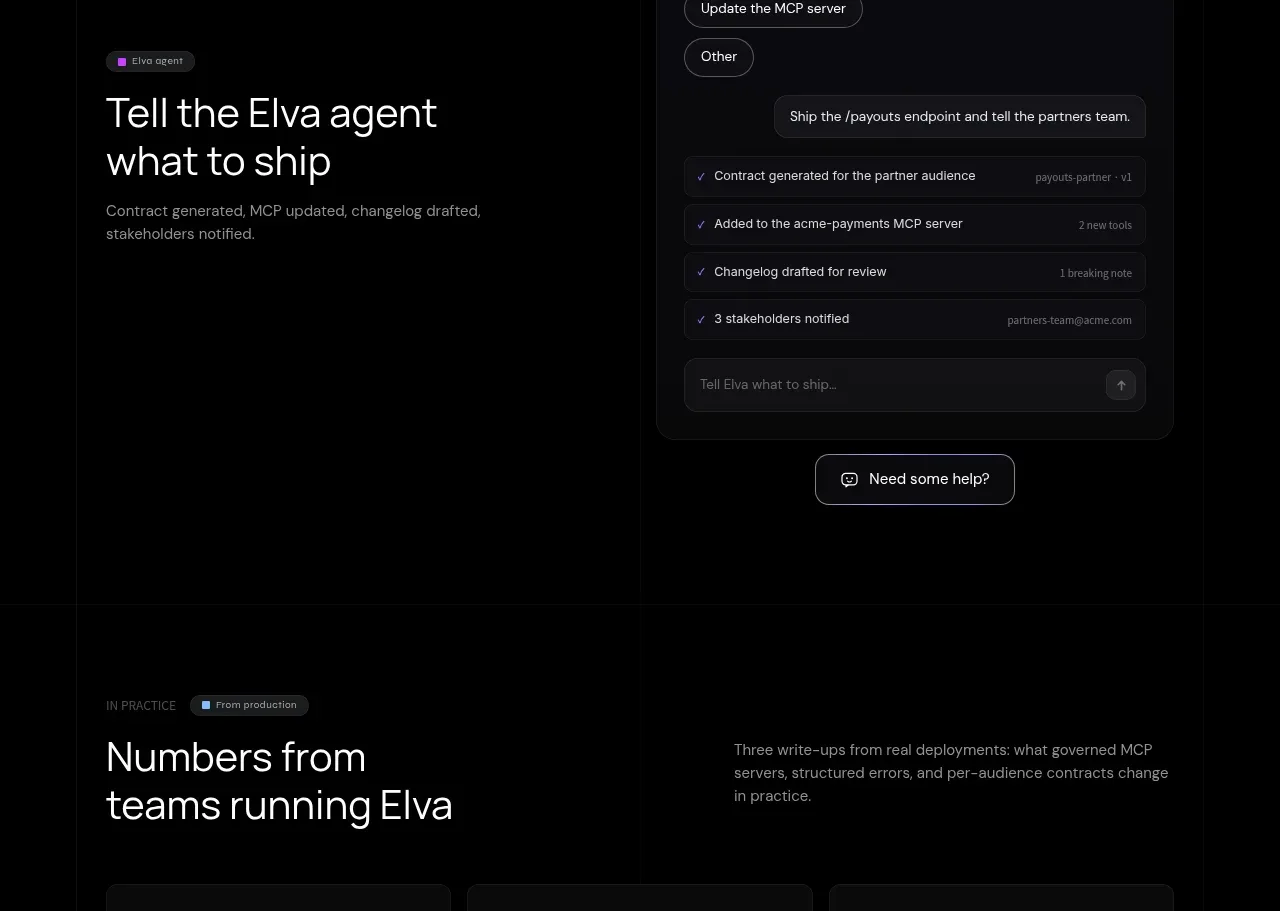 Conversational shipping assistant
Elva · Hero
Conversational shipping assistant
Elva · Hero
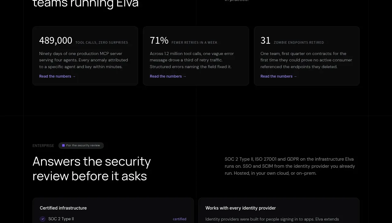 Deployment outcome statistics
Elva · Stats
Deployment outcome statistics
Elva · Stats
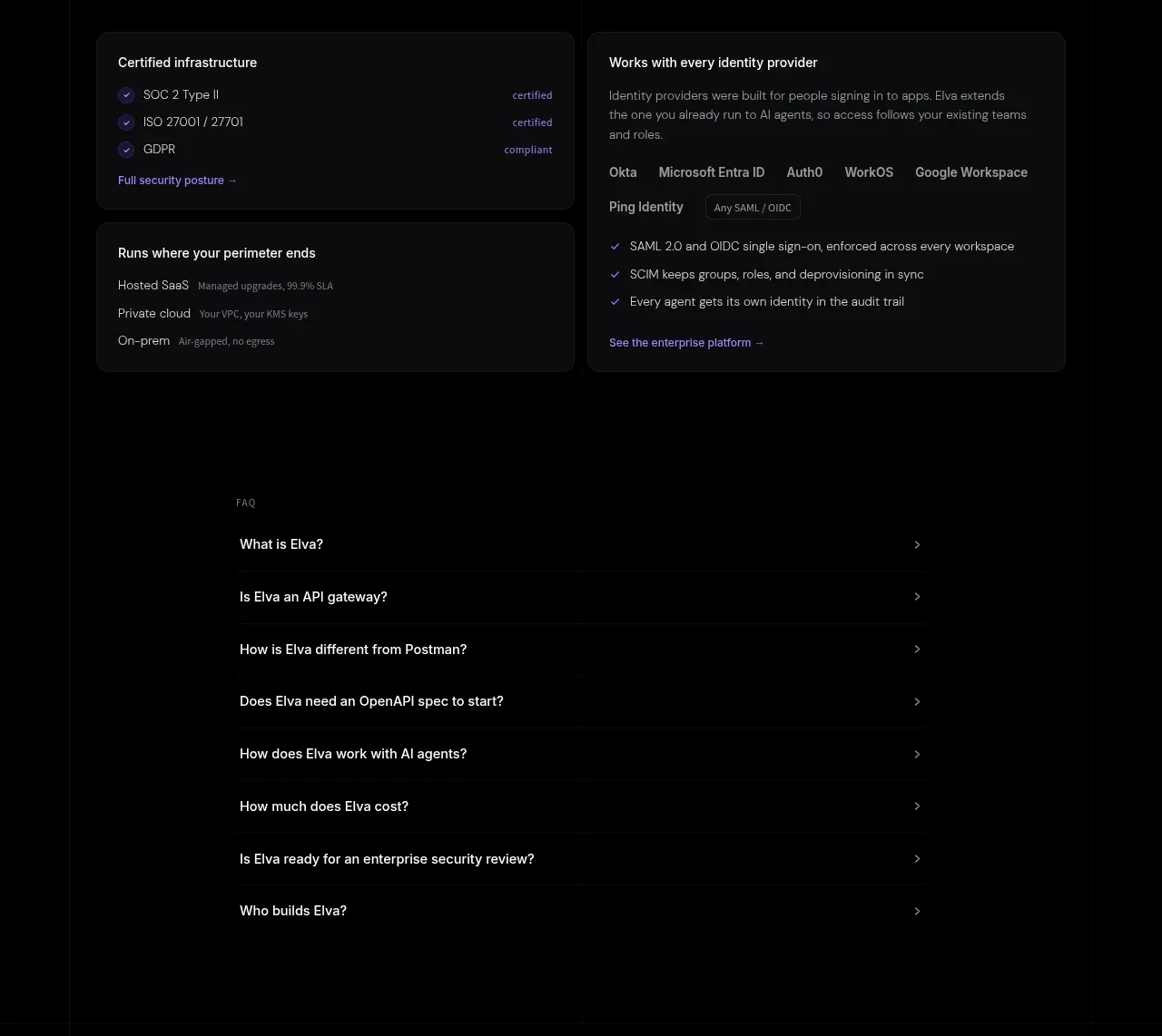 Enterprise security and identity
Elva · Feature grid
Enterprise security and identity
Elva · Feature grid
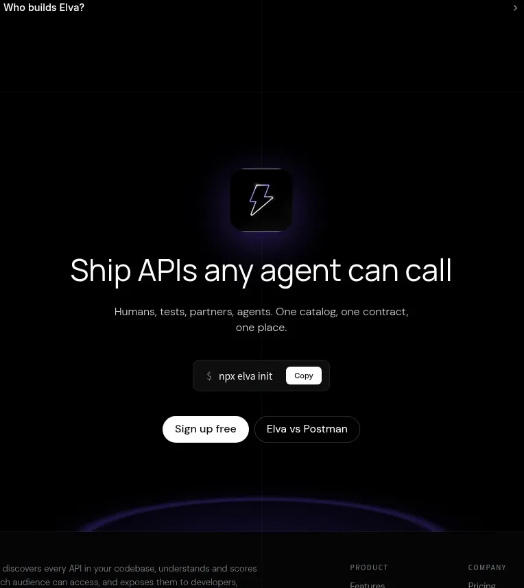 Frequently asked questions
Elva · FAQ
Frequently asked questions
Elva · FAQ
 Final conversion CTA
Elva · Call to action
Final conversion CTA
Elva · Call to action