kage
kage
getelva.ai
Design analysis
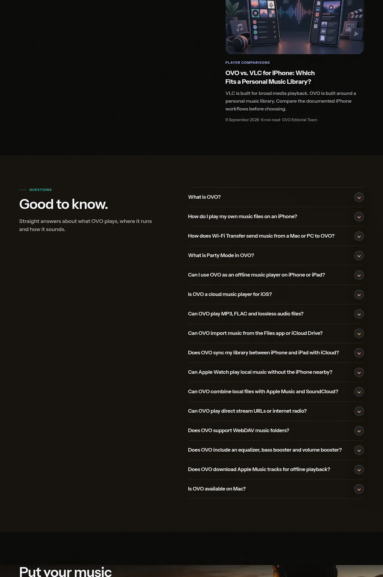
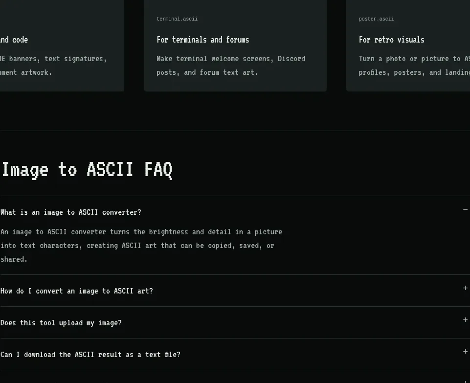
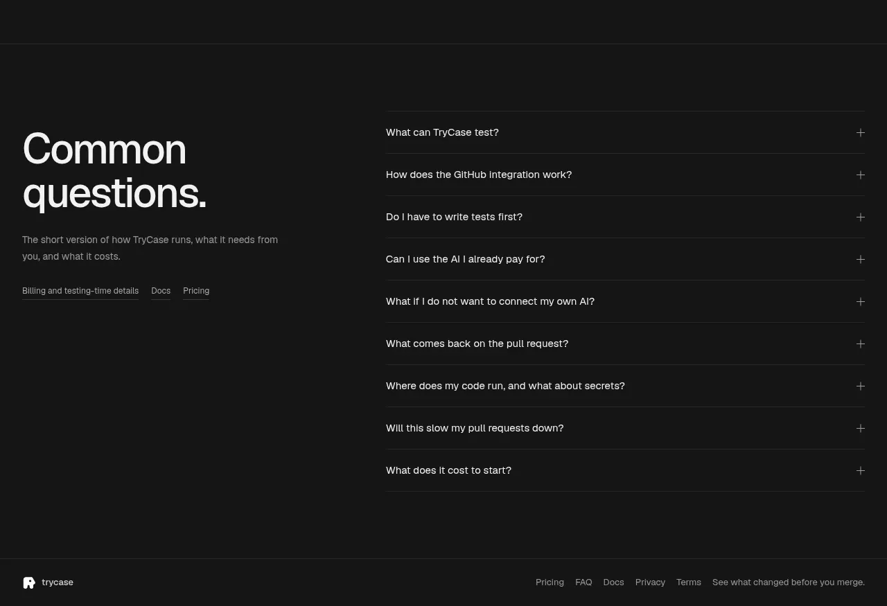
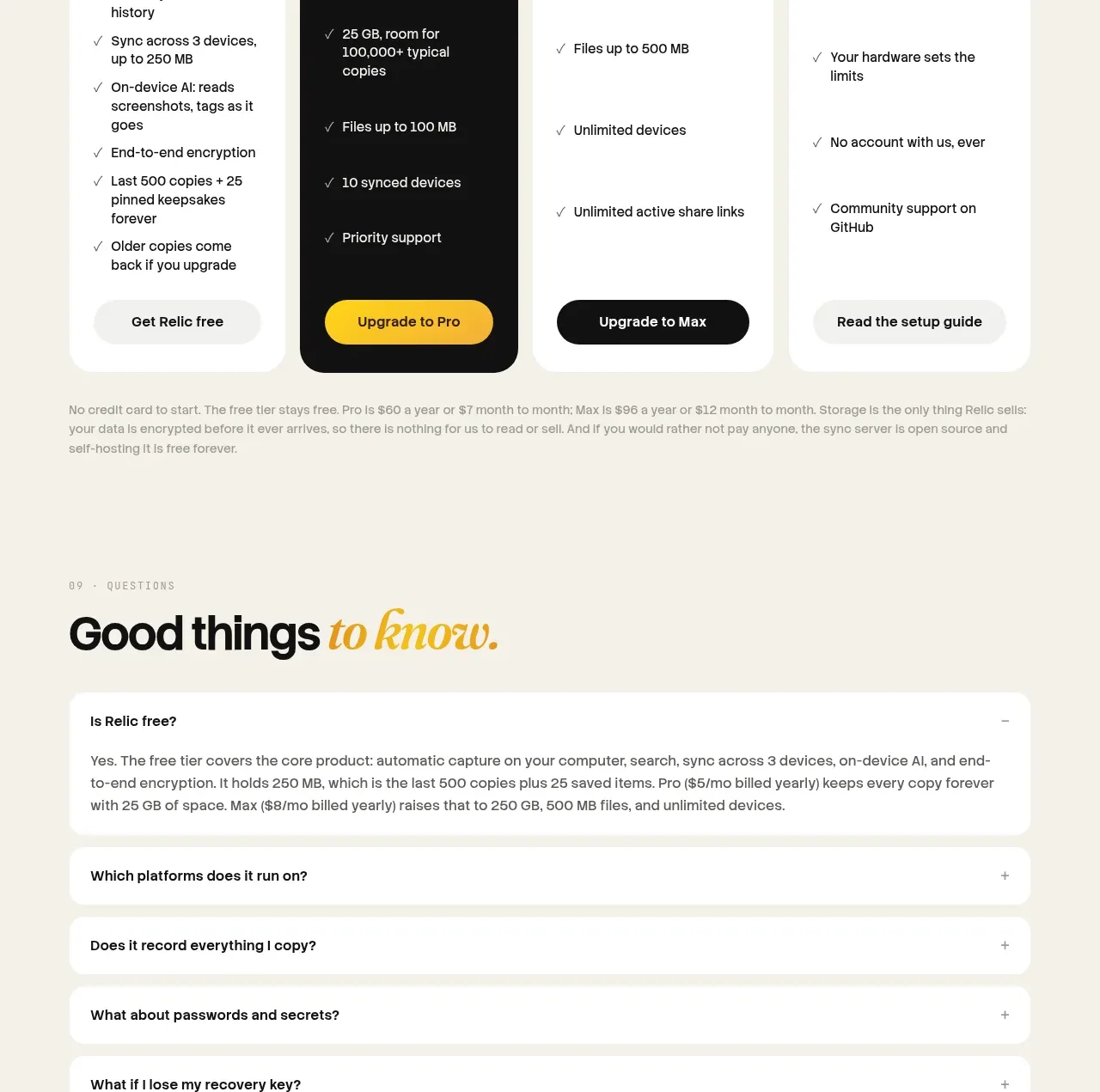
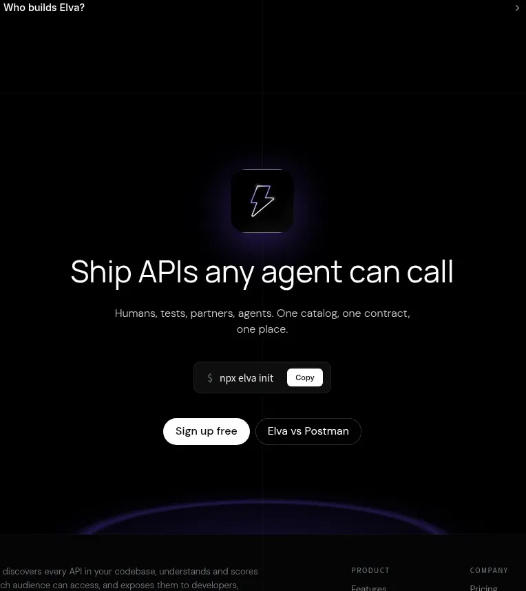
A narrow, centered FAQ list reduces uncertainty with simple rows, generous vertical spacing, and right-aligned disclosure affordances. The restrained treatment fits the otherwise technical page.
Prompt preview
## Reference images

Study these alongside the description below: hierarchy, rhythm, spacing, colour. Build for the product you are asked about, using this design language.

- Component: https://kage-design-assets.t3.tigrisfiles.io/components/elva/1eb2f570-9576-4b74-bb9a-568459f8b568-1789452095-10.webp
- Full page it was cut from: https://kage-design-assets.t3.tigrisfiles.io/screenshots/elva/1eb2f570-9576-4b74-bb9a-568459f8b568-1789452038199-full.webp
- Component on Kage: https://kage.design/component/elva-faq

## Before you start
Ask what objections, setup questions, pricing questions, and trust concerns users have about the product. Turn those into original FAQ questions and answers.

Build a centered FAQ section on a black background. Add a tiny uppercase eyebrow and a max-width around 580px. Render 6–8 accordion rows with 16px text, 24–28px vertical padding, and a subtle #17171b bottom border. Place a small chevron or plus icon at the far right. Closed rows should remain compact; the open row should reveal 14px muted text with a 16–20px gap without shifting the overall visual hierarchy. Use #eeeeef for questions, #85858e for answers, and violet (#9679ff) only for the active indicator. Add keyboard focus rings and animate height/opacity modestly. Keep the list readable and avoid cards around every row.

Never use logos, product names, copy, illustrations, or imagery from the reference.