kage
kage
epilude.com

Design analysis
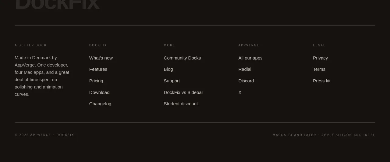
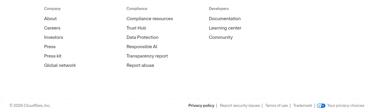
The footer organizes product, solution, comparison, resource, and company navigation into compact columns and ends with a small operational-status indicator.
Prompt preview
## Reference images

Study these alongside the description below: hierarchy, rhythm, spacing, colour. Build for the product you are asked about, using this design language.

- Component: https://kage-design-assets.t3.tigrisfiles.io/components/epilude-notetaker/4c1f6c09-8367-4067-b5eb-19bb83b45625-1789365731-6.webp
- Full page it was cut from: https://kage-design-assets.t3.tigrisfiles.io/screenshots/epilude-notetaker/4c1f6c09-8367-4067-b5eb-19bb83b45625-1789365700735-full.webp
- Component on Kage: https://kage.design/component/epilude-notetaker-footer

## Before you start
Ask for the user's site map, primary navigation groups, support links, and any status message they want displayed. Build the footer around that information.

Create a dark multi-column footer with a restrained max-width inner container. Use five compact link groups with small uppercase or medium-weight group labels and vertically stacked low-contrast links. Keep columns aligned on a desktop grid and collapse them into accordions or stacked groups on mobile. Add a small status line near the lower left with a green dot, using it only if the product has a meaningful operational or availability message. Use #1a1a1a for the footer surface, #deded8 for headings, #92928e for links, #303030 for dividers, and an accessible green accent around #35c58a. Keep line height generous enough for scanning and add hover underlines or color transitions.

Never: use logos, product names, copy, illustrations, or imagery from the reference.