kage
kage
esigna.app

Design analysis
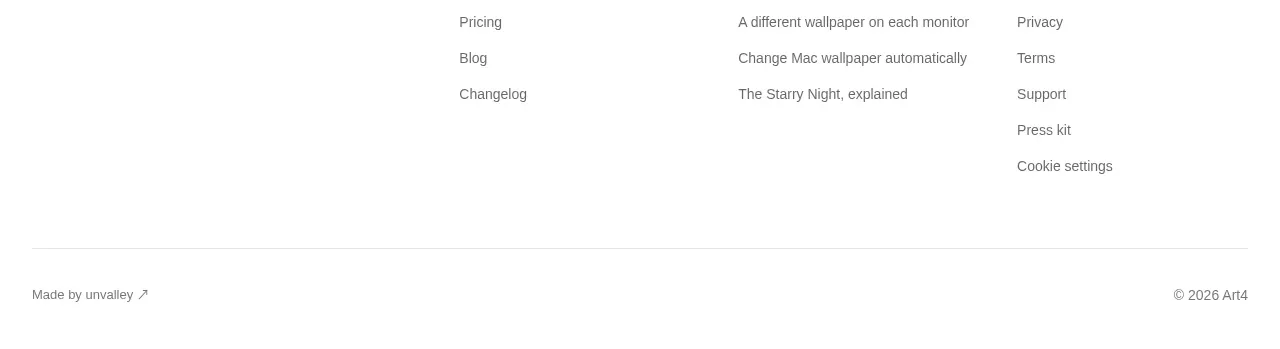
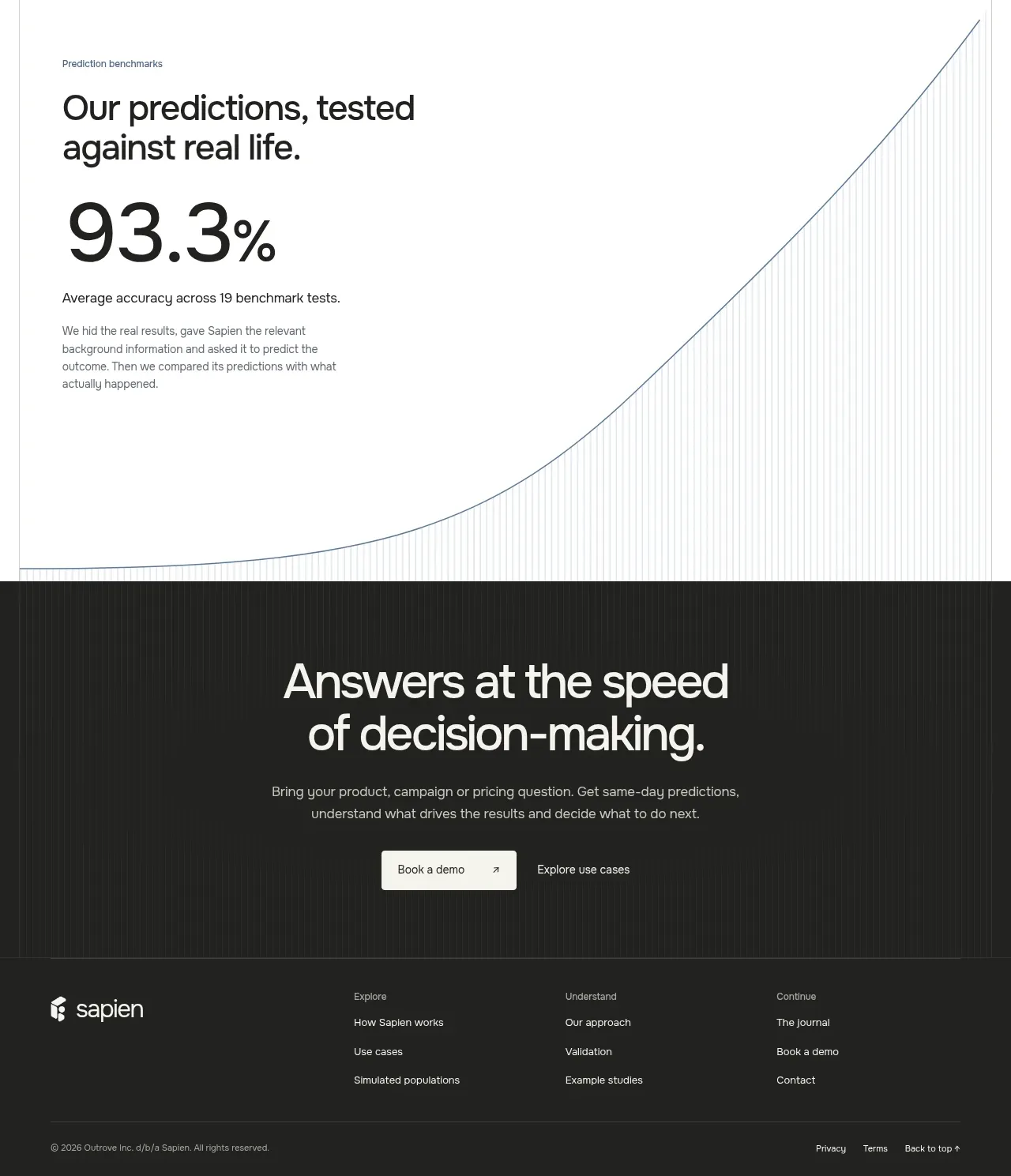
The footer closes the page with a short brand statement, grouped navigation links, and a quiet legal baseline that preserves the editorial tone.
Prompt preview
## Reference images

Study these alongside the description below: hierarchy, rhythm, spacing, colour. Build for the product you are asked about, using this design language.

- Component: https://kage-design-assets.t3.tigrisfiles.io/components/esigna/76bcd194-d16d-4973-9e2e-b189e2506cae-1791007556-9.webp
- Full page it was cut from: https://kage-design-assets.t3.tigrisfiles.io/screenshots/esigna/76bcd194-d16d-4973-9e2e-b189e2506cae-1791007443637-full.webp
- Component on Kage: https://kage.design/component/esigna-footer

## Before you start
Ask what pages, resources, support destinations, legal links, and social destinations the user's product needs. Apply the same information hierarchy to the user's brand.

Build a spacious multi-column footer with a thin top border. Use a left column for a small brand treatment and one-sentence description, then four or five compact link columns with uppercase or semibold group labels and muted links. Add a bottom row for copyright, policy links, and an optional small status or location note. Use warm off-white #faf9f7, ink #2a2926, secondary text #706e68, and divider #e3e0d9. Keep typography small but readable (12–14px), align columns to a shared grid, and add clear hover underlines or color changes. On mobile, collapse groups into stacked columns while preserving comfortable tap targets.

Never: use logos, product names, copy, illustrations, or imagery from the reference.