kage
kage
esigna.app

Design analysis
A warm editorial landing page for an email-signature builder: ivory canvas, charcoal serif display type with italic second lines, terracotta mono eyebrows, and full-width rounded "photo mats" that frame real editor and inbox screenshots over misty landscape photography. The rhythm alternates airy, centred statement sections with dense artefact rows — a four-step numbered row, a 3×2 feature bento, a full-bleed template gallery, a hairline accordion — before closing in a single large pricing panel and a light multi-column footer. Colour stays ~90% neutral; a single orange accent marks every section and the landscape mats provide all the warmth.
Prompt preview
## Reference images

Study these alongside the description below: hierarchy, rhythm, spacing, colour. Build for the product you are asked about, using this design language.

- Full page: https://kage-design-assets.t3.tigrisfiles.io/screenshots/esigna/76bcd194-d16d-4973-9e2e-b189e2506cae-1791007443637-full.webp
- Above the fold: https://kage-design-assets.t3.tigrisfiles.io/screenshots/esigna/76bcd194-d16d-4973-9e2e-b189e2506cae-1791007429206.webp
- Design on Kage: https://kage.design/designs/esigna-landing-page

## Before you start
Ask the user what they are building, who it is for, and what brand assets they already have (name, colours, type). Wait for the answers before writing any code. Everything below is a design language to apply to *their* product — do not rebuild the reference site itself.

## Page structure
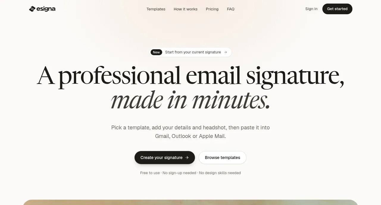
1. **Top nav** — wordmark left; four quiet text links centred (product tours, pricing, FAQ); right side has a plain "Sign in" link and one dark pill CTA. Transparent on the ivory background, no border.
2. **Hero** — centred stack: a small pill badge plus inline link ("start from your current signature"), a two-line serif display headline where the second line is italic, one short subcopy sentence, two pill buttons (dark primary with arrow, white secondary), and a dot-separated microcopy row of reassurances ("Free to use · No sign-up needed · No design skills needed").
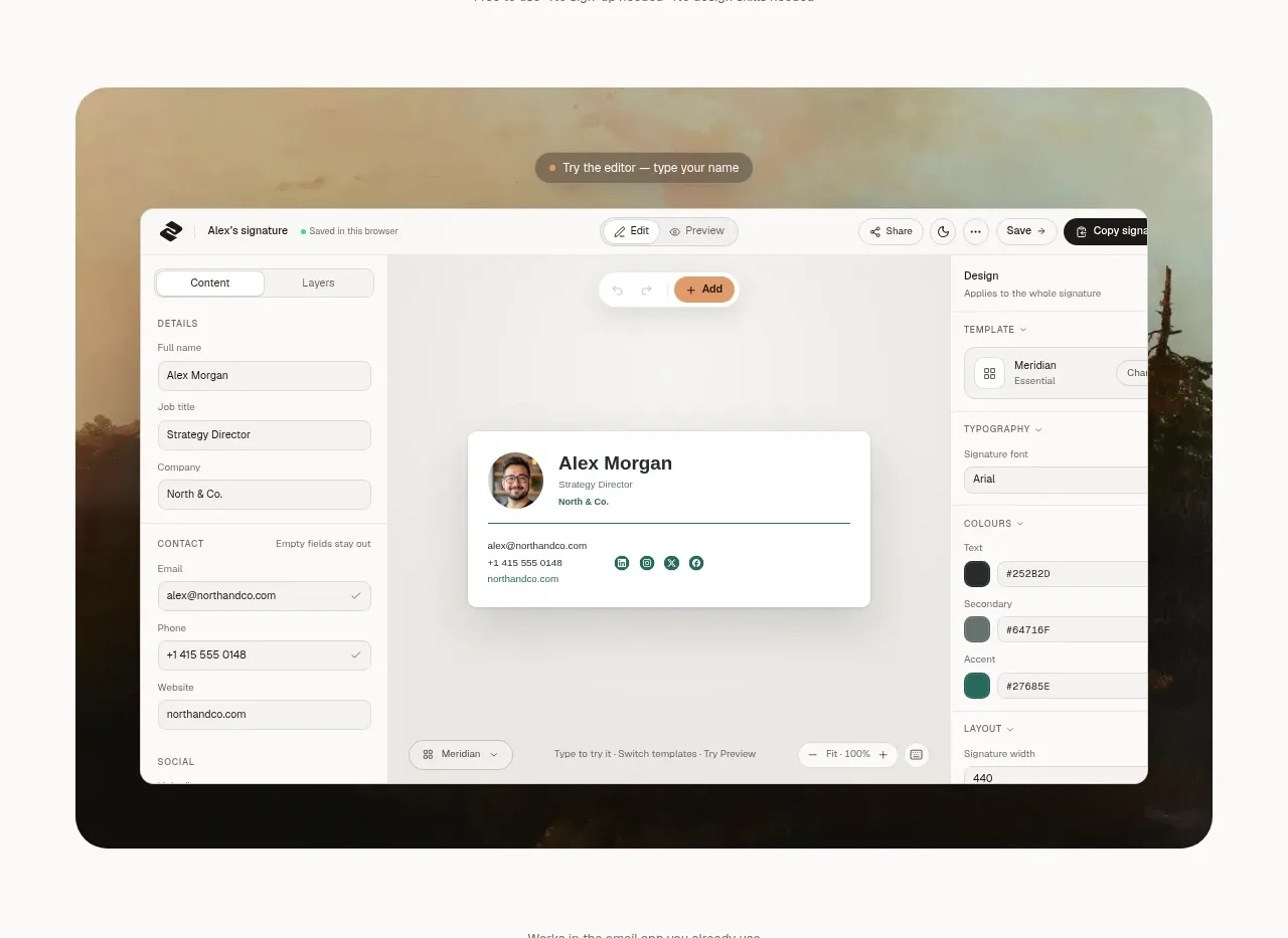
3. **Hero visual** — a full-width rounded card (24–32px radius) acting as a "photo mat": a desaturated warm landscape photograph fills it, with a complete product screenshot (editor UI: left field sidebar, centre canvas, right controls panel) sitting on top with soft shadows. A floating pill prompt ("Try the editor — type your name") overlaps the mat's top edge.
4. **Client strip** — one muted caption line ("Works in the email app you already use") above a single row of five greyscale client logos.
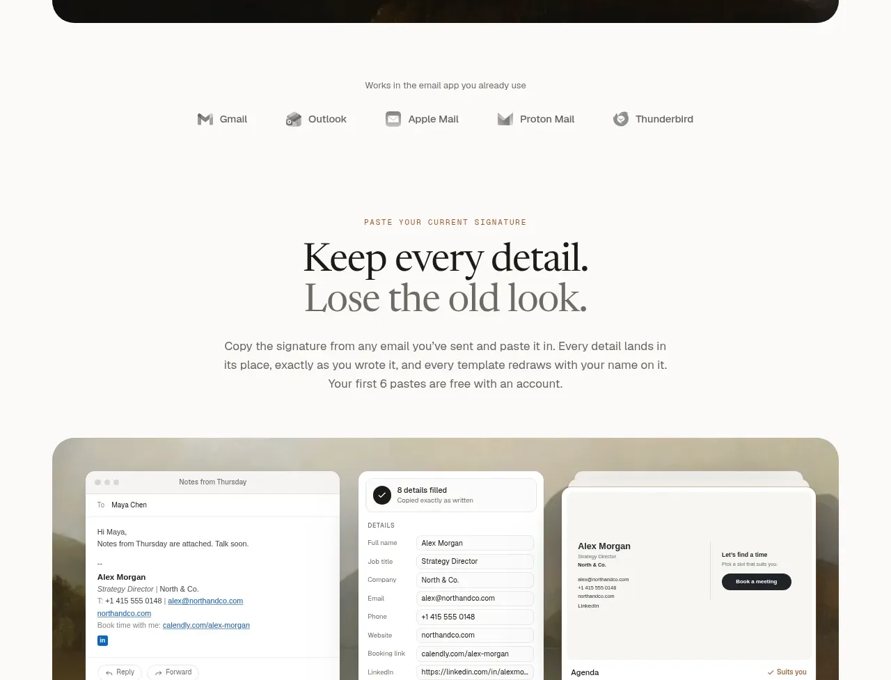
5. **Import feature section** — eyebrow + two-line serif headline ("Keep every detail. / *Lose the old look.*") + subcopy, then another photographic mat containing three overlapping mock panels showing a before → form → after flow. Below it: a four-column numbered row (01–04, each with a hairline top rule, mono number, short title, two-line body), then dual CTAs and a fine-print line with an inline privacy link.
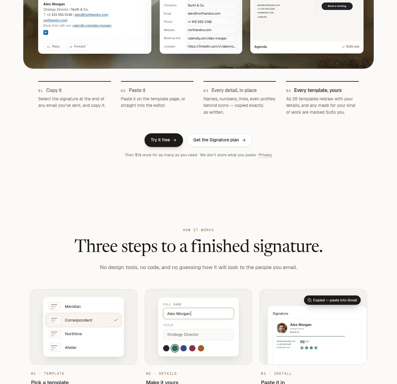
6. **How it works** — eyebrow + headline + subcopy, then three equal cards, each holding a small mock UI artefact (template list, detail form with colour swatches, copied-toast preview) with a mono numbered label and short paragraphs underneath.
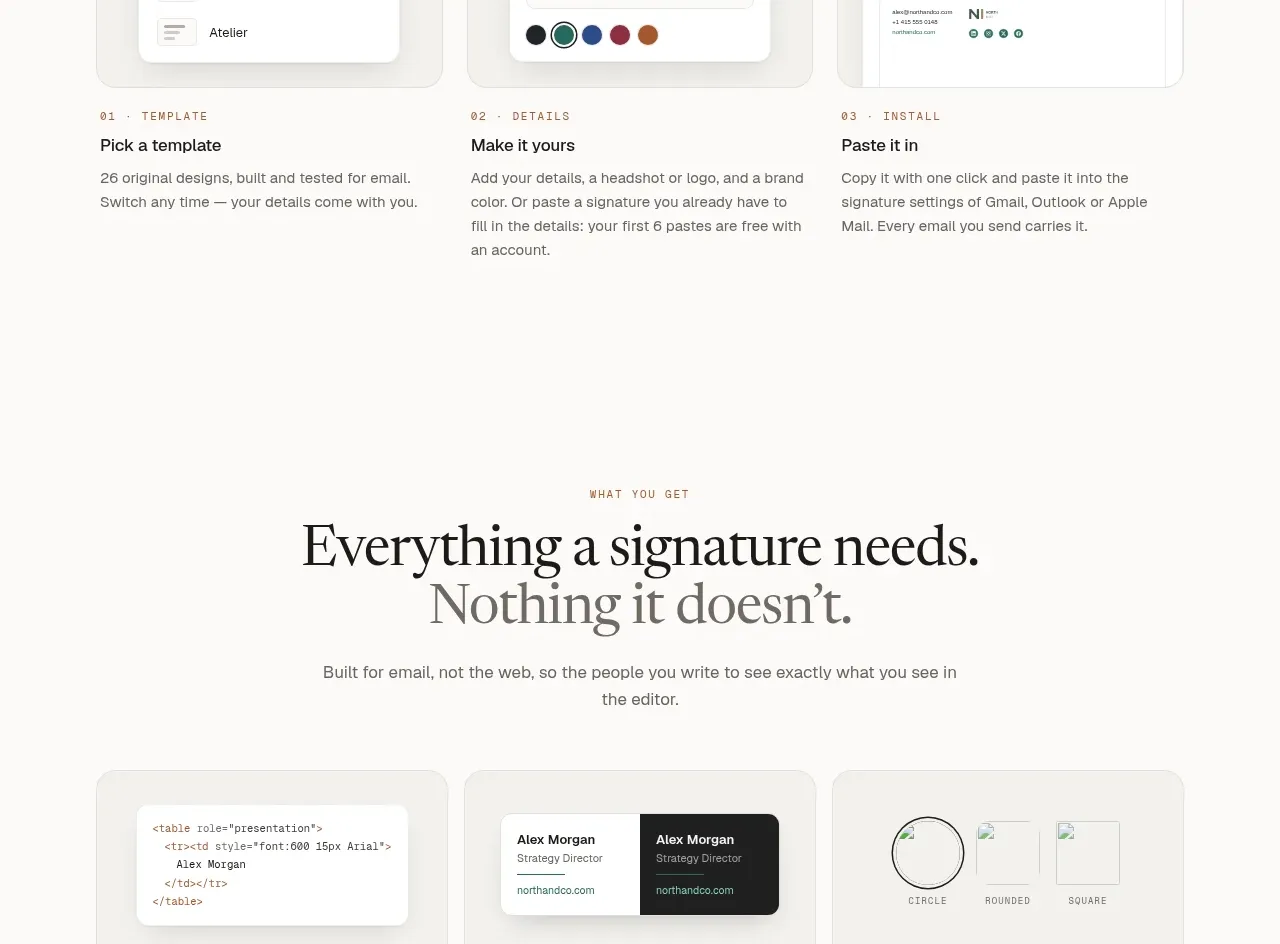
7. **Feature bento** — eyebrow + two-line headline ("Everything a signature needs. / *Nothing it doesn't.*"), then a 3×2 grid of flat beige cards: a small illustrative mock (code snippet, dark-mode chips, crop shapes, colour dots, link chip, file list) sits above a title and one-line muted body. No borders, no shadows.
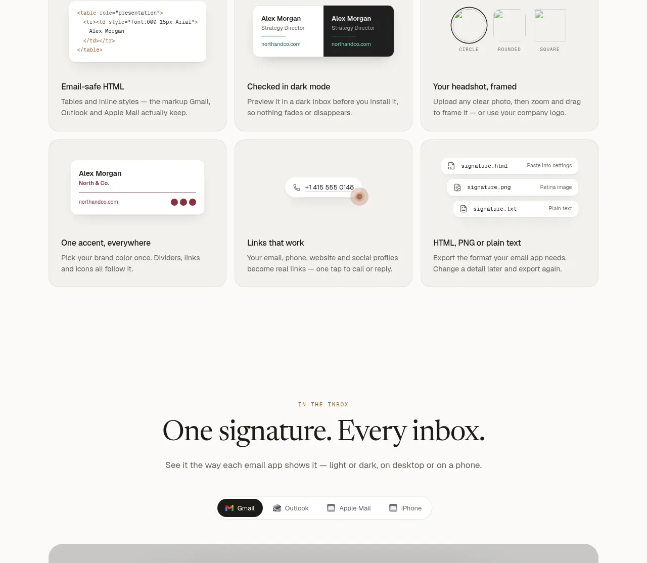
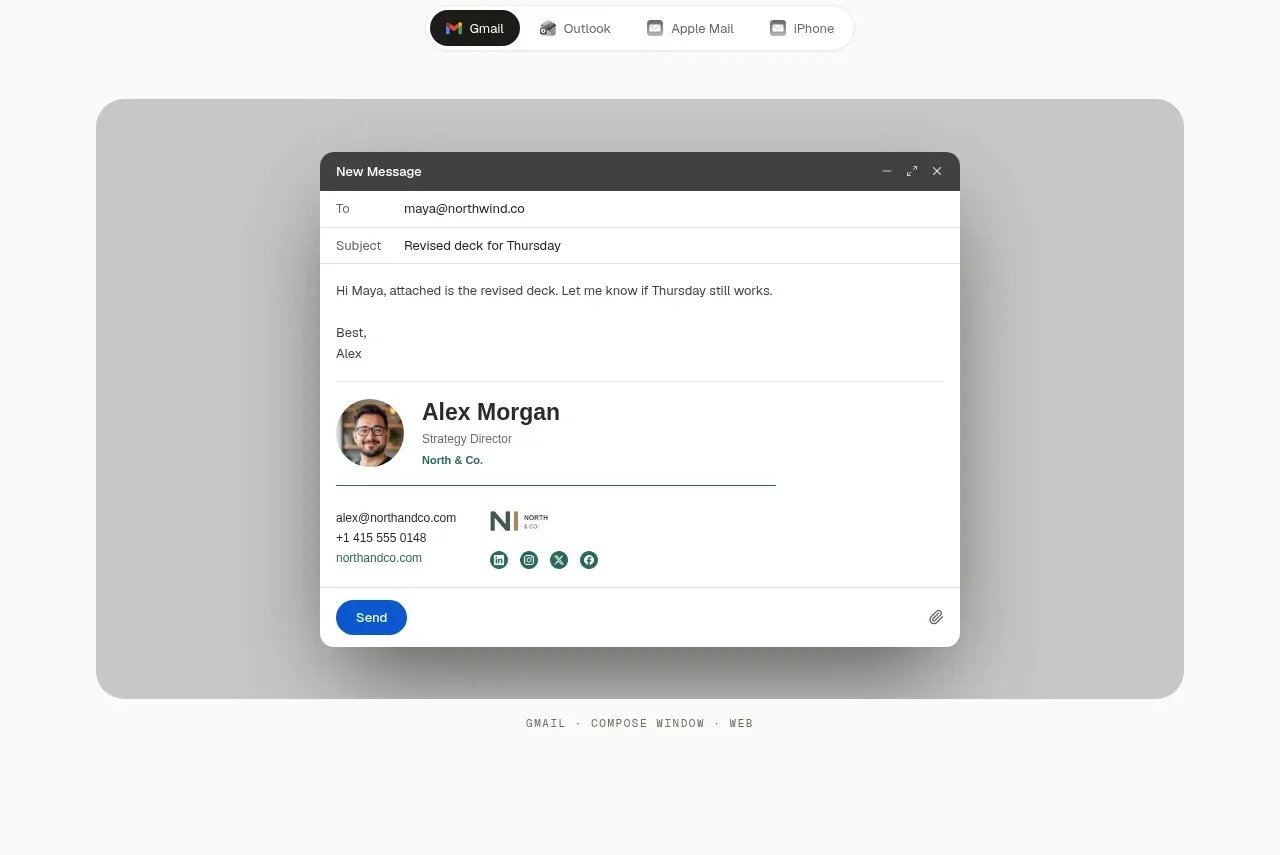
8. **Inbox preview** — eyebrow + headline + subcopy, a segmented pill tab control (Gmail active/dark; Outlook, Apple Mail, iPhone), then a wide photographic mat containing a realistic email compose window with the user's rendered signature inside; a mono uppercase caption ("GMAIL · COMPOSE WINDOW · WEB") sits beneath.
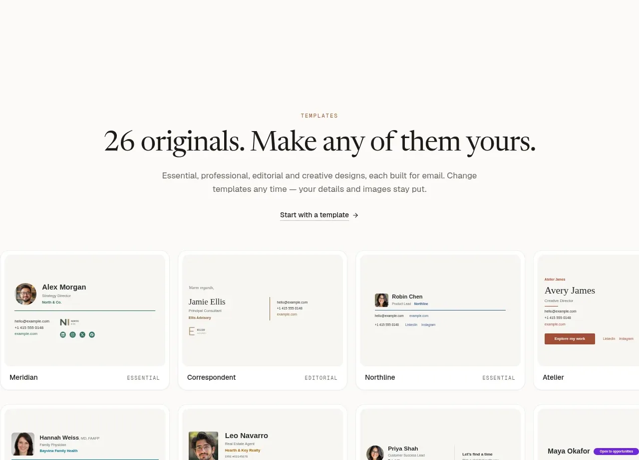
9. **Template gallery** — eyebrow + headline ("26 originals. Make any of them yours.") + an arrowed text link, then a full-bleed, edge-to-edge two-row grid of template cards where the outer cards are cropped by the viewport; each card shows the rendered artefact itself with a name + category label row at the bottom. Below: a caption and a wrapped row of profession pill tags ending in an "All professions →" link.
10. **FAQ** — eyebrow + headline + a human support line with the email address inline, then a hairline-divided accordion with the first question pre-opened and chevrons right-aligned.
11. **Pricing** — one large rounded panel containing everything: eyebrow + two-line headline ("Free to make. / *Pay once for more.*") + subcopy, then two plan columns (Free $0 vs paid $19 once) each with a price row, one-line description, thin-check checklist, and contrasting CTA; a fine-print line about checkout closes it.
12. **Footer** — light, same ivory: brand blurb on the left, five plain link columns (Product, Install, Languages, Account, Company), and a small legal/copyright line.

## Design language
- **Palette**: warm ivory page background (~#F7F3EB), slightly deeper beige for cards (~#EFE8DC), charcoal ink for text and primary buttons (~#221E17), muted warm grey for secondary text (~#6E675C), hairline rules (~#DED5C6). One terracotta/orange accent (~#C4622F) used *only* for mono eyebrows, step numbers and tiny markers. Photographic mats are desaturated warm landscapes (dawn mist, muted greens/browns) that carry all the colour temperature.
- **Type pairing**: a classical serif with true italics for all display headlines; a neutral grotesque sans for body, UI and buttons; a monospace face in uppercase with wide tracking (~0.12–0.16em) for eyebrows, captions and category labels. Display scale is dramatic — roughly 64–88px with tight leading versus 15–16px/1.6 body — and the italic second line of each headline is the page's signature move.
- **Section metronome**: every content section opens with the same triple — orange mono eyebrow, two-line serif headline with italic turn, 1–2 sentence centred subcopy. Reuse this relentlessly so the page reads as one voice.
- **Rhythm**: alternate airy centred text sections with heavy full-width visual cards. Dense rows (numbered steps, bento grid, gallery) sit on flat fills with no card borders, so density never feels noisy; generous vertical padding (~120–160px) separates sections.
- **Photo mats**: product screenshots never float on the bare background — they sit inside large rounded "mats" of photography with a soft vignette, which makes UI artefacts feel like mounted prints. Keep this pattern for any hero-level visual.
- **Buttons**: full pill radius. Primary = solid ink with a trailing arrow glyph; secondary = white/off-white with a hairline border. Microcopy rows of dot-separated reassurances always follow CTA groups.
- **Numbered structures**: hairline top rule, mono orange number (01–04), short bold title, two-line muted body — laid out in equal columns. Use this instead of icon cards for process content.
- **Cards and mocks**: floating UI mocks use white surfaces, 12–16px radius, layered soft shadows, and believable micro-chrome (toolbars, toasts, field labels) so they read as real software. Bento cards stay flat: mock on top, 16px title, one muted line.
- **Gallery**: let the template/artefact grid bleed past the viewport edges so cropping implies more content; label each artefact with a mono name + category row rather than decorative overlays.
- **Controls**: segmented pill tabs with a dark active segment for switching previews; hairline-divided accordions with the first item open.
- **Pricing**: one containing panel with two plan columns instead of separate cards; thin check glyphs, contrasting CTA weights, price as huge serif with the qualifier ("once") in small text beside it.
- **Motion**: restrained — subtle hover states on links and pills, smooth accordion expansion, tab switching; no parallax or decorative animation.

## Never
- Do not use the esigna name, wordmark or logo, or any of its copy, headline phrasing or template names (e.g. Meridian, Correspondent, Northline, Atelier, Practice, Keystone, Agenda, Campus).
- Do not reuse the Alex Morgan persona details, the specific landscape photographs, or the Gmail/Outlook/Apple Mail/Proton Mail/Thunderbird logos unless they are the user's own assets or genuinely applicable.
- Never present the result as the reference product; apply the visual language to the user's own brand, copy and screenshots.
Components from this page
All components
 Minimal top navigation
esigna · Navigation
Minimal top navigation
esigna · Navigation
 Signature builder hero
esigna · Hero
Signature builder hero
esigna · Hero
 Product editor showcase
esigna · Feature grid
Product editor showcase
esigna · Feature grid
 Copy-and-paste workflow
esigna · Feature grid
Copy-and-paste workflow
esigna · Feature grid
 Capabilities grid
esigna · Feature grid
Capabilities grid
esigna · Feature grid
 Inbox preview tabs
esigna · Tabs & steps
Inbox preview tabs
esigna · Tabs & steps
 Template gallery
esigna · Gallery
Template gallery
esigna · Gallery
 Questions answered FAQ
esigna · FAQ
Questions answered FAQ
esigna · FAQ
 Two-tier pricing table
esigna · Pricing table
Two-tier pricing table
esigna · Pricing table
 Multi-column site footer
esigna · Footer
Multi-column site footer
esigna · Footer