kage
kage
esigna.app
Design analysis
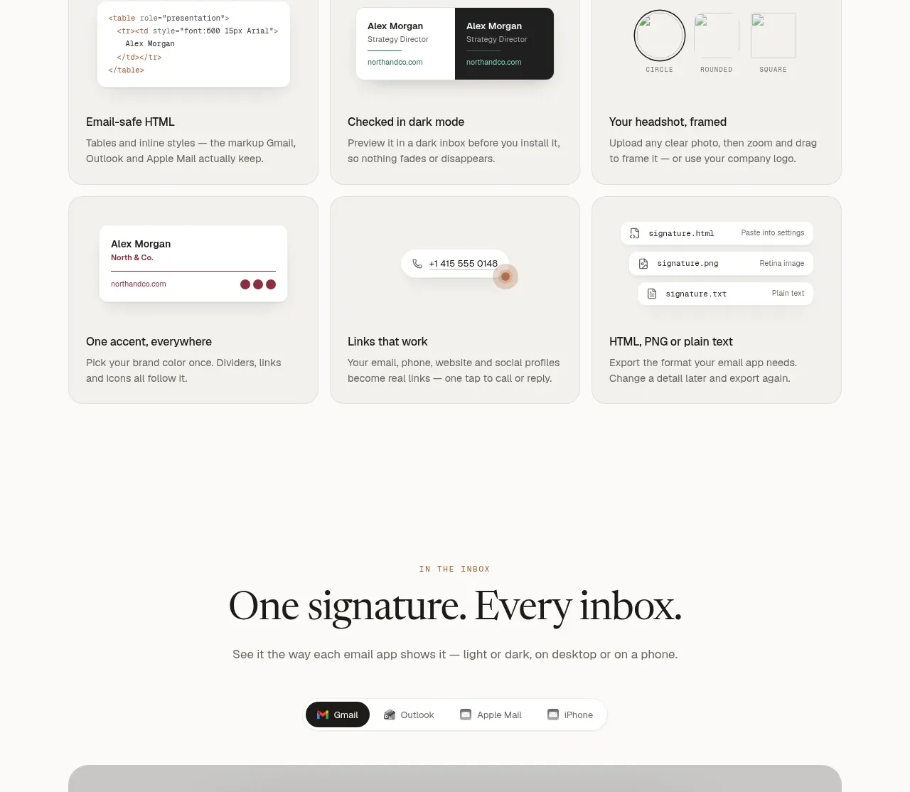
A dense horizontal gallery presents many selectable variations, supported by profession filters that make a large catalog feel approachable.
Prompt preview
## Reference images

Study these alongside the description below: hierarchy, rhythm, spacing, colour. Build for the product you are asked about, using this design language.

- Component: https://kage-design-assets.t3.tigrisfiles.io/components/esigna/76bcd194-d16d-4973-9e2e-b189e2506cae-1791007555-6.webp
- Full page it was cut from: https://kage-design-assets.t3.tigrisfiles.io/screenshots/esigna/76bcd194-d16d-4973-9e2e-b189e2506cae-1791007443637-full.webp
- Component on Kage: https://kage.design/component/esigna-gallery

## Before you start
Ask what reusable templates, examples, or content variants the user's product offers and how people should filter them. Apply the same browsing logic to that catalog.

Build a template gallery section with a centered eyebrow, editorial headline, short description, and a subtle text CTA. Present a wide multi-column gallery of preview cards, ideally with four cards visible on desktop and horizontal overflow or a carousel on smaller screens. Each card has a pale preview canvas, a small realistic UI specimen, a title row, and a category label. Use 12–16px gaps, 14px radius, warm gray surfaces (#f1f0ec), white preview areas, and very light borders. Below the gallery, add centered rounded filter chips for categories; active filters should use dark fill and white text while inactive chips remain white with gray borders. Keep the gallery visually rich but avoid heavy shadows.

Never: use logos, product names, copy, illustrations, or imagery from the reference.