 kage
kage
evvery.app
Design analysis
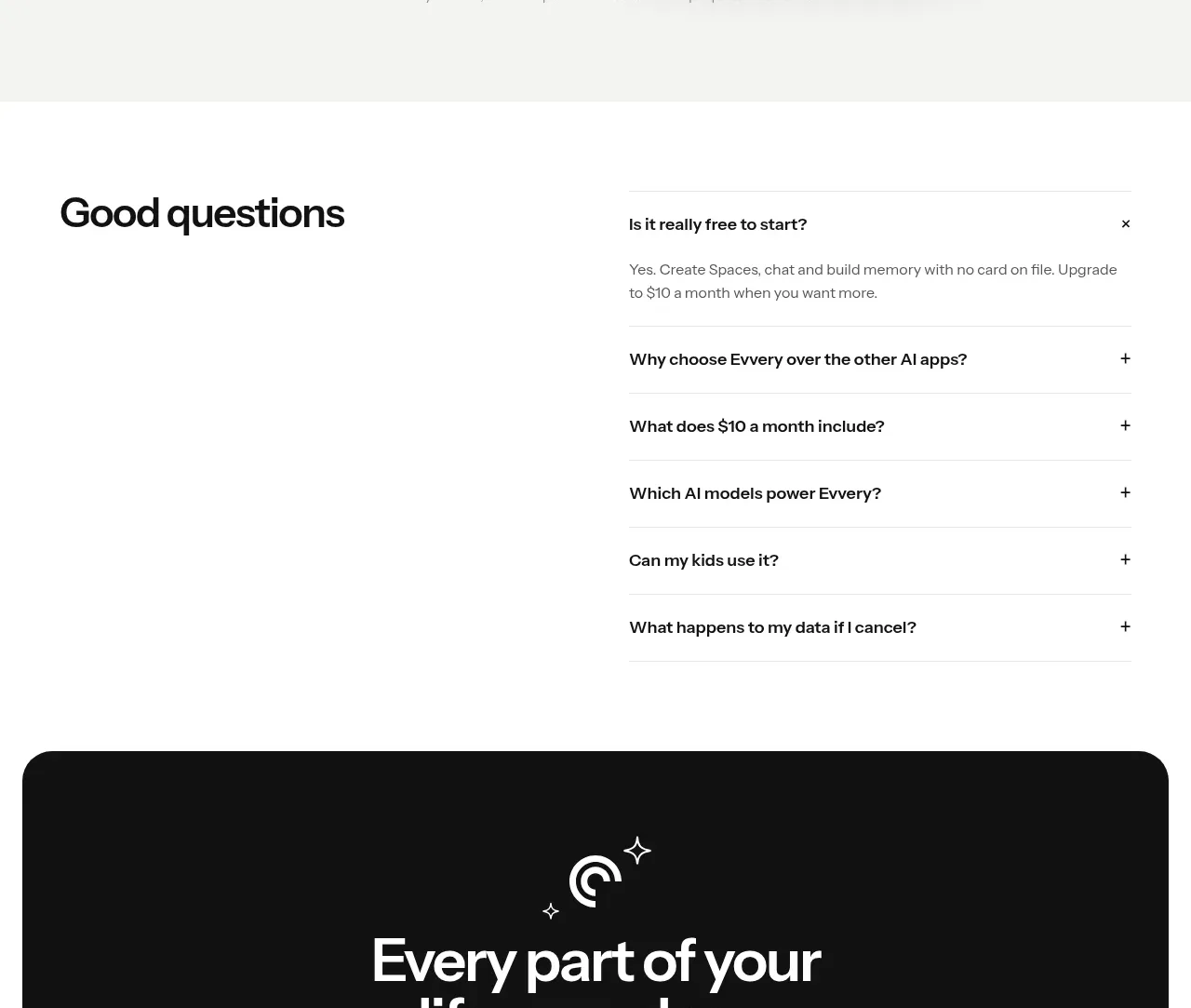
A large rounded black panel closes the page with a compact brand moment, a decisive headline, supporting reassurance, and the same two-action pattern as the hero.
Prompt preview
## Reference images

Study these alongside the description below: hierarchy, rhythm, spacing, colour. Build for the product you are asked about, using this design language.

- Component: https://kage-design-assets.t3.tigrisfiles.io/components/evvery/a269aa57-af78-4f36-91fc-487db18a20bb-1790402475-10.webp
- Full page it was cut from: https://kage-design-assets.t3.tigrisfiles.io/screenshots/evvery/a269aa57-af78-4f36-91fc-487db18a20bb-1790402436622-full.webp
- Component on Kage: https://kage.design/component/evvery-cta

## Before you start
Ask what the user's final conversion goal is and what brand emotion the closing moment should create. Apply these principles with original content.

Create a large centered CTA panel near the end of the page. Use a near-black background, 28–32px radius, generous 64–88px vertical padding, a small decorative mark or simple abstract accent, a large centered two-line headline, muted supporting text, and two pill buttons. Make the primary button white and the secondary one transparent with a light border. Keep the panel visually self-contained with clear contrast and avoid adding unnecessary navigation or dense content. Ensure buttons have hover, focus, and pressed states.

Never use the reference's logo, product name, copy, illustrations, imagery, or exact button labels.
More components

 Network growth CTA
godaylight.com · Call to action
Network growth CTA
godaylight.com · Call to action
 Split closing CTA
godaylight.com · Call to action
Split closing CTA
godaylight.com · Call to action

 Closing conversion banner
FastRouter.ai · Call to action
Closing conversion banner
FastRouter.ai · Call to action

 Final download call to action
Blenny · Call to action
Final download call to action
Blenny · Call to action

 Visual download call to action
Art4 · Call to action
Visual download call to action
Art4 · Call to action

 Sponsor call to action
opensend.cc · Call to action
Sponsor call to action
opensend.cc · Call to action