kage
kage

Design analysis
A consumer AI assistant page built as alternating full-bleed chapters — black hero, white, warm off-white, black privacy band, photo band — each opened by a tiny uppercase eyebrow label. Hierarchy comes almost entirely from extreme type-scale jumps: a ~90px hero headline with small rounded photo thumbnails embedded inline in the sentence, echoed later by a three-line statement in the privacy band. Proof is carried by flat product mockups (memory chips, iMessage-green bubbles, action timelines, status-dot integration rows, LIVE/PLANNED badges) rather than marketing shots, while photography appears only as gradient-overlaid Space cards and one sky background. Hand-drawn touches — a scribble underline, an oval around the $10, script captions — soften the monochrome system, and the 01/02/03 card trio inverts its third card to black to set the page's rhythm.
Prompt preview
## Reference images

Study these alongside the description below: hierarchy, rhythm, spacing, colour. Build for the product you are asked about, using this design language.

- Full page: https://kage-design-assets.t3.tigrisfiles.io/screenshots/evvery/a269aa57-af78-4f36-91fc-487db18a20bb-1790402436622-full.webp
- Above the fold: https://kage-design-assets.t3.tigrisfiles.io/screenshots/evvery/a269aa57-af78-4f36-91fc-487db18a20bb-1790402431611.webp
- Design on Kage: https://kage.design/designs/evvery-landing-page

## Before you start
Before writing any code, ask the user: what product are you building, who is it for, and what brand assets do they already have (name, logo, colours, typeface, product screenshots)? Wait for the answers. Every rule below is applied to *their* product — its copy, its imagery, its domain — never to the reference site.

## Page structure
Build a single long marketing page with these sections, in order:

1. **Top nav (black)** — wordmark left; six text anchor links right (product pillars + pricing); one white pill CTA at far right. Slim, single row.
2. **Hero (black, full-bleed)** — centred two-line display headline (~90px) with small rounded photo thumbnails embedded *inside* the sentence as inline chips, plus a hand-drawn SVG underline under the final word. Below: 3-line grey paragraph, then two pill CTAs side by side (solid white primary; 1px-bordered secondary with a platform glyph), then a one-line pricing caption in small grey text.
3. **Category pill strip (still on black)** — a horizontally scrollable row of pill chips, each with a small emoji/icon + label (life domains). Acts as a bridge into the next section.
4. **Differentiator trio (white)** — left-aligned bold heading. Three equal cards in a row, each with a tiny index label (01/02/03), heading, short body, an embedded visual (mini UI mockup or stacked photos) and a one-line footnote pinned to the card bottom. Render the third card inverted black.
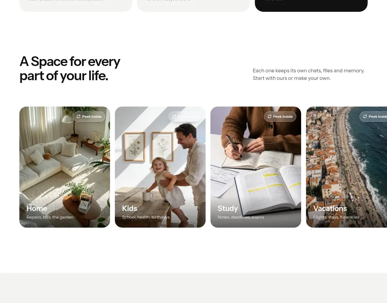
5. **Spaces gallery** — split header: huge two-line heading left, one short paragraph right. Below, edge-to-edge horizontally scrollable photo cards with dark gradient overlays, name + sub-label bottom-left, and a small "peek inside" chip top-right on each.
6. **Memory feature (warm off-white band)** — eyebrow label, centred heading + subcopy, then one large white UI card mockup: a header row, tag-style memory chips (some blurred), a "+ add" chip, a right-aligned user question bubble and a left-aligned assistant reply paragraph.
7. **Texting feature (white)** — eyebrow, centred heading, subcopy, one solid black pill CTA, then a split visual: phone mockup with chat bubbles (green SMS-style) on the left, and a stacked action-timeline card on the right ("memory saved", "to-do added", a drafted message row with an inline approve button).
8. **Shared spaces split** — photo card left with a handwritten-style script caption and a small notification chip overlapping it; right column has eyebrow, heading, body.
9. **Connections split (mirrored)** — eyebrow, heading, body left; white card right with three integration rows (icon, name, sub-label, status dot + label) and a small assistant note card beneath.
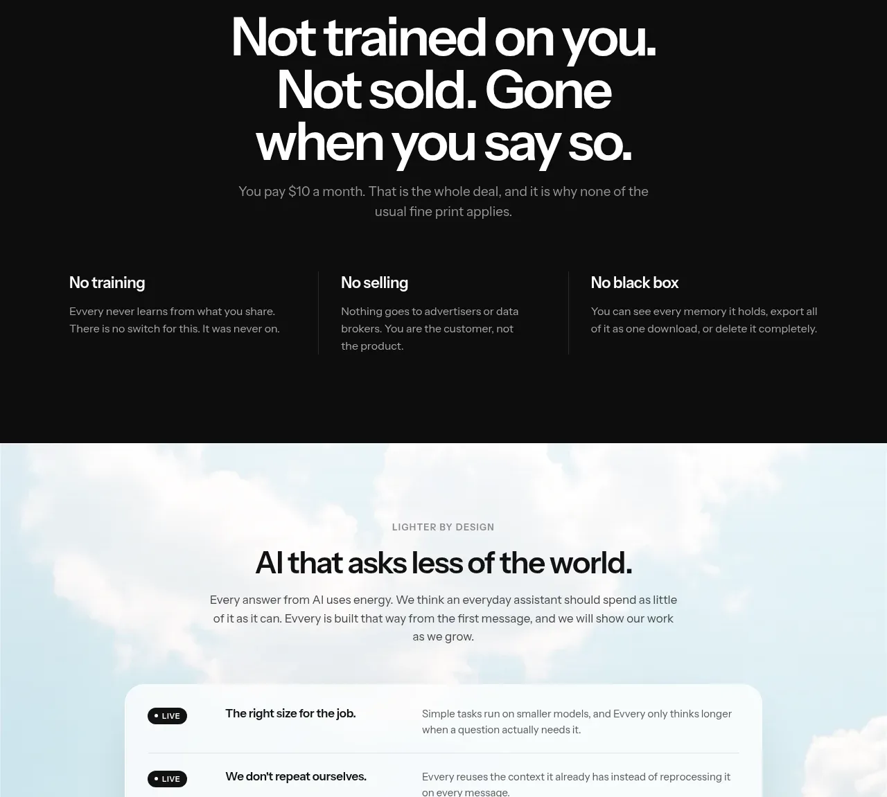
10. **Privacy band (full black)** — eyebrow, huge centred three-line statement (~72px), one grey sentence, then three columns (bold claim + two-line explanation) separated by hairline vertical rules.
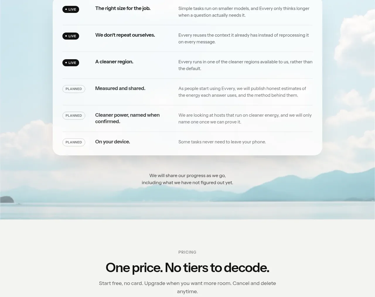
11. **Sustainability section (full-bleed sky photo background)** — eyebrow, heading, subcopy, then a floating white card with a 6-row commitment list; each row = status badge (filled "live" vs outlined "planned"), bold title, grey description. Small italic caption below the card.
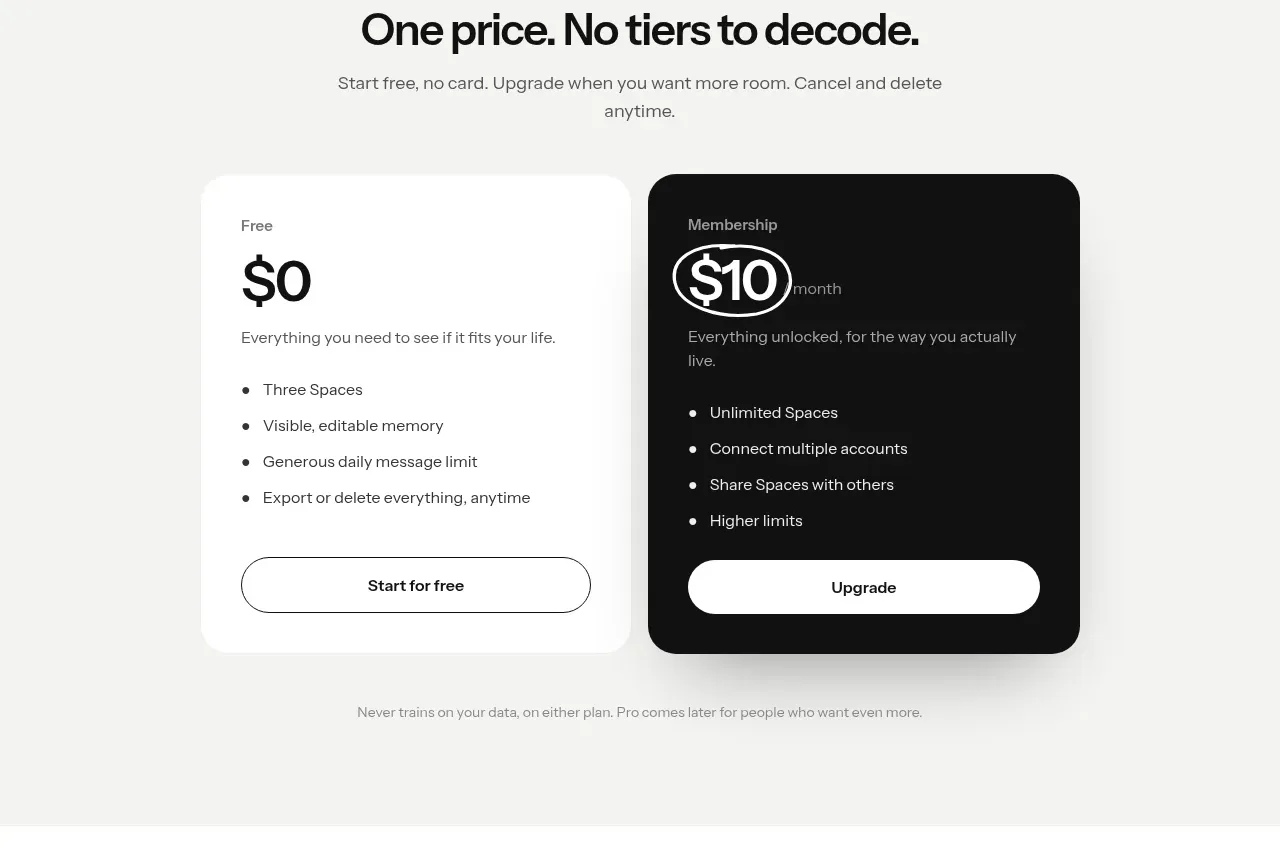
12. **Pricing (white)** — eyebrow, centred heading with a "one price, no tiers" message, subcopy. Two cards: light free tier (big price, bullet list, outlined pill button) and black paid tier (price with a hand-drawn oval scribble around it, bullet list, solid white button). Small footnote centred below.
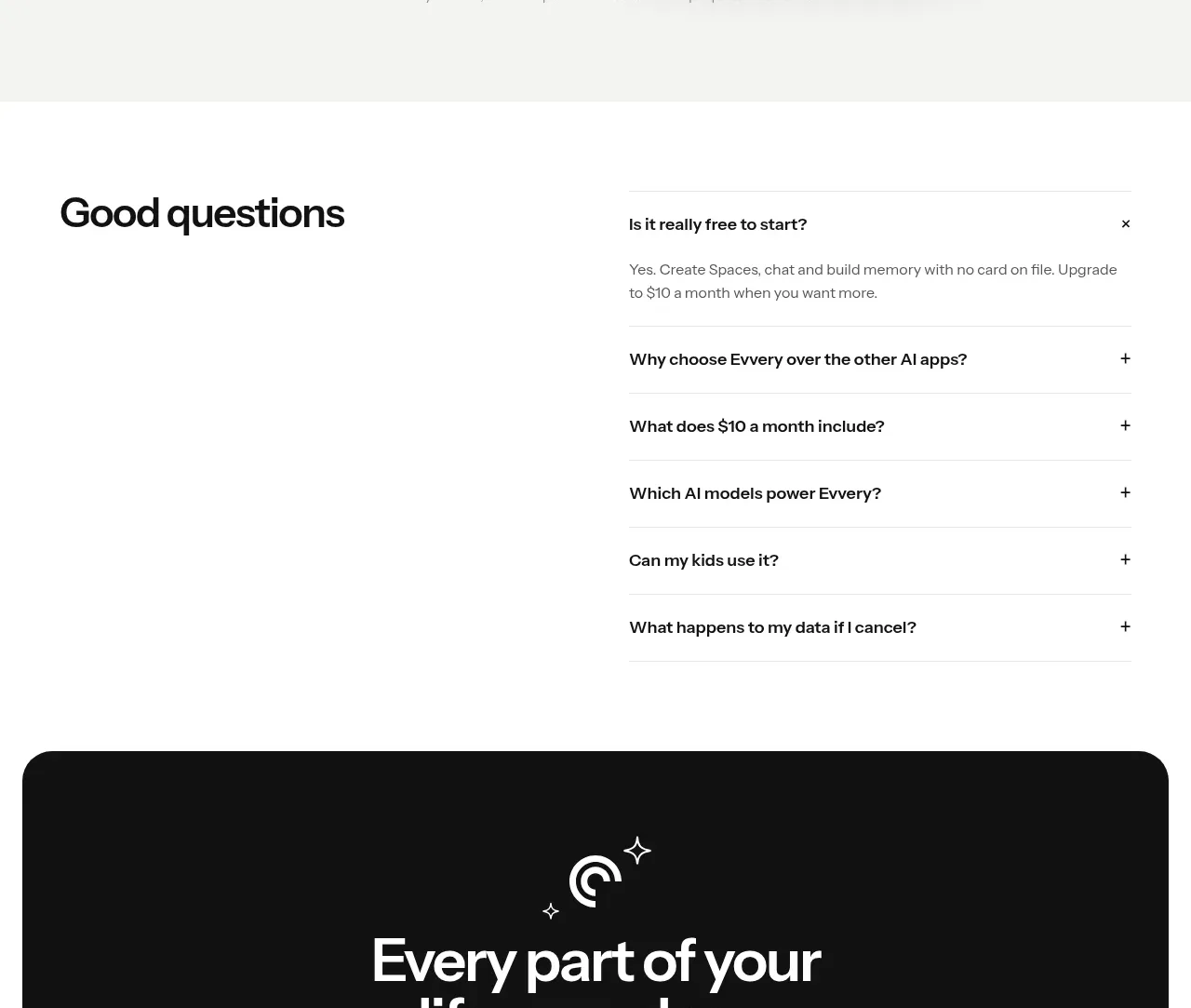
13. **FAQ** — heading in a left column; right column an accordion with hairline dividers, "+"/"×" toggles, first item expanded by default.
14. **Final CTA** — inset black rounded card (not full-bleed): centred logo mark with small sparkle doodles, heading, one-line subcopy, same two CTAs as the hero.
15. **Footer (black)** — wordmark + copyright left; five small utility links right.

## Design language
- **Palette:** near-black `#0A0A0A`–`#111111` for dark bands and cards; white `#FFFFFF`; warm off-white `#F4F2ED` for alternating light bands; muted grey text `#8A8A86` on light, `#9B9B97` on dark. Strictly monochrome chrome — colour enters only via photos, emoji chips and one green `#3DC760` SMS bubble in the phone mockup.
- **Type:** one geometric-humanist sans throughout. Display sizes clamp ~56–96px at weight 650–700 with -0.02em tracking; body 16–17px/1.6; eyebrow labels 11–12px uppercase with 0.15em letter-spacing in grey. Hierarchy is built by scale jumps (tiny eyebrow → huge headline → small body), not by colour or weight variety.
- **Rhythm:** alternate full-bleed band colours (black → white → warm grey → white → black → photo → white → black) so each chapter reads as a scene change; every chapter opens with an eyebrow label; centre-aligned feature chapters alternate with asymmetric two-column splits.
- **Buttons & chips:** everything is a pill (radius 999px). Primary = solid white on black or solid black on white; secondary = 1px translucent border, no fill. Category chips and memory tags are small pills with icons.
- **Cards:** radius 16–24px, borderless on light backgrounds, separated by whitespace; 1px `rgba(0,0,0,0.08)` hairlines for dividers inside cards; only floating UI mockups get a soft diffuse shadow. The dark variant inverts with white-on-black text and `rgba(255,255,255,0.14)` hairlines.
- **Product mockups:** rebuild real product screens as flat cards — chips, bubbles, status rows — instead of abstract illustrations; use status semantics consistently (dot + label like "connected", filled pill for live items, outlined pill for planned items).
- **Hand-drawn accents:** exactly one per key moment — an SVG scribble underline on a hero word, a scribbled oval around a price, a script-font caption on a photo. Never more.
- **Inline image chips:** small (1–1.2em) rounded photo thumbnails embedded mid-sentence in display headlines, radius ~30%, using the user's own imagery.
- **Motion:** restrained — subtle lift/brightness on pill hover, smooth accordion expansion, gentle horizontal scroll on card galleries. No parallax or glow effects.

## Never
- Do not use the reference site's name, wordmark, logo, copy, taglines, FAQ text or photography anywhere.
- Do not reuse its specific photo chips, illustration doodles or icon set; source or generate equivalent assets for the user's product.
- Do not imitate Apple/iMessage branding beyond generic platform-accurate UI conventions, and never present the result as the reference product.
Components from this page
All components
 Minimal product navigation
Evvery · Navigation
Minimal product navigation
Evvery · Navigation
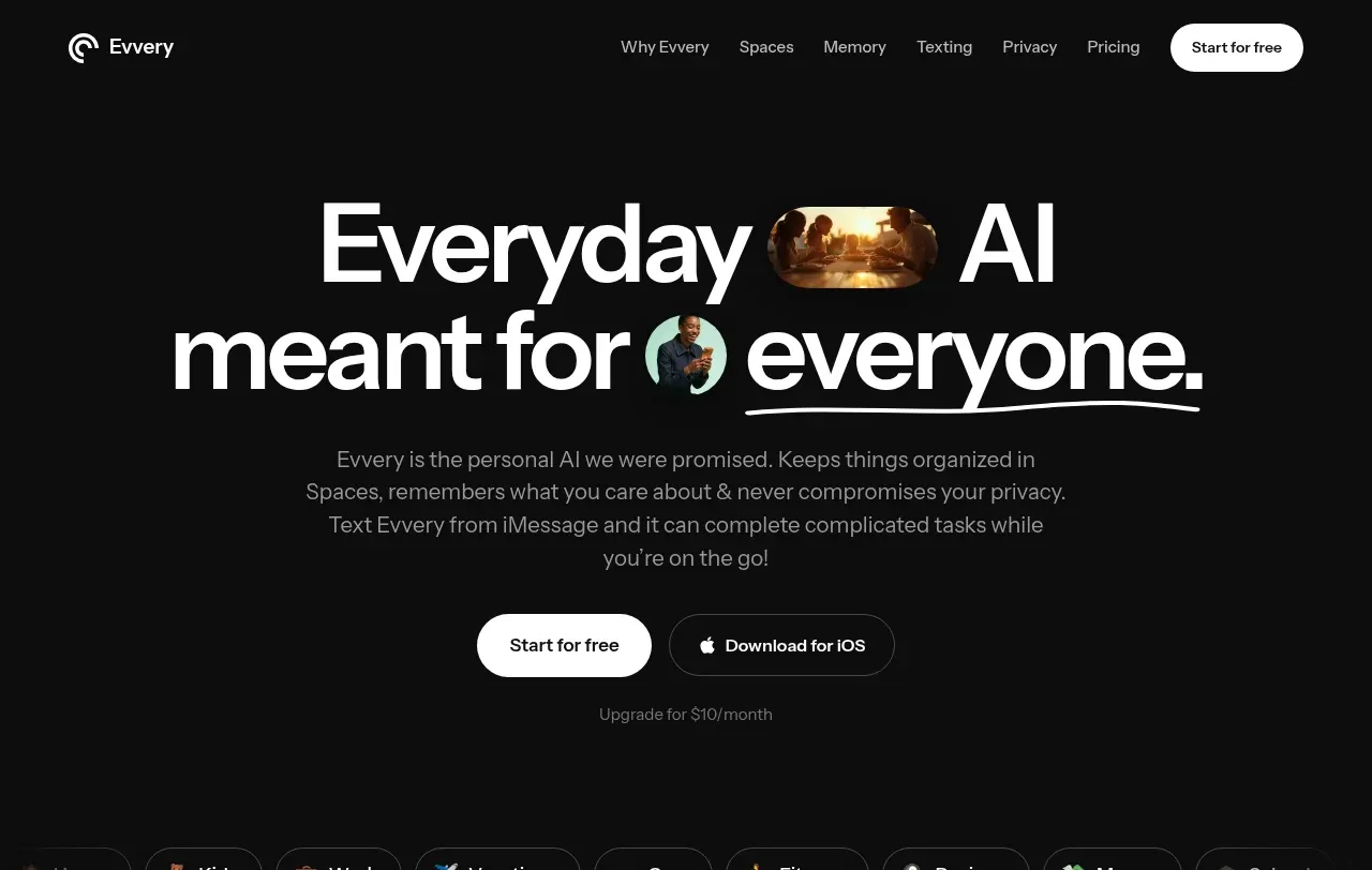 Everyday AI hero
Evvery · Hero
Everyday AI hero
Evvery · Hero
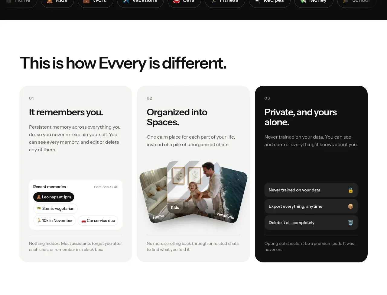 Three product differences
Evvery · Feature grid
Three product differences
Evvery · Feature grid
 Life spaces gallery
Evvery · Gallery
Life spaces gallery
Evvery · Gallery
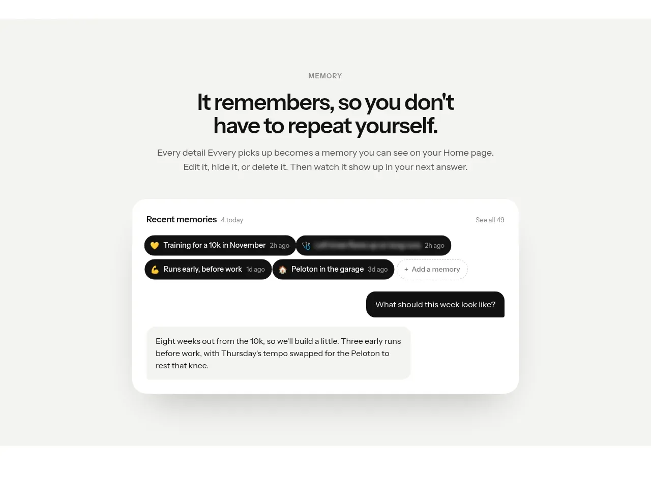 Memory feature showcase
Evvery · Feature grid
Memory feature showcase
Evvery · Feature grid
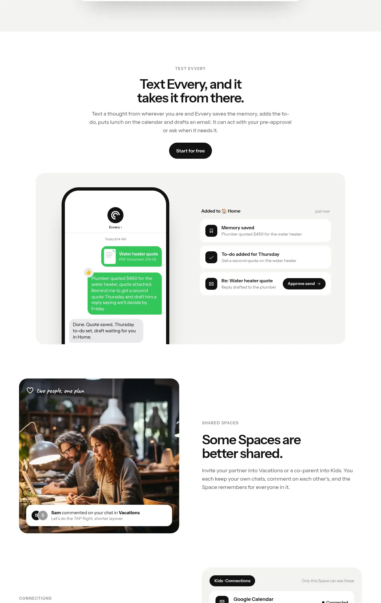 Text action and shared workflows
Evvery · Feature grid
Text action and shared workflows
Evvery · Feature grid
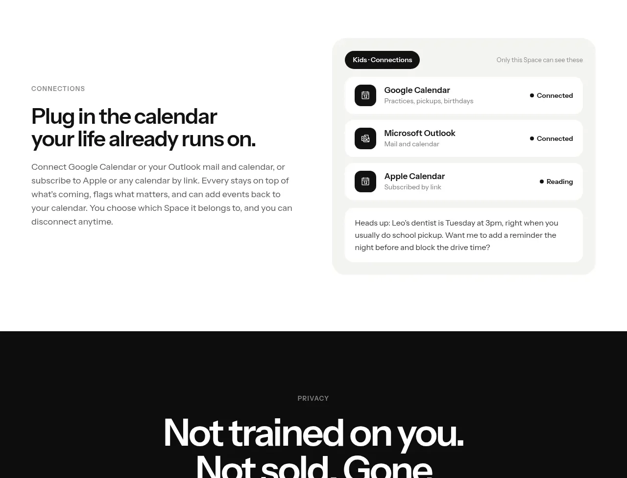 Privacy promise
Evvery · Feature grid
Privacy promise
Evvery · Feature grid
 Sustainability commitments
Evvery · Table
Sustainability commitments
Evvery · Table
 Two-tier pricing
Evvery · Pricing table
Two-tier pricing
Evvery · Pricing table
 Frequently asked questions
Evvery · FAQ
Frequently asked questions
Evvery · FAQ
 Final conversion panel
Evvery · Call to action
Final conversion panel
Evvery · Call to action
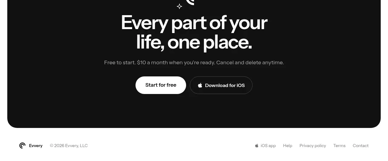 Compact legal footer
Evvery · Footer
Compact legal footer
Evvery · Footer