kage
kage
evvery.app
Design analysis
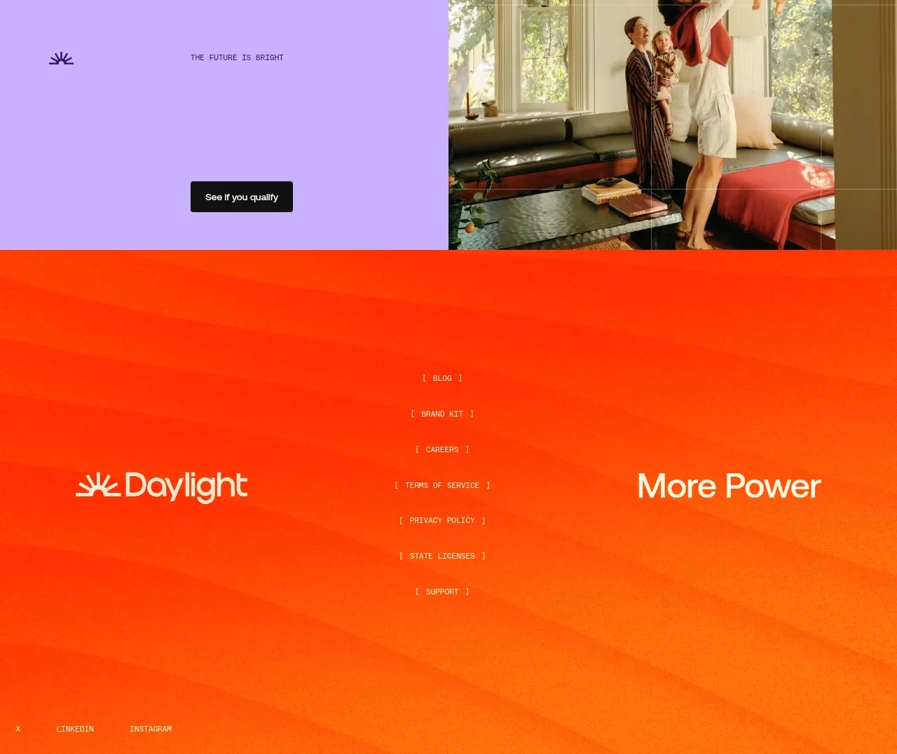
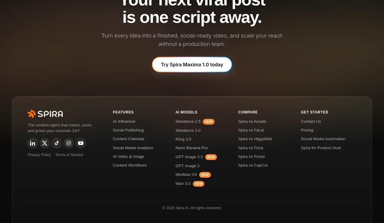
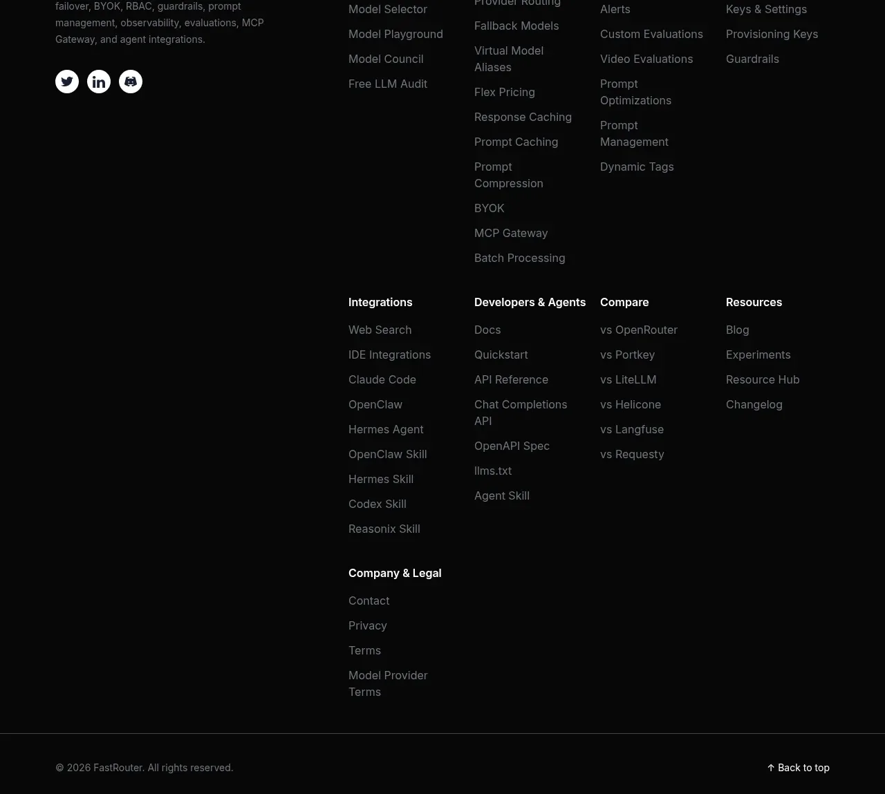
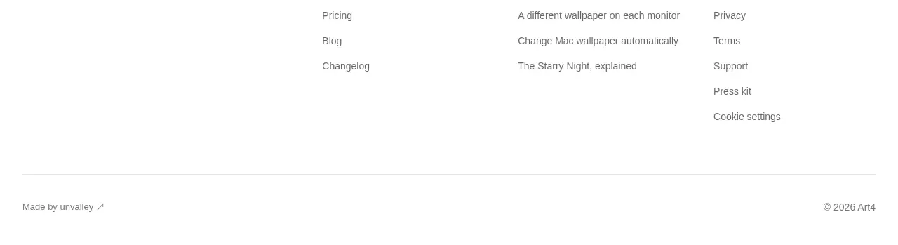
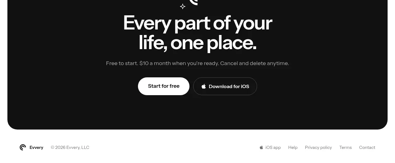
A restrained footer balances a small brand attribution on the left with utility and legal links on the right, preserving the page's quiet visual language.
Prompt preview
## Reference images

Study these alongside the description below: hierarchy, rhythm, spacing, colour. Build for the product you are asked about, using this design language.

- Component: https://kage-design-assets.t3.tigrisfiles.io/components/evvery/a269aa57-af78-4f36-91fc-487db18a20bb-1790402475-11.webp
- Full page it was cut from: https://kage-design-assets.t3.tigrisfiles.io/screenshots/evvery/a269aa57-af78-4f36-91fc-487db18a20bb-1790402436622-full.webp
- Component on Kage: https://kage.design/component/evvery-footer

## Before you start
Ask what legal links, support links, social links, and brand details the user's product requires. Use the user's identity and content.

Build a compact footer below the closing CTA with a white background, a shared max-width container, and a thin top boundary if needed. Put a small brand attribution and copyright on the left, and a horizontal group of app, help, privacy, terms, and contact links on the right. Use 12–14px muted gray text, generous 24–32px padding, and enough contrast for accessibility. On mobile, wrap links into a tidy second row and preserve comfortable tap targets.

Never use the reference's logo, product name, copy, illustrations, imagery, or exact legal text.