kage
kage
evvery.app
Design analysis
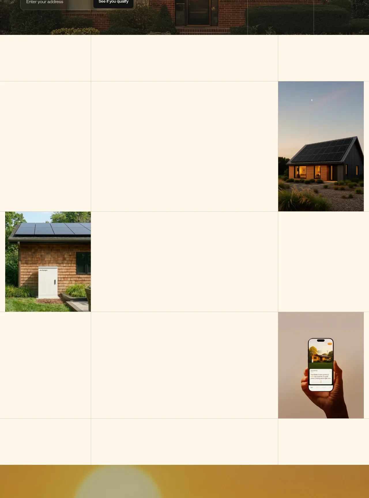
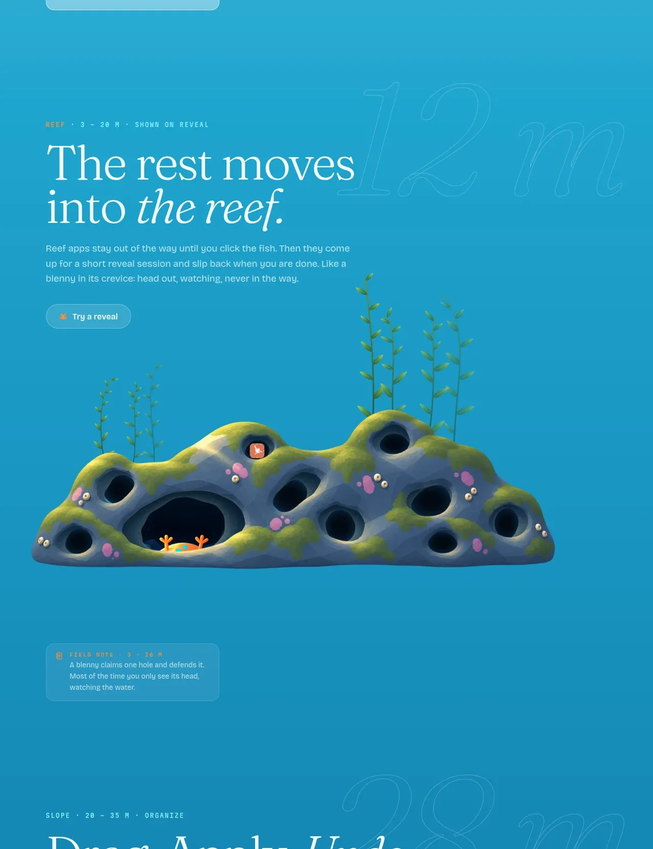
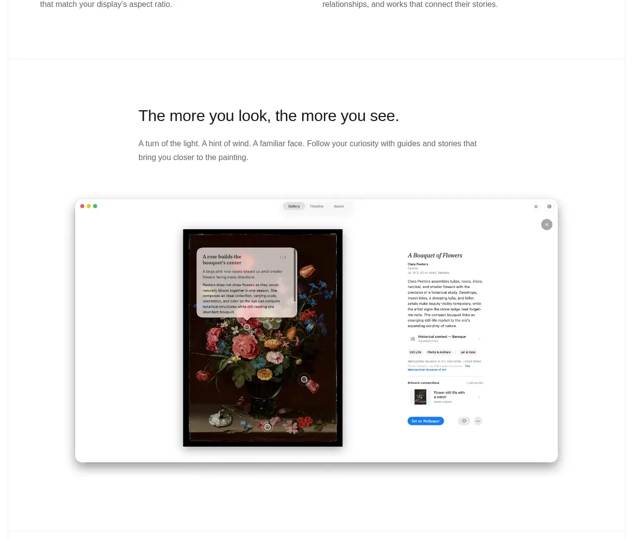
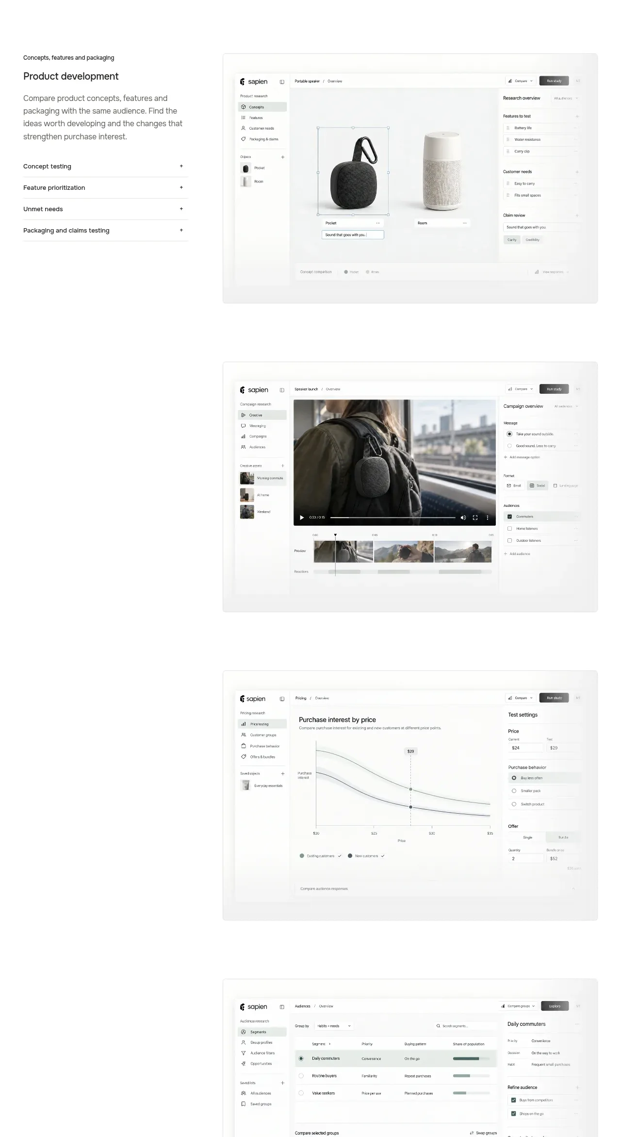
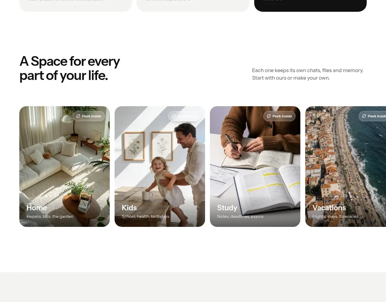
A spacious gallery turns product categories into visual cards, using large imagery, dark overlays, and short labels anchored at the bottom.
Prompt preview
## Reference images

Study these alongside the description below: hierarchy, rhythm, spacing, colour. Build for the product you are asked about, using this design language.

- Component: https://kage-design-assets.t3.tigrisfiles.io/components/evvery/a269aa57-af78-4f36-91fc-487db18a20bb-1790402472-3.webp
- Full page it was cut from: https://kage-design-assets.t3.tigrisfiles.io/screenshots/evvery/a269aa57-af78-4f36-91fc-487db18a20bb-1790402436622-full.webp
- Component on Kage: https://kage.design/component/evvery-gallery

## Before you start
Ask what categories or workflows matter for the user's product and what imagery is appropriate to its brand. Build an original gallery around those answers.

Create a wide gallery section with a two-part intro: a bold heading on the left and a short supporting paragraph on the right. Below it, show a horizontal row of four or more tall rounded image cards. Use varied but coherent imagery, a subtle bottom gradient, small contextual labels, and a restrained “peek” affordance near the top. Cards should be around 220–260px tall on desktop, use 18–22px radius, and have 12–16px gaps. Allow horizontal scrolling on narrow screens. Use white space generously and keep text legible over images.

Never use the reference's logo, product name, copy, illustrations, imagery, or exact category names.