kage
kage
fastrouter.ai
Design analysis
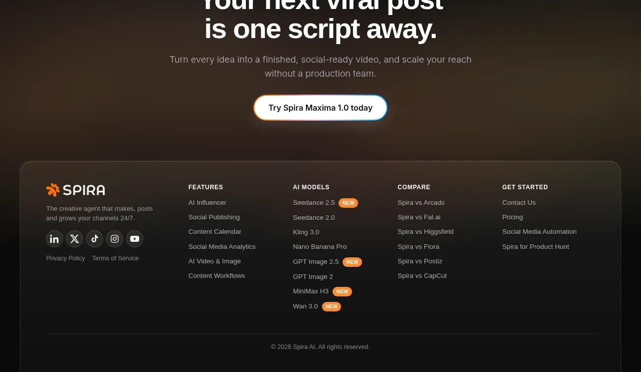
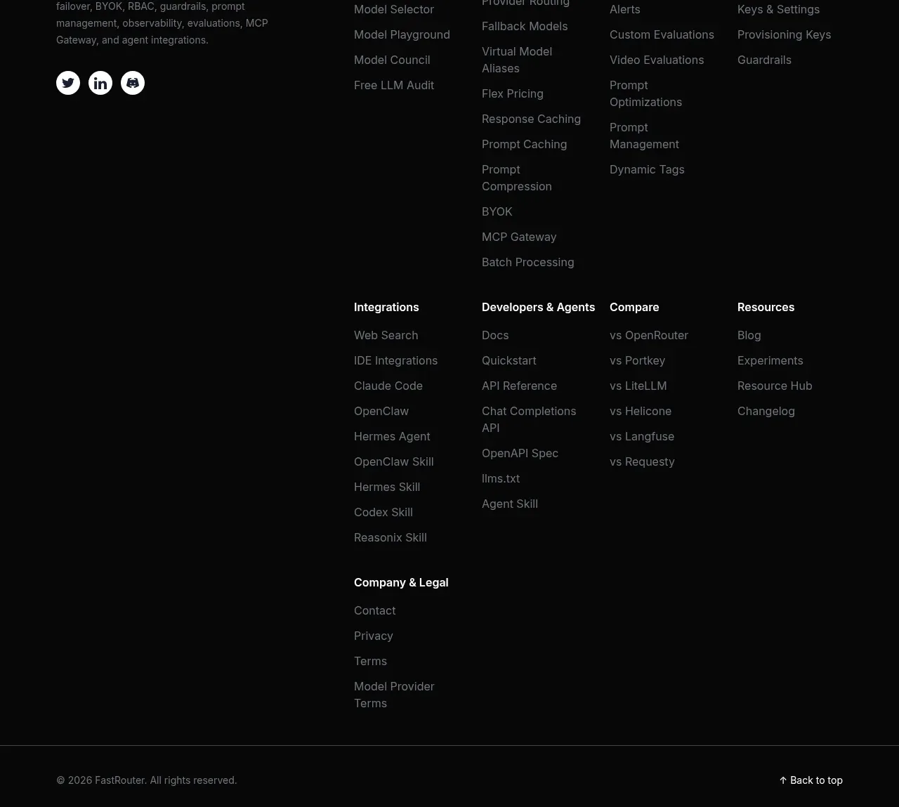
The footer provides a concise product description and social links beside several grouped navigation columns, then ends with a thin legal bar and back-to-top affordance. The dark treatment maintains continuity with the closing CTA.
Prompt preview
## Reference images

Study these alongside the description below: hierarchy, rhythm, spacing, colour. Build for the product you are asked about, using this design language.

- Component: https://kage-design-assets.t3.tigrisfiles.io/components/fastrouter-ai/218f3f00-5cca-4309-9765-d0ad1151c96f-1791266483-10.webp
- Full page it was cut from: https://kage-design-assets.t3.tigrisfiles.io/screenshots/fastrouter-ai/218f3f00-5cca-4309-9765-d0ad1151c96f-1791266439499-full.webp
- Component on Kage: https://kage.design/component/fastrouter-footer

## Before you start
Ask what navigation groups, support resources, legal links, and social destinations the user's product needs. Organize them around the user's information architecture.

Build a dark multi-column footer. On the first row, place a small brand block with a mark, short description, and social icon buttons, alongside 4–6 columns of grouped links. Use clear 12–13px group headings in `#f1f2f4`, muted link text around `#858a92`, and generous 12–16px vertical gaps. Use a near-black background `#080909`, subtle divider `#292b2e`, and 32–48px horizontal padding within a centered max-width container. Allow long link columns to wrap into a second row on desktop and stack groups on mobile. End with a full-width divider, copyright text, and a back-to-top link. Provide hover, focus, and sufficient contrast for every link; use real accessible labels for social icons.

Never use logos, product names, copy, illustrations, or imagery from the reference.