kage
kage
fastrouter.ai

Design analysis
An enterprise AI-gateway landing page organised as alternating white and near-black full-bleed bands, with a royal-blue primary accent and a green highlight reserved for the Insights sub-brand. Hierarchy is built from uppercase tracked eyebrows, tight display headlines, and pale-blue abstract flow diagrams that alternate sides down the page, before closing with a dark code-sample band, testimonial cards, and a dense multi-column footer. Feature rows breathe with ~120px padding while the solutions and footer sections tighten density, producing a steady enterprise rhythm rather than one long hero.
Prompt preview
## Reference images

Study these alongside the description below: hierarchy, rhythm, spacing, colour. Build for the product you are asked about, using this design language.

- Full page: https://kage-design-assets.t3.tigrisfiles.io/screenshots/fastrouter-ai/218f3f00-5cca-4309-9765-d0ad1151c96f-1791266439499-full.webp
- Above the fold: https://kage-design-assets.t3.tigrisfiles.io/screenshots/fastrouter-ai/218f3f00-5cca-4309-9765-d0ad1151c96f-1791266432991.webp
- Design on Kage: https://kage.design/designs/fastrouter-landing-page

## Before you start
Ask the user these questions and wait for the answers before writing any code:
- What product are we building and what does it do?
- Who is it for (engineers, enterprise buyers, or a mixed audience)?
- What brand assets already exist: name, logo mark, primary accent colour, secondary highlight colour, and typeface?
Everything below is a layout and visual grammar to apply to the user's own product and brand — not the reference site.

## Page structure
1. **Header** — slim bar (~64px): wordmark left; right side a compact solid "Sign in" button plus a menu trigger. No inline nav links; white background, hairline bottom edge.
2. **Hero** — centred column: announcement pill (small icon + text + accent link), two-line display headline, two-sentence muted subcopy, then two CTAs side by side (solid primary + bordered secondary). Below, a fan/arc of rounded partner-logo tiles with the product's own mark glowing in a coloured circle at the centre — reads as "one hub routing to everything".
3. **Trust bar** — tiny "Trusted by teams at" microcopy above a single muted grayscale logo row (6–7 marks).
4. **Flagship feature split** (light) — left: pill badge ("Introducing …"), headline with the product name tinted in the highlight colour, short body, two CTAs; right: a stats card with oversized numbers (e.g. a percentage and a dollar figure) plus secondary metrics in a small grid.
5. **Dark enterprise band** — left: headline + vertical capability list where the first item is expanded with body copy and a 3px accent left-border and the rest are collapsed titles; right: a dark UI mockup (catalog/grid with filter chips and item cards).
6. **Four alternating feature rows** (light) — each row: uppercase eyebrow → headline → one-line intro → three icon bullets (bold title + one-line body) → accent "Get started ↗" link. Text and diagram swap sides each row. Diagrams are abstract flow mockups: app card → criteria chips → model icons; failover cards with red failure and green success states; critique loops; dashboard tiles — drawn as small soft cards on pale accent-tinted panels with connector lines.
7. **Dark solutions band** — headline with right-aligned supporting paragraph; three role cards (icon, role title, two-line body, large soft gradient shape bleeding from the bottom edge); below, two stacked full-width banners: a self-host banner (icon, text, secondary CTA) and a credits banner (large headline, fine print, primary CTA, decorative imagery on the right).
8. **Capability grid** (light) — headline + supporting sentence; 2×2 grid of bordered cards, each with title, body, and a small abstract illustration (chip flows, shield, alert routing, task routing).
9. **Supported-models row** — centred grayscale logo strip.
10. **Dark developer band** — headline left, supporting sentence right; segmented control (SDK vs Direct API); large code window with macOS dots, copy button, language tabs, and a syntax-highlighted snippet demonstrating one concrete integration step (e.g. swapping the base URL).
11. **Testimonials** (light) — headline left, supporting sentence right; three bordered cards: avatar, name, role/company, multi-line quote.
12. **Closing CTA band** (dark, subtly textured) — centred two-line headline + the same two CTAs as the hero.
13. **Footer** (dark) — brand column (wordmark, short description, social icons) plus eight grouped link columns (product, platform features, integrations, developers, comparisons, resources, company/legal); bottom bar with copyright and a "Back to top" link.

## Design language
- **Band rhythm**: alternate white (#ffffff / #f8fafc) and near-black (#0a0a0b) full-bleed sections; never place two same-value bands adjacent — each switch resets attention and marks a new chapter of the pitch.
- **Hierarchy ladder** inside every section: 11–12px uppercase eyebrow with +0.08em tracking in gray-500 → clamp(30px, 4vw, 44px) headline at weight 650–750 with -0.02em tracking → 16px/1.6 gray-600 body → 15px bold titles with 14px gray bodies for bullets.
- **Accent discipline**: one primary accent (sample from the brand; reference ≈ #2563eb) owns primary buttons, links, active borders and the glowing centre mark. One secondary highlight (reference ≈ #22c55e green) appears only to tint one keyword in a headline and one sub-brand badge. Purple→pink gradients live only inside decorative shapes on dark cards.
- **Buttons & pills**: primary = solid accent, white text, ~10px radius, faint shadow; secondary = white with 1px gray border (on dark: #1a1a1d fill, #2a2a2e border); badges and segmented tabs are full-radius pills.
- **Cards**: 12–16px radius, 1px #e5e7eb border on light backgrounds and #26262a on dark, flat fills; shadows only as soft blurs under floating diagram elements.
- **Diagram grammar**: build abstract product mockups in code — small white cards, chips, dot icons, solid/dashed connectors with arrowheads, red/green success-failure states — seated on pale accent-tinted (#eef2ff-ish) rounded panels. Diagrams communicate flow (request → decision → outcome), never screenshots.
- **Dark sections**: page background #0a0a0b; mockups and cards #131316 with faint borders; text white / gray-400; the active item in lists gets a 3px accent left-border.
- **Type**: one modern grotesk sans throughout (Inter-like); weights 400/500/650/750 only; no serif; stat numerals oversized (28–36px, weight 700).
- **Spacing**: hero and band transitions breathe at ~120–160px vertical padding; feature rows ~96px; grid gaps 24–32px; density deliberately increases in the solutions banners and footer.
- **Interaction**: in-copy links carry a trailing ↗ arrow; hovers darken borders and tint backgrounds slightly; segmented controls switch tab panes; the code window has a working copy button.
- **Code-block grammar**: dark window (~#0d1117), 12–13px mono, traffic-light dots, tab row for languages, muted comments with accent-coloured strings; the snippet must show one real integration move.

## Never
- Do not use the FastRouter name, lightning-bolt logo, or any of its copy; do not include Product Hunt badges or referral text from the reference.
- Do not reproduce provider logos or icons (OpenAI, Anthropic, Google, xAI, Mistral, Meta, etc.); build the logo arc from the user's own partners or generic placeholder marks.
- Do not copy testimonial names, roles, quotes, or company logos; create neutral placeholders the user can fill.
- Never present the finished result as FastRouter or imply any affiliation with it.
Components from this page
All components
 Minimal product navigation
FastRouter.ai · Navigation
Minimal product navigation
FastRouter.ai · Navigation
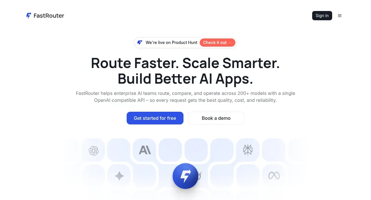 AI routing hero with dual CTA
FastRouter.ai · Hero
AI routing hero with dual CTA
FastRouter.ai · Hero
 Trusted by teams logo strip
FastRouter.ai · Logo cloud
Trusted by teams logo strip
FastRouter.ai · Logo cloud
 Insights and enterprise model access
FastRouter.ai · Feature grid
Insights and enterprise model access
FastRouter.ai · Feature grid
 Routing reliability and model collaboration
FastRouter.ai · Feature grid
Routing reliability and model collaboration
FastRouter.ai · Feature grid
 Solutions by organizational role
FastRouter.ai · Feature grid
Solutions by organizational role
FastRouter.ai · Feature grid
 Goal-oriented product capabilities
FastRouter.ai · Feature grid
Goal-oriented product capabilities
FastRouter.ai · Feature grid
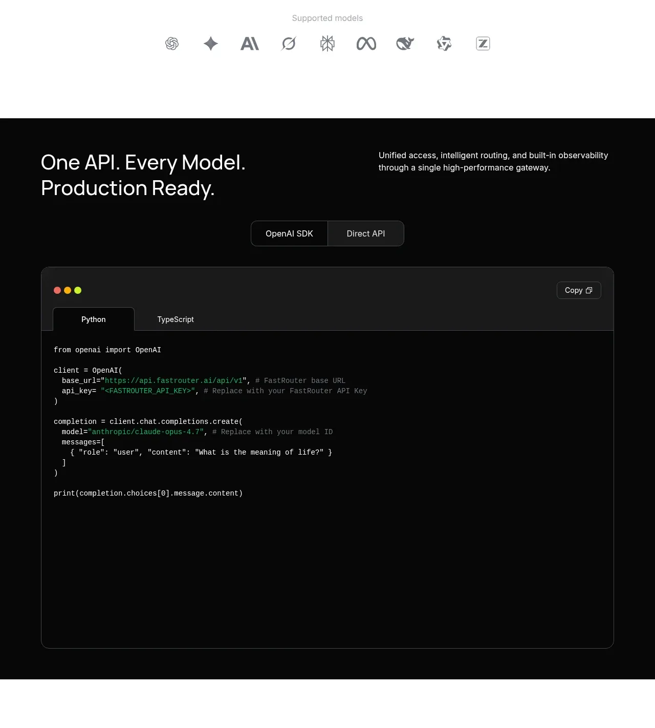 Production-ready API code example
FastRouter.ai · Code block
Production-ready API code example
FastRouter.ai · Code block
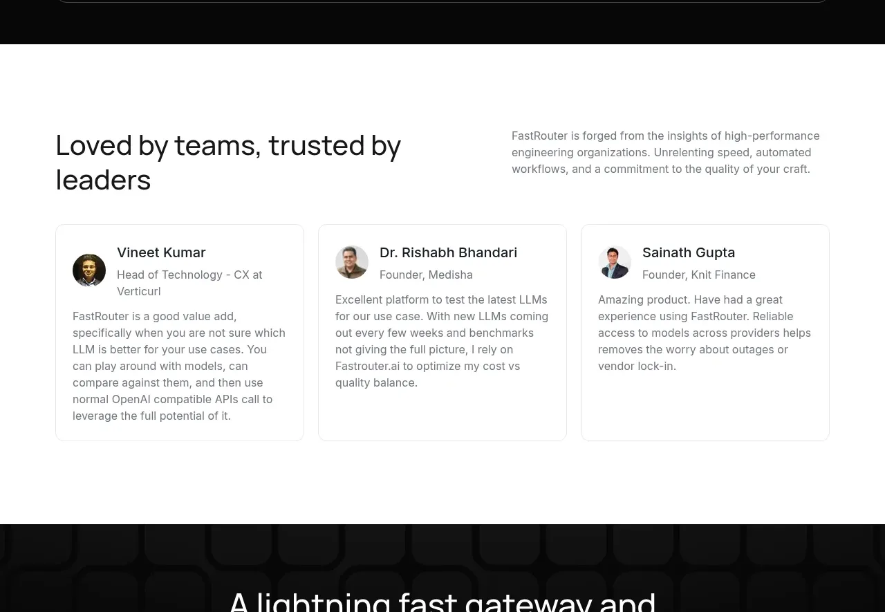 Customer testimonial cards
FastRouter.ai · Testimonials
Customer testimonial cards
FastRouter.ai · Testimonials
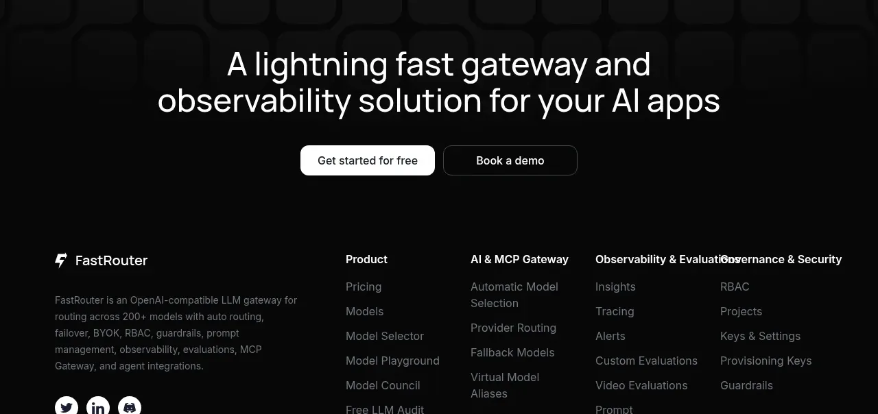 Closing conversion banner
FastRouter.ai · Call to action
Closing conversion banner
FastRouter.ai · Call to action
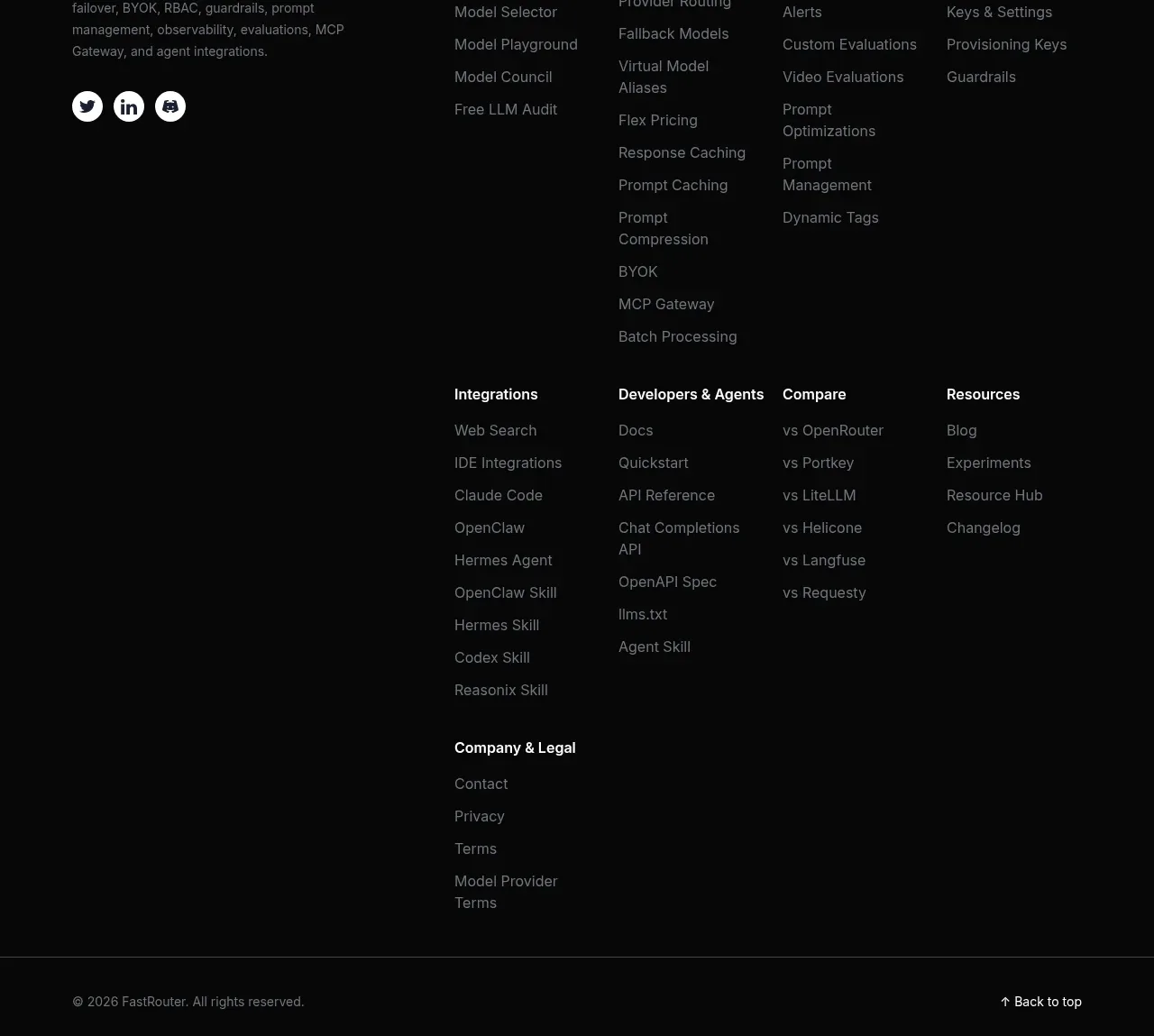 Multi-column product footer
FastRouter.ai · Footer
Multi-column product footer
FastRouter.ai · Footer