 kage
kage
coastcreative.studio

Design analysis
A high-contrast closing CTA uses oversized editorial typography, a short eyebrow, and one pill button over a subtle cool-blue atmospheric background. Fine diagonal lines add a premium, crafted finish without introducing a competing illustration.
Prompt preview
## Reference images

Study these alongside the description below: hierarchy, rhythm, spacing, colour. Build for the product you are asked about, using this design language.

- Component: https://kage-design-assets.t3.tigrisfiles.io/components/father/e7444c2f-2da8-491a-acc7-45230a85c8b9-1789538600-7.webp
- Full page it was cut from: https://kage-design-assets.t3.tigrisfiles.io/screenshots/father/e7444c2f-2da8-491a-acc7-45230a85c8b9-1789538499004-full.webp
- Component on Kage: https://kage.design/component/father-cta

## Before you start
Ask what the user's primary conversion should be, what emotional promise the brand can credibly make, and which visual motifs belong to that brand. Then create an original closing CTA.

Create a full-width closing CTA with a deep near-black background (#101318) and a very subtle navy glow (#152238) behind the content. Use a max-width container, a small uppercase eyebrow, and a very large responsive headline with one emphasized word or phrase in an italic serif/display face. Keep the headline tight and editorial, around 56–76px desktop with a 0.95–1.0 line-height, then place one bright pill CTA beneath it. Add only extremely subtle 1px diagonal or geometric hairlines in #27303b as background texture, keeping them low contrast and noninteractive. The CTA should have 80–120px vertical padding, strong left alignment, and a single clear action. On mobile, reduce the headline to 42–52px and preserve the same hierarchy.

Never: copy logos, product names, exact copy, illustrations, or imagery from the reference.
More components

 Final conversion banner
tiun. · Call to action
Final conversion banner
tiun. · Call to action

 Mobile app conversion CTA
Payflip · Call to action
Mobile app conversion CTA
Payflip · Call to action

 Final download call to action
Grimo AI · Call to action
Final download call to action
Grimo AI · Call to action

 Download conversion panel
Kilo Code for iOS and Android · Call to action
Download conversion panel
Kilo Code for iOS and Android · Call to action
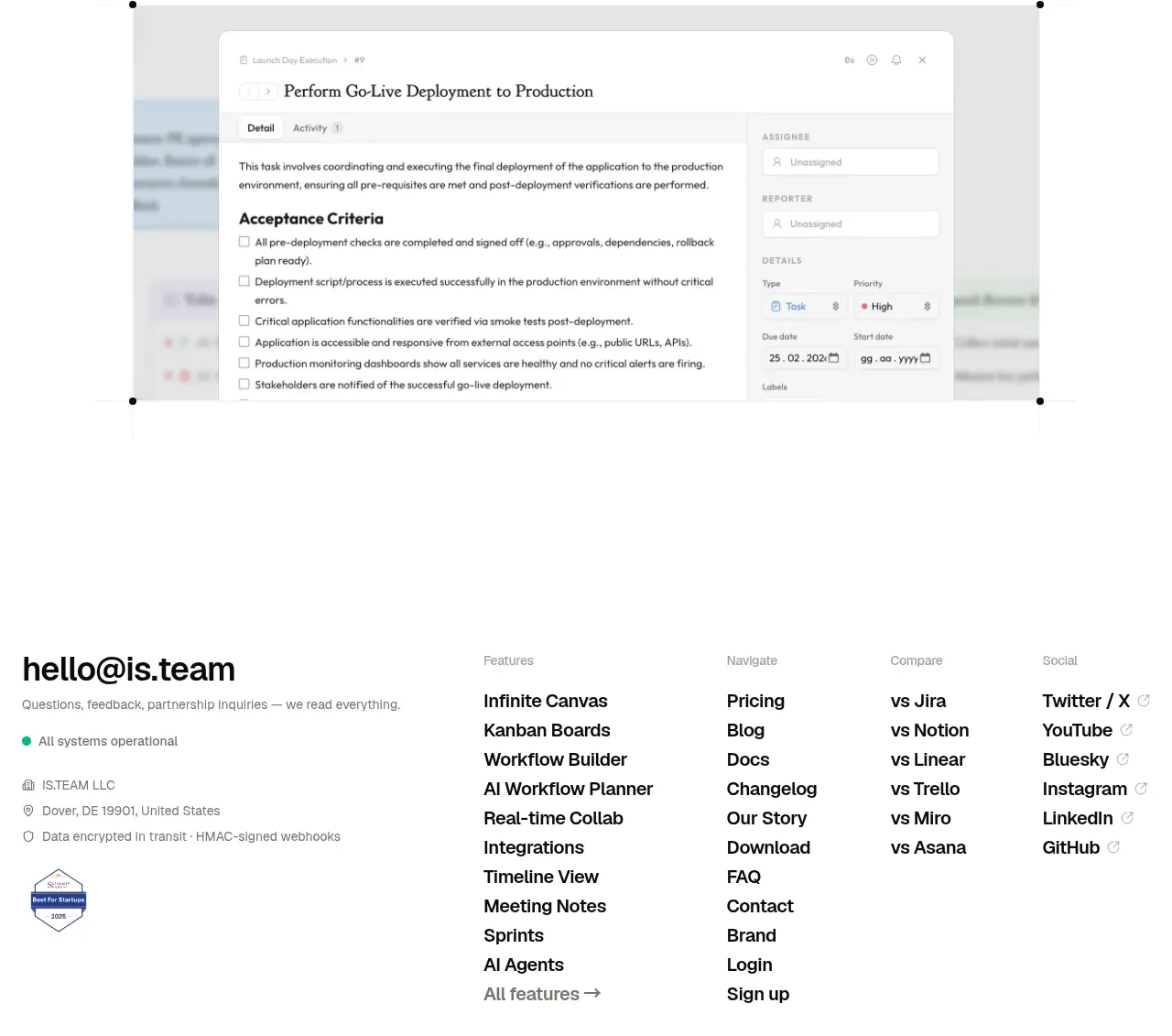
 Final conversion CTA
is.team · Call to action
Final conversion CTA
is.team · Call to action

 Final conversion panel
Idlen · Call to action
Final conversion panel
Idlen · Call to action