kage
kage
coastcreative.studio
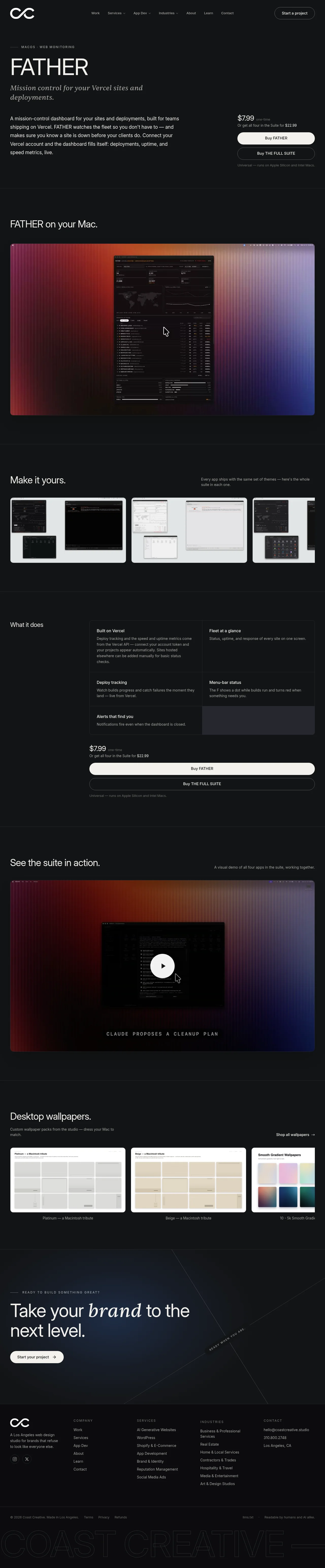
Design analysis
A dark, restrained product page uses a near-black canvas, thin gray rules, compact navigation, and large neutral type with italic serif accents to create an editorial studio feel. The hero moves from a left-aligned product pitch to a right-side purchase module, then the page alternates spacious screenshot-led sections with denser feature and pricing content; cool blue and warm red gradients appear mainly inside product media and the closing CTA rather than across the UI.
Prompt preview
## Reference images

Study these alongside the description below: hierarchy, rhythm, spacing, colour. Build for the product you are asked about, using this design language.

- Full page: https://kage-design-assets.t3.tigrisfiles.io/screenshots/father/e7444c2f-2da8-491a-acc7-45230a85c8b9-1789538499004-full.webp
- Above the fold: https://kage-design-assets.t3.tigrisfiles.io/screenshots/father/e7444c2f-2da8-491a-acc7-45230a85c8b9-1789538494991.webp
- Design on Kage: https://kage.design/designs/father-landing-page

## Before you start
Ask the user what they are building, who it is for, and what brand assets they already have (name, colours, type). Wait for their answers before designing. Apply the reference's design language to their product, not to the reference product.

## Page structure
1. **Global header:** Use a wide, low-height dark navigation bar with a simple abstract brand mark at left, compact links across the middle, and a rounded outlined “start” action at right.
2. **Hero product introduction:** Place a small uppercase category eyebrow with a short horizontal rule, then a large sans-serif product title and an italic serif supporting line on the left. Below, add a readable paragraph describing the product. On the right, align a compact price block with a primary light pill button, secondary outlined pill, and small compatibility note.
3. **Primary product showcase:** After a thin divider, introduce the app with a short heading such as a product-on-device statement, followed by one large rounded-corner screenshot or video still spanning most of the content width.
4. **Theme or configuration gallery:** Add a section heading on the left and a small explanatory note on the right, then show a horizontal row of three or more rounded media cards demonstrating variations, themes, or configurations. Let the row crop at the viewport edge to imply more content.
5. **Feature and purchase section:** Use a two-column layout with a short “what it does” heading at left and a bordered feature grid at right. Divide the grid with thin rules into concise feature cells; allow the final cell to become a subtle tinted block. Place a repeated price and purchase-control stack directly below the grid.
6. **Demo section:** Introduce a large heading on the left and a small description aligned to the right, then show a large rounded video thumbnail. Use a centered light circular play control and a dark, atmospheric media treatment.
7. **Related product gallery:** Add a heading and supporting copy on the left with a right-aligned shop link, followed by a horizontal row of light wallpaper or companion-product cards with captions beneath each image.
8. **Closing studio CTA:** Transition into a taller dark panel with a very subtle blue glow and thin intersecting diagonal lines. Add a small uppercase eyebrow, oversized headline with one italic serif word or phrase, and a light rounded CTA button.
9. **Footer:** Finish with a multi-column footer containing the brand mark and studio description, company/service/industry link groups, and contact details. Add social controls beneath the description, then a thin legal row with copyright, terms, privacy, credits, and accessibility text. End with an oversized outlined background wordmark cropped by the viewport.

## Design language
- Build hierarchy through scale and whitespace rather than decoration: oversized display headings, compact uppercase metadata, medium body copy, and short labels.
- Keep the page mostly near-black, approximately `#101112` to `#141516`, with white text around `#F3F3F1`, muted gray text around `#8D8D8A`, and hairline borders around `#292A2C`.
- Pair a clean modern sans-serif for navigation, headings, UI labels, and body copy with an italic editorial serif for select subtitle words and the closing CTA emphasis. Use tight display tracking and modest line heights for large headings; use relaxed line height for the hero paragraph.
- Maintain a wide centered container with generous horizontal margins. Use thin full-width dividers to mark section changes, and alternate between single-column media sections, two-column explanatory sections, and dense grids so the rhythm becomes more informational after the hero.
- Treat screenshots as the visual anchors: use large rounded rectangles, restrained corner radii around 8–12px, and media that can contain rich product detail. Keep surrounding UI flat with almost no shadows.
- Reserve colour for media and atmosphere: use warm red/orange fading into cool indigo/blue in product demos, and a very subtle blue-black glow behind the final CTA. Do not turn the whole page into a gradient.
- Style actions as high-contrast pills: an off-white filled primary button with dark text and a transparent dark outlined secondary button. Repeat the purchase module later so the conversion path remains visible after the feature grid.
- Keep galleries horizontal and image-led, with consistent card widths, rounded corners, captions, and deliberate edge cropping. Use a centered circular play button for video and make hover states understated: slight brightness or scale change, never loud animation.
- Use motion sparingly: fade or translate sections into view, gently scale media on hover, and preserve the calm, premium pacing. Keep the header, typography, dividers, and footer visually stable.

## Never
- Do not use the reference's logos, wordmarks, product names, copy, illustrations, photography, screenshots, wallpaper designs, or icon sets.
- Do not present the result as FATHER, Coast Creative, or any other reference product.
- Create original content and media appropriate to the user's product while preserving the layout logic, contrast, spacing, and editorial pacing.
Components from this page
All components
 Global navigation
FATHER · Navigation
Global navigation
FATHER · Navigation
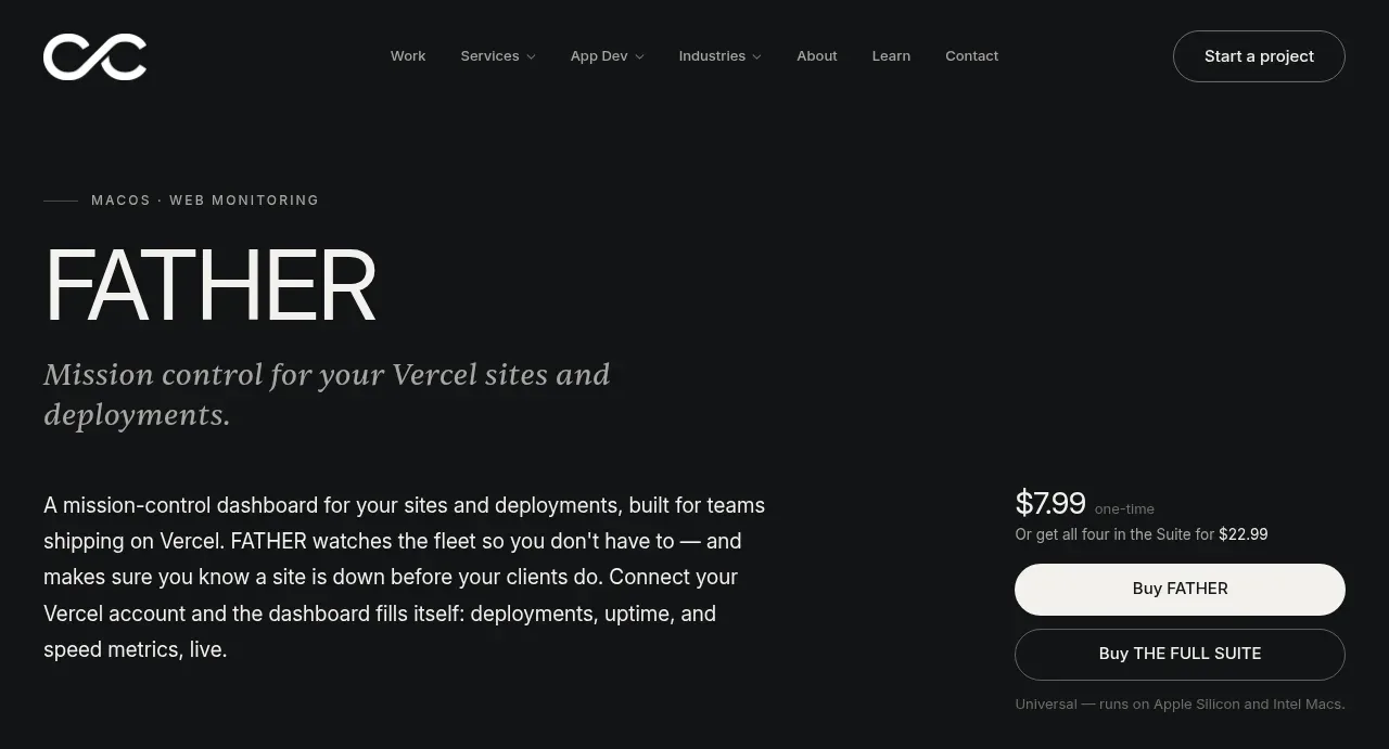 Product hero with purchase actions
FATHER · Hero
Product hero with purchase actions
FATHER · Hero
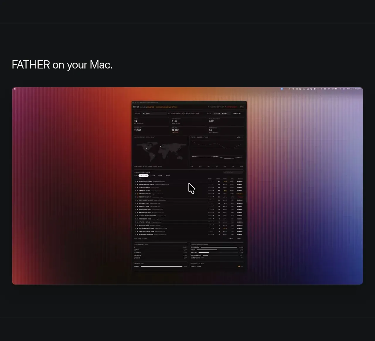 Featured product screenshot
FATHER · Gallery
Featured product screenshot
FATHER · Gallery
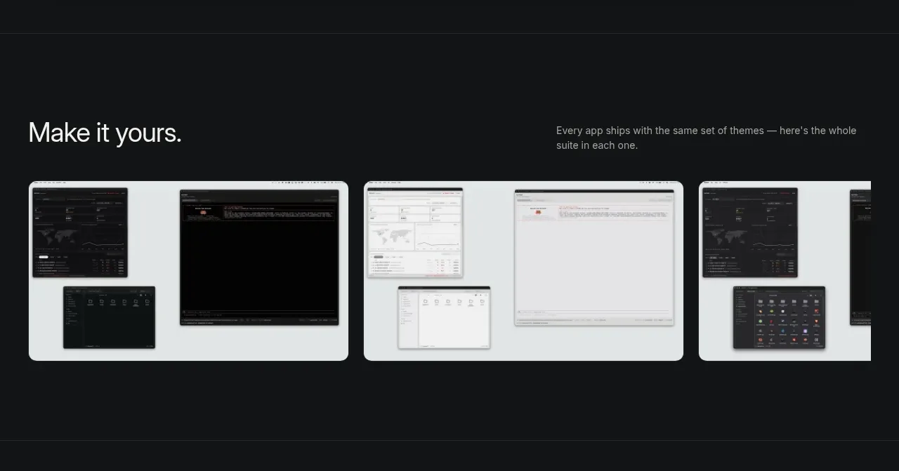 Theme and variation gallery
FATHER · Gallery
Theme and variation gallery
FATHER · Gallery
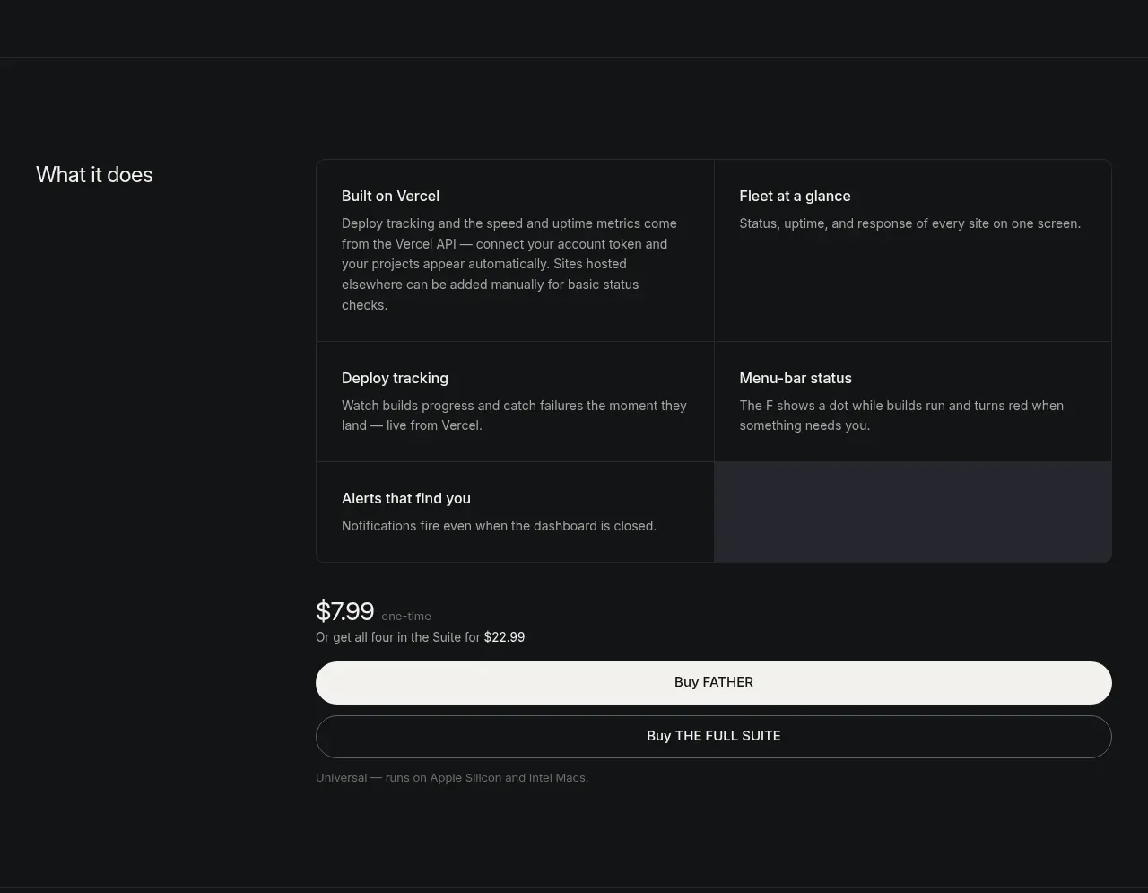 Feature overview and purchase block
FATHER · Feature grid
Feature overview and purchase block
FATHER · Feature grid
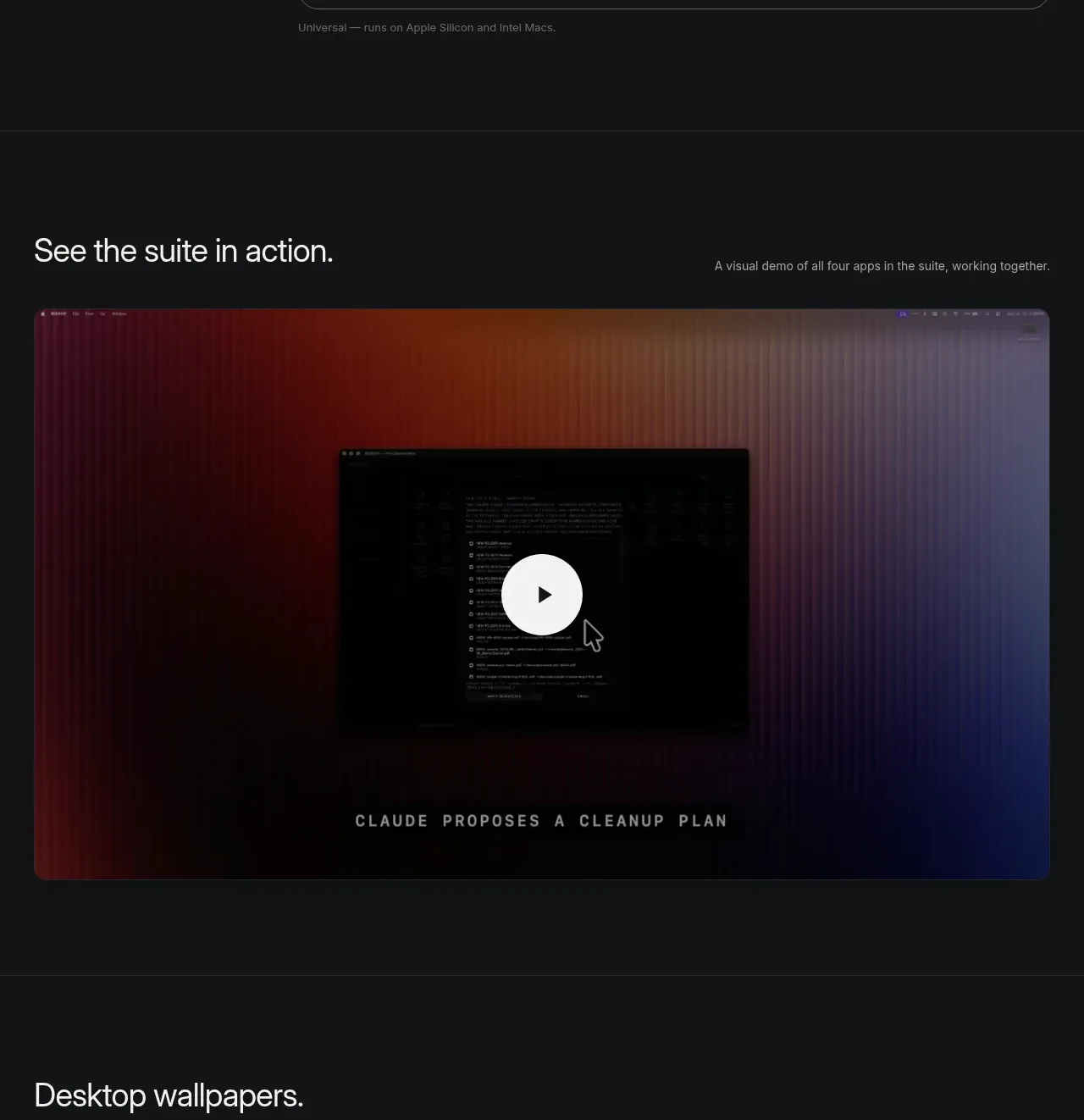 Product demo video
FATHER · Gallery
Product demo video
FATHER · Gallery
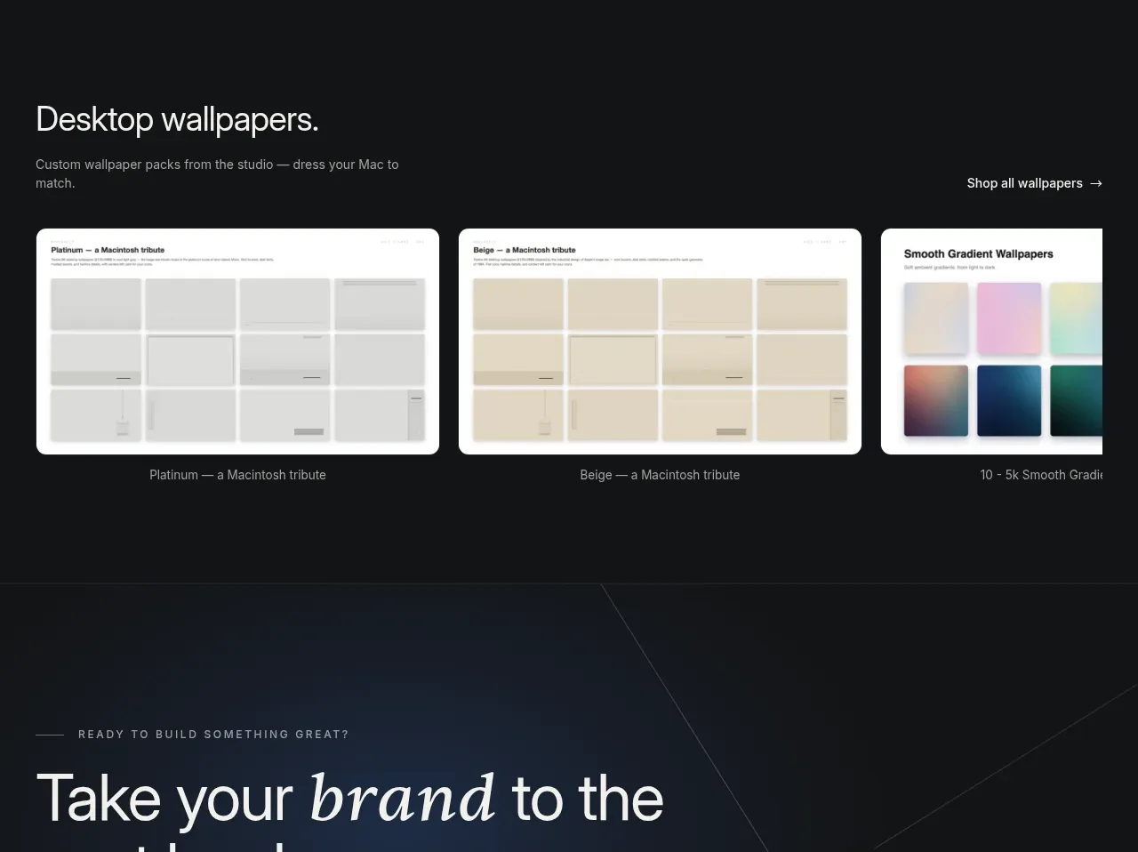 Wallpaper collection gallery
FATHER · Gallery
Wallpaper collection gallery
FATHER · Gallery
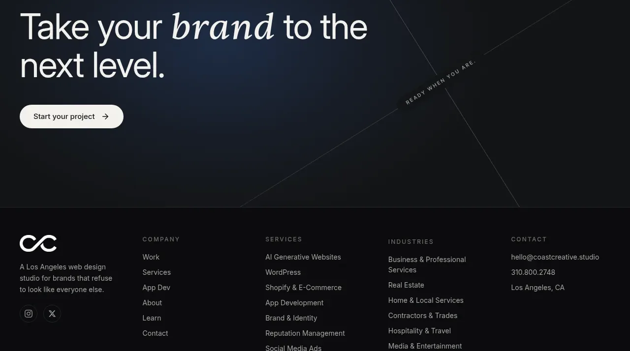 Studio closing call to action
FATHER · Call to action
Studio closing call to action
FATHER · Call to action
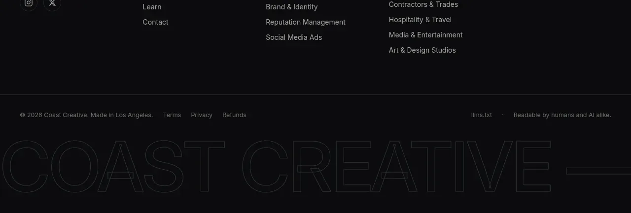 Multi-column studio footer
FATHER · Footer
Multi-column studio footer
FATHER · Footer