kage
kage
coastcreative.studio
Design analysis
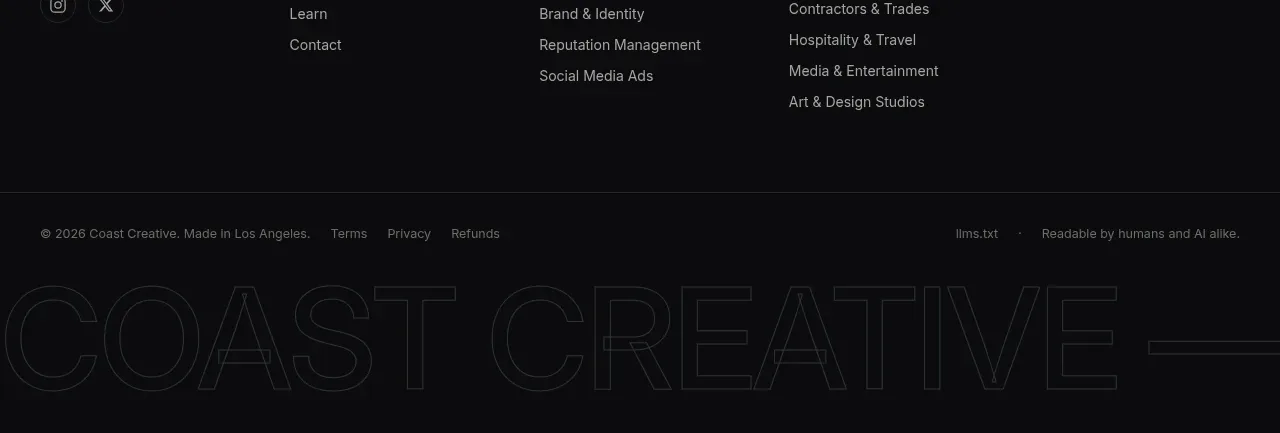
The footer separates brand description and social links from grouped navigation columns, then finishes with a slim legal strip and oversized outlined wordmark treatment. It provides depth and closure while preserving the dark visual system.
Prompt preview
## Reference images

Study these alongside the description below: hierarchy, rhythm, spacing, colour. Build for the product you are asked about, using this design language.

- Component: https://kage-design-assets.t3.tigrisfiles.io/components/father/e7444c2f-2da8-491a-acc7-45230a85c8b9-1789538600-8.webp
- Full page it was cut from: https://kage-design-assets.t3.tigrisfiles.io/screenshots/father/e7444c2f-2da8-491a-acc7-45230a85c8b9-1789538499004-full.webp
- Component on Kage: https://kage.design/component/father-footer

## Before you start
Ask what the user's company is, which navigation groups and contact details are needed, and what legal/social links must be present. Apply the structure to that brand without borrowing reference content.

Build a dark multi-column footer on #0d0e10 with a thin top border. Use a responsive grid: brand/about block on the left, then three or four link groups with small uppercase labels and vertically spaced muted links. Keep the brand description short and readable, and place social icon buttons beneath it with accessible labels. Use off-white #e7e7e5 for headings, #8f9196 for links, 13–15px body text, and 10–11px uppercase group labels with letter spacing. Add a lower legal bar separated by a 1px #282a2e border, containing copyright, policy links, and a small accessibility or attribution note. Optionally place a very large low-contrast outlined typographic brand treatment at the bottom as texture, ensuring it does not affect readability. Collapse columns cleanly on mobile.

Never: copy logos, product names, exact copy, illustrations, or imagery from the reference.