kage
kage
coastcreative.studio
Design analysis
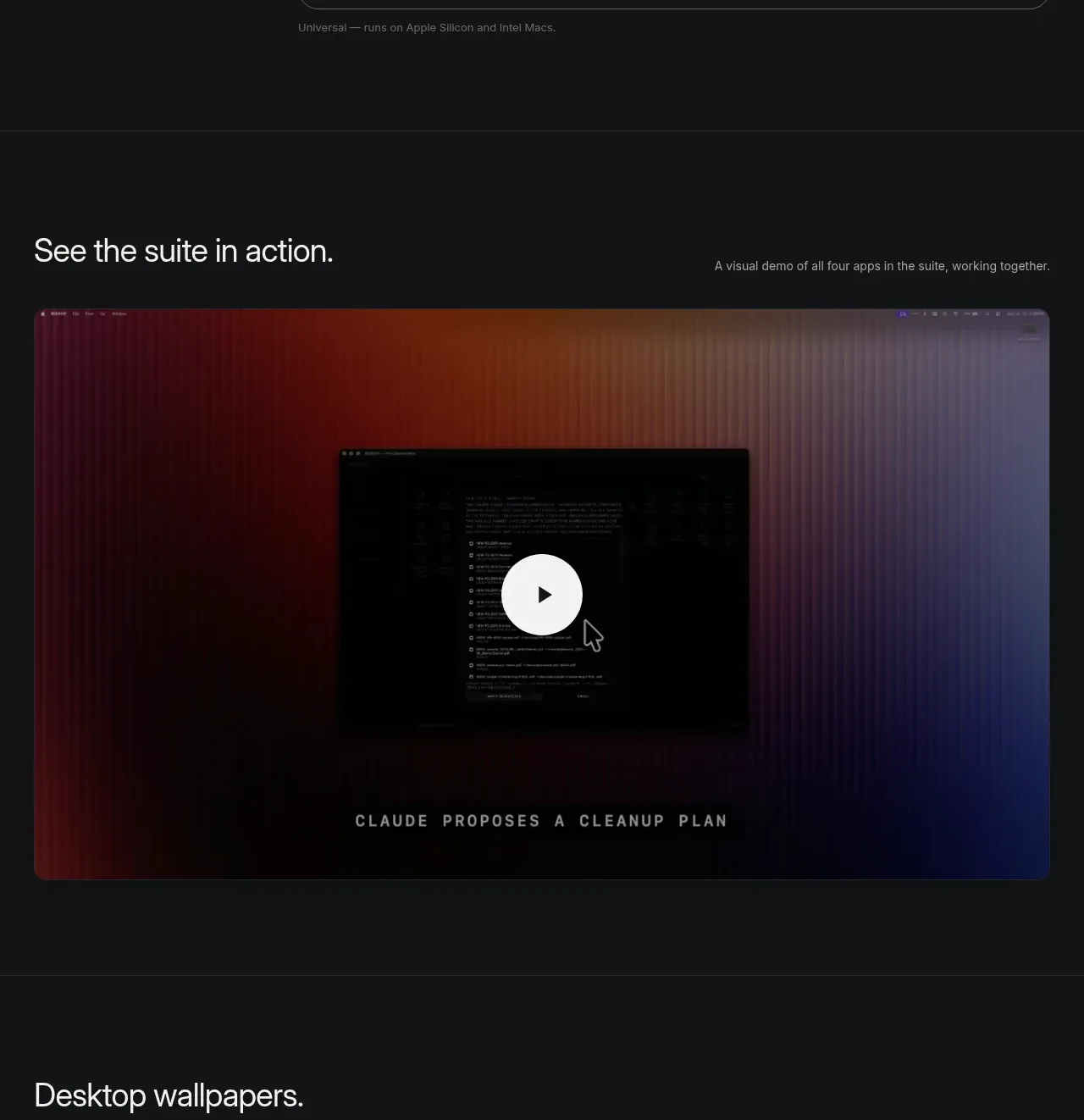
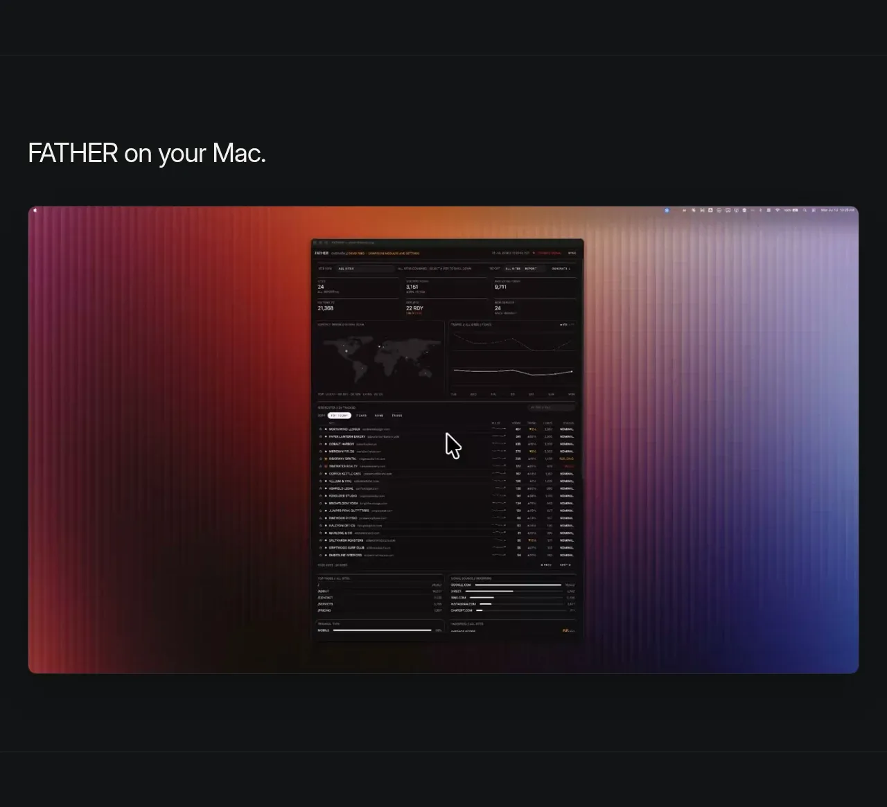
A short heading introduces a single oversized rounded product visual. The image is treated as a showcase object with dark margins, strong scale, and a soft multicolour glow that gives the otherwise monochrome page a focal point.
Prompt preview
## Reference images

Study these alongside the description below: hierarchy, rhythm, spacing, colour. Build for the product you are asked about, using this design language.

- Component: https://kage-design-assets.t3.tigrisfiles.io/components/father/e7444c2f-2da8-491a-acc7-45230a85c8b9-1789538598-2.webp
- Full page it was cut from: https://kage-design-assets.t3.tigrisfiles.io/screenshots/father/e7444c2f-2da8-491a-acc7-45230a85c8b9-1789538499004-full.webp
- Component on Kage: https://kage.design/component/father-gallery

## Before you start
Ask what product or interface should be showcased and what its brand colours are. Then use the following composition rules to create a distinctive showcase for that product.

Build a full-width dark showcase section with a small heading aligned to the same content grid as the hero. Below it, place one large responsive media frame, approximately 16:9 or slightly taller, with 16–20px rounded corners and overflow hidden. Use the user's real product screenshot or a generated placeholder, but make the frame feel premium with a subtle ambient gradient behind it, such as deep red #7b2037 fading through #2b1725 into blue-violet #27265b. Keep the image crisp, avoid excessive decoration, and let the surrounding near-black #111214 create contrast. Add a modest top and bottom padding rhythm and ensure the media scales without cropping important UI. If the product has motion, allow a quiet autoplay preview with reduced-motion fallback.

Never: copy logos, product names, exact copy, illustrations, or imagery from the reference.