kage
kage
coastcreative.studio
Design analysis
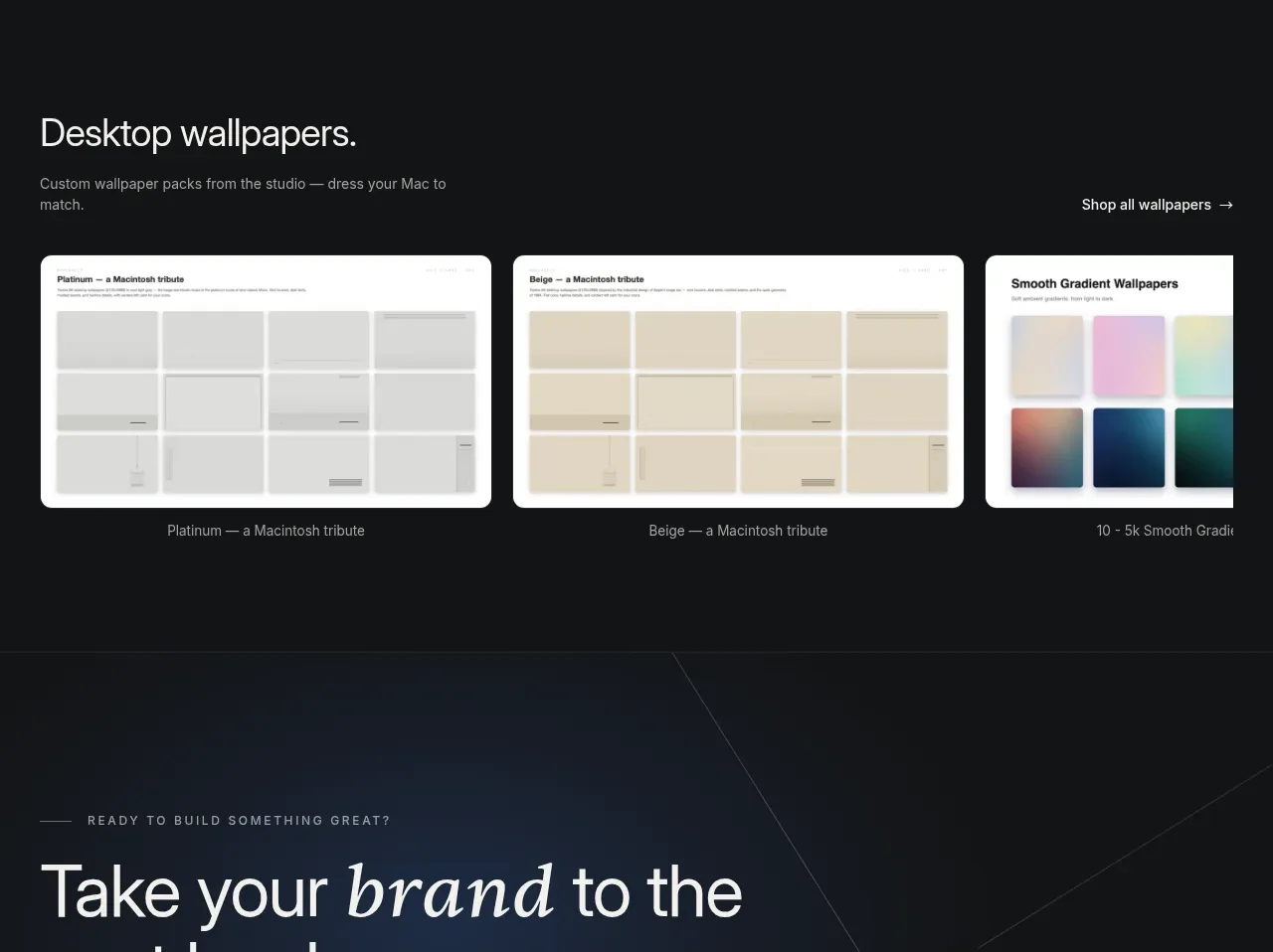
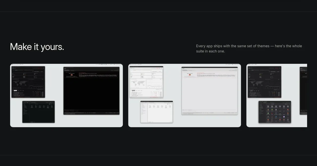
A compact editorial gallery presents several variations side by side under a simple heading and supporting sentence. Rounded cards, generous gutters, and horizontally clipped overflow make the row feel like a browseable product family.
Prompt preview
## Reference images

Study these alongside the description below: hierarchy, rhythm, spacing, colour. Build for the product you are asked about, using this design language.

- Component: https://kage-design-assets.t3.tigrisfiles.io/components/father/e7444c2f-2da8-491a-acc7-45230a85c8b9-1789538598-3.webp
- Full page it was cut from: https://kage-design-assets.t3.tigrisfiles.io/screenshots/father/e7444c2f-2da8-491a-acc7-45230a85c8b9-1789538499004-full.webp
- Component on Kage: https://kage.design/component/father-gallery-2

## Before you start
Ask what variations, templates, modes, or configurations exist in the user's product and what visual system their brand uses. Apply these rules to an original gallery.

Create a dark gallery section with a two-part heading row: a clear medium-large title on the left and a short muted explanation on the right. Beneath it, show a horizontally arranged set of three or more preview cards with consistent aspect ratios, 14–18px corner radii, and 16px gaps. Each card should show a different product state or theme inside a light or brand-specific surface, with a small caption below. Allow the row to overflow horizontally on smaller screens with scroll snapping and no intrusive scrollbar; on desktop, let the final card slightly approach the viewport edge to suggest more content. Use #111214 for the section, #e8eaeb for neutral preview surfaces, subtle #2a2c30 borders, and off-white headings. Keep card shadows restrained and use hover scale or border emphasis only.

Never: copy logos, product names, exact copy, illustrations, or imagery from the reference.