kage
kage
coastcreative.studio
Design analysis
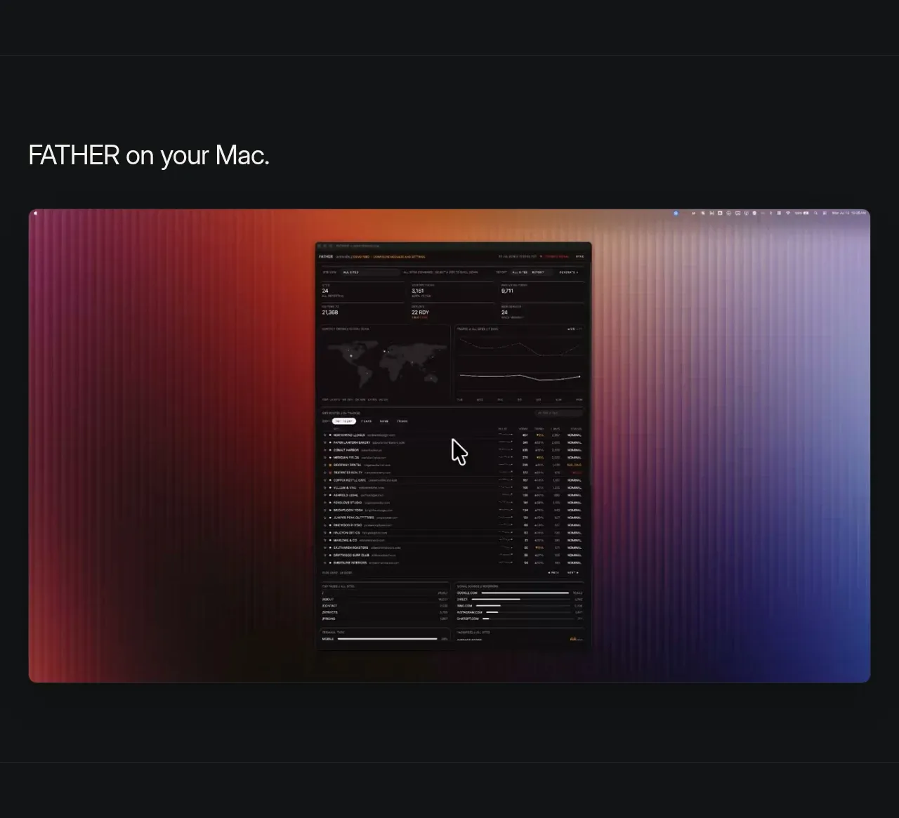
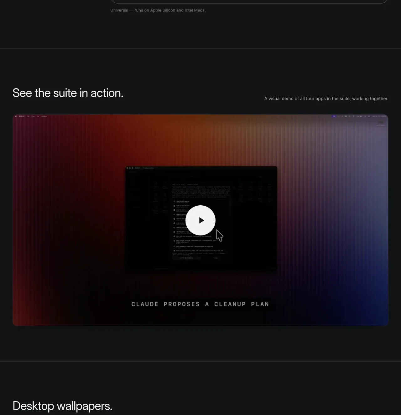
A second media section frames a visual demo with a heading and short descriptor, then uses a large rounded thumbnail and an unmistakable centered play control. A restrained gradient and caption-like detail add atmosphere without competing with the video.
Prompt preview
## Reference images

Study these alongside the description below: hierarchy, rhythm, spacing, colour. Build for the product you are asked about, using this design language.

- Component: https://kage-design-assets.t3.tigrisfiles.io/components/father/e7444c2f-2da8-491a-acc7-45230a85c8b9-1789538599-5.webp
- Full page it was cut from: https://kage-design-assets.t3.tigrisfiles.io/screenshots/father/e7444c2f-2da8-491a-acc7-45230a85c8b9-1789538499004-full.webp
- Component on Kage: https://kage.design/component/father-gallery-3

## Before you start
Ask what workflow the demo should show, what the user's product brand feels like, and whether the video should autoplay or be user initiated. Use those answers to make an original media section.

Create a dark video showcase with a heading row and one oversized rounded video thumbnail beneath it. Match the page's max-width grid, use 16–20px radius, and preserve a cinematic aspect ratio. Apply a very subtle brand gradient or vignette behind the thumbnail, but keep the product interface legible. Place a centered circular play button with a light #f3f3f1 fill, dark icon, and 56–72px desktop diameter; add hover brightness/scale and a visible focus ring. Include a small optional uppercase caption or metadata line integrated into the media frame, but avoid visual clutter. Support keyboard activation, accessible labels, poster fallback, and reduced motion. Maintain generous section padding so the media reads as a feature moment.

Never: copy logos, product names, exact copy, illustrations, or imagery from the reference.