kage
kage
coastcreative.studio
Design analysis
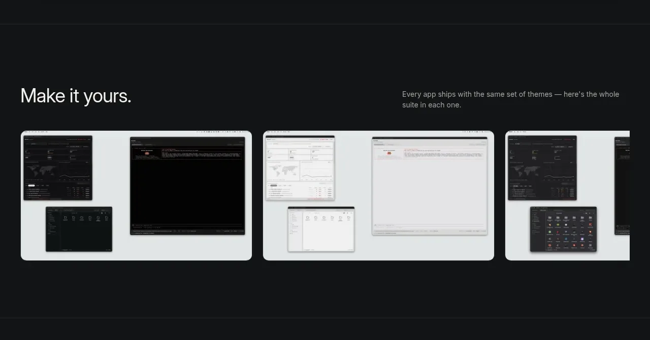
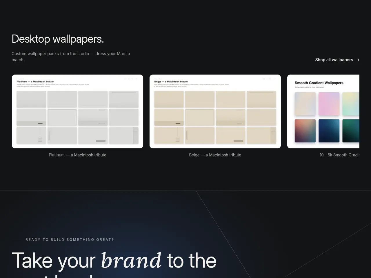
A product-adjacent collection section uses a heading, a right-aligned browse link, and a row of large preview cards with captions. The light previews stand out sharply against the dark page and make the collection immediately understandable.
Prompt preview
## Reference images

Study these alongside the description below: hierarchy, rhythm, spacing, colour. Build for the product you are asked about, using this design language.

- Component: https://kage-design-assets.t3.tigrisfiles.io/components/father/e7444c2f-2da8-491a-acc7-45230a85c8b9-1789538599-6.webp
- Full page it was cut from: https://kage-design-assets.t3.tigrisfiles.io/screenshots/father/e7444c2f-2da8-491a-acc7-45230a85c8b9-1789538499004-full.webp
- Component on Kage: https://kage.design/component/father-gallery-4

## Before you start
Ask what related collection, add-on, or resource the user's product should promote and what the desired browse action is. Translate the principles below into that brand's visual language.

Build a dark collection section with a heading and short supporting copy on the left and a simple text link on the right. Beneath, display three large preview cards in a horizontal row. Give each card a pale surface or image area, 14–18px rounded corners, a consistent aspect ratio, and a small muted caption aligned beneath it. Use a max-width container but allow the row to clip or scroll on narrow screens. Make the browse link understated yet discoverable with an arrow or directional affordance, and add hover treatment to cards through a subtle lift, border, or image zoom. Keep the palette restrained: #111214 background, #f0f0ed card surfaces, #b0b1b4 captions, and off-white headings. Ensure captions remain readable and cards have descriptive accessible labels.

Never: copy logos, product names, exact copy, illustrations, or imagery from the reference.